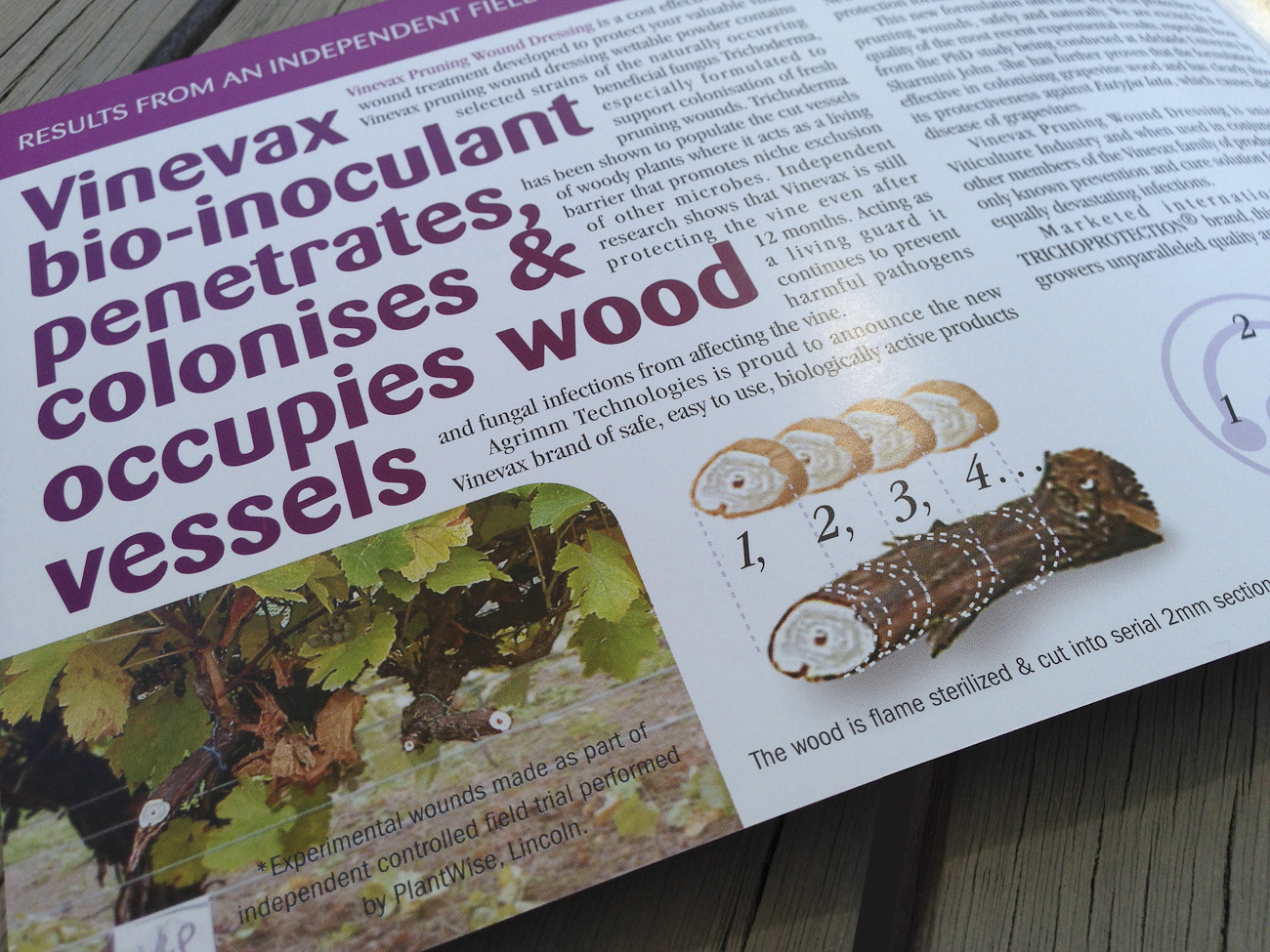
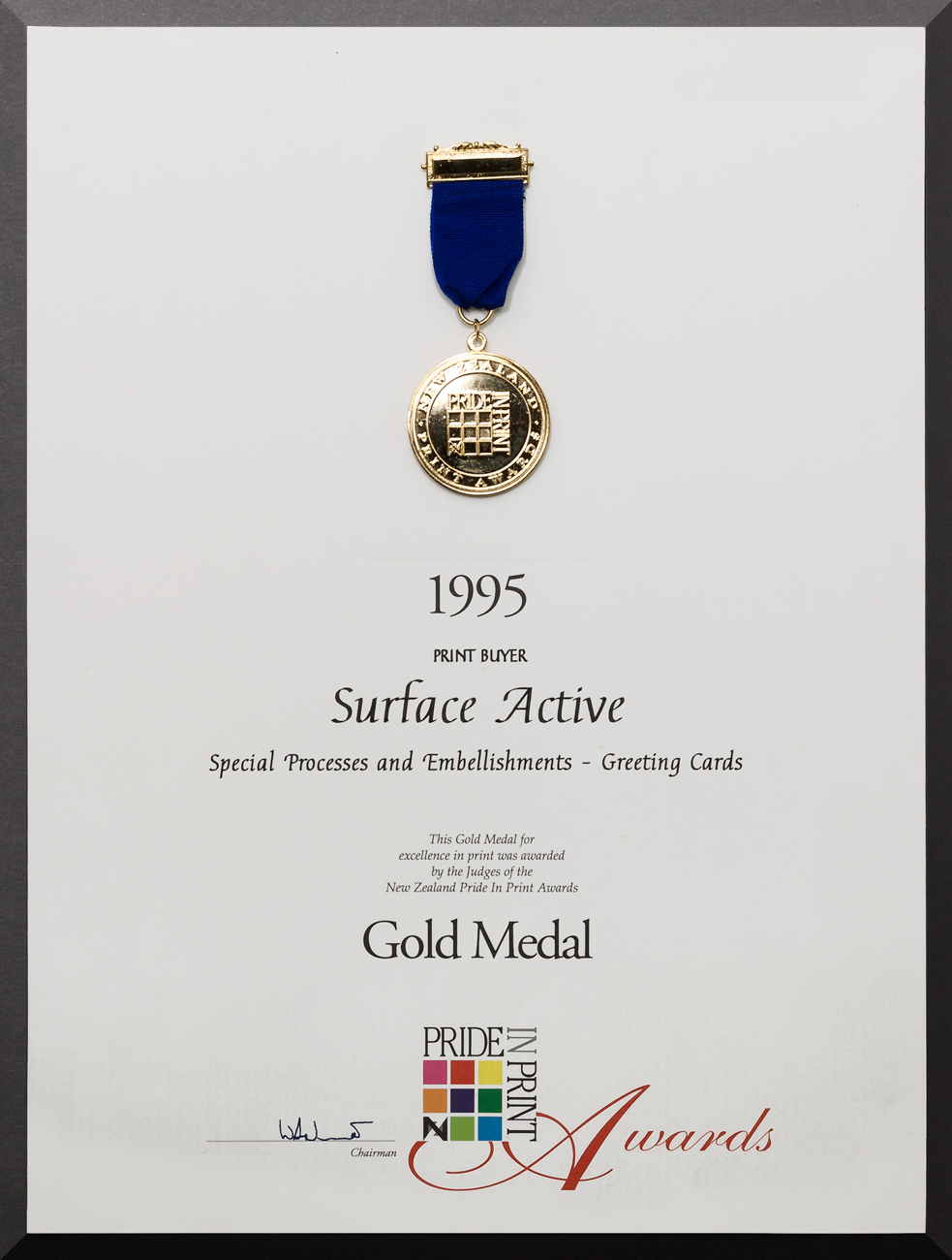
Surface Active art-to-wear: T-shirts in the spirit of fun.
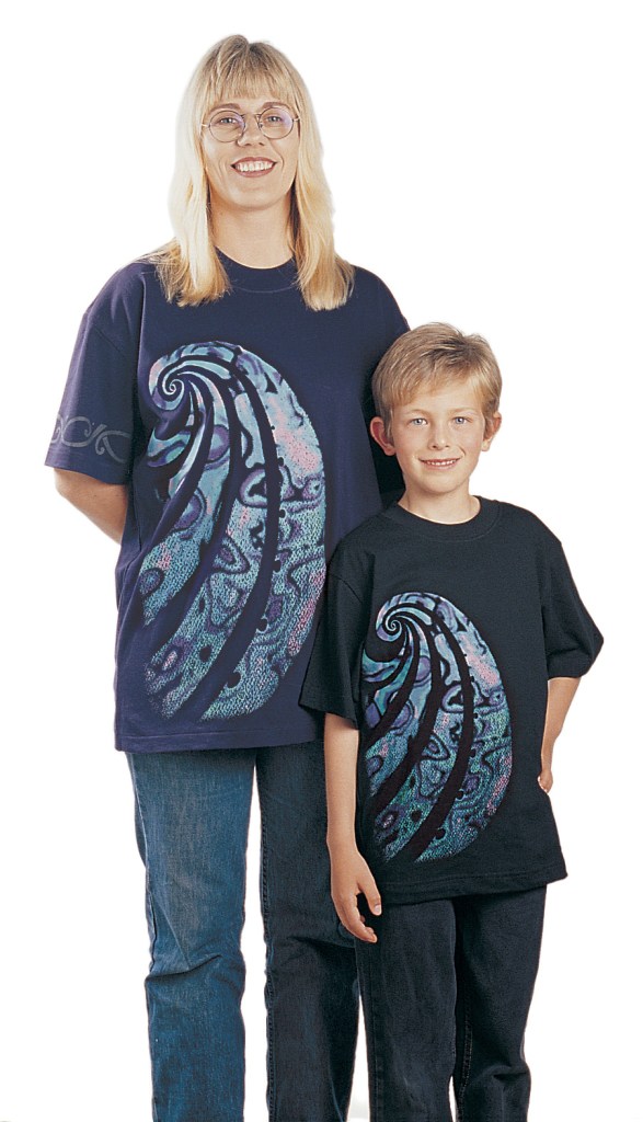
‘Paua Aotearoa’, adults and kids T-shirt, four colour print on navy and black fabric. Adult garment a four colour print. Placement; four colour front, one complementary small one colour print on back. Piecework kowhaiwhai print on sleeves.
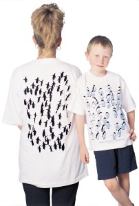
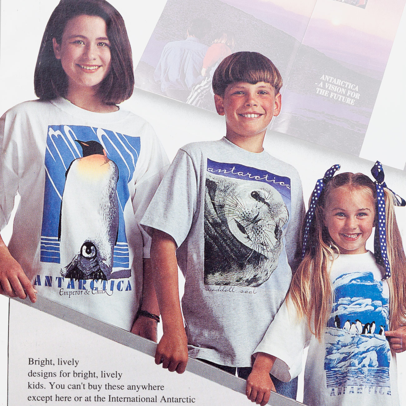
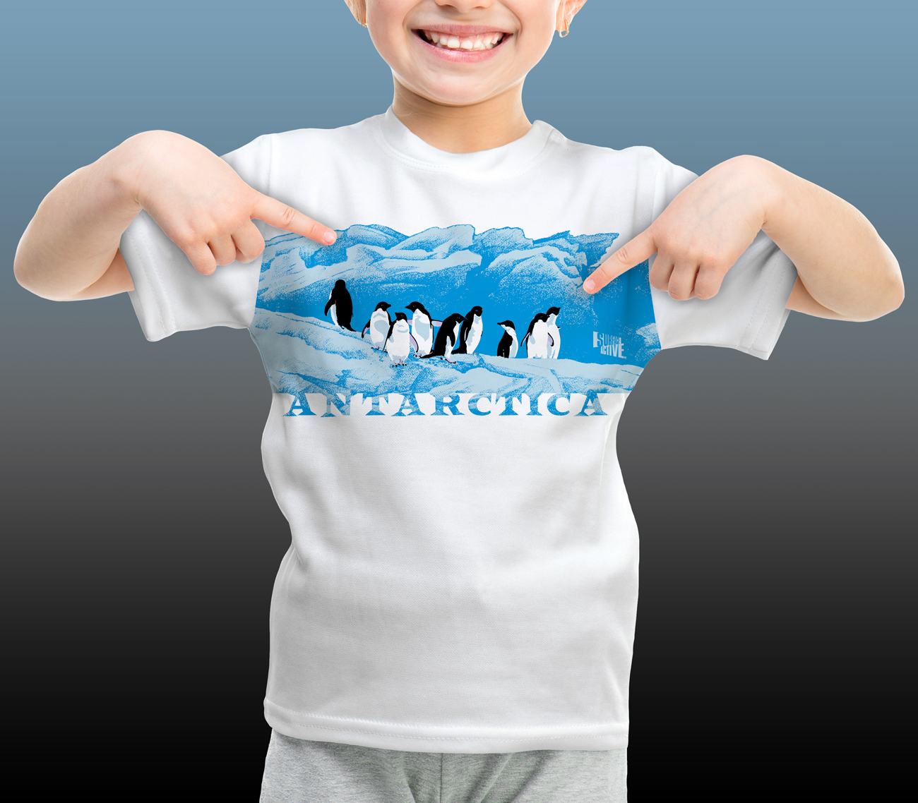
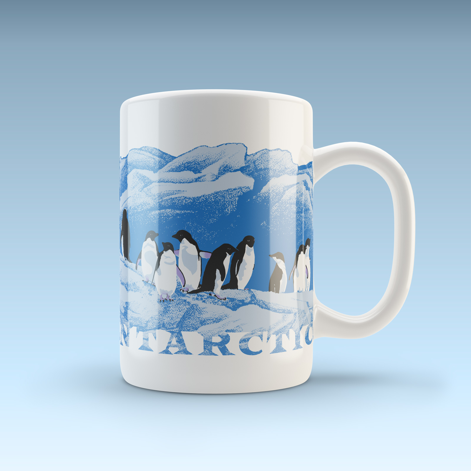
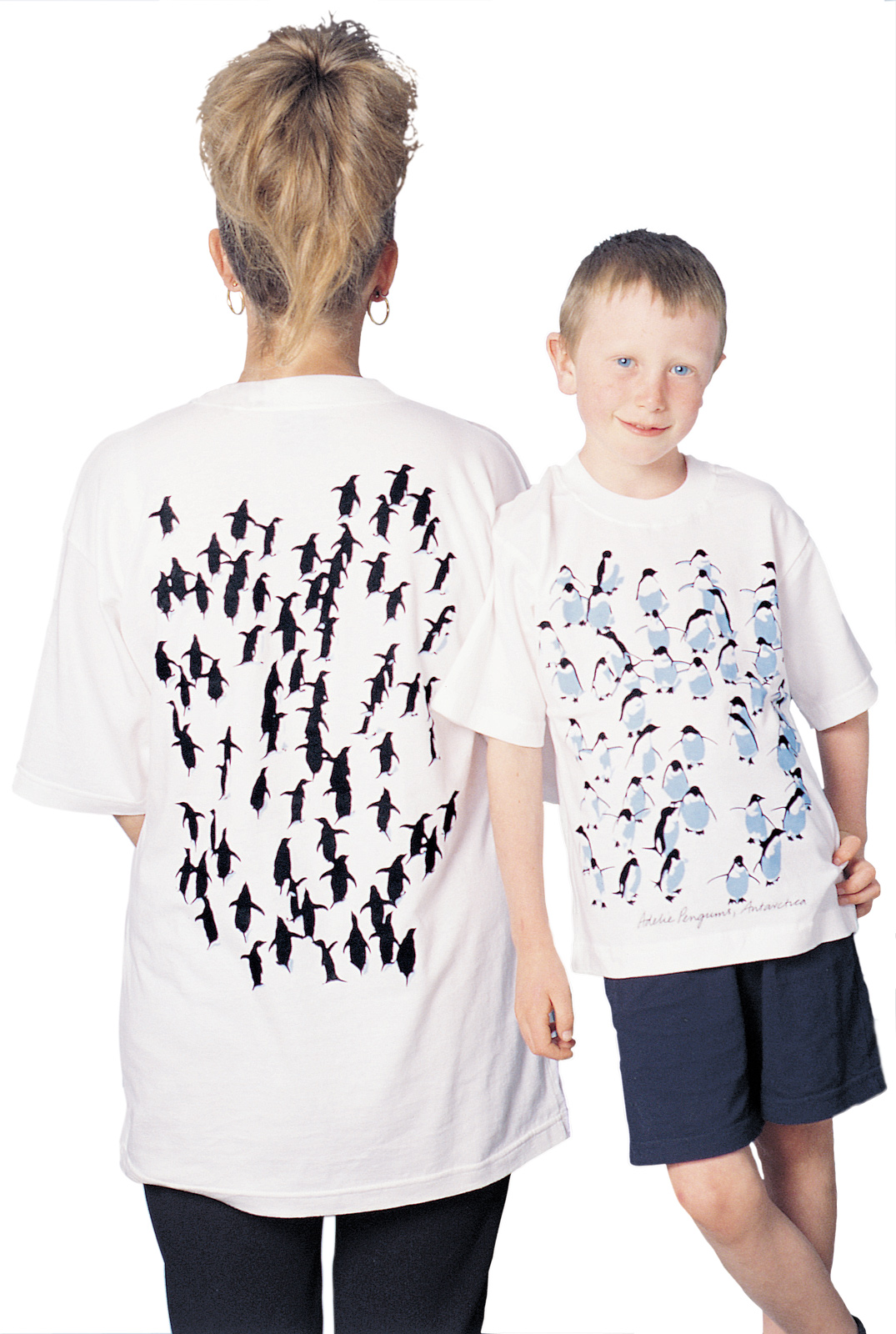
‘Adelie Penguins, Antarctica’ adult’s and children’s two colour print.
As an illustrative graphic designer, writer, desktop publisher; once before I was a design pARTner in an in-house craft garment screenprinting studio, the medium of the workingman’s artist.
By the mid 1980s T-shirts had become hot promotional items, garments on the outskirts of fashion, and a relatively new medium for the Graphic Designer’s art. What had for a long time been considered a poor medium for Graphic Design grew to an almost essential one. All you have to do is walk down the street anywhere in the world since the early 80s to see what a ubiquitous promotional vehicle they have become. If you mail out 100 potential clients a direct mail brochure perhaps 200 people will see it. But mail out, or better yet, sell 100 T-shirts, and assuming they’re at all decent looking, you launch 100 walking billboards.
The trend over the past several decades has been to embrace more casual clothing, to the point of stone-washed and distressed, though this has in no way meant this sort of clothing has become less expensive or stylish. Brand awareness, including personal brand awareness has been part of this trend—to such an extent that people want, or are at least willing to flaunt, the name of the brand or designer of their shoes, jeans, and bags on the items in question. In short clothing manufacturers made their products promotional vehicles for themselves.

Surface Active | The New Zealand Nature T-shirt Company.

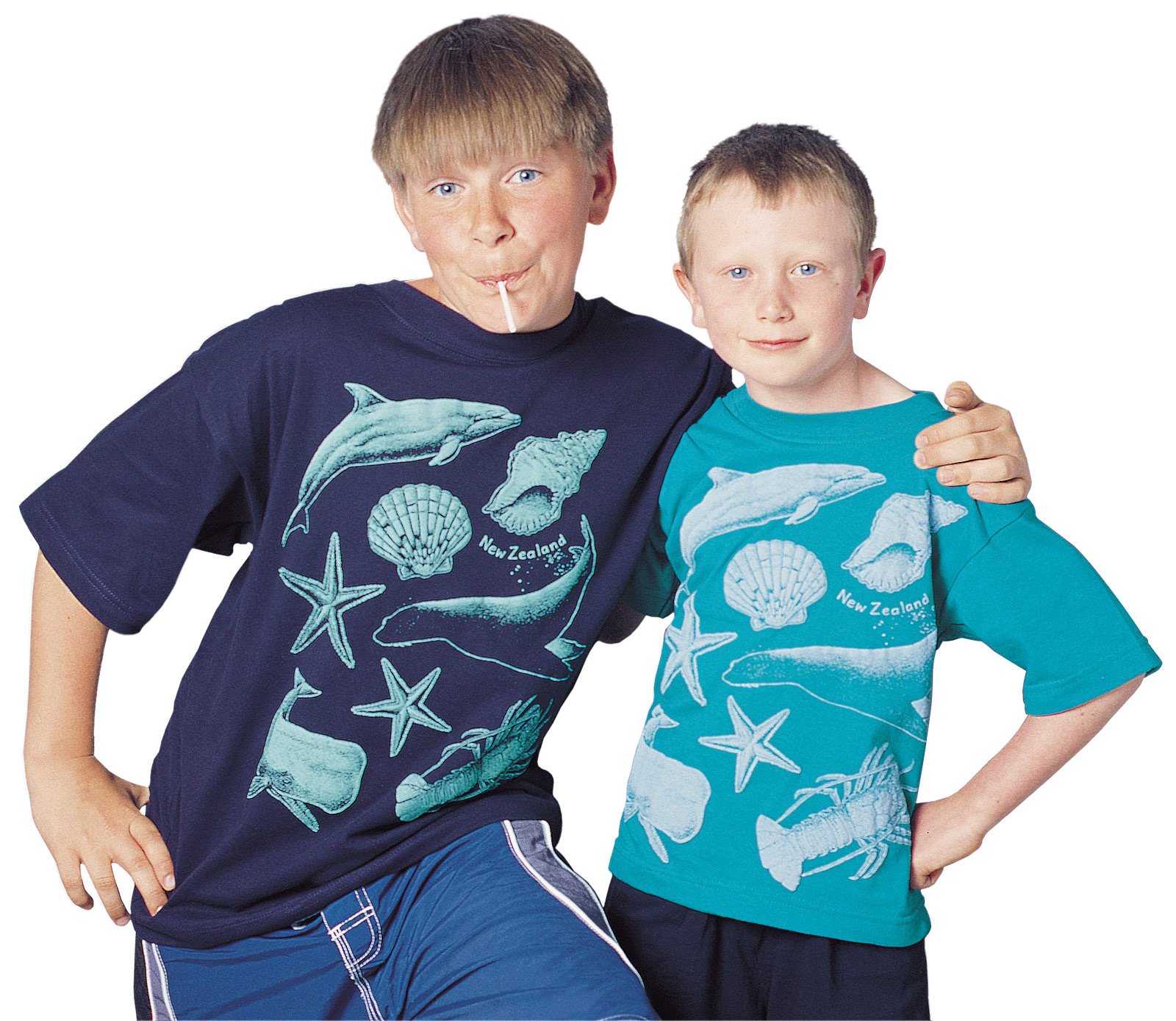
‘Ocean – New Zealand’ one colour children’s T-shirt print on navy blue and jade green fabric. Placement; One colour front and back. ‘Puff’ printed emboss effect ink.

‘Ocean – New Zealand’ and ‘Seashore – New Zealand’ one colour children’s T-shirt prints on navy blue and jade green fabric. Placement; One colour front and back. ‘Puff’ printed emboss effect ink.

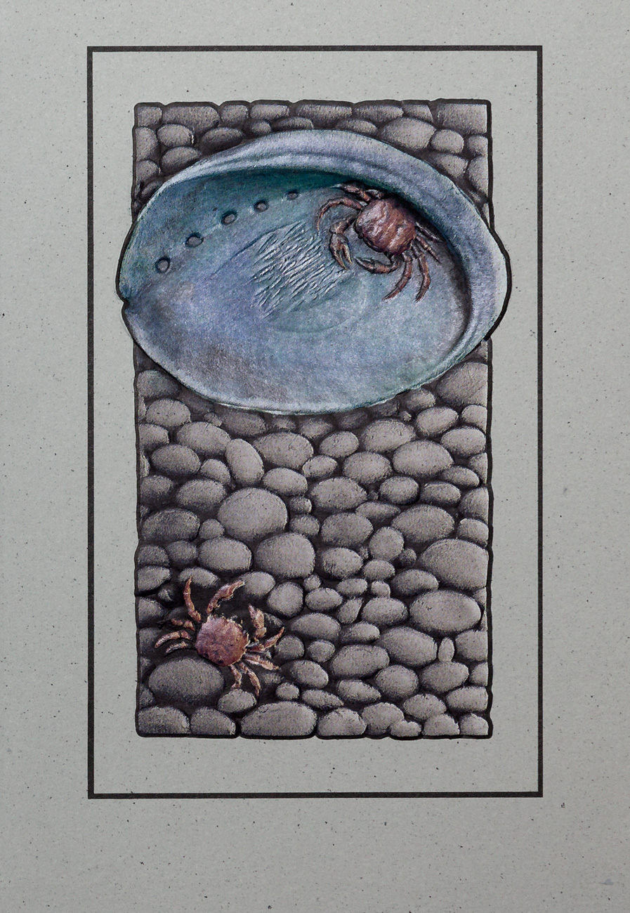
Saltwater crayfish – koura. Charcoal and ink on coquille board drawing.

‘Forest floor – New Zealand’ one colour children’s T-shirt print on unbleached cotton and dark green fabric. Placement; One colour front and back. ‘Puff’ printed emboss effect ink.

Chrissie models ‘Kiwi – New Zealand’ the first of our mixed digital and drawing board graphics. ‘Puff’ printed emboss effect ink.

‘Sandy shore’ one colour garment print on grey marle fabric. Placement; front and back, with a smaller complimentary designalong the hemline on the back.

‘Sandy shore’ one colour garment print on unbleached cotton fabric. Placement: front and back, with a smaller complimentary design along the hemline on the back.

‘Taniwha Aotearoa – Maori rock art New Zealand. One colour T-shirt print on black fabric. Placement; larger graphic on front complementary smaller graphic back. Front print metallic gold manual colour blend.

‘Taniwha Aotearoa – Maori rock art New Zealand. One colour long sleeve T-shirt print on black fabric. Placement; larger graphic on front complementary smaller graphic back. Front print metallic gold manual colour blend.

‘Treefern New Zealand’ T-shirt, two colour print on dark green fabric. Printed front and sleeve of garment.

‘Tapa NZ’ children’s T-shirt on unbleached cotton fabric. 2 colours placed front, back and sleeves.

‘Tapa NZ’ two colour T-shirt on unbleached cotton fabric. Placement; 2 colours placed front, back and sleeves.

‘Light of the Pacific – Nuclear-free New Zealand’ T-Shirt. Two colour print on navy and unbleached cotton fabric. Placement; Two colour front, small complementary one colour back, ssleeves printed one colour ‘sharkstooth’ woodcut as piecework.

‘Light of the Pacific – Nuclear-free New Zealand’ T-Shirt. Two colour print on navy and unbleached cotton fabric. Placement; Two colour front, small complementary one colour back, sleeves printed one colour ‘sharkstooth’ woodcut as piecework.

‘Light of the Pacific – Nuclear-free New Zealand’ T-Shirt. Two colour print on unbleached cotton fabric. Placement; Two colour front, small complementary one colour back, sleeves printed one colour ‘sharkstooth’ woodcut as piecework.

Surface Active catalogue of graphic T-shirt designs, 1994–95. Concertina fold “paper dolls” presentation concept. Vivid Rod Morris kea plumage detail cover graphic.

‘Adelie Penguins, Antarctica’ adult’s and children’s two colour T-shirt print on white fabric. Placement; Complementary graphics, two colours front and back.

‘Pukeko New Zealand’ four colour T-shirt print on navy blue fabric. Placement; 4 colours front with small complementary 3 colour print on the back.

‘Pukeko New Zealand’ four colour children’s T-shirt print on navy blue fabric. Placement; 4 colours front with small complementary 3 colour print on the back.

‘Adelie Penguins, Antarctica’ adult’s and children’s two colour T-shirt print on white fabric. Placement; Complementary graphics. two colours front and back.

Beautiful type makes a statement of its own; it adds elegance and attitude to my words; The tuatara is a two colour “pen & ink” wildlife art design printed using three dimensional “puff” inks.

‘Tuatara – Living fossil map’ two colour T-shirt print on black fabric using opaque and three dimensional puff inks.

Surface Active art-to-wear: making waves in a sea of sameness.

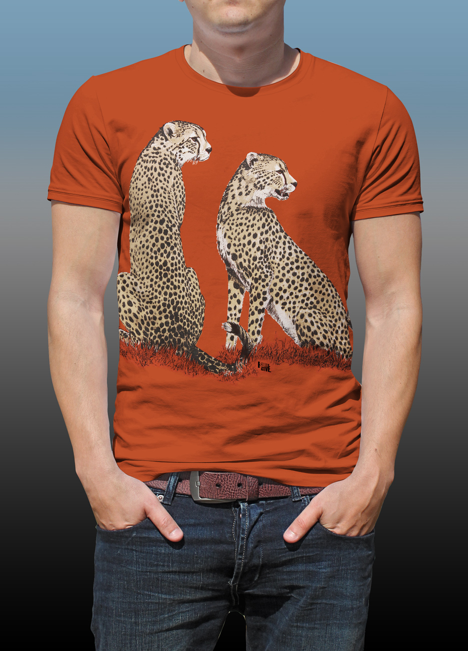
‘Paua Aotearoa’ T-shirt, four colour print on black fabric. Placement; four colour front, complementary small one colour graphic on back. Piecework kowhaiwhai print on sleeves.

‘Paua Aotearoa’, adults and kids T-shirt, four colour print on navy and black fabric. Adult garment a four colour print. Placement; four colour front, one complementary small one colour print on back. Piecework kowhaiwhai print on sleeves.

‘Paua Aotearoa’ T-shirt, four colour print on black fabric. Placement; four colour front, complementary small one colour graphic on back. Piecework kowhaiwhai print on sleeves. Model: Shaun.

‘Paua Aotearoa’, adults and kids T-shirt, four colour print on navy and black fabric. Adult garment a four colour print. Placement; four colour front, one complementary small one colour print on back. Piecework kowhaiwhai print on sleeves.

Weta long sleeve T-shirt on oatmeal marle fabric. Six colour print. Placement; piecework, front, back and sleeve.

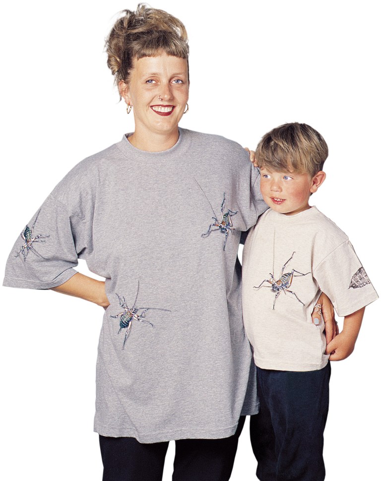
‘Weta – New Zealand’ T-shirt, adults and kids, on oatmeal and grey marle fabric. Adult garment a six colour print. Placement; piecework, front, back and sleeve.

‘Weta – New Zealand’ six colour print T-shirt on light brown marle fabric. Placement; Six colour print as piecework, front, back and sleeve.

‘Weta – New Zealand’ T-shirt, adults and kids, on oatmeal and grey marle fabric. Adult garment a six colour print. Placement; piecework, front, back and sleeve.

Surface Active T-shirt swingtag front.

Surface Active T-shirt swingtag back.

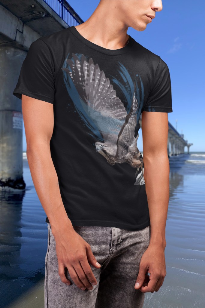
Surface Active ‘Kiwi Space Shuttle’ T-shirt, mixed media, digital illustration.

‘Kiwi Space Shuttle’ print detail.

‘Sperm Whale – Kaikoura New Zealand’ T-shirt, five colour print on white or dark blue-green fabric. Placement; five colour print back, complementary small one colour graphic on front.

Some screen printed art began as woodcuts.

‘Spotted Shags – New Zealand’ T-shirt, seven colour print on grey marle fabric. Placement; seven colour front, one colour woodcut around hem front and back.

‘Spotted Shags – New Zealand’ T-shirt, seven colour print on navy blue fabric. Placement; seven colour front, one colour woodcut around hem front and back.

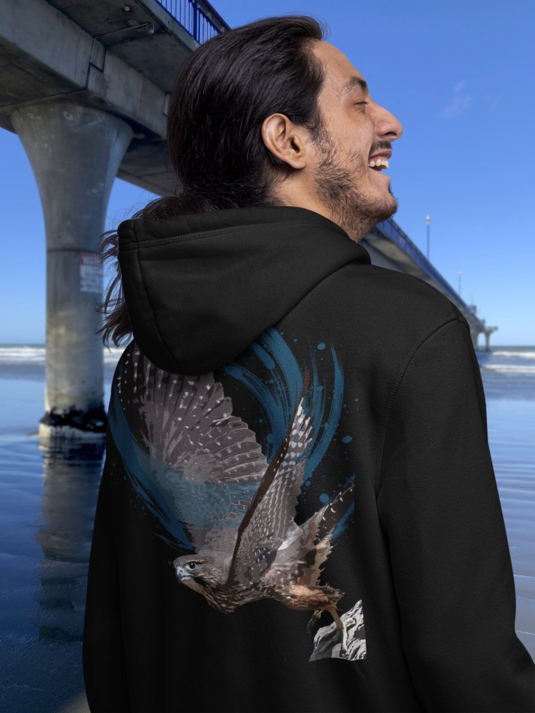
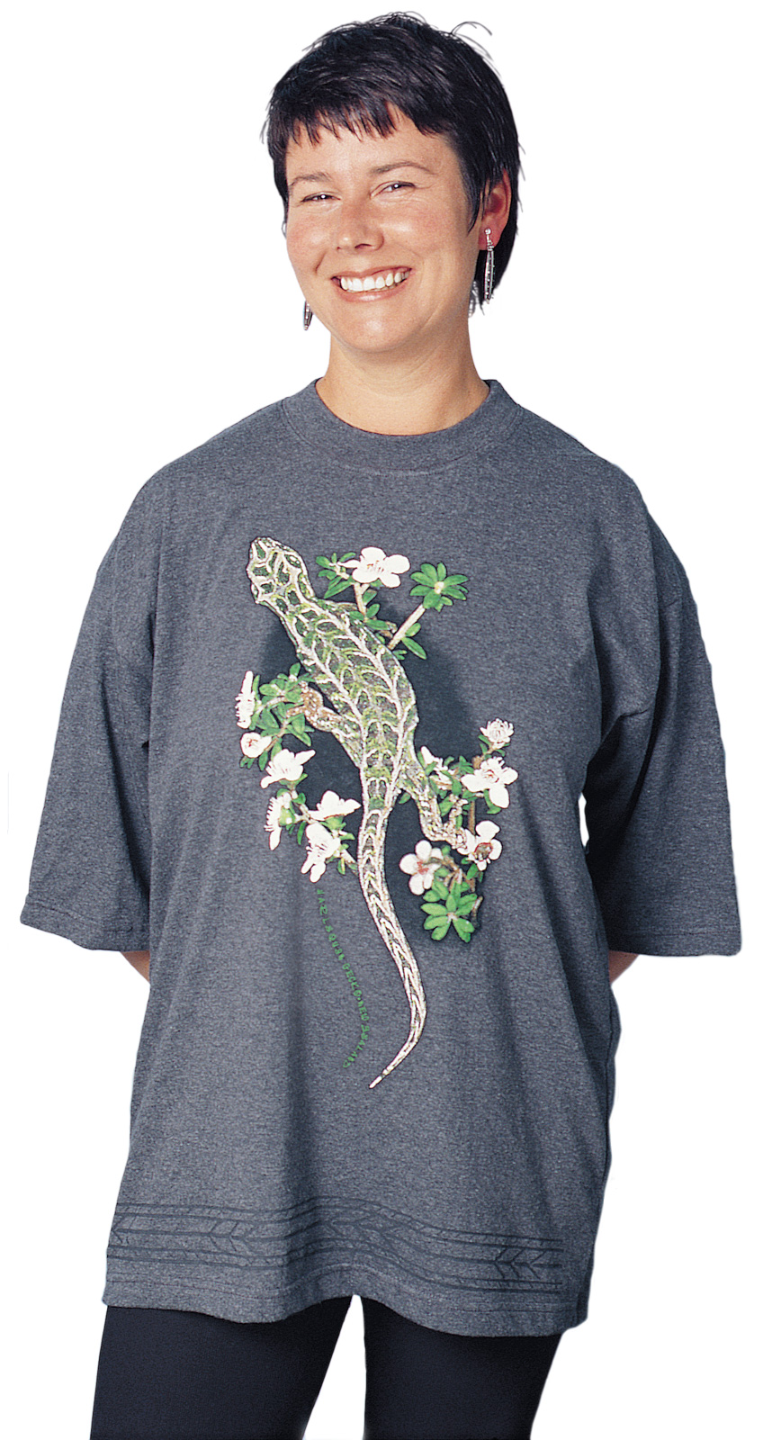
‘Jewelled Gecko – New Zealand’ eight colour T-shirt print on dark green fabric. Placement; Eight colour front print, one colour kowhaiwhai print front and back around hem.

‘Jewelled Gecko – New Zealand’ eight colour T-shirt print on dark green fabric. Placement; Eight colour front print, oone colour kowhaiwhai print front and back around hem.

Surface Active | Making waves in a sea of sameness

‘Kea – New Zealand’ T-shirt, eight colour print on white fabric. Placement; eight colour front.

‘Harlequin Gecko – New Zealand’ eight colour T-shirt print on charcoal marle fabric. Placement; Eight colour front print, one colour woodcut print front and back around hem.

‘Harlequin Gecko – New Zealand’ eight colour T-shirt print on light-brown marle fabric. Placement; Eight colour front print, one colour woodcut print front and back around hem.

‘Harlequin Gecko – New Zealand’ eight colour T-shirt print on charcoal marle fabric. Placement; Eight colour front print, one colour woodcut print front and back around hem.

‘Hoiho – New Zealand’ T-shirt, eight colour print on deep violet fabric. Placement; eight colour front, one colour woodcut around hem front and back.

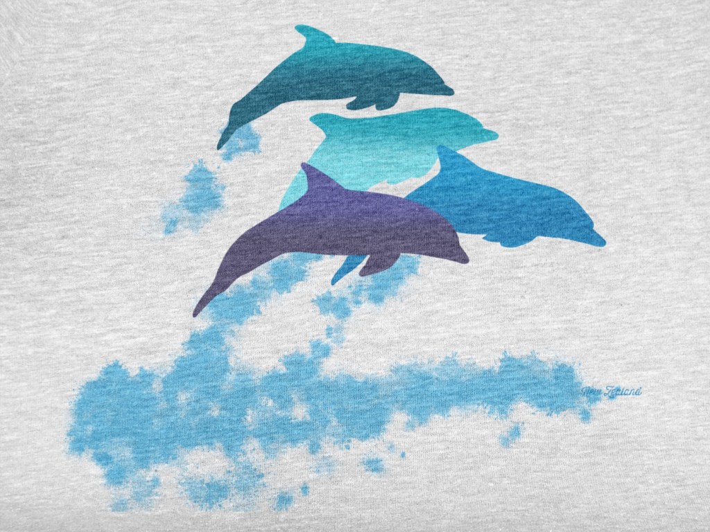
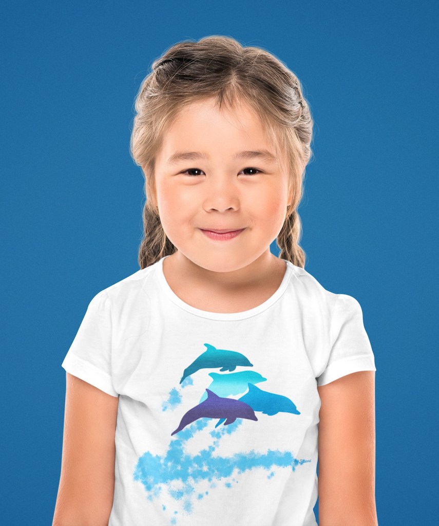
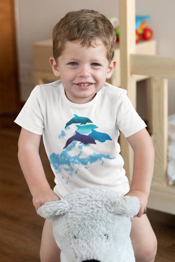
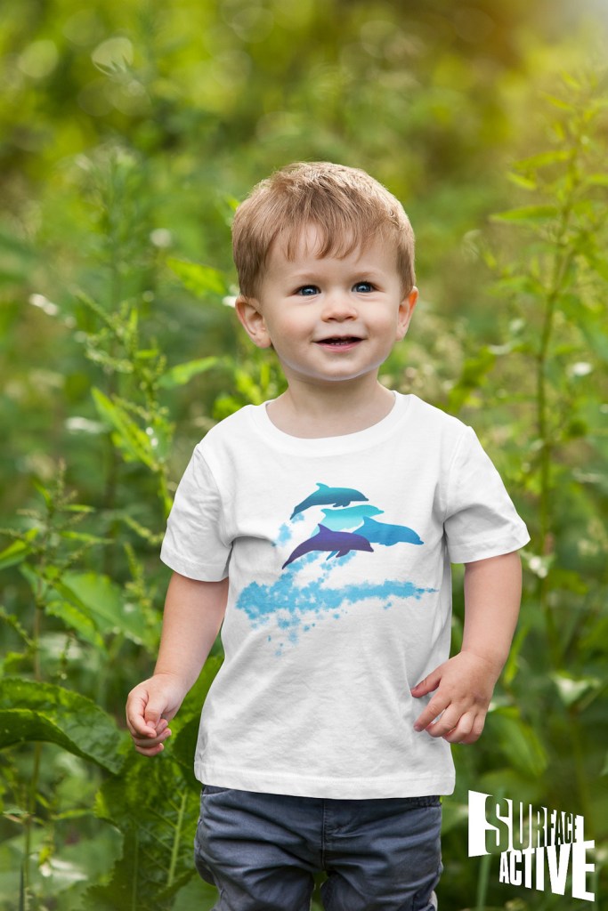
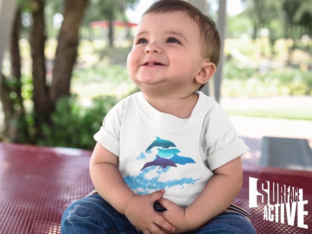
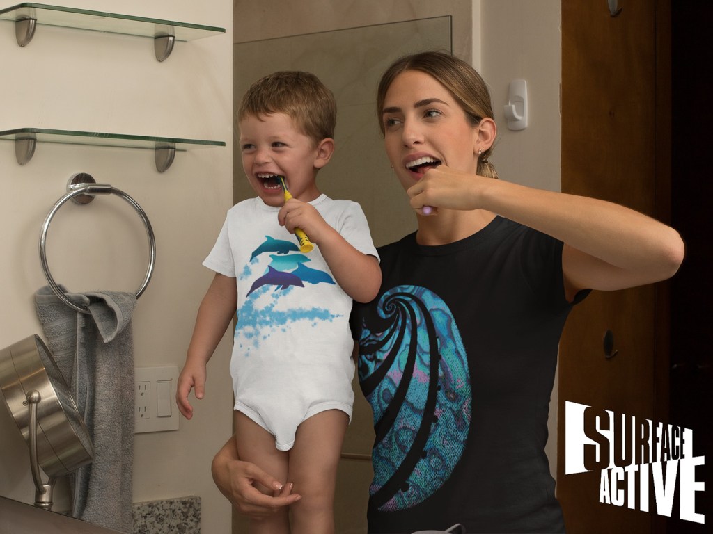
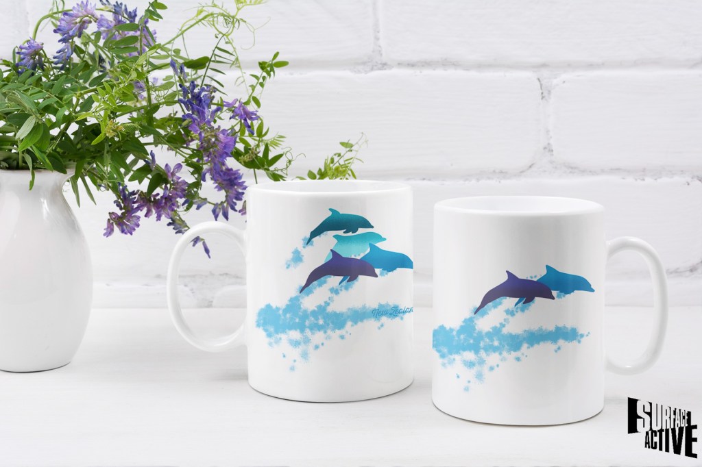
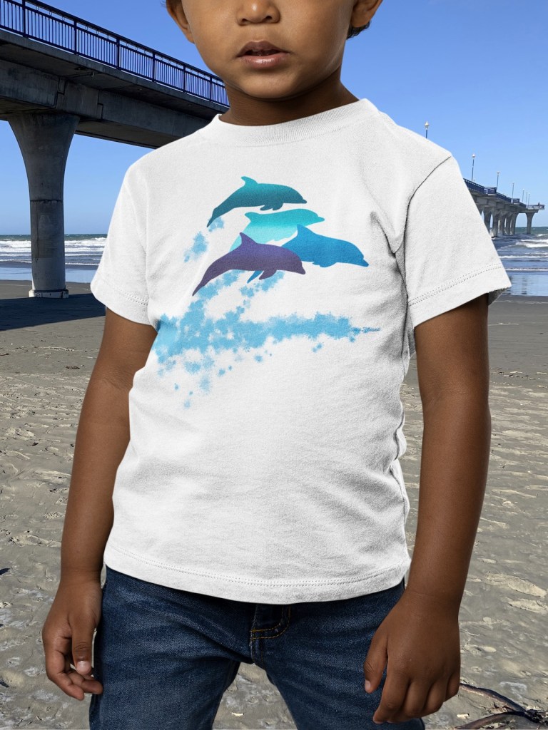
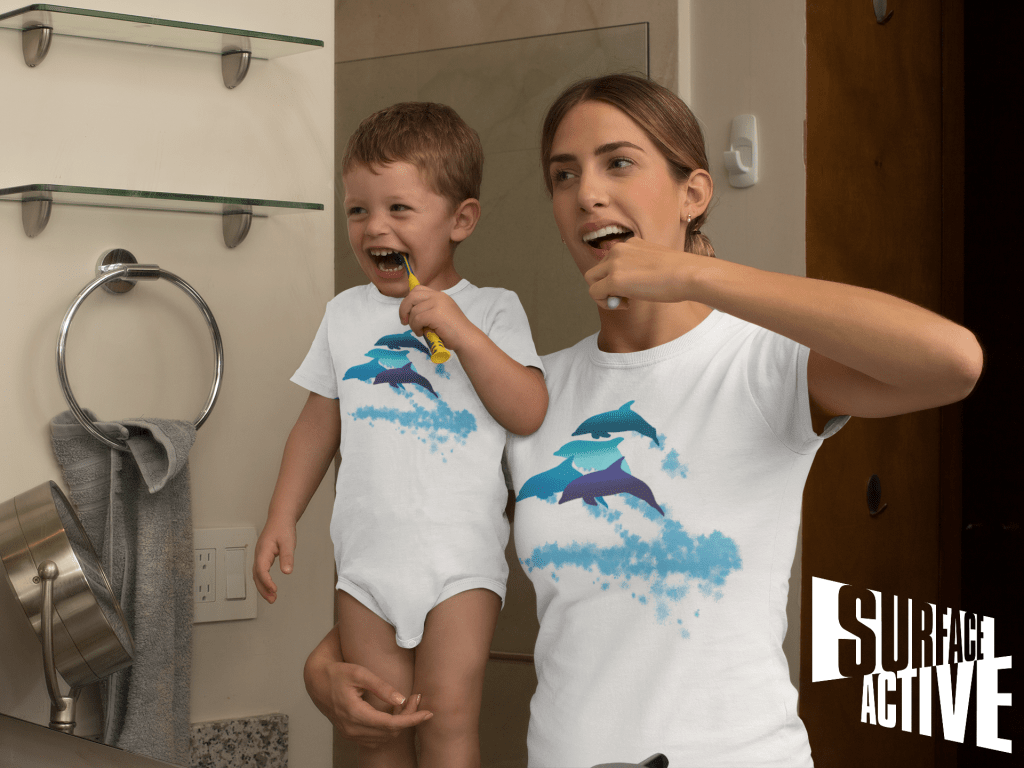
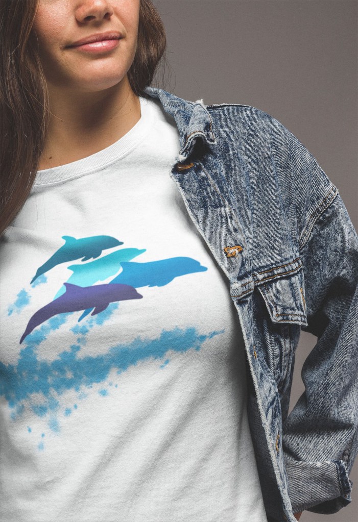
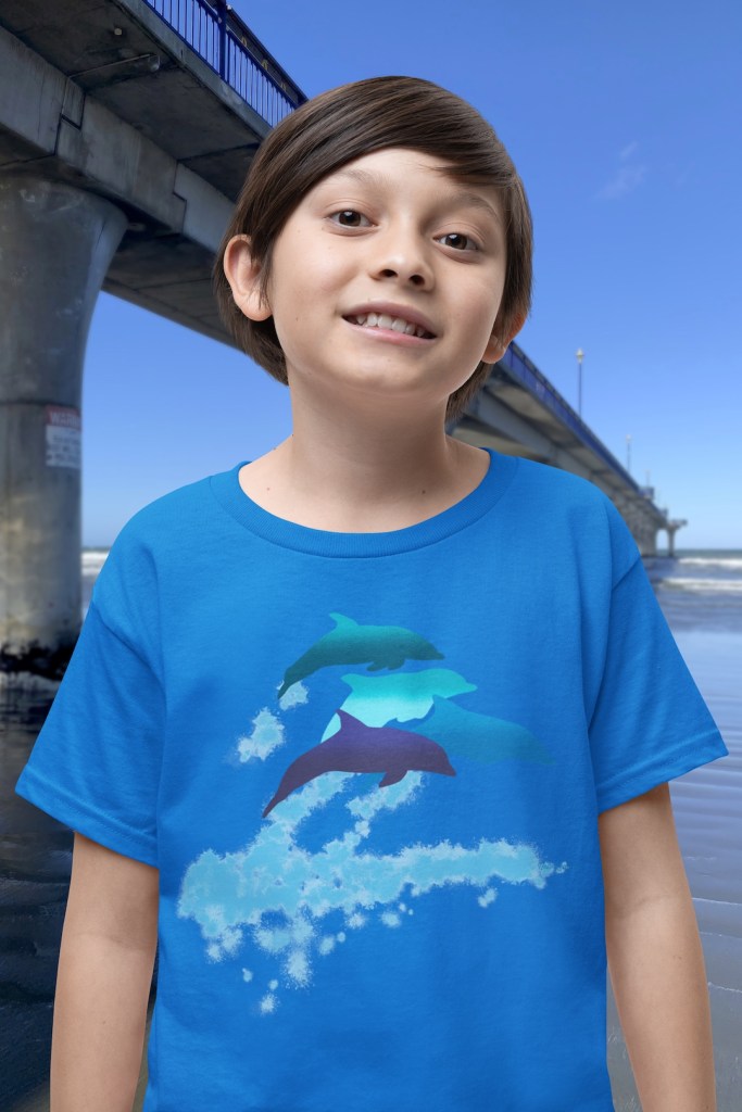
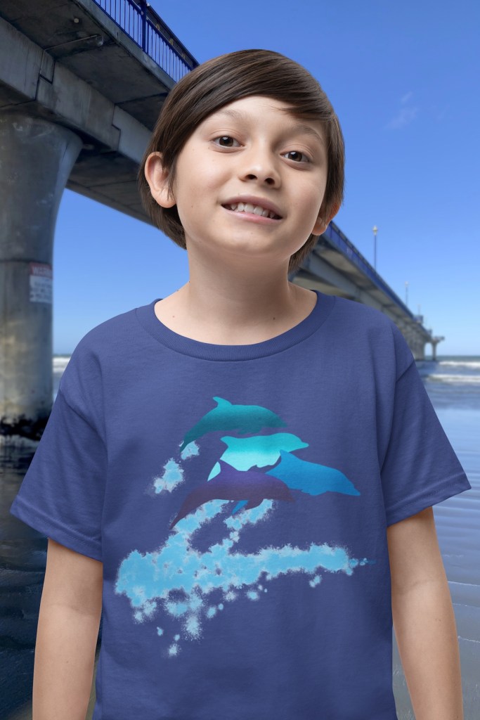
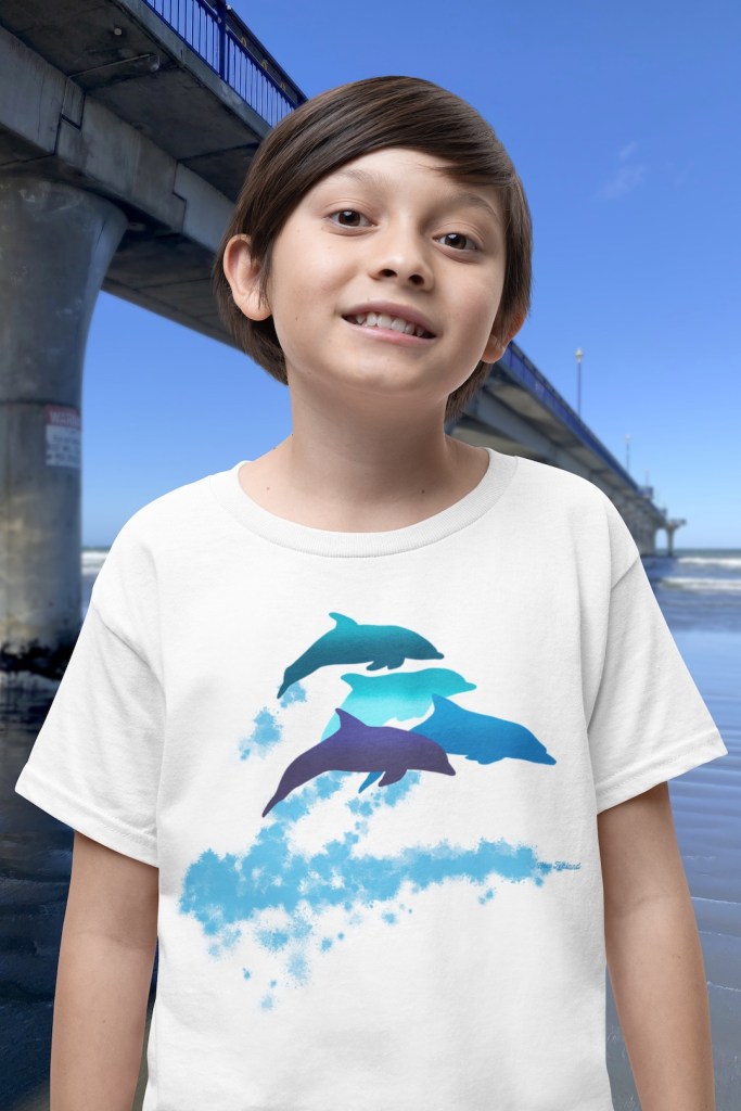
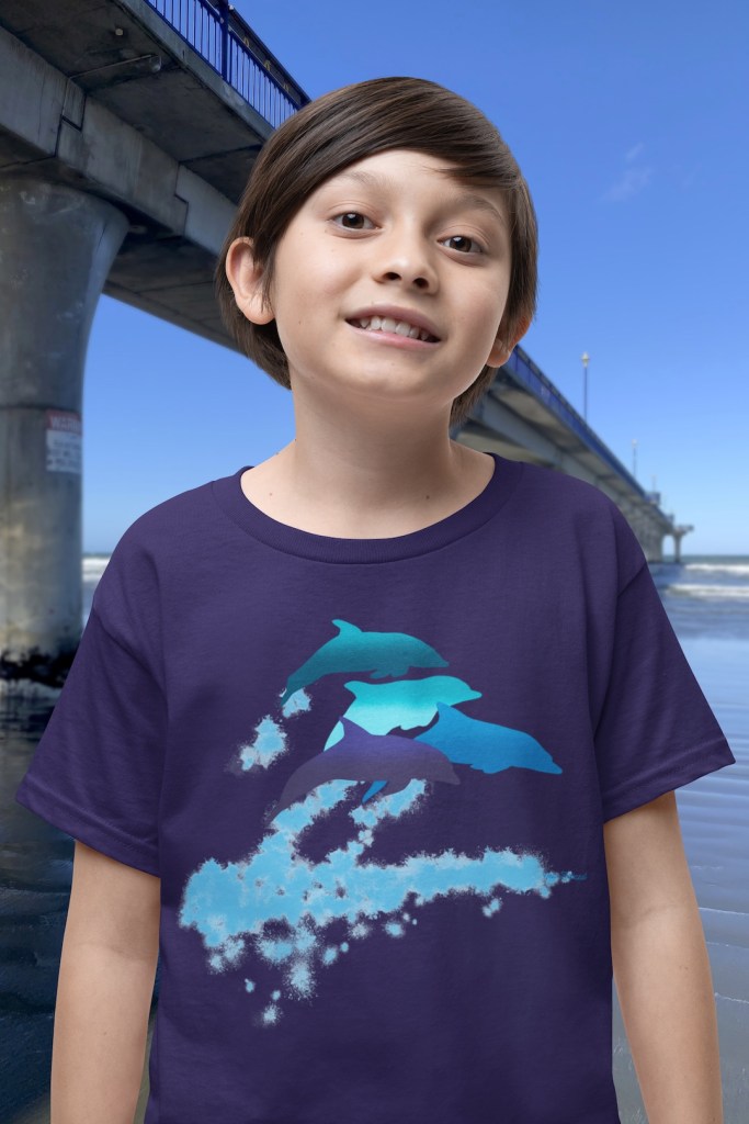
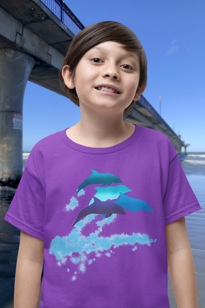
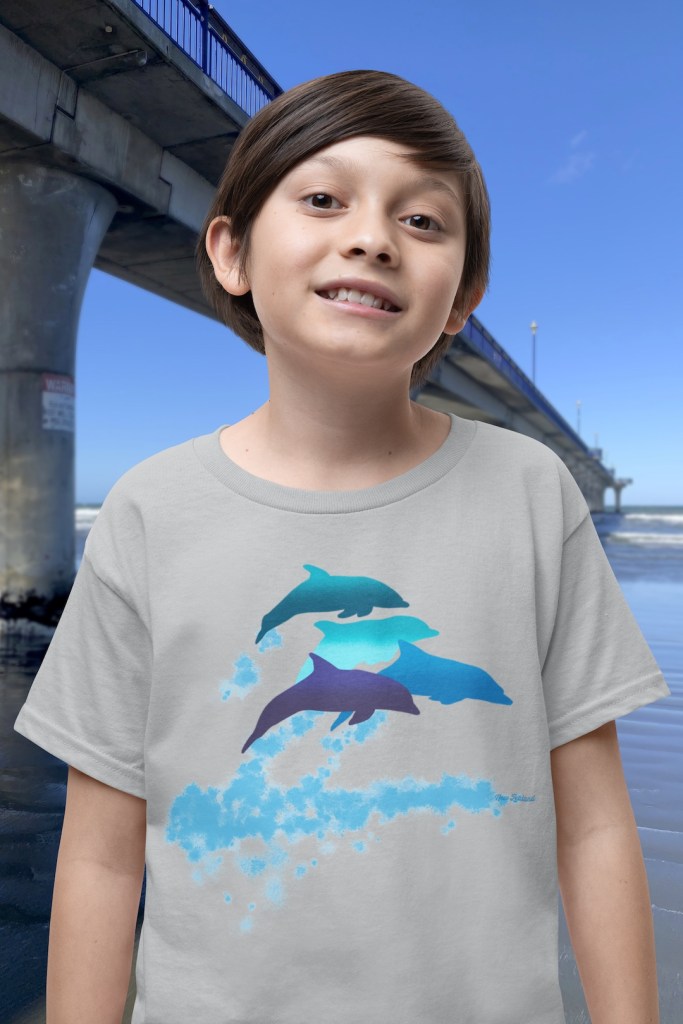
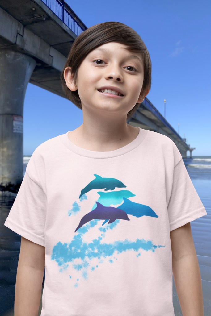
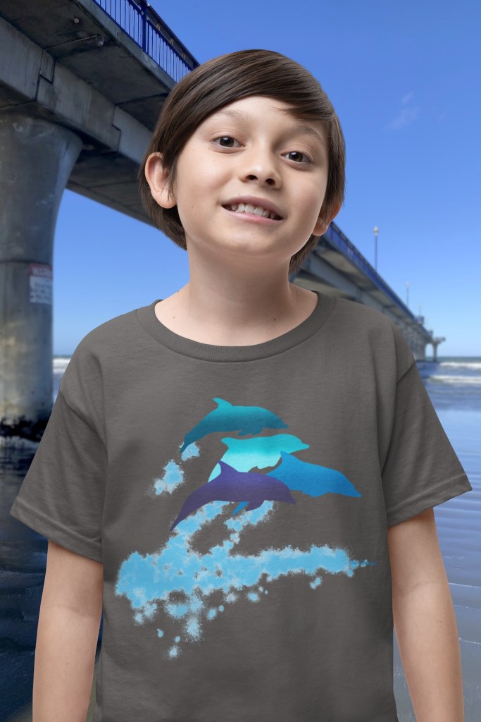
‘Common dolphin – New Zealand’ T-shirt, eight colour print on white fabric. Placement; eight colour front, one colour kowhaiwhai around the hem front and back.

Surface Active wildlife collage design, step and repeat one colour fabric print on custom bedding set.

Surface Active wildlife collage design fabric print as wallpaper.
Surface Active art-to-wear
Promotional teeshirts take this walking billboard concept one step further by being clothing that promotes products, services, cultural and ideological views in such a way that the wearer is willing to be identified—whether through a sense of aesthetics, humour, social responsibility, or irreverence, or loyalty to a watering hole, cultural institution, environmental organisation or charity. People are willing to wear someone else’s message because they feel it says something about themselves—which is the essence of fashion.
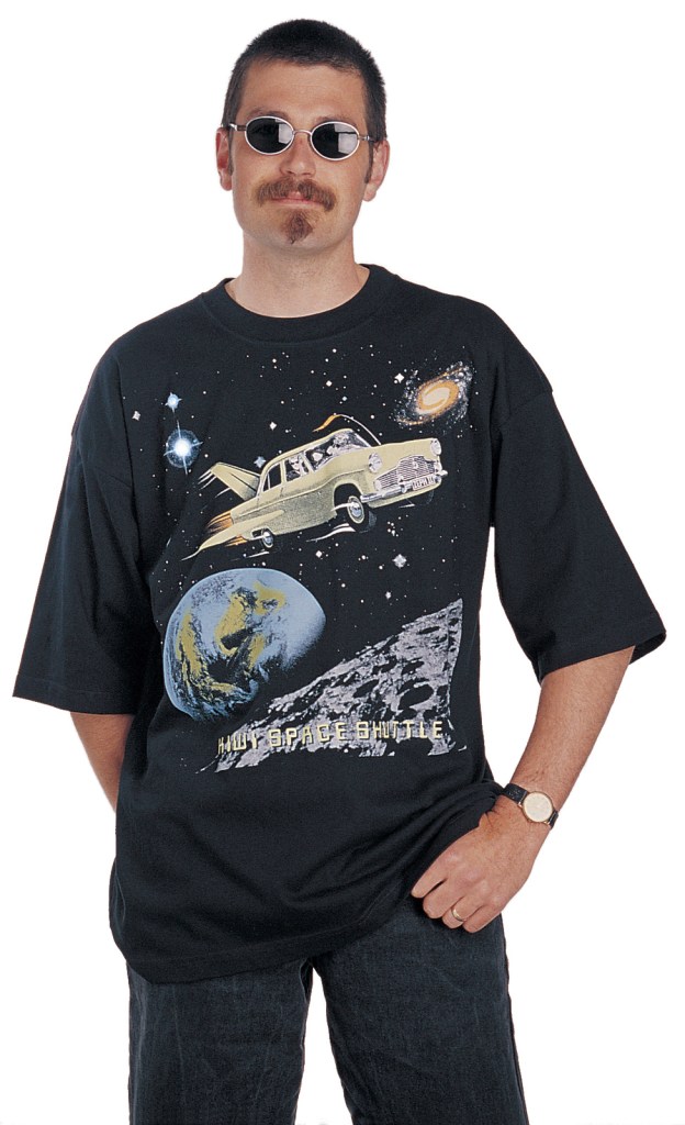
‘Kiwi Space Shuttle’ T-shirt, six colour print on grey marle fabric. Placement; six colour front, one colour woodcut around hem front and back.
Initially our Surface Active art-to-wear T-shirts were designed to be retailed by us at our stall at the Christchurch Arts Centre Market, by direct mail to the list of supporters we collected, and at Great New Zealand Craftshow events nationwide. We grew to be wholesalers to environmental organisations such as Greenpeace and the Maruia Society, for inclusion particularly in their annual pre-Xmas direct mail catalogue campaigns and sold in their retail stores.
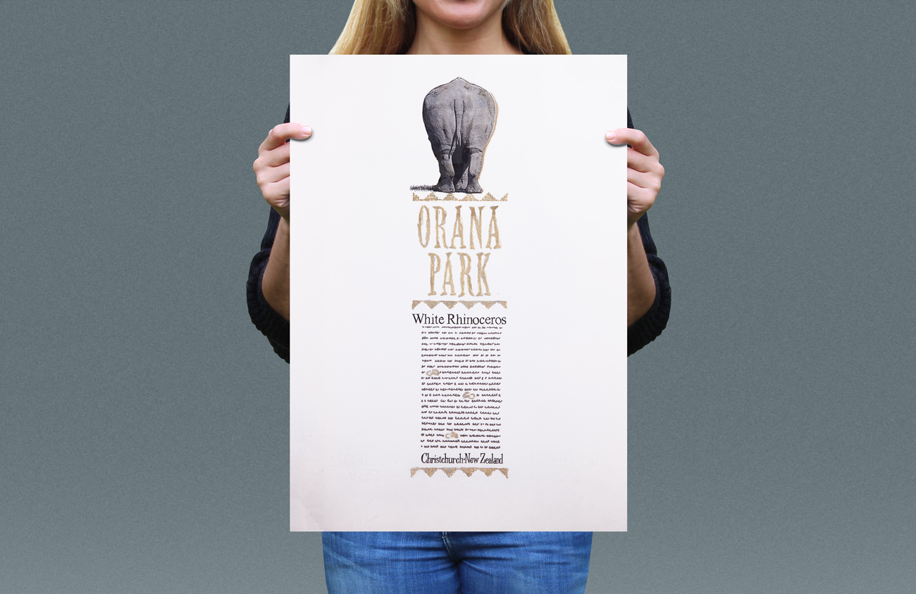
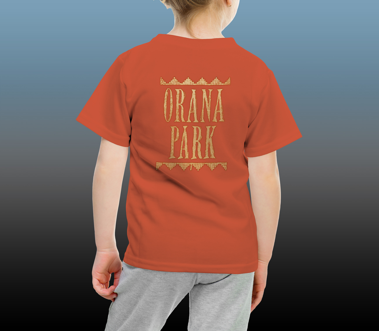
As design pARTners in the visual arts Chrissie Terpstra and I applied our teeshirt design skills to everything from promoting small businesses and one-time events, to our Surface Active wildlife art, Kiwiana and nuclear free collections. We wholesaled our handscreenprinted T-shirts to the likes of Wild Places and The Epicentre, Christchurch’s two ecostores, and to Greenpeace and the Maruia Society. Our market developed to include DoC visitor centres and similar conservation themed retail outlets in National Parks and the prestigious Te Papa store in Wellington. As our business and reputation grew we were commissioned by tourist attractions like the International Antarctic Centre, Orana Park and certain Doc conservancies to design and produce custom ranges of adult and children’s shirts.
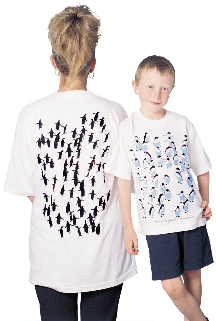
‘Adelie Penguins, Antarctica’ adult’s and children’s two colour T-shirt print on white fabric. Placement; Complementary graphics, two colours front and back.
This delightful collection is from our SurfaceActive Art-to-Wear range 1996–2000.
 In terms of our T-shirt design itself, it evolved from straightforward application of a symbol or logo, screenprinted on the kitchen table in our flat in 1986, sometimes hand painted to finish, to approaches that treat the shirt as a canvas, involving printing the garments as piecework prior to being stitched up by local seamstresses. Whereas our early designs simply applied graphics to the front of the shirt, our designs developed into appearing on the front and back, wrap around, and encircling the hems and sleeves. Treating the T-shirt we were printing on as the design of a piece of clothing in the round. We also developed from printing initially printing white and light coloured shirts to having our locally made pure cotton garments custom dyed in vivid dark hues in small batches prior to their speciality “dark shirt” printing.
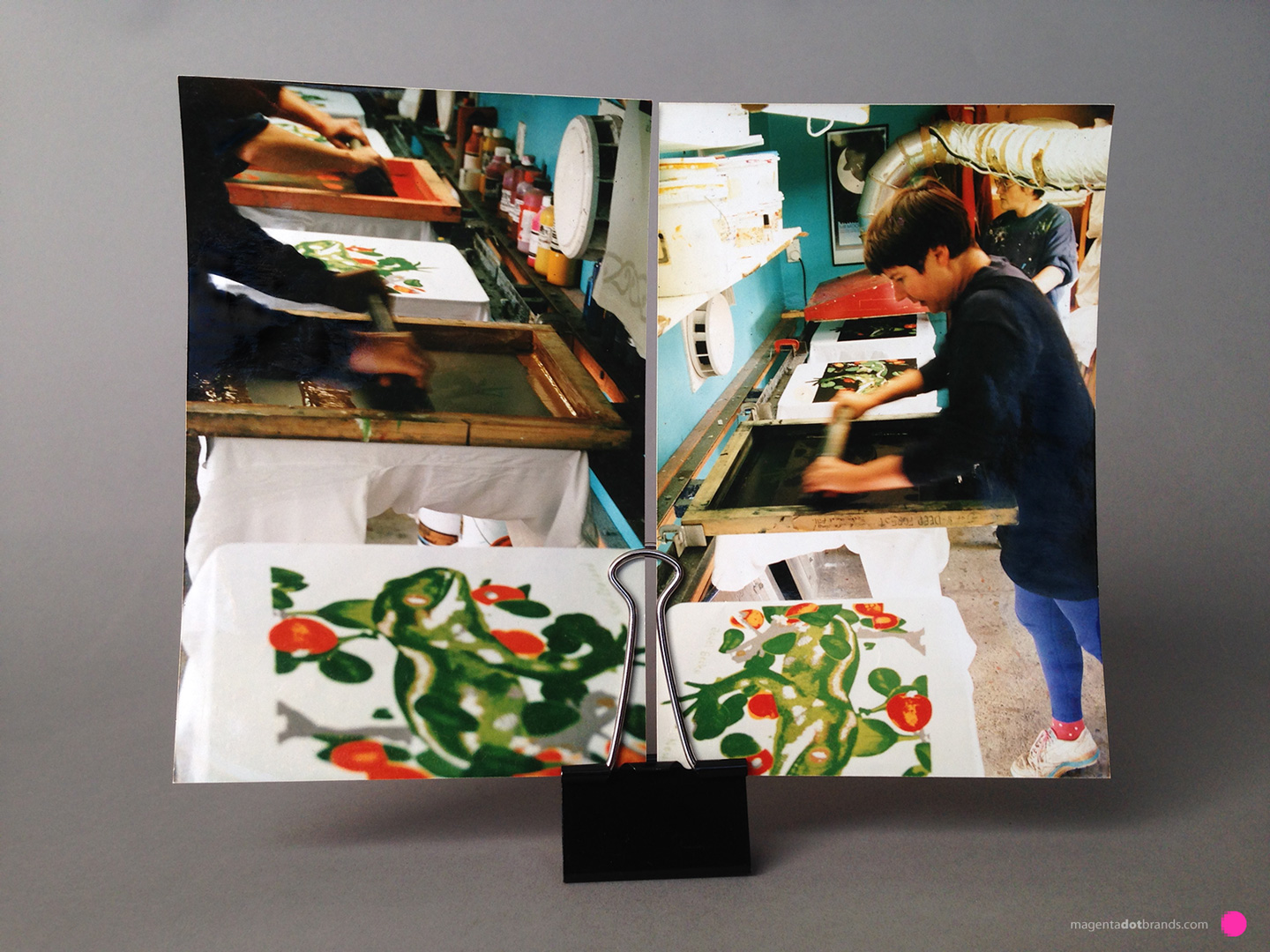
The mechanics of hand-screen printing fabric
When you are printing on cotton fabric with seams you cannot get the kind of fine detail you can printing on paper. The fabric absorbs the inks or dyes and the colour spreads through the fibres—the fabric equivalent of dot gain.
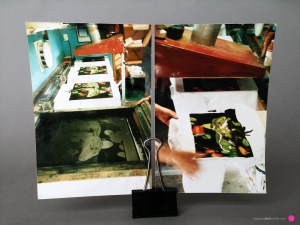
Surface Active print shop, Jewelled gecko hand pulled eight colour Teeshirt printing in progress.
With our layered or hand-separated multicolour designs the colour is laid down in areas with the hand-pulled silk-screening process, with “flash-curing” of the print between colour passes, in some cases up to 10 passes to print one garment, front, back, hem and sleeves, one colour at a time.
Fabric colour and the issue of “hand” or feel of the fabric printing inks
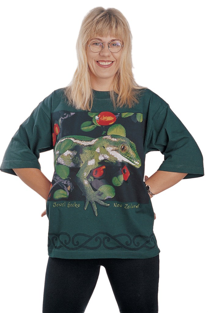
‘Jewel Gecko – New Zealand’ eight colour T-shirt print on dark green fabric. Placement; Eight colour front print, one colour kowhaiwhai print front and back around hem.
The other reason other than avoiding toxic (and highly hazardous) solvents that are used for printing “Plastisol” inks, and for selecting water based inks and dyes as the better option is that of the “hand” or feel of the ink. Water-based inks have a nicer feel to them but they are more difficult to work with as they easily cure, “dry in” or clog the stencil especially in peak demand hot summer weather, rendering it useless and in need of remaking. Waterbased dyes have no “hand” to them as such as the screenprint literally dyes the light coloured fabric.
Custom designed and built in-line printing workshop
We developed a custom in-line sequential printing methodology, rather than rotary print methodology in our back-shed “sheltered workshop” to successfully overcome the drying-in drawback of waterbased printing dyes and Supercover inks. It was achieved by way of additional manual labour and an innovative use of my own design of screen holding humidifier boxes for keeping the ink and screens moist between print runs.
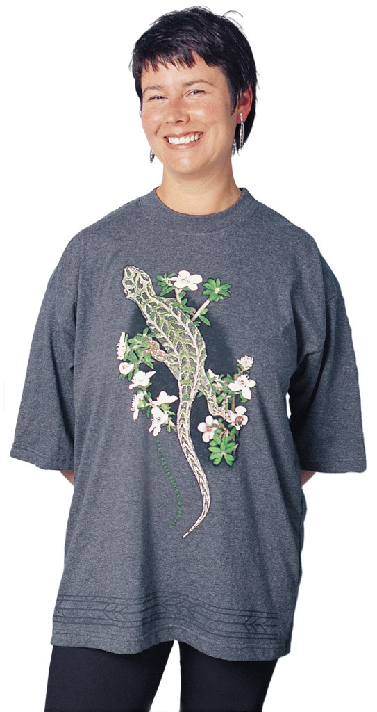
‘Harlequin Gecko – New Zealand’ eight colour T-shirt print on charcoal marle fabric. Placement; Eight colour front print, one colour woodcut print front and back around hem.
If you want to lay down a light colour on a dark shirt you have to use acrylic Super-cover inks, in some cases laying down two light coats to best build opacity while preserving detail. Flash curing in between is the only way ensure print quality is maintained throughout the print run
If your dark shirt design has a lot of solid light ink coverage you end up making something that has the feel of a bullet-proof vest when you’re wearing it. We avoided this by planning our designs to combine both ink and dye passes, colours darker than the fabric colour are dyes, lighter ones are super-opaque acrylics, all required flash curing between.
The other huge benefit with water-based inks, aside from wash-up with water, and their “thinners” being water, is that the finished garment once flashed off to the point of being touch dry is given a final cure in just 20 minutes in a domestic tumble dryer rather than a 6m long high-tech curing oven.
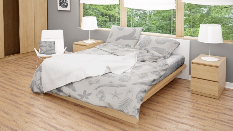
Surface Active wildlife collage design, step and repeat one colour fabric print on custom bedding set.
Optimising the illustration workflow for easy printing and graphic quality

‘Ocean – New Zealand’ one colour children’s T-shirt print on navy blue and jade green fabric. Placement; One colour front and back. ‘Puff’ printed emboss effect ink.
One of our specialities is one colour “puff printed” designs, the so called puff inks contract when cured and so draw up the fabric surface. This has a tremendous tactile and visual effect on single colour dark shirt prints such as the Tuatara and children’s Ocean and Forest floor designs.
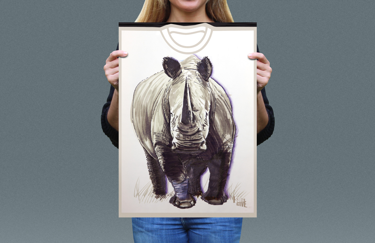
I developed a variation of drawing wildlife art for reproduction from classic zoology methods, using mixed media, charcoal pencil with pen and ink on coquille board to achieve a crisp “line and tone” effect from one colour “line” images.
Garment prices scaled with print cost
With hand-pulled screen printing the cost of printing a batch of shirts scales with the number being produced up to a certain point, set-up and clean-up time being equal regardless of quantity. The number of graphic “placements” (a graphic on the front is one placement, front and back, two placements, etc.), and the number of colours, type of ink used,. per graphic also determines the printing cost.
Regarding the gallery and our T-shirt models
As with other some portfolios on the site Archive the over 40 designs included here are collected from the period between 1988–2002 of our Surface Active printed garment editions. I have made no effort to force the shirts into defined categories; rather, I present them in a manner intended to inspire and entertain—an approach appropriate to the spirit of fun that T-shirts represent.
‘Weta – New Zealand’ T-shirt, adults and kids, on oatmeal and grey marle fabric. Adult garment a six colour print. Placement; piecework, front, back and sleeve.
In that light-hearted vein a shout-out must go to our T-shirt models from back-in-the-day, the kids are all 20-or-30-something now at time of writing. Our compliments and lasting gratitude are also due to their T-shirt modelling parents, our friends. SurfaceActive employed most of them as our highly-trusted sales crew selling from our stall at the weekend Christchurch Arts Centre Market, come rain or shine, year-round 1988–2002.
Credits
Design and Art Direction: Design pARTners, Chrissie Terpstra and Shaun Waugh
Illustrator: Shaun Waugh
Hand-pulled screen printing: Surface Active: Chrissie Terpstra and crew