
Design is about communication, the more compelling the design, the deeper the response
![]() More compelling design doesn’t mean prettier, or more arty. By more compelling I mean richer, more complete, better because it is more efficient, better because it is attractive in useful ways. The design of Vinevax’s new brand collateral isn’t merely about their product looking better on the shelf, but actually functioning better as an advertisement for itself in a competitive retail environment. The design has to do with the work of increasing sales by making Vinevax’s packaging beautiful and clear.
More compelling design doesn’t mean prettier, or more arty. By more compelling I mean richer, more complete, better because it is more efficient, better because it is attractive in useful ways. The design of Vinevax’s new brand collateral isn’t merely about their product looking better on the shelf, but actually functioning better as an advertisement for itself in a competitive retail environment. The design has to do with the work of increasing sales by making Vinevax’s packaging beautiful and clear.
It’s exciting.
Whether you are launching a new product or wanting a packaging upgrade for an established brand, the goal of packaging design is to attract customers’ attention, connect with them, be memorable, and persuade them to purchase your product over your competitors.
As a graphic designer and brand manager I strive to produce the best logos, conceptual print collateral pieces and websites that money can buy. In 2002 the Vinevax product naming, logo design and branding project was no exception. Agrimm was an established biotechnology company, formed by two scientists from Canterbury University in 1984. Agrimm Technologies’ laboratories and specialist production facilities based in Lincoln, near Christchurch have grown to be a world leader in the development and manufacture of effective, safe and environmentally friendly biological or ‘living barrier’ plant protection products focussing on the Trichoderma family of beneficial fungi.
 Around 2002 the results from independent field testing from a PhD study being conducted at Adelaide University proved that a formulation of their ‘Trichoseal’ wettable powder product for vines was a protective and a cost effective treatment against dieback disease. At this point Agrimm engaged the services of the tattoo studio who developed the exciting new product brand and positioning statement ‘Vinevax’, ‘Living barrier wound dressing for vines’. This marketing effort superseded the legacy product that had been sold, but effectively not marketed, under their Trichoprotection® quality mark.
Draft logo design ideas covering diverse approaches are explored at the thumbnail visual concept stage. Being small in size and produced in a fluent brainstorm you do not get attached to any one idea because you have fussed over it for ages. Instead associative thinking kicks in and one idea leads to another in and the air becomes thick with ideas.
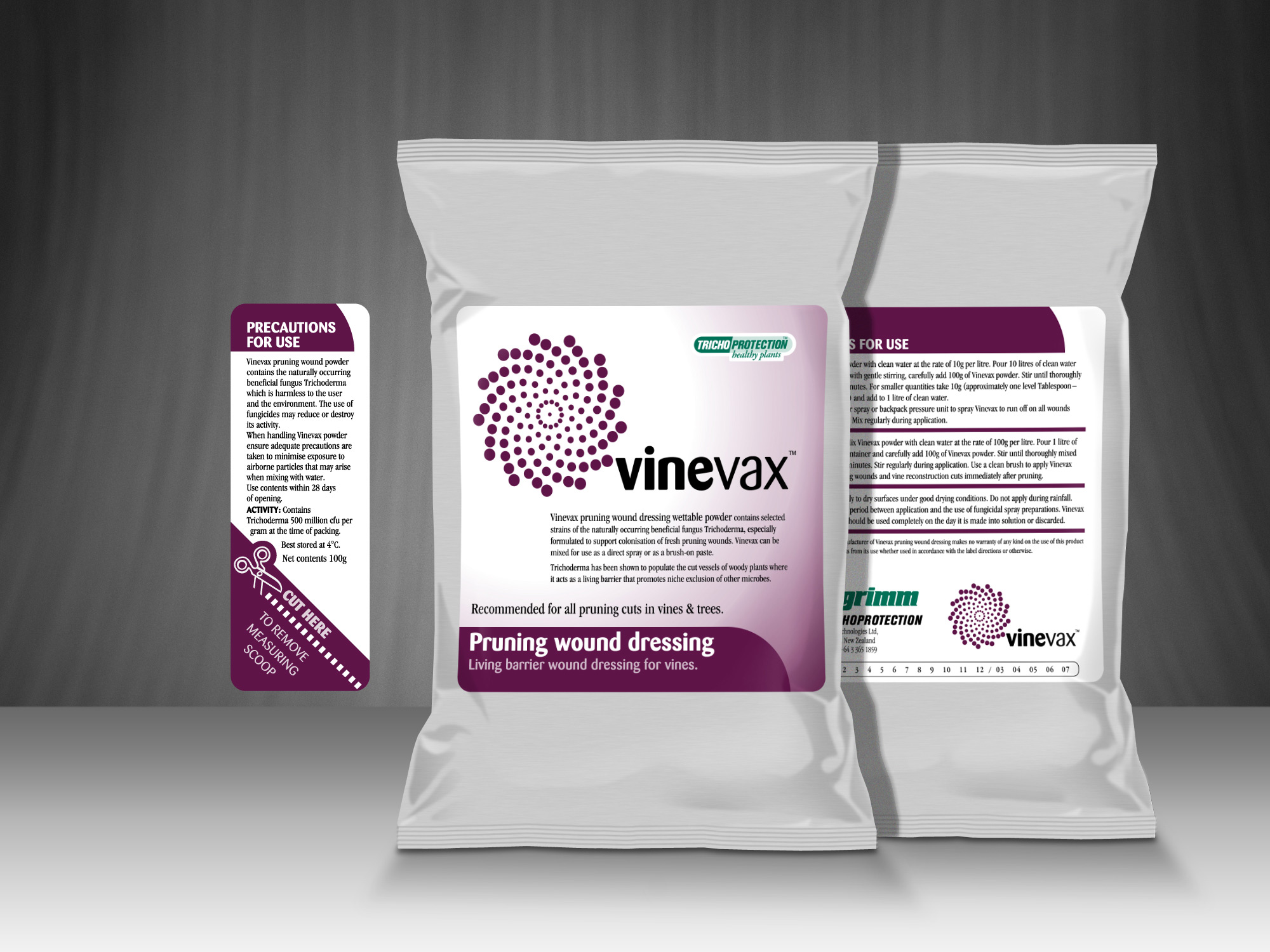
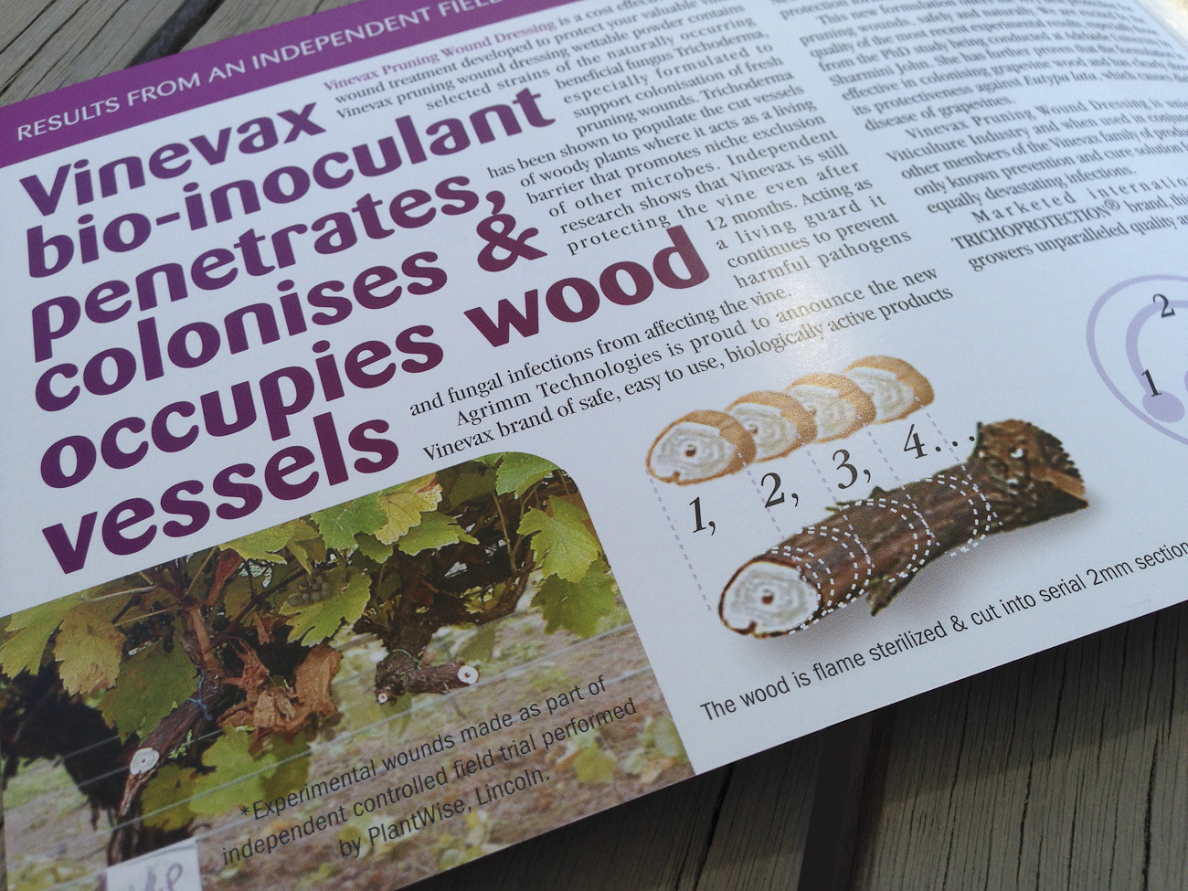
I redesigned their logo, system of product brochures, packaging system and trade advertising. The project encompassed the development of a system of new product names and logos, a system of product brochures, a packaging system and trade advertising. The art direction emphasis on careful editing, photo composites and custom infographics demonstrating their product performance turned out to be part of a mix that yielded tremendous sales success for the firm.
Part of the creative thinking behind the branding theme art direction was to fully engage the strengths of the product and interest of the horticultural market by maximising the integration of colour type, image, and message. This was brought together in the conceptual A5 print brochures printed on quality medium weight board finished with metallic foil stamping of the logo symbol and spot overglossing of images.
These days I am well aware you want your branding and marketing communications to work hard. As hard as, let’s say, this Vinevax brochure does. So to see more proof just have a look around or call Shaun on;
+64 21 067 6176.
Or email him hello@magentadotbrands.com


The brand design rationale
A blend of the outstanding clarity and distinction of the new product name, and research into the client’s market, their competitors and the biology of commensalism (by which trichoderma behaves as a living-barrier to plant pathogens), plus extensive visual research lead to several design solutions.
Our recommendation to the client, approved by them in the presentation, is inspired by one of the intricate yet simple mathematical designs that are found in nature. One that is related to a certain mathematical sequence know as the Fibonacci series—as seen in the opposing spiral forms of flowers, pinecones and pineapples. Inspired by these natural forms the bold, clean and modern new brand expresses at once a radiant shield-like energy, dynamic rotation and vigorous growth out from the centre.
Credits
Printer: Croft Print Limited
Design firm: tattoo
Account executive: tattoo
Copywriter: tattoo, including product naming
Creative director / designer / illustrator / print production: Surface Active graphic design
Font credits: Barmeno, Garamond Condensed
