advertising, identity, illustration, packaging, web design
Welcome to my design portfolio archive. It is very much a work in progress.
Selected archive projects
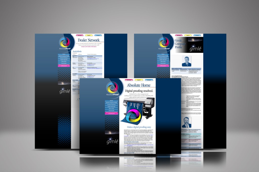
Absolute-Proof launch website 1998
Absolute Proof | Digital proofing resolved. Best-in-class colour-managed workflow hub and digital proofing software solution, launched in 1998, this was the first iteration of the web design timed for the product launch just prior to Drupa in Dusseldorf that year.
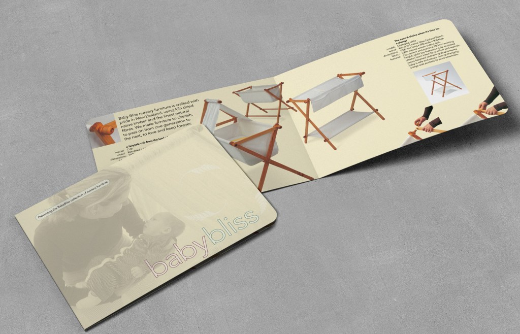
BabyBliss rebrand & brochure makeover
To design a brochure that sells, the key is simple: Keep all eyes on the product. Many people are not in the market for nursery furniture. The way to profits is to visualise those who are interested and present your nursery furniture to them.
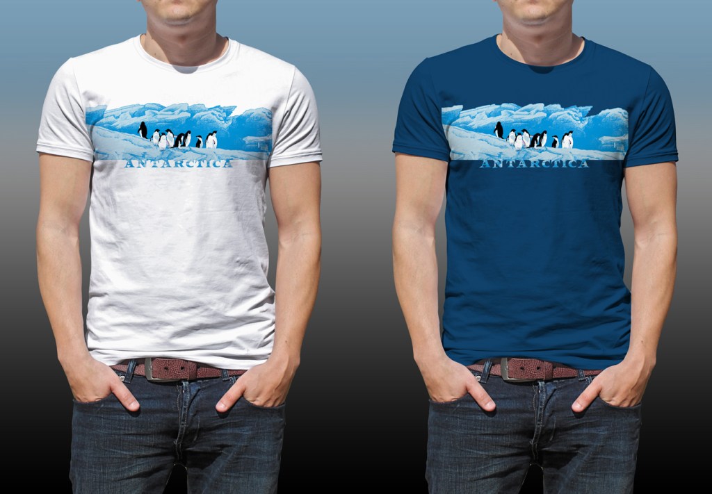
Cool T-shirts for Antarctica
Surface Active design pARTners’ good art achieves standout 1991 competition win.
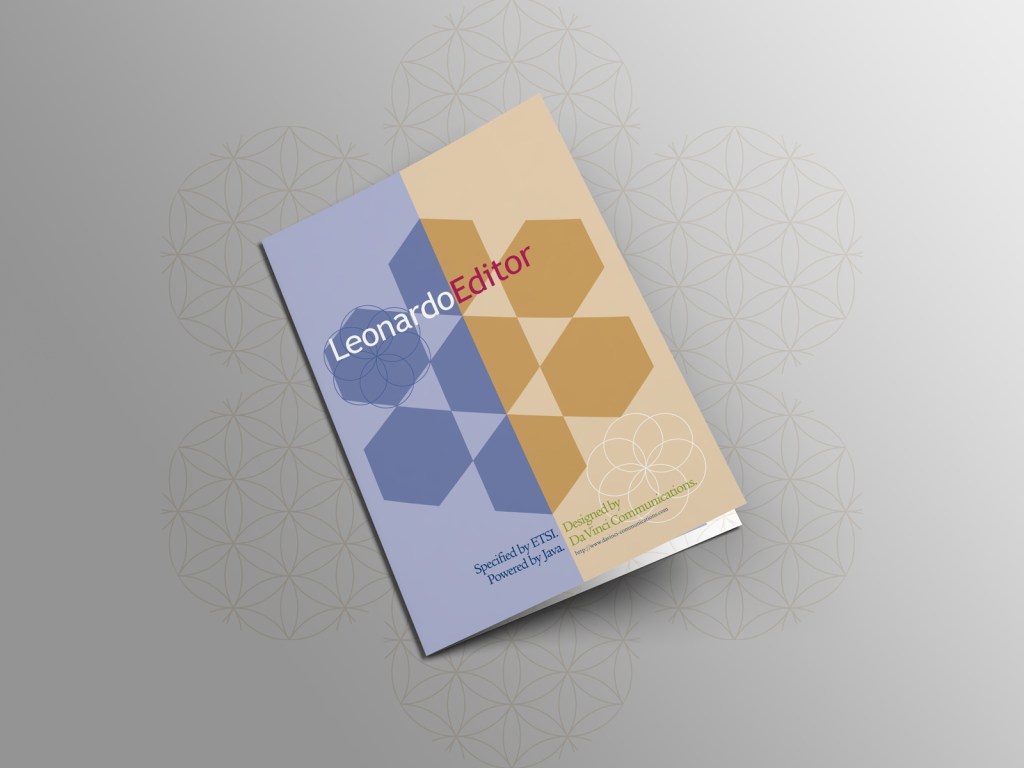
Da Vinci rebrand: software brochures
Pleasing design needs no apology, even in technical publications. Artistic expression can be placed on the same level as informational expressional.
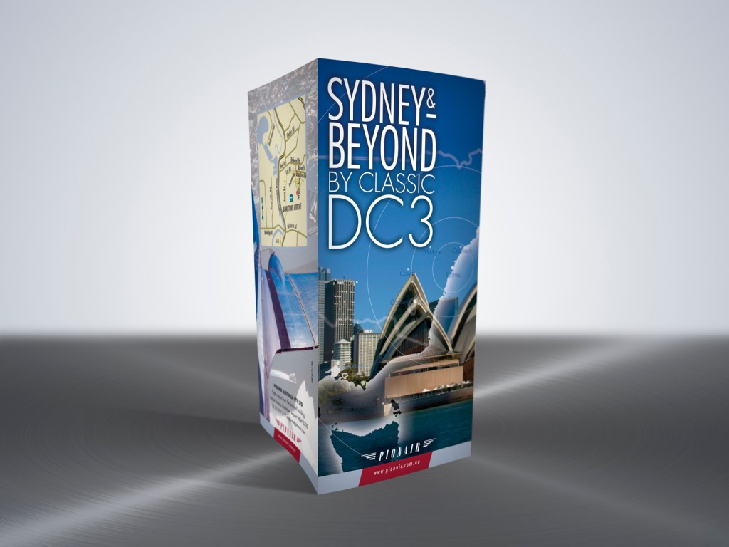
DC3 flightseeing brochure
Why is striving to make something look better worthy toil? There are benefits to clarity, ease of understanding for busy people justifies hours in production.
DC3 Golden Era advertising
Desktop publishing as in-house designer for Pionair was a path of discovery.
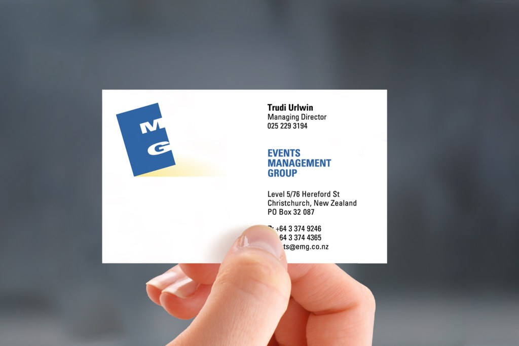
Events Management Group branding
EMG was a Christchurch event management firm established to support the performing arts and to project manage the creation and development of large and small scale events.
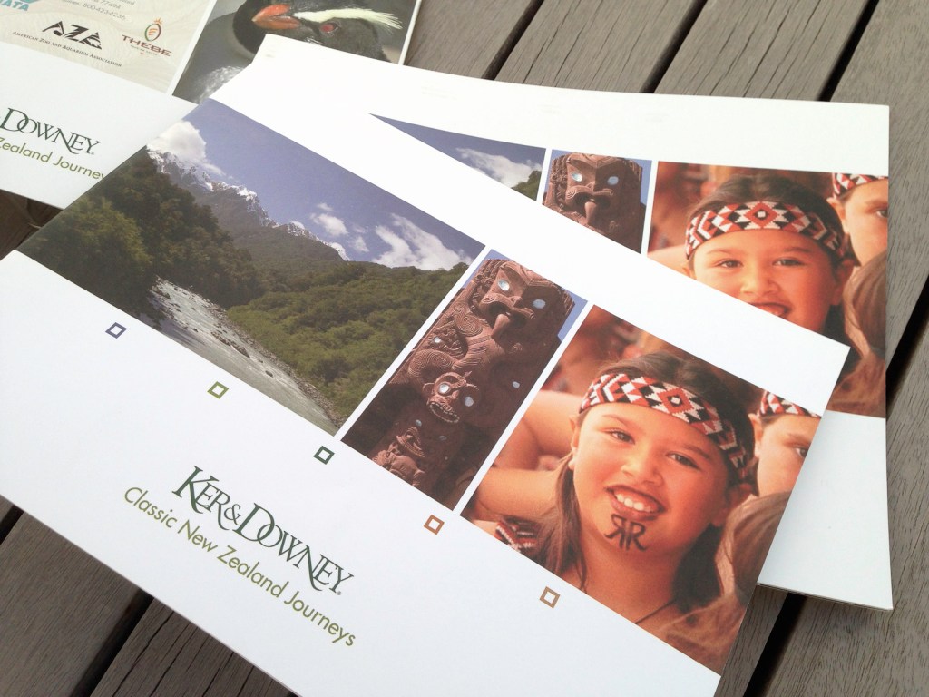
Ker & Downey affluent travel brochure
In 2005 Pionair embarked on a JV with US affluent travel firm Ker & Downey.

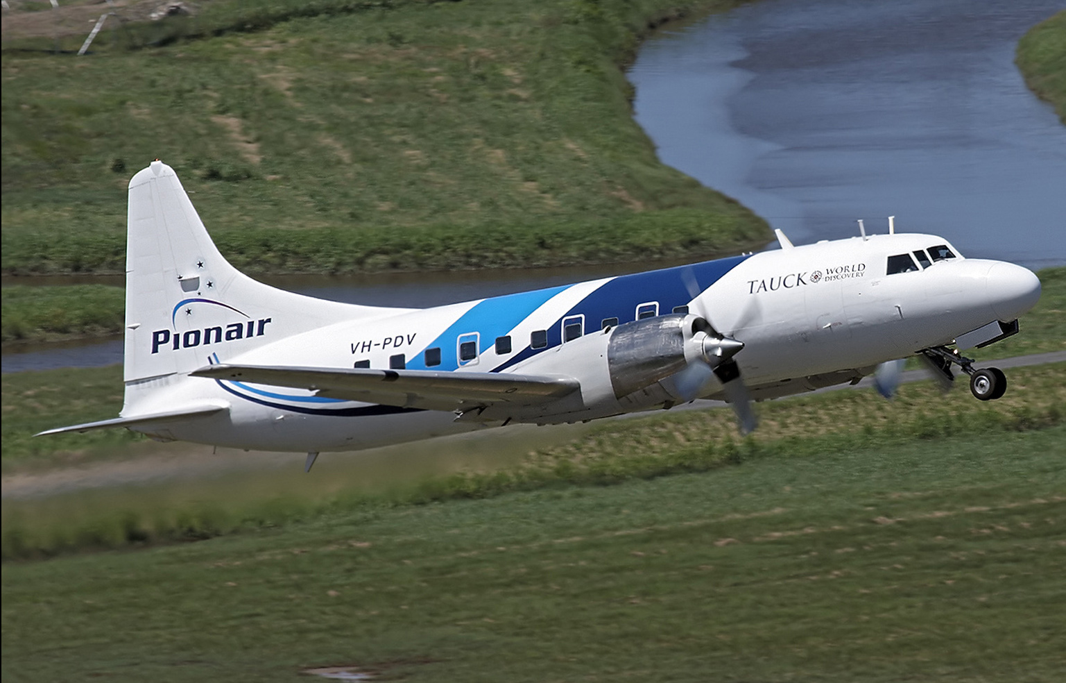
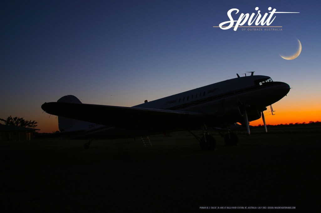
Logo in the sky: Pionair
Working for Pionair my strength at creating powerful brands that flow across all print and web media as well as hands-on skills with 3D objects and sign graphics was put to good use.
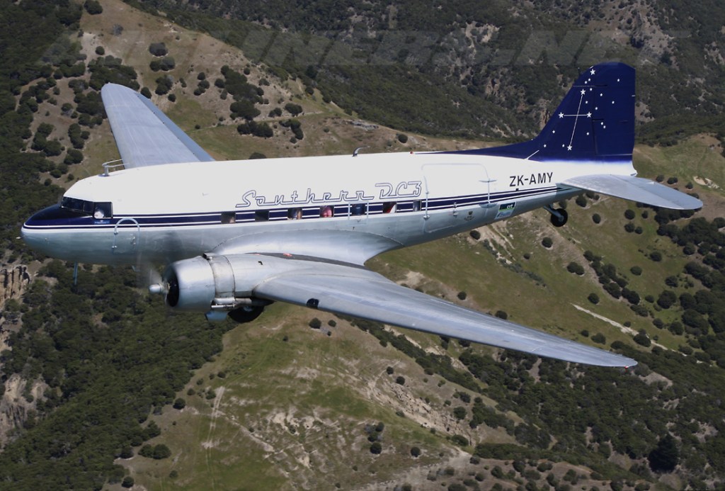
Logo in the sky: Southern DC3
This is how the Southern DC3’s streamlined moderne livery was applied to the reigning Hangar Queen of Wigram ZK-AMY
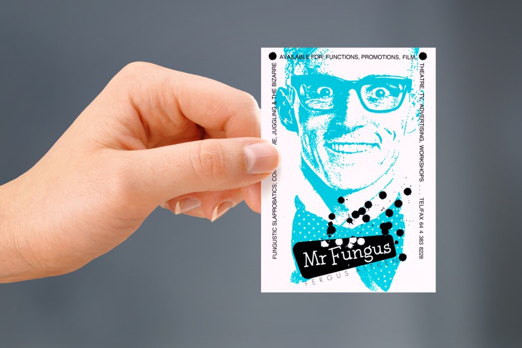
Mr Fungus logo & identity system
Good design must be purposeful. The project kicked off with brief for a logo, business card and poster. The solution was to design his two-sided card as two small posters to make a big impression at close range.
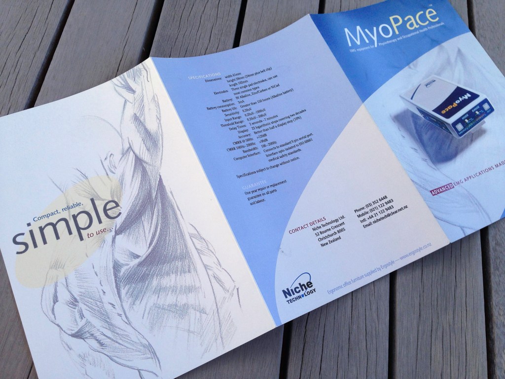
MyoPace EMG brochure
MyoPace: EMG equipment for Physio & Occupational Health Pros. The brief was for a Hi tech product brochure makeover.
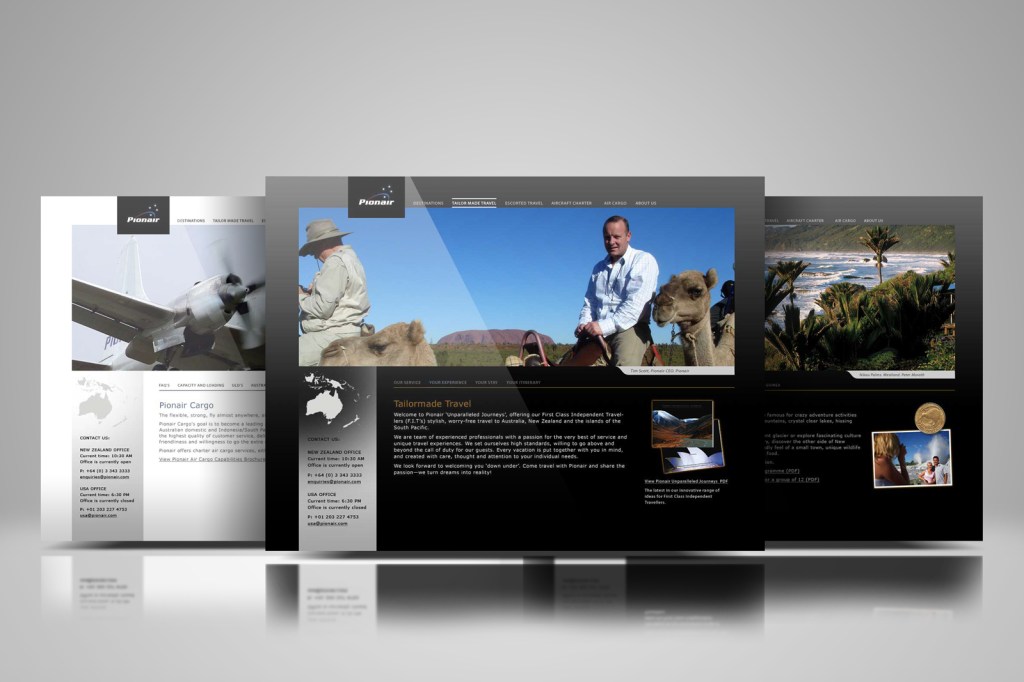
Pionair N.Z. & Australia websites
The Australian & New Zealand firms had two websites side-by-side, Pionair.com, and Pionair.com.au which I designed and maintained 2003–2009. In 2008 a new “affluent trave/air cargo/air charter” themed redesign for both websites was briefed.
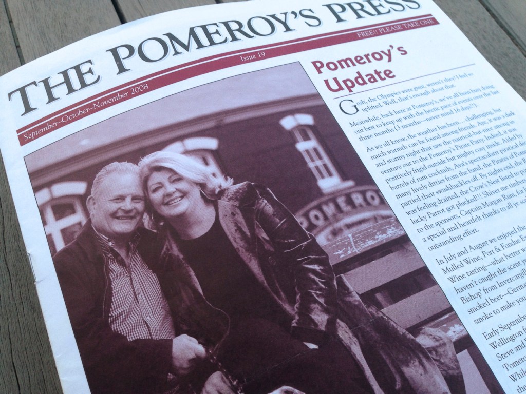
Pomeroy’s pub newsletter
THE QUARTERLY POMEROY’S Old Brewery Inn and restaurant newsletter had a name inspired by their brand, “The Pomeroy’s Press”, it was designed and laid out with a look that made the news.
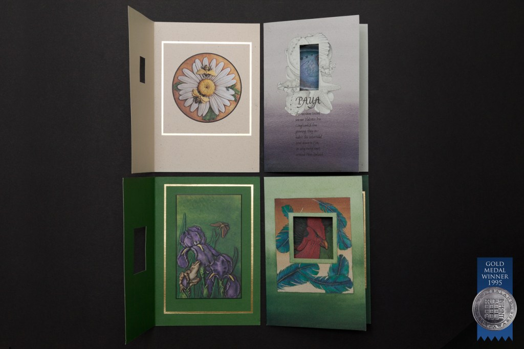
Pride in print gold 1995
The set of brand new Craig Fletcher Art fully sculpturally embossed and match printed greeting cards were awarded New Zealand’s best of the best print award.
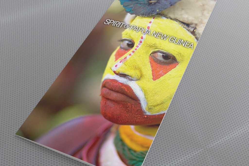
Spirit of Papua New Guinea brochure
One of three “Hidden Gems” brochures forming a 2009 direct mail campaign to Pionair’s past traveller database and affluent travel agents in the U.S.
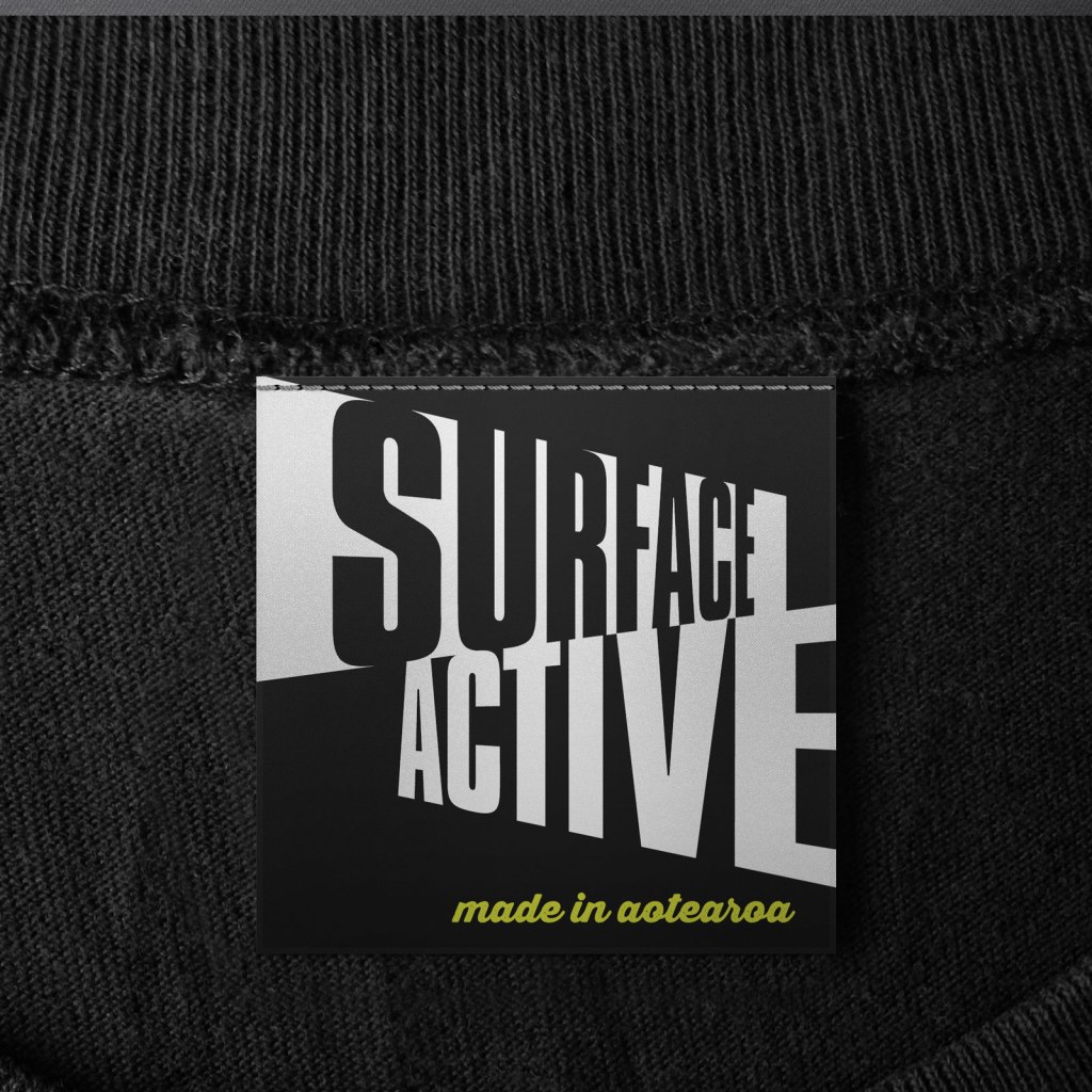
Surface Active: Making waves in a sea of sameness
Wildlife art teeshirts take the walking billboard concept one step further when people feel the shirt says something about themselves—which is the essence of fashion.
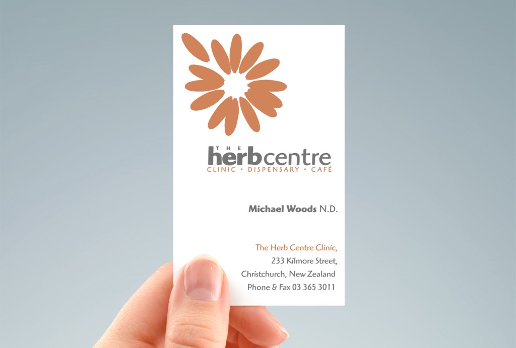
The Herb Centre logo: the dance of art & type
One is hand drawn and the other is bought, I got them separately, but art and type are two sides of the same coin—there is magic in making them work together!
