![]() Established in 1994, The Herb Centre brings together a clinic of qualified health practitioners, who provide a range of alternative medicine modalities, a herbal dispensary and shop and The Herb Centre Café all under one roof.
Established in 1994, The Herb Centre brings together a clinic of qualified health practitioners, who provide a range of alternative medicine modalities, a herbal dispensary and shop and The Herb Centre Café all under one roof.
The business came under new ownership in 2000 at which time I was briefed to develop a new brand and identity system. This included collateral such as stationery, packaging and building signage. The building signage depicted in this portfolio is the redesign and upgrade carried out by the Carl Pavletich in 2008 in a joint venture collaboration with the client. The new colour story and other innovations retain several of the core original elements of the 2000 rebrand signage.
The dance of art and type…
One is hand drawn and the other is bought, I got them separately, but art and type are two sides of the same coin—there is magic in making them work together!
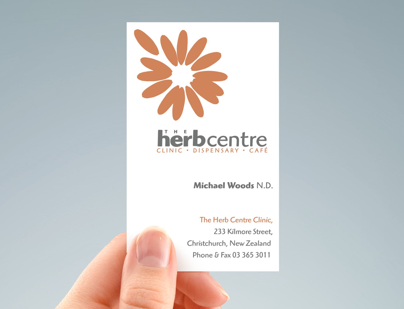
Side by side, a big graphic with small words creates a successful business look of authority by making the graphical symbol stand out and understating the typeset business.
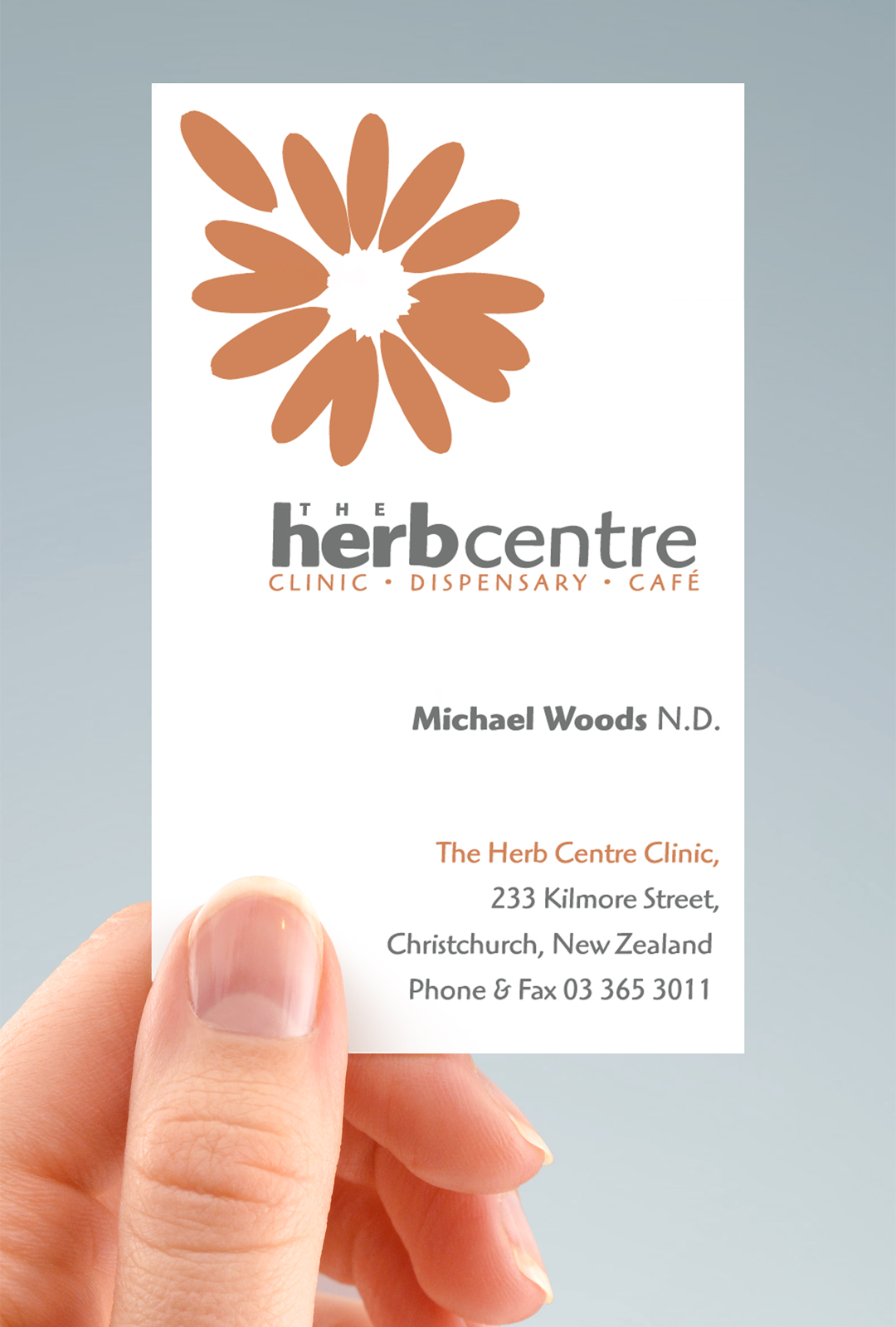
Circles are strong design elements, while the vector drawing of the daisy adds to that by providing a familiar focal point which the eye can interpret with ease. The natural form of the flower is a pleasing one enhanced by the gestalt of the exceptional petal that implies a human element to the design as it is easy to imagine that petal has being “picked” by a hand just out of the frame—an apropriate visual metaphor for the all that Herb Centre implies.
Proximity is what turns individual letters into words and likewise, bring the words and daisy graphic close enough and they click together to form a coherent unit, occupying pretty much the same space. This allows the characteristics of each to rub off on the other, the whole adds up to a “word image” that’s greater than the sum of its parts. Adding bright cheerful orange to the mix, a colour that brings to mind a happy, sunny outdoorsy feeling, this along with the descriptive imagery brings an artistic style which is easily manipulated to be very expressive, because while the art and type can be made to work together in proximity they can also be separated, overlapped. The chief goal of a corporate identity system design is to promote consistency across all brand expressions.
My system approach quickly brought order and style to the Herb Centre’s designs. It has other benefits, too: It’s orderliness is easy to live with for a long time, and as we see with The Herb Centre branding, a system adapts readily to a wide range of uses.
Distinctive, bold, flexible and appropriate for the client’s firm, it is important that the Herb Centre’s business logo shares all these characteristics.


If you think rebranding might be a good strategy for your firm contact me here.
Credits
Printer: Colour Digital Printing (CDP)
Design firm: Surface Active graphic design
Signage, building exterior: Carl Pavletic / Herb Centre collab.
Font credits: Highlander
©magentadot brands
