
The restrained look for Pomeroy’s English style pub newsletter is pure news
POMEROY’S OLD BREWERY INN, CHRISTCHURCH, NEW ZEALAND
THE QUARTERLY POMEROY’S Old Brewery Inn and restaurant newsletter had a name inspired by their brand, “The Pomeroy’s Press”, it was well-edited by Chrissie Terpstra who was also chief reporter between 2005–2010 and was designed and laid out with a look that made the news.
The secret of The Pomeroy’s Press is attention to detail in terms of the classic newspaper look, visual hierarchy, placement, spacing and being laid out in cooperation with the editor makes The Pom’s Press newsletter look designed. Its layout is designed to impart the news quickly and sequentially. When pairing the name with a typefont for the masthead I chose the classic look of Goudy Oldstyle. I paired that with Goudy Sans and a heavy Grotesque sans serif for story headings, banners, accents and dropcaps for a newsy look. For the body text classic Goudy Oldstyle light, set tight with a moderate amount of leading gives the look of a dense “read” typical of the newspaper style. Heavy top rules and half-point rules were used between vertical columns, heavier horizontal rules between stories and to “finish” the bottom of the page.
![]() Adding to the dense structure are good photos, custom illustration, and simple straightforward photocomposites that kept the graphic focus in the newsletter on information, making the stories approachable to the reader and on pro-social fun!
Adding to the dense structure are good photos, custom illustration, and simple straightforward photocomposites that kept the graphic focus in the newsletter on information, making the stories approachable to the reader and on pro-social fun!
The publication was offset printed in two colours, red and black, and the images were all given a slick duotone treatment to add a little pizazz.
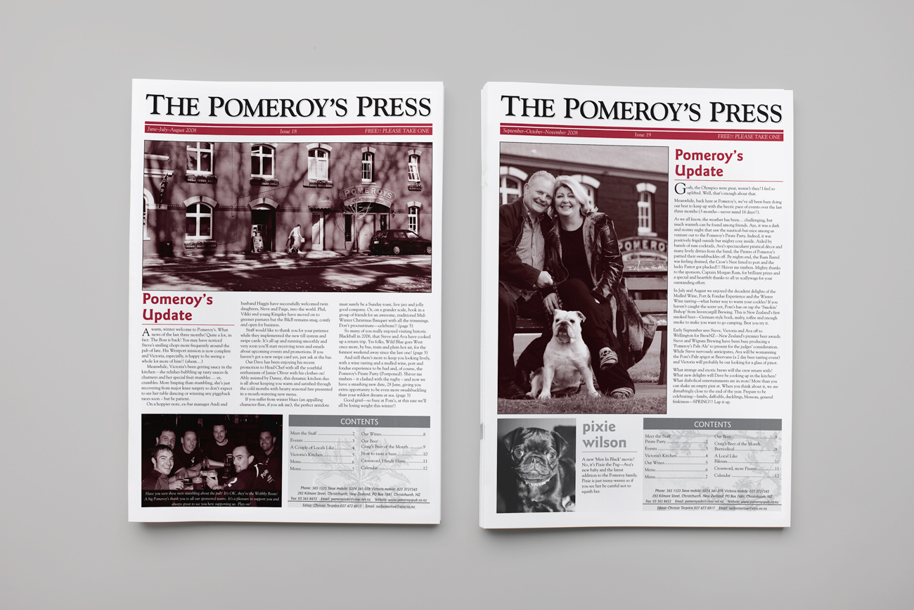
The Pomeroy’s Press issues 18 and 19, 2008.
To ensure a seamless experience uniting print and web and to drive customer engagement with their pub website, the content created for The Pomeroy’s Press was used to update the site content to coincide with the newsletter publication every quarter. Victoria’s kitchen seasonal menu, the wine list, craft beer list, calendar of upcoming events, photo galleries of recent events plus selected vividly written stories about local personalities and Pom’s staff were cherrypicked to share. An optimised PDF of each issue of Pom’s Press was also uploaded. Presenting a connected experience to Pom’s customers positively affected the perception of their brand and through a consistent effort over five years created a competitive advantage. MagentaDot Brands helped Pomeroy’s to develop, manage and deliver a contextually relevant and connected experience for customers, creating a unified experience across print & web touch points.

Pomeroy’s O.B.I. is a real family owned and operated community based pub
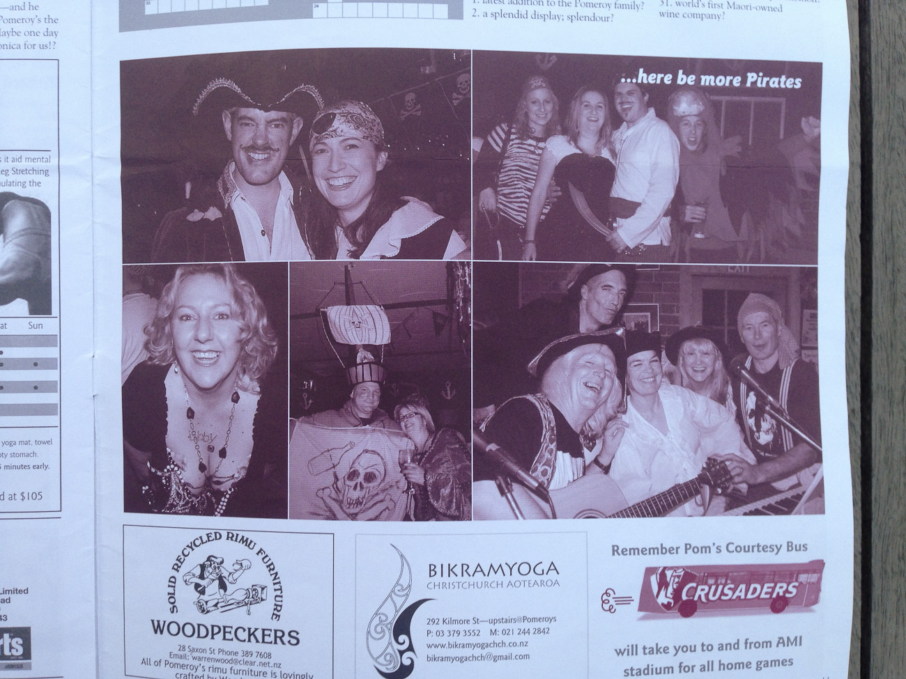
Pomeroy’s is still family-owned and operated, and they pride themselves on being a real community-based pub. Pom’s is comfortable and the locals are friendly, there is always someone to chat to and always something going on entertainment-wise with their acoustic music, jazz, blues and folk music nights, not to mention wine and beer tasting events, quiz nights and other regular special events like the fringe theatre and comedy Laugh-Inn shows and the annual mid-winter Pirate Party.

Two barkeepers, Pomeroys Old Brewery Inn.
Pomeroy’s O.B.I. is housed in a Category 1 historic building, and it has Christchurch’s largest range of boutique and Craft Beers on tap and restaurant meals in a comfortable english style pub that’s renowned for its hospitality. Victoria Pomeroy’s influence and flair for fine “gastro-pub” cuisine shapes the menu of “Victoria’s Kitchen” restaurant and ensures happy diners. Steve’s bonhomie, warmth, and penchant for great tasting cold beers sees everyone having a good time.

Steve and Victoria Pomeroy, Pomeroys Old Brewery Inn.
Affectionately know as “Pom’s” by locals, it is an outstanding place that has been carefully and tastefully restored and strengthened with 32 tonnes of steel since the earthquakes of 2011, where the building was badly damaged. Working with an engineering firm Steve, a builder by trade, spent months, and $1.8 million, along with his construction crew to strengthen the building and prevent a forced demolition.
Whether you enjoy craft-brewed beers, wining and dining or you’re staying next door at Pomeroy’s on Kilmore Boutique bed and breakfast, you are made to feel part of the Pomeroy’s family from the moment you step through the door of Pomeroy’s pub.
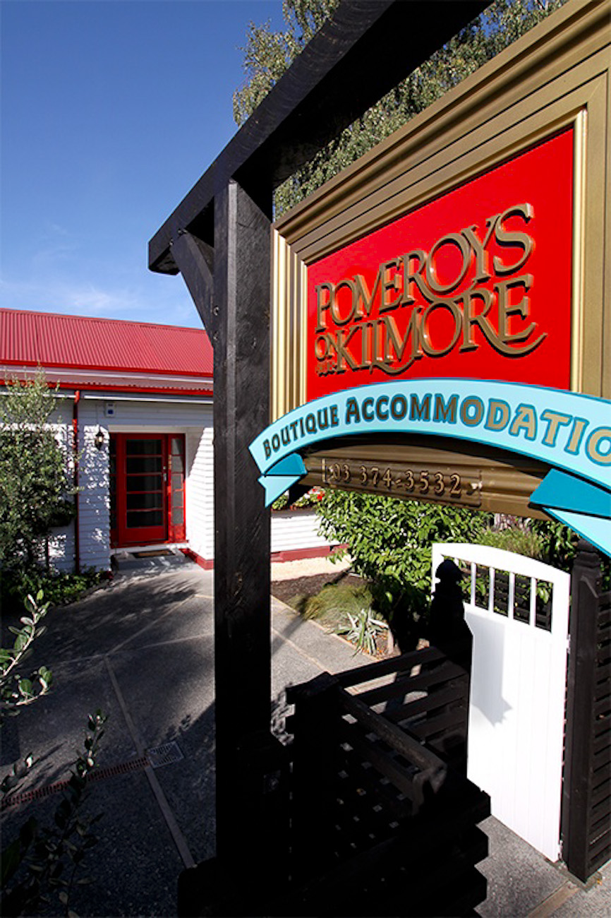
Entrance to Pomeroy’s on Kilmore Boutique Accommodation.
A unique publication with common design challenges
Pomeroy’s pub community newsletter “Pomeroy’s Press” was unique but its design challenges are common. Pomeroy’s Press was a restaurant menu, wine list plus craft beer “beeriodical” and news newsletter; it delivered highly coveted information to local patrons, pub-goers, diners and Pomeroy’s on Kilmore guests, who read every word. Good information, well-researched and written articles illustrated with high quality photos and the generous A3 fold A4 format on nice paper all made for a magnanimous impression and made Pom’s Press eminently readable.


With no need to “hook” its reader, Pomeroy’s Press could be dense with text, pictures and local business advertising and it was organised to keep its information flowing like craft beer from a tap. The layout sweeps the reader smoothly from front to back, uninterrupted, so they can relax with their beer and absorb the material rather than jump, dart and backtrack, newspaper style. Here’s what I mean;

Pomeroy’s Press newsletter front page, masthead and seasonal leading article.
CONSISTENT MASTHEAD: The newsletter name, The Pomeroy’s Press is both inspired by the Pomeroy’s Old Brewery Inn brand and also true to materials, it was printed in two colours on a Heidelberg printing press. Attention is first focused on key issue date data below the masthead, and the issue contents are prominent in a clearly headed and tinted box at the foot of the front page. The Masthead and the graphics reach the outer margins, the visual weight of this key information is aligned vertically and dead centre with type drop shadows adding punch and clarity to this essential information.

Pomeroy’s Press, 3 month Calendar of Events.
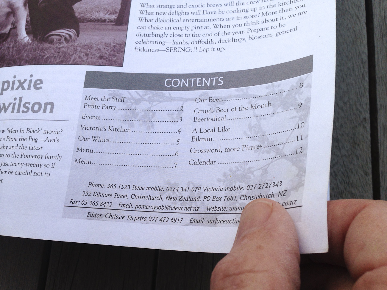
Contents-at-a-glance box and front matter headed up with grey over rule.
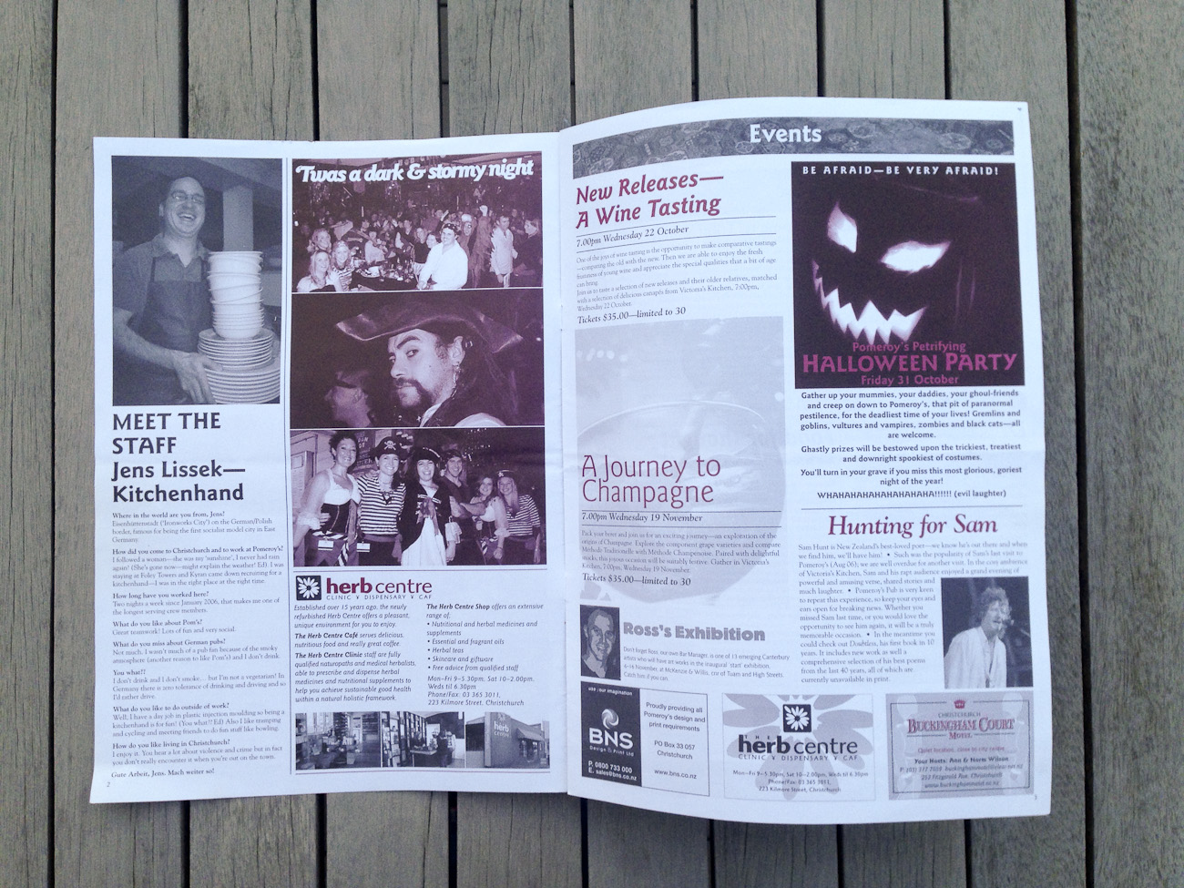
TYPOGRAPHY AND IMAGES, A SINGLE SPEAKING VOICE ON EVERY PAGE: Variable one two and three column pages are laid out on a twelve column grid, to handle odd sizes and shapes such as crosswords, variable width advertising and the full page calendar of events. Pomeroy’s Press’s articles begin at the upper left and flow straight through, the way a commentator would deliver the news. Note that nothing stands out, although muted switches in font style (roman, italics, bold), generous margin widths and stragic use of centred setting serve to alter the tone of voice.
The scheme of typefaces has plenty of contrast, is easy to read, but nothing really stands out because a subdued layout exudes confidence.
With such subdued treatment, the font choices were important. I picked the versatile, newsy, Goudy Oldstye and Goudy Sans complimentary font families. Light Goudy Oldstyle for readable text, and bold sans-serif for headlines, subheads and label-type information for the body of the newspaper information, for distinguishing the menu, wine and craft beer lists Block Berthold sans-serif was added. The scheme has lots of contrast; it is easy to read and forgiving to build to a tight timeframe and consistently meet the deadline.
Subdued but contrasting typography confidently asserts the authority of The Pomeroy’s Press’s.
LOW KEY LAYOUT, ONE PICTURE PER ARTICLE, GENEROUSLY SIZED: Empty space to the right of article headings creates a visual stage for the article’s headlines and subheadings and leads the audience to listen to the information presented. Rules and initial caps used judiciously draw full attention to each article without making them stand out—low key says confident—and that establishes the authority of The Pomeroy’s Press’s voice.

Highly readable and vividly written Victoria’s Kitchen seasonal menu.
CENTRED LAYOUT FOR THE RESTAURANT MENU: Centred objects are motionless and therefore convey a sense of stability, like a foundation. Lighting in Victoria’s Kitchen restaurant and the bar is dim so practical considerations are the priority for the must-read menu information, so the type is large and carefully laid out. And the bold white type in grey overline boxes draws full attention to the restaurant’s unique marketing propositions without this information standing out—once again low key says confident—and that establishes the expectation of excellent food in the diner. The overline also resembles the line below the masthead on page one, providing continuity.
STAY ON BRAND: Colours from the Pomeroy’s logo are used in the newsletter but colour on the page is used sparingly. I stuck to white or light backgrounds for easy reading.
CONSISTENT NEWSLETTER CONTENT TEMPLATE: The content changed, but the featured sections stayed the same using these ideas:
- The lead article is the Pomeroy’s family greeting, it is short, sweet, light-hearteded personal and illustrated with a graphical image.
- Upcoming events are listed on the back page in the full page calendar.
- New seasonal menu every edition. New dishes are presented and described in detail, with vivid descriptions.
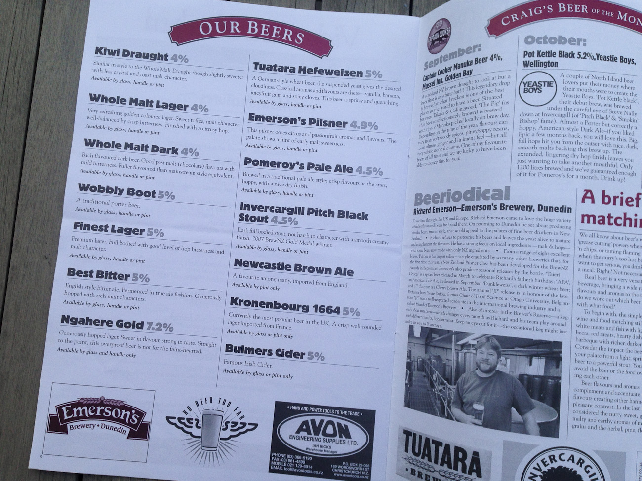
- What’s on Tap. Our beers, Craig’s Beer of the month and the Beeriodical, tasting notes of new brews and stories centred on the craft brewing personalities boost sales.
- “Our Wines” wine list changes seasonally to match the cuisine, tasting notes and vineyard stories go a step further to pique diners’ interest in wine and food matching and trying something new.
- Fun feature articles sharing interesting facts about staff members and locals each month, including the kitchen crew and bar staff too.
- Photo galleries of recent pub events
- Pomeroy’s pub-themed custom crossword and fun Handy Hints section
- Local business advertising and advertorials showcase the small businesses of the pub’s clientele.
Variable sizes of local business advertising and image galleries of recent events, the twelve column layout grid handles odd sizes and shapes with ease, making for very efficient production of visually pleasing page layouts.
FINAL WORD, CONTENT IS KING
The Pomeroy’s Pub newsletter was well worth the time and effort because the written and visual content was produced to a standard to ensure it was consistently well read. The quality of the written word is critical; they always influence a reader’s opinion of the design and the publication—the more pleasant the words, the higher the opinion. Published on a seasonal basis it kept Pomeroy’s restaurant and bar top-of-mind with guests, built loyalty and boosted sales.
More: People pictures add life to The Pomeroy’s Press

Credits
Date: 2005–2010
Client: Pomeroy’s Old Brewery Inn
Editor in chief, reporter, photographer: Chrissie Terpstra
Design, art direction, photography, desktop publishing, print production: Design pARTners, Chrissie Terpstra and Shaun Waugh
©magentadot brands
