
Graphics must be purposeful
Recently returned to settle back in Wellington from the U.K. in 1991, having done his time entertaining Covent Garden and international festival audiences, Fergus Aitken was a busker, a young exponent of clowning, juggling, mime and the bizarre who needed a logo and a business stationery promotional kit to advertise and promote his comic mime character Mr Fungus. More broadly he needed to promote his availability for various performing arts roles and as a mime workshop teacher in community, school and tertiary education settings. The first project, a card, would be handed over personally or included in direct mail campaigns to various audiences, where it would be viewed mainly at very close range.
The brief for Mr. Fungus’s logo and business card: make big impression at close range
The solution was to design his two-sided card as two small posters to make a big impression at close range. Like a good poster the design of the Mr Fungus card is simple and bold. It connects quickly and releases its information easily. Words describe his capabilities, his genre, and convey the specifics necessary to enable communication. Words tell the viewer who, what, how and why. The design conveys comic theatre, farce, “Fungustic slaprobatics” and New Zealand’s loudest mime, and that Fergus excels in comedy light entertainment innovation and tradition.
The design approach: first evaluate the photos
I was given two black & white studio photos from Fergus’s archive, and a small amount of text. I wanted the images carry most of the design load, to do this I found their strengths and worked with the story they tell. The portrait of Mr Fungus in costume should convey the story, but it needed masking out from its background and rendering as a high contrast pen & ink illustration for its two focal points, his eyes/nerdy glasses and the polkadot bowtie to stand out as a strong centre of interest with real power. The key to the illustration is to make it big and simple, the key to composition was to centre his head in the poster, which is the strongest position and amplifies the power of the story in the expression on Mr Fungus’s face, which grabs our undivided attention.
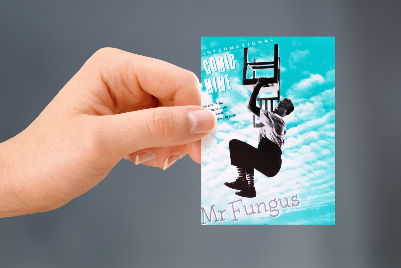
A comic character world famous in New Zealand as the world’s loudest mime


The Mr Fungus logo: design on the funny side
Sometimes a name and a graphic image go together well. The graphic pictured with the name, words and pictures together are stronger than words alone. Because a logo has only a few elements to do the work, type plays a central role in the design, so I paid close attention to the style and setting out of the handlettering. The style of the subject, the comic slapstick character of Mr Fungus was best conveyed in a warm idiosyncratic handwriting of the name in an informal, irregular slab-serif typewriter style font. These are the earmarks of a human handlettering and along with the messy inksplatter marks they echo the random funny quirks of the comedy in Mr Fungus’s work.
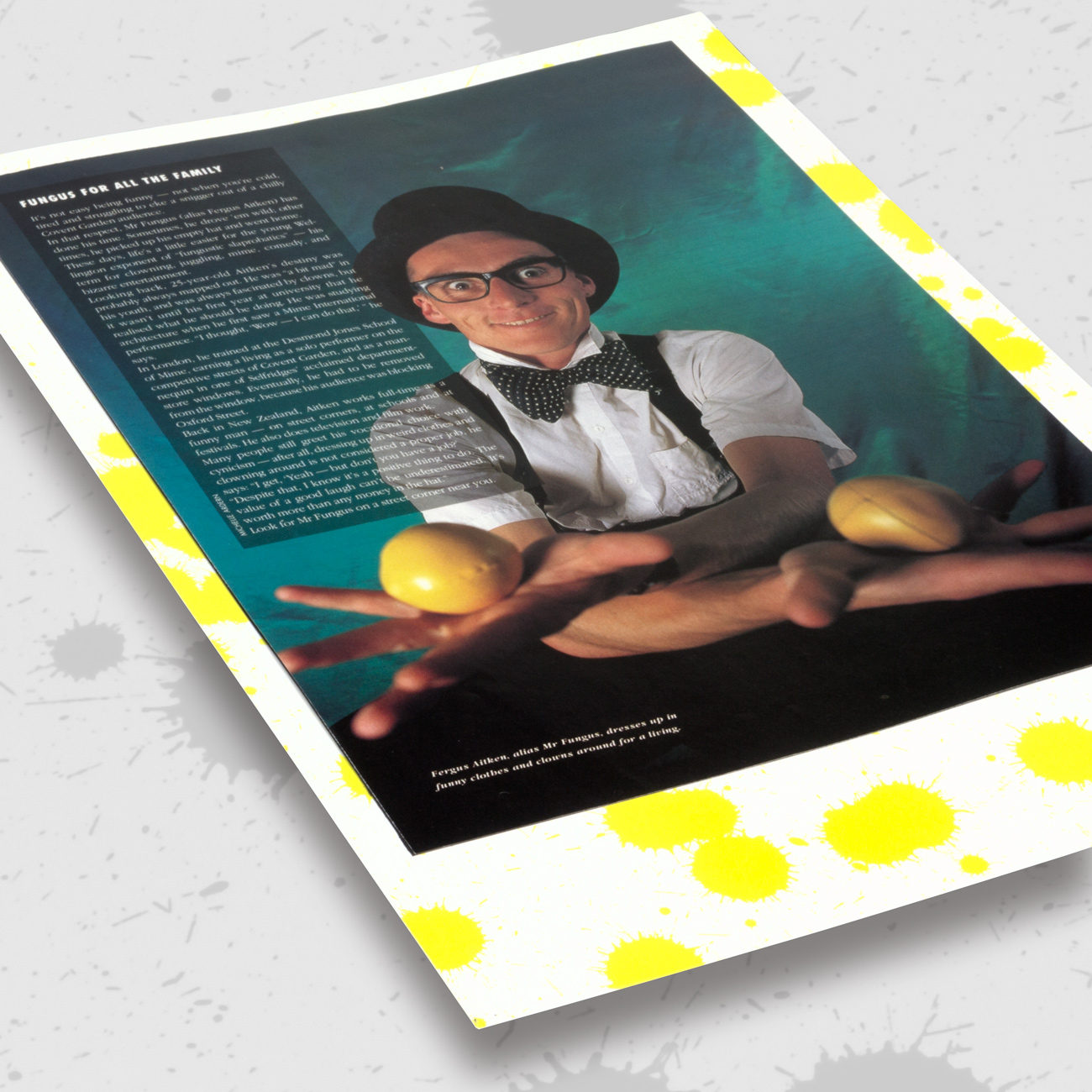
Fergus Aitken, alias Mr Fungus, dresses up in funny clothes and clowns around for a living.
The small supporting details of the ink spots in the corners to guide the eyes around the contact information completes the small poster.
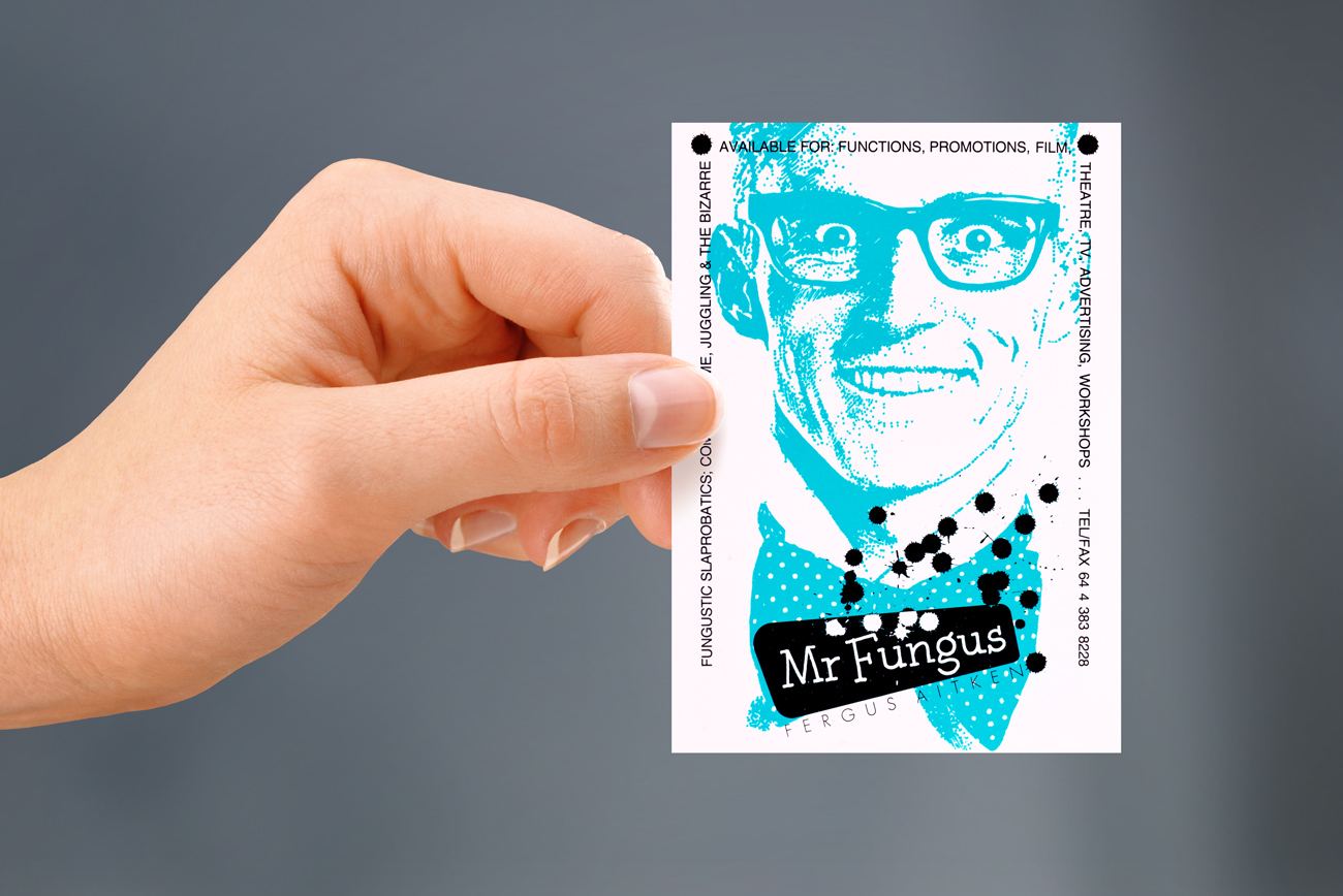
His face and costume tells a story and by illustrating it in high contrast with the background masked out the image is transformed into one with real power. The key to audience engagement with the Mr Fungus character is to make it simple, and make it big.
This absurdist concept makes a big impression, while the goal of the type is communication, so it is designed for the reader.
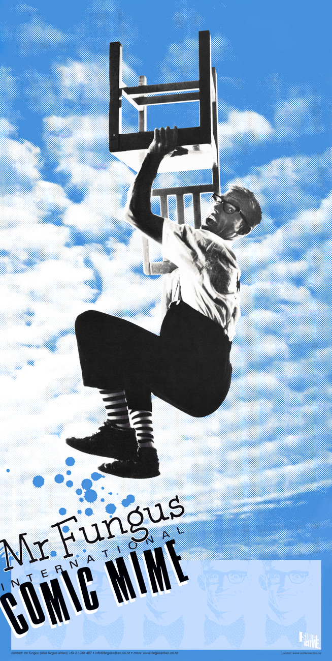
A poster for New Zealand’s loudest mime.
©magentadot brands
