The MyoPace EMG product capabilities brochure presents the utility of a high tech piece of medical equipment beautifully and inexpensively. The brief was for a product brochure makeover. A plain sheet of paper is transformed into an engaging, easy-to-read A5 three-panel brochure with full bleed printing and two rollover folds.
By combining well thought out and carefully art directed studio photography, a large format pastel illustration and clear typography the new brochure tells a user-friendly story in words and pictures.


MyoPace: EMG equipment for Physiotherapy and Occupational Health Professionals
The Niche technology EMG (Electro Myograph) brochure was direct mailed to physiotherapists in New Zealand and abroad, given out by hand, displayed at trade shows for customers to take and distributed to their wholesale customers. This capable feature-packed device represented high performance and great value for money and was successfully retailed and wholesaled by Niche technologies at trade shows domestically and internationally.
Though the specialist audience is familiar with the sales literature for medical devices, telling the clear story of the Myopace EMG in words and pictures is as demanding for this device as it is anywhere.

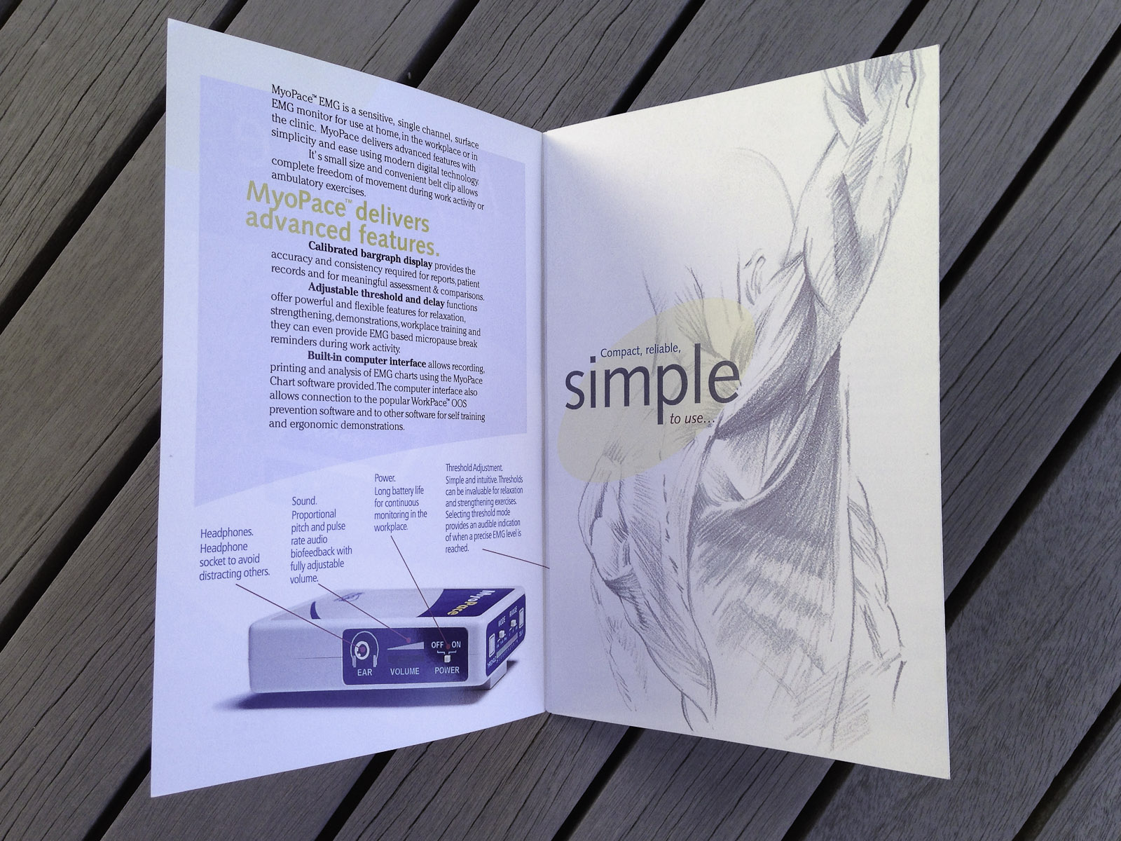
The brochure core is the inside spread, with well thought out studio photography presenting the device as the hero, the brochure succeeds with focussed, flowing, nicely paced compositions and photos.
The “before” lacks interest and impact
The “before” lacks impact due to unappealing colours and a beige generic case housing the device. With the introduction of basic identity elements and well thought out art directed studio photography presenting the device as the hero, the “after” succeeds with focussed compositions and photos in a flowing and nicely paced rollover fold brochure.
The message is part verbal, part visual and clearly expressed.
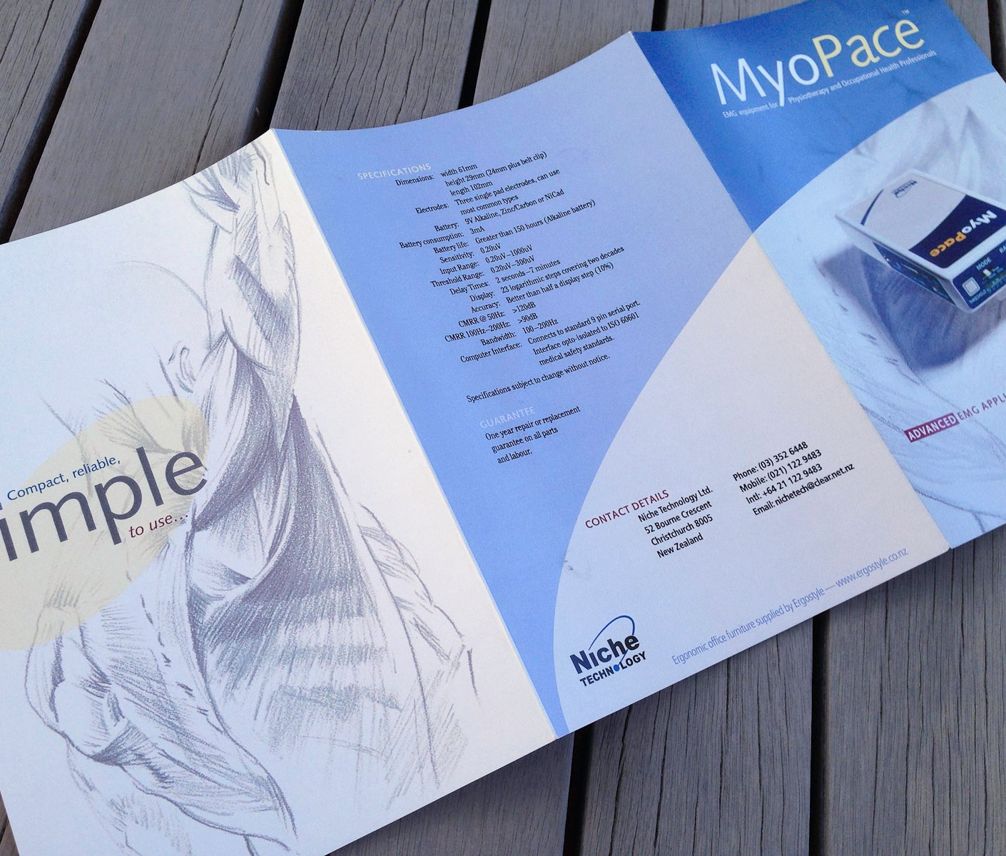
The 6 panel well organised layout has variety and a clear design goal. Where appropriate, on the cover and page two, the material conforms to fitting into individual panels. For the three panel inside spread the folds are ignored and the design is the entire page.
Good looking images working together as storytellers
People see before they read so to attract customers images have prominence in the design concept. The photos were all visualised up front prior to the studio shoot. The images convey the utility and benefits of the EMG and it’s bundled software and some were clear-cut, without backgrounds or edges.
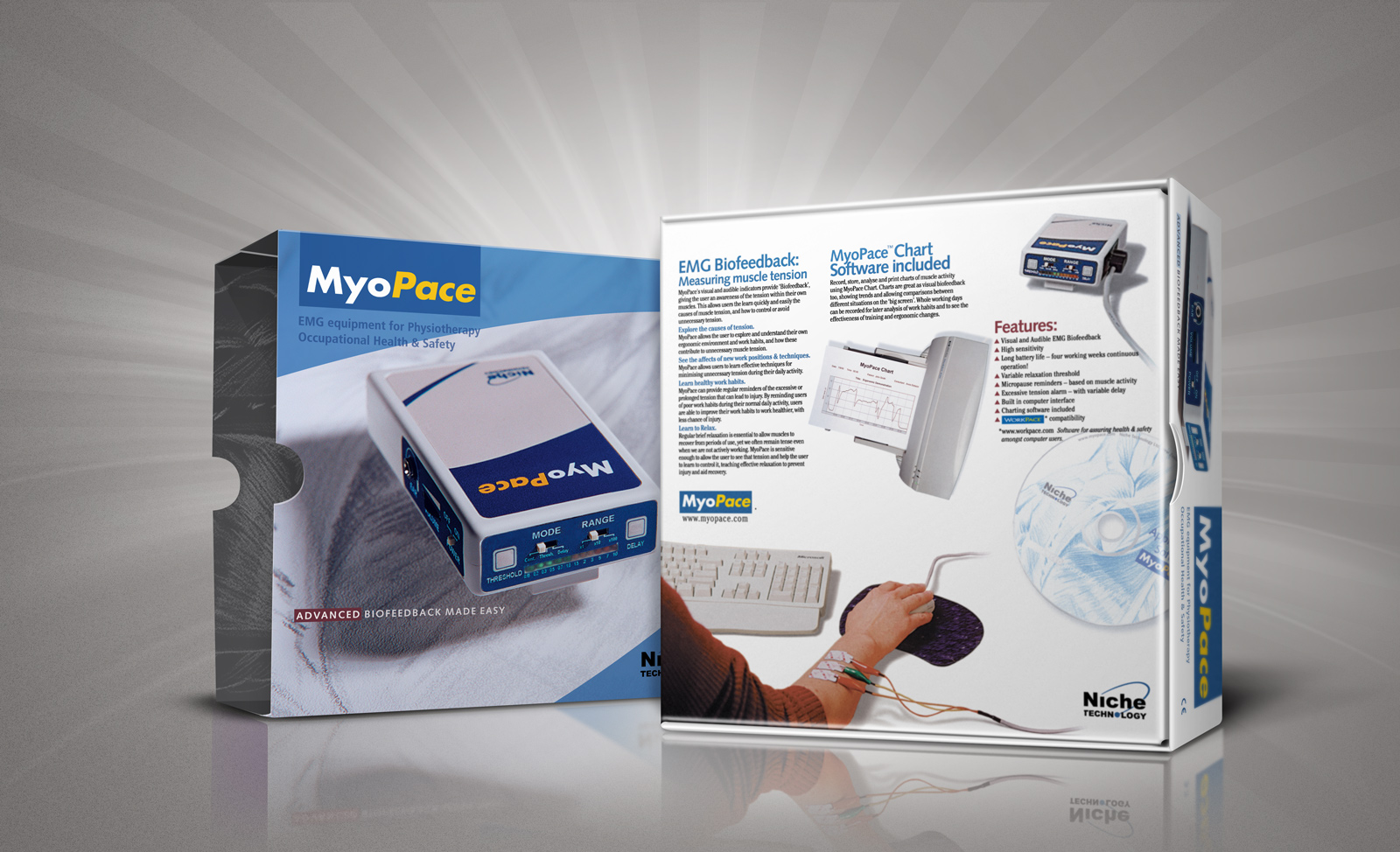
MyoPace EMG Equipment for Physiotherapy carton.
Easily read typefaces
Type was chose for its clarity and power. I chose two highly legible modern sans-serifs, Frutiger and the humanist sans Syntax for headings, and for the text, up-to-date yet classic Cheltenham, as with its larger x-height it is a Roman face that works as well on screen in smaller sizes as it does in print.
Wide screen interior layout
The interior layout ignores the folds and treats the entire page as a single canvas. The layout can conform to the information that is necessary to convey, from the information out. The layout makes use of curved graphics and photos with and without edges to show the Myopace EMG “in the round”. Along with that is a composite illustrating the bundled software and a shot of the EMG device modelled in therapeutic use in the workplace.
Front cover design sets the stage
Strongly focussed full bleed image, the photo presents the device in such a way that it is both framed, clearly named, and by the means of an oblique view, shallow depth of field and a one light lighting setup the EMG device appears to pop-up forward, almost leaping clean off the page. To the audience the anatomical life drawing of musculature tells the story in one picture of what the Myopace device is and what it is used for.
Product name, positioning statement, selling message and branding elements are well organised in a size and colour coded visual hierarchy.
Dual purpose back cover
One of the first things read, yet it must also work as the conclusion. It is the best place for the dry product specifications data sheet, guarantee, contact details and an empty space for the dealer stamp. Cinema credit style typography for the specification list keeps the list typography well anchored in the layout and is optimal for reading quickly in a single bite.
The chief product benefits are simply put with poster-like clarity and emphasis on this standalone page, the reader is encouraged to take the plunge and read on.
Fold in panel, a welcome message that compliments the cover and the inside spread
Sequence matters, message and brochure format present the story, best foot forward. The chief product benefits are simply put using image, colour and type with poster-like clarity and emphasis on this standalone page, the reader is encouraged to take the plunge and read on.
Inside: the brochure core
The inside is taken in all at once so the layout has been designed to best fit and express the capabilities of the feature packed EMG device. The client assisted the design goals by providing concise, pragmatic copy, just the facts. The text is extremely clear with wide line-spacing, black in colour and set in columns of optimal width which can be read easily and quickly. Readers are pulled into the story by eye catching callouts that set the design theme. Generous white borders around the non-bleed elements give the layout a fresh, organised look. Multiple captions on the product images have tremendous value because every image has several stories to tell.
Credits
Printer: Colour Digital Printing (CDP)
Design firm: Surface Active Graphic Design
Copywriter: Client, including product naming
Creative director / designer / illustrator / print production: Shaun Waugh
Font credits: Cheltenham, Frutiger, Sytnax
©magentadot brands
