
![]() TruLine Civil are a family owned civil engineering headquartered in Greymouth and with operational bases there and in Christchurch. The TruLine logo design was inspired by the theme of their core business, laying drainage pipelines, and portrays this forward thinking firm in a fresh, dynamic way.
TruLine Civil are a family owned civil engineering headquartered in Greymouth and with operational bases there and in Christchurch. The TruLine logo design was inspired by the theme of their core business, laying drainage pipelines, and portrays this forward thinking firm in a fresh, dynamic way.
As good as some, better than most
Since 2012 TruLine have made a significant contribution to the rebuild of Christchurch’s horizontal infrastructure and roading network. TruLine has earned the respect of their civil contracting peers due to the metre rate per day which they can lay water mains and waste water pipelines. Other contractors manage about 20 m per day, TruLine consistently delivers 100 m per day. This performance is down to sheer hard work. Having photographed this crew at work on a number of occasions I have been impressed witnessing this high-energy highly-skilled crew’s ability to coordinate personnel, machinery and resources.
Print quality says craftsmanship
Print craftsmanship says quality and a minimal well laid-out page is more professional than a showy design, poorly built. An engineer’s corporate I.D. system must work hard and the graphics must be purposeful.
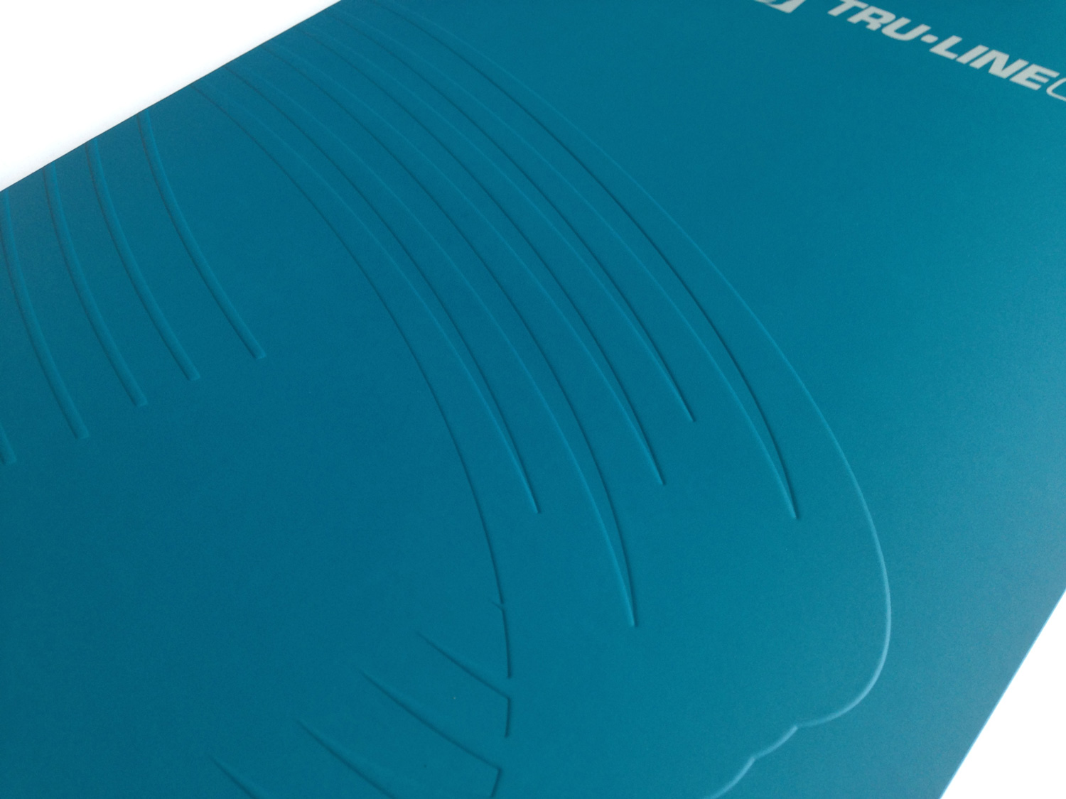
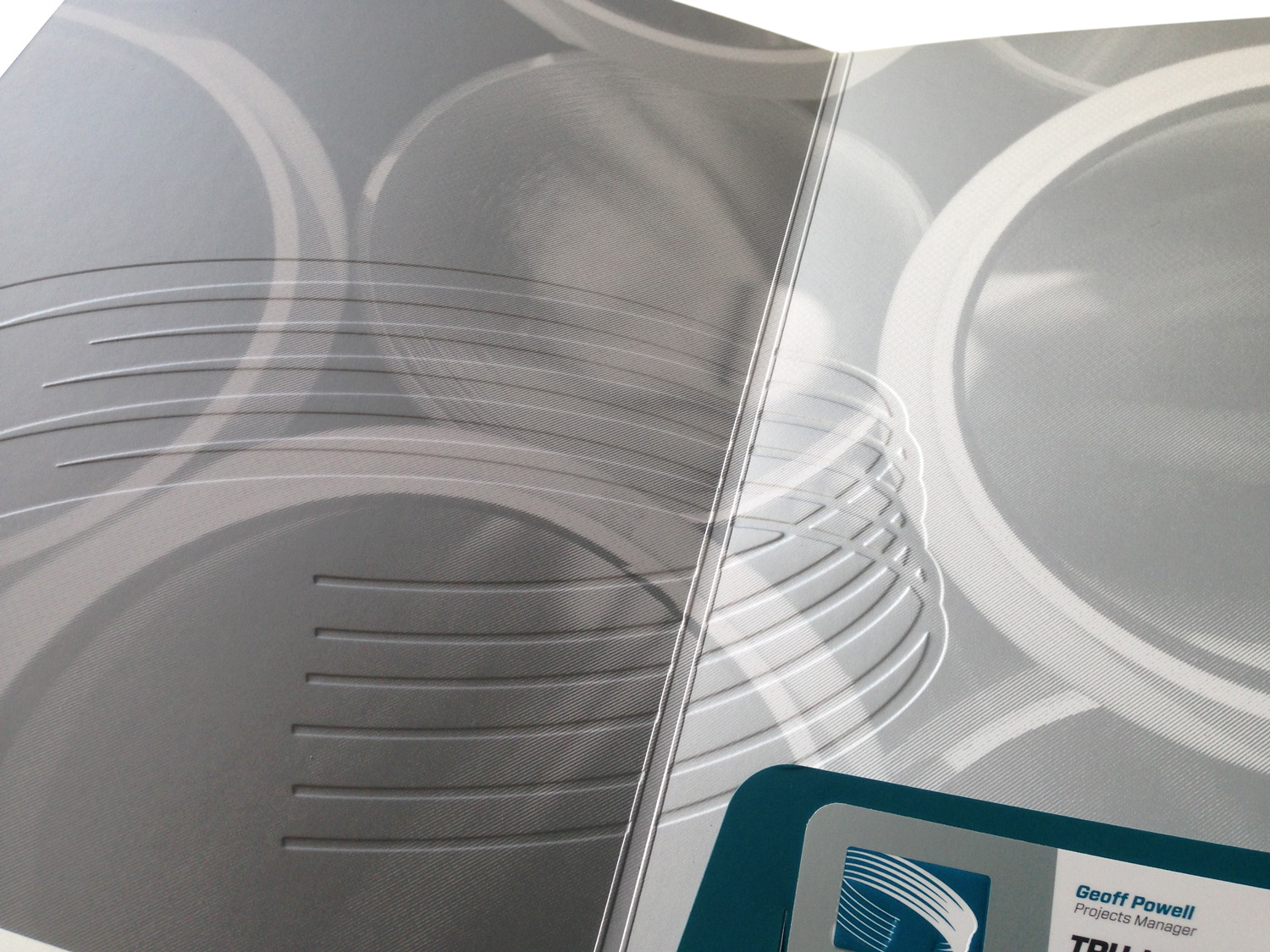
Craftsmanship is attention to detail and the fit and finish of Tru-Line Civil’s corporate stationery system is good looking, works hard and adapts easily. The design conforms to the world’s most popular business look. It is corporate—uncluttered, clean and impressive. While the Print craftsmanship says quality, the dynamic illustrated logo sends a powerful message.
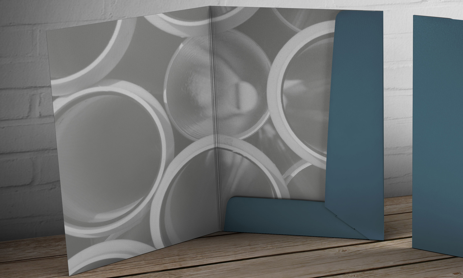
The Tru-Line business system, consists of A4 letterhead, envelope, business card, with compliments slip and a versatile laminated and embossed document folder that is trimmed down from the same worksheet as the folder to create a custom Word document cover with a window. The system is easily manipulated and I can adapt it for almost any use. At the core of the system is the Tru-Line Civil logo, or “mark” and a separate block of text.
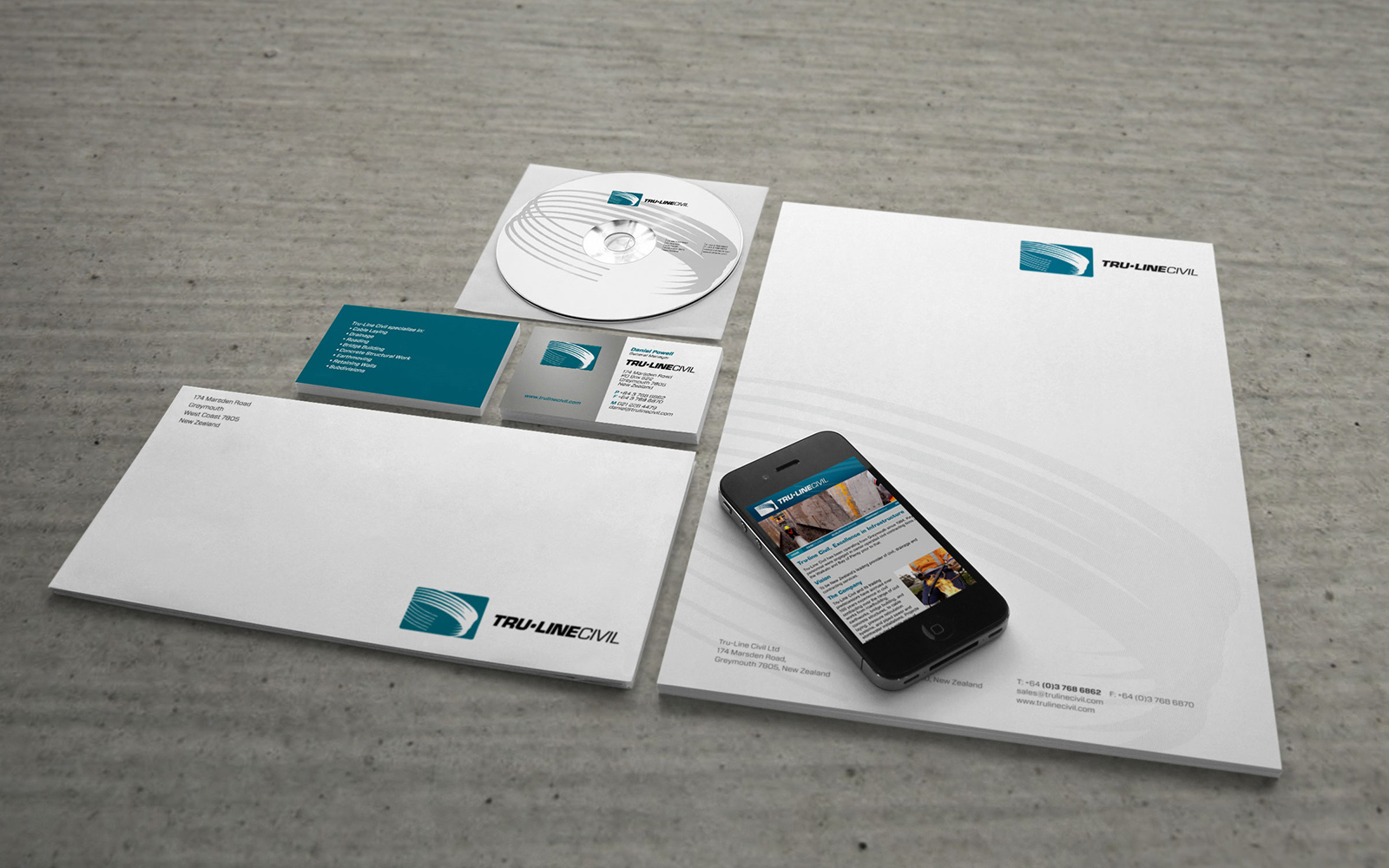
Tru-Line Civil corporate stationery system and website.
In addition to the full set of corporate stationery the custom Word bid document template delivers highly critical business-to-business information, primarily tender bid documents, that are read by professionals who read every word. With no need to “hook” the reader in, Tru-Line’s B2B documents can be long, dense with text, charts, tables and organised so their information flows like water from a tap.
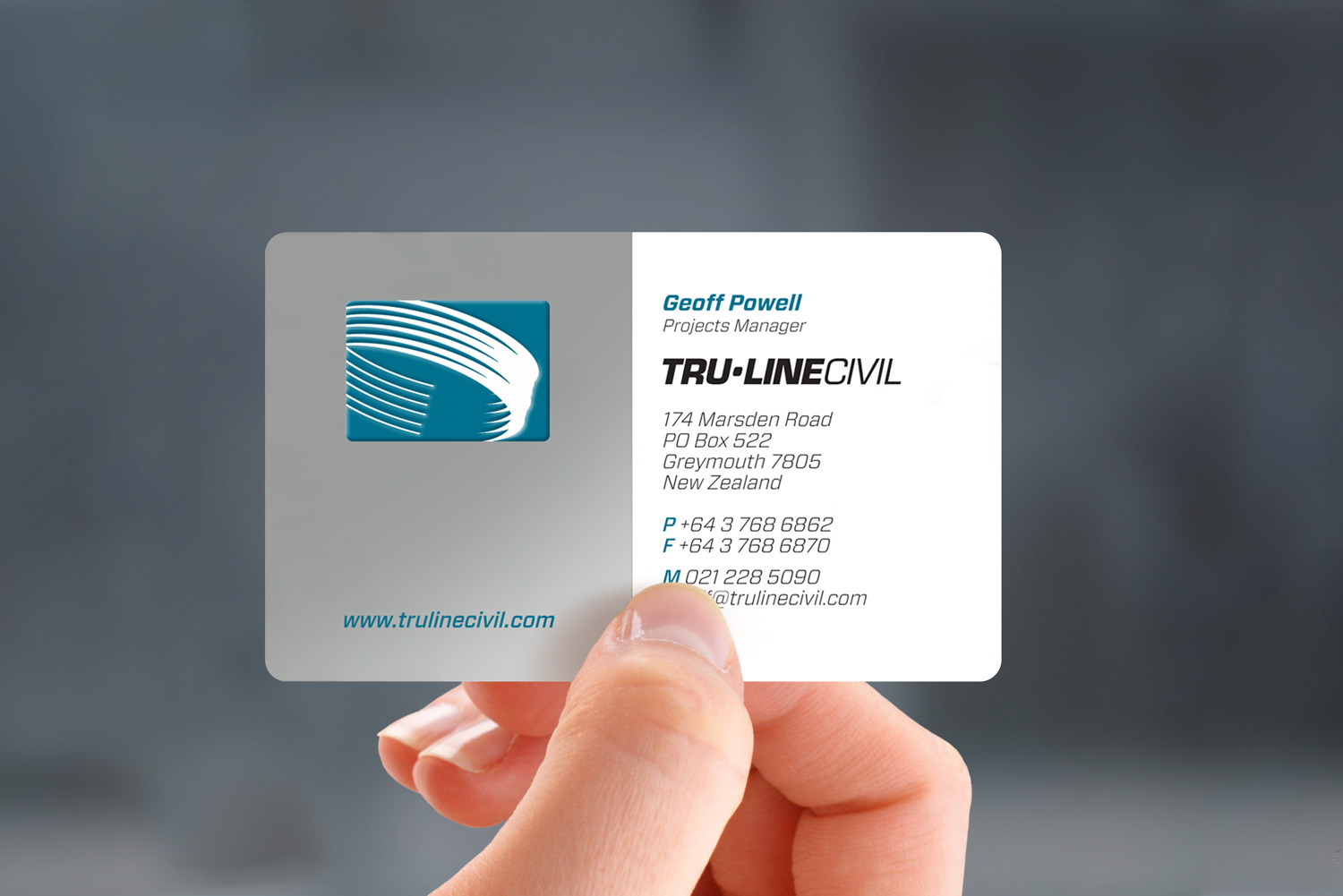
The Tru-Line Civil business card is dressed to impress. Printed 3 colours including one metallic ink. Civil engineering is the sort of work where you are out in the field getting your hands dirty so the matt laminate, and radiused corners ensures they are robust and presentable on the job. The well crafted embossed logo is a theme repeated in the stationery system. It is craftsmanship that says quality.
Description
Project name: Tru-Line Civil stationery system
Disciplines: Brand and identity systems design / Corporate communications design / Digital Illustration / Photography / Print production / Typographic design / Word document template
Client (Industry): Tru-Line Civil (Construction / Contracting)
Format: Booklet / Brand identity system
Credits
Printer: Brightprint Ltd
Design firm: MagentaDot Brands
Art director / designer / photographer: Shaun Waugh
Client: Tru-Line Civil
Font credit: Vitesse, Vitesse Sans (Forza), Helvetica Neue, Helvetica Neue Condensed
©magentadot brands
