I was commissioned by MTC Equipment in January 2015 to design and art direct their rename and rebrand project. This included designing their new business logo and identity system, designing and populating their new online catalogue website , and creating a distinctive brand launch and product brochure.
It was a great opportunity to work with an established family company, formerly Murray Tractor Company, to implement a rename, rebrand, and repositioning their new business as import agents of Chieftain Trailers of Ireland in the New Zealand, and Australasian regional markets.
The new brand identity
The “M” monogram along with the company name forms a cohesive signature. The colour scheme of the logo, the corporate look of symbol and text block matched the brief to implement an evolutionary improvement upon the successful attributes of the legacy Murray Tractors’ logo, not replace it. More on the identity system below.
The online catalogue website is instrumental to brand launch and success going forward
Their online catalogue website is instrumental to the success of MTC Equipment selling their range of Chieftain transport trailers, other product lines, plus spare parts and after sales service.
But there is more to an impressive online catalogue than a collection of colourful pages. An effective online catalogue is a 24-hours-a-day selling machine to the domestic, Australasian and global markets. It is a website that is as effective as their leading salesperson, as knowledgeable as their top buyer and as organised as their best office administrator. The website captures online everything that is good about MTC Equipment’s business.
Built to order, MTC’s trailer designs offer a complex of optional extras and custom design parameters—all of which needed to be made easily accessible and easily understood.
From a web designer’s perspective, this requires an extensive graphic design and programming background. My experience and creativity in collaboration with that of the team at Dynamic Multimedia/DMM, built an effective catalogue website under my Art Direction and hands-on production effort to get to the final result.

The overview of product category pages is well laid out, and user scan time is significantly reduced by offering both visual icon and list of contents views of product categories side-by-side.
A user friendly online catalogue “Chunks” information when users are required to recall information
At the individual product “item” page level, by “chunking” complex information the catalogue item pages are simplified. So when problem solving by comparing one product with another users are best able to recall and retain information they need. This is required to attract customers and visitors.

User scan time is significantly reduced by offering both visual and textual list of contents views of product categories side-by-side.
The ordering process is well-integrated with the product detail pages making the shopping and ordering process easier. This ease of use requires careful planning and advanced web design, but it is essential to retain site visitors and encourage them to return. If you are ready to start on a catalogue web design project contact me here.
TAKE A LOOK AT THE MTC EQUIPMENT SITE

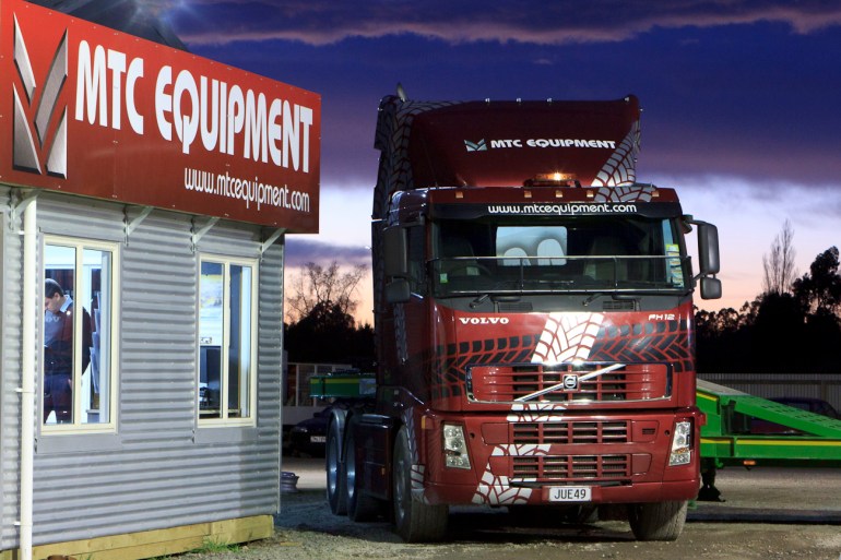
Designed on a grid, MTCs business stationery system says ‘corporate’, including this uncluttered, clean and impressive form. The system works on simple principles that are easily manipulated. The logo or “mark” is at its core, and a separate block of text and illustrated, gritty truck tyre tread developed from the logo. Combined they attractively deliver the appropriate thematic connotations of the heavy transport trailer and farm equipment “workhorse” product range.
Versatile MTC symbo
The MTC “M” Monogram was designed stand alone and for as the key repeating element of a graphical truck tyre tread pattern. This versatile illustrative brand asset stands strong when rendered with a gritty industrial look, true to the rugged, hard working character of MTC’s products and their markets.
A set of stationery items and forms was followed through with a 12 page printed launch catalogue, and a print advertising campaign placed in various trade publications.


MTC Equipment is able to make a mark in the Agricultural, Industrial and Road Transport industries by creating a launch announcement and product brochure that stands out from the norm.

The back cover design is a break from the run of document. It features a festive display of spares and a half page horizontal advertisiment launching a new “High Tensile” semi-trailer type. The launch ad in the MTC Equipment rebrand campaign.

The cover graphic is a dynamic composition of the tyre tread pattern made from the MTC Monogram, the interior road photo is one that I shot near Porters Heights on the Arthurs Pass highway.
Description
Project name: MTC Equipment branding
Disciplines: Branding / Print design / Responsive web design
Client (Industry): MTC Equipment (Automotive)
Formats: Advertising / Booklet / Brochure / Direct mail / Stationery / Website
Date: 2015
Credits
Art direction/graphic design/web design/UX design: Shaun Waugh
Copywriter: Client / Shaun Waugh
Printer: BrightPrint Limited
Web Design: MagentaDot Brands
Web development: DMM
Font credits: Defense, Futura, Futura Condensed, Impact
©magentadot brands


