Robin Willan fabricating a bespoke radiator for a WWII warbird aircraft restoration. Radiator Shop, Auto Restorations.

Radiator shop staff photos

Radiator restoration and manufacturing shop staff 2009–12

Auto Restorations radiator shop icon.Custom vintage car and aircraft radiators are restored or manufactured to their original beautiful condition and the highest care for their originality in brass, copper and German Silver. The craftsmanship and high standard of Auto Restoration’s work is second to none as their multiple Concours D’Elegance Awards attest to.

Bugatti t49 side elevation clearcut on a white background. Auto Restorations.

The works of Ettore Bugatti advanced the 20th century aesthetics in engineering design. This Bugatti t49 restoration by Auto Restorations is one of Bugatti’s most successful 8 cylinder sports touring cars between the wars.

These photos were shot and photo composites produced 2009–2012, they offer a historical profile of Auto Restorations during that time soon after Allan Wylie stepped up from the Mechanical Shop floor to the role of General Manager. Pictures of their employees on their redesigned website, and capabilities brochure in print helped Auto Restorations transform from a faceless company to people that their customers can relate to. The highly specialised, high value personal service that Auto Restorations’ workforce offer to customers is an advantage that they have over large companies. Good photos of their skilled workforce reinforce this.


Date: 2009–12
Client: Auto Restorations
Photographer, photo composites: Shaun Waugh


©magentadot brands

Bob Sterling precision fitting new bespoke aluminium panels on a classic Ferrari restoration in the Panel Shop at Auto Restorations.

Panel shop expert workforce

The portraits of the Panel Shop staff 2009–12

Auto Restorations Panel Shop icon.All bodywork defects are expertly repaired by the team of experts in Auto Restorations’ autobody panel shop. New panels are made up in steel or aluminium, repair patches are welded in place. Louvres can be made in engine bonnets. With a close eye to the fit and finish of their work, doors, boot lids and bonnets are expertly fitted to achieve perfect alignment and even gaps, one of the more challenging aspects of automobile restoration.

1963 Ferrari 250 GT Lusso, bonnet detail.

1963 Ferrari 250 GT Lusso, bonnet detail shot in the paint booth.

Informal portraits of their employees on their redesigned website, and capabilities brochure in print helped Auto Restorations transform from a faceless company to people that their customers can relate to. The highly specialised, high value personal service that Auto Restorations’ workforce offer to customers is an advantage that they have over large companies, their multiple international Concours D’Elegance awards attest to this. Good photos of their skilled workforce reinforce this.

These photos were shot and photo composites produced 2009–2012, they offer a historical profile of Auto Restorations during that time soon after Allan Wylie stepped up from the Mechanical Shop floor to the role of General Manager.


Date: 2009–12
Client: Auto Restorations
Photographer, photo composites: Shaun Waugh


©magentadot brands

Peter Hendricks putting the finishing touch on the Concours award winning paint job of a complete Ferrari Lusso restoration, Paint Shop, Auto Restorations.

Paint shop staff photos

The portraits of the Paint Shop craftsmen, 2009–12

Auto Restorations Paint Shop icon.The two Auto Restorations spray painters work in a modern refinishing facility that was purpose built to achieve award winning paint finishes that are the utmost in appearance and durability, as the firm’s multiple Concours d’Elegance awards prove.

Custom body Delahaye 135 roadster, front three quarter view.

Custom body Delahaye 135 roadster. The originals of these cars were the works of many different coach builders, throughout Europe, who built upon the chassis supplied by Delahaye.

These photos were shot and photo composites produced 2009–2012, they offer a historical profile of Auto Restorations during that time soon after Allan Wylie stepped up from the Mechanical Shop floor to the role of General Manager. Pictures of their employees on their redesigned website, and capabilities brochure in print helped Auto Restorations transform from a faceless company to people that their customers can relate to. The highly specialised, high value personal service that Auto Restorations’ workforce offer to customers is an advantage that they have over large companies. Good photos of their skilled workforce reinforce this.


Date: 2009–12
Client: Auto Restorations
Photographer, photo composites: Shaun Waugh


©magentadot brands

Simon Steffens machining a bespoke part in the Auto Engineering Shop at Auto Restorations.

Machine Shop skilled workforce photos

The portraits of the Automotive Engineering Shop’s skilled workforce 2009–12

Auto Restorations Automotive Engineering Shop icon.Auto Restorations’ machine shop is well equipped and staffed by seasoned experts. This allows them to make or recondition any mechanical part they need to restore a car, almost without exception. From engine block to king pin, they can machine them all.

Machined crankshaft for Aston Martin DB6 restoration made from Billet Steel for the DB6 engine by Auto Restorations’ machine shop.

Crankshaft made from billet steel for Aston Martin DB6 engine by Auto Restorations’ machine shop.

These photos were shot and photo composites produced 2009–2012, they offer a historical profile of Auto Restorations during that time soon after Allan Wylie stepped up from the Mechanical Shop floor to the role of General Manager. Pictures of their employees on their redesigned website, and capabilities brochure in print helped Auto Restorations transform from a faceless company to people that their customers can relate to. The highly specialised, high value personal service that Auto Restorations’ workforce offer to customers is an advantage that they have over large companies. Good photos of their skilled workforce reinforce this.


Date: 2009–12
Client: Auto Restorations
Photographer, photo composites: Shaun Waugh


©magentadot brands

Graeme Climo dimensioning a bespoke aluminium body panel for a classic Delage restoration in the Custom Coachbuilding Shop at Auto Restorations.

Custom Coachbuilders’ portraits

Informal portraits of the Custom Coachbuilding team 2009–12

Auto Restorations custom coachbuilding plane icon.With mastery in wood, steel and aluminium the two coachbuilders, working along with the autobody Panel Shop team of six, construct custom coachwork one-off designs from scratch as well as restoring existing bodies, all achieved using construction techniques appropriate to the age of the chassis. Existing autobody designs are re-created in aluminium, traditional wood and tubular steel from drawings or photos, or new bespoke designs created to the customer’s brief.

1963 Ferrari 250 GT Lusso, front three quarter view, left.

Award winning 1963 Ferrari 250 GT Lusso, widely regarded as the most beautiful sports car of the 20th century.

Informal portraits of their employees on their redesigned website, and capabilities brochure in print helped Auto Restorations transform from a faceless company to people that their customers can relate to. The highly specialised, high value personal service that Auto Restorations’ workforce offer to customers is an advantage that they have over large companies, their multiple international Concours D’Elegance awards attest to this. Good photos of their skilled workforce reinforce this.

These photos were shot and photo composites produced 2009–2012, they offer a historical profile of Auto Restorations during that time soon after Allan Wylie stepped up from the Mechanical Shop floor to the role of General Manager.


Date: 2009–12
Client: Auto Restorations
Photographer, Graphic designer: Shaun Waugh


©magentadot brands

Andy Dalton, Mechanical Shop.

Blue collar portraits of mechanics

The informal portraits of Mechanical Services & Auto Electrical Shop staff 2009–12

Auto Restorations Mechanical Shop icon.Eight staff perform all mechanical repairs and servicing, rewiring, electrical upgrades, the rebuilding of all types of engines, from primitive vintage, rare mid-century European sports cars, to early Formula One racing car types.

Alfa Romeo 6C 2300 Monza engine, right side.

Alfa Romeo 6C Monza engine, supercharged Super Sport variant.

Informal portraits of their employees on their redesigned website, and capabilities brochure in print helped Auto Restorations transform from a faceless company to people that their customers can relate to. The highly specialised, high value personal service that Auto Restorations’ workforce offer to customers is an advantage that they have over large companies, their multiple international Concours D’Elegance awards attest to this. Good photos of their skilled workforce reinforce this.

These photos were shot and photo composites produced 2009–2012, they offer a historical profile of Auto Restorations during that time soon after Allan Wylie stepped up from the Mechanical Shop floor to the role of General Manager.


Date: 2009–12
Client: Auto Restorations
Photographer, Graphic designer: Shaun Waugh


©magentadot brands

Jamie, office manager, receptionist and P.A. at Auto Restorations.

White collar staff informal portraits

Informal portraiture in the workplace using available light


AUTO RESTORATIONS WORKSHOP, STEWART STREET, CHRISTCHURCH 2009–2012


When shooting informal portraiture avoid distraction from the most important purpose—getting photographs. These photos were shot and photo composites produced 2009–2012, they offer a historical profile of Auto Restorations during that time soon after Allan Wylie stepped up from the Mechanical Shop floor to the role of General Manager. Pictures of their employees on their redesigned website, and capabilities brochure in print helped Auto Restorations transform from a faceless company to people that their customers can relate to. The highly specialised, high value personal service that Auto Restorations’ workforce offer to customers is an advantage that they have over large companies, their multiple international Concours D’Elegance awards attest to this. Good photos of their skilled workforce reinforce this.

Lineup of classic cars in carpark of Auto Restorations, Stewart Street Christchurch workshop.

Italy, the United States, France, and Australia are represented in this lineup of 20th century classic cars, from the current work in progress at Auto Restorations in September, 2009.

Whether shooting outdoors or indoors, consider using the flash to light the subject. If the available light is insufficient then you need to build up more light until the clearest and best photo is taken. This may involve bouncing flash light up off the ceiling or outdoor canopy. You shouldn’t see light in the final picture—you should see the subject.

Dropping to one knee and shooting up at your subject yields a heroic image.

Informal portrait of Allan Wylie, Auto Restorations’ manager leaning against his 1938 Ford roadster.

Visual anthropology: Work method documentary photography

Anthropology is the study of human societies and cultures and their development. So it follows that informal portraiture of people going about their tasks, such as these photos of Auto Restorations’ skilled workforce, is besides its marketing communications purpose, anthropology, which is a field that values good, factual photography more than beautiful pictures. In the classic sense the principle is that a moody shot of a mother holding a child will not work, while a picture of an entire family with all their belongings standing before a straw house has a great deal of information.

As an artist I have various goals in mind when I photograph people. I accentuate special characteristics and play with composition, graphic devices and graphic twists such as action in the frame.

As a documentary photographer with an anthropological bent I must capture visually readable, factual data. This assignment for Auto Restorations demonstrates both aspects of my photography.

Bob Sterling plies his skills precision fitting a new bespoke aluminium panel, that was fabricated in-house, onto a classic Ferrari restoration in the Panel Shop.

Des Ward disassembling panels on a classic Maserati restoration.

Bob Sterling and Andy Wiley go about their tasks in this wide view of the Panel Shop and Custom Coach Shop at Auto Restorations

Bob Sterling and Andy Wiley go about their tasks in the Auto Restorations panel shop.

Trying to understand people gives meaning to the world

Trying to understand people performing work tasks leads to understanding. I took these photographs to talk about and show these people as they were, getting as much information as I could without losing the viewer’s interest. I composed my pictures carefully and waited for special, revealing moments, sometimes shooting in continuous burst mode to capture just the right moment.

Tough shooting situations make war on my photographer’s senses. I must be thinking on several levels all at the same time.

Andy Wylie hand finishing the welding on the bespoke space frame of a 1953 Barchetta recreation “kit” car, in the Custom Coachwork Shop at Auto Restorations.

Andy Wylie hand finishing a weld on the bespoke space frame of a 1953 Barchetta recreation.

Barchetta 1953 left.

Auto Restorations’ built Barchetta 1953 to customer design. The restoration of Classic cars is the re-creation of works of art that further the aesthetics in engineering design.

There are times when I might shoot five or six pictures besides the one obvious candidate. This comes from the discipline of what you could call visual anthropology. I haven’t stopped fact hunting or searching for relationships, compositions and visually interesting graphical twists.


The portraits of administrative staff 2009–12

Auto Restorations management white collar symbolWith 26 employees and very low staff turnover, several key people having worked over 20 years for the firm, and several others having clocked up more than a decade’s service, this has resulted in a vast accumulation of broad and deep specialist knowledge and experience.

The restoration of classic vehicles is a “high touch” process managed by Auto Restorations’ administrative staff. When restoring an automobile hidden defects are sometimes found that were not visible on first inspection. If these parts are best replaced, or extensively repaired to guarantee the restoration’s quality, the customer is sent photos and the matter discussed. The decision on how to proceed is then agreed upon in the process. Customers therefore are never faced with unexpected costs when they collect their completed restoration.

“The international renown and recognition that Auto Restorations has earned over the years is due to the exemplary skills, talents and exacting standards of our individual employees…”~Allan Wylie, General Manager 2008–2016


Date: 2009–12
Client: Auto Restorations
Photographer, Graphic designer: Shaun Waugh


©magentadot brands

Before & Aftereffects

A picture is worth a thousand words but a good-looking picture is worth much more

Avoid the use of poor images for your promotions. The most successful publicity photos look lifelike, convincing, and are free of distracting clutter. Professional Photoshop retouching is a great way to correct poor photos to maximise the performance of your images. Being concerned with maximising image quality whether for reasons of pride if nothing else, is beside the point, because in the end everybody wants their pictures to look good on the web and in print.
Keep on reading!

Pomeroy’s Press newsletter front page, masthead, leading article, Pomeroy’s family greeting, photo of Steve and Victoria Pomeroy.

Pomeroy’s pub newsletter

The restrained look for Pomeroy’s English style pub newsletter is pure news


POMEROY’S OLD BREWERY INN, CHRISTCHURCH, NEW ZEALAND


THE QUARTERLY POMEROY’S Old Brewery Inn and restaurant newsletter had a name inspired by their brand, “The Pomeroy’s Press”, it was well-edited by Chrissie Terpstra who was also chief reporter between 2005–2010 and was designed and laid out with a look that made the news.

The secret of The Pomeroy’s Press is attention to detail in terms of the classic newspaper look, visual hierarchy, placement, spacing and being laid out in cooperation with the editor makes The Pom’s Press newsletter look designed. Its layout is designed to impart the news quickly and sequentially. When pairing the name with a typefont for the masthead I chose the classic look of Goudy Oldstyle. I paired that with Goudy Sans and a heavy Grotesque sans serif for story headings, banners, accents and dropcaps for a newsy look. For the body text classic Goudy Oldstyle light, set tight with a moderate amount of leading gives the look of a dense “read” typical of the newspaper style. Heavy top rules and half-point rules were used between vertical columns, heavier horizontal rules between stories and to “finish” the bottom of the page.


Wild Blue - Pomeroys Pub ‘No Beer Too Far’ logo for their L.R.D.G (Long Range Drinking Group)Adding to the dense structure are good photos, custom illustration, and simple straightforward photocomposites that kept the graphic focus in the newsletter on information, making the stories approachable to the reader and on pro-social fun!


Keep on reading!

Poster design portfolio

Steve Jobs: “I don’t think of my life as a career. I do stuff. I respond to stuff. That’s not a career—it’s a life”

Indeed.

Make the work beautiful. Make it simple. Make it clear. Posters put it out there.

A successful poster demands a clear, strong, single-minded focus so that all elements ’speak’ in a single voice that engages the audience.

A pocket-size showcase brochure in a custom carbon fibre clam for the kinetic sculptures of Phil Price

Phil Price mini portfolio

A pocket-size showcase brochure in a custom carbon fibre clam for the kinetic sculptures of Phil Price.

A tight budget means doing more with less so this dual purpose business card brochure needed to show a range of kinetic works. Thinking of my paper as a screen or a stage I laid out a montage onto eighteen small panels that unfold into an informative, a4 size flier.

This slideshow requires JavaScript.

The rationale behind this design uses the simple key to designing advertisements that sell: keep all eyes on the product. The goal, through pictures and composition was to make the wind activated kinetic sculptures speak for themselves. Into the layout montage I crafted drama, impact and interest. The only words in the brochure are the philprice.co.nz URL embossed in relief on the polished carbon fibre cover of the clamshell which the client designed and fabricated. Below the URL on the cover is a small authoritative Phil Price logo.

A pocket-size showcase brochure in a custom carbon fibre clam for the kinetic sculptures of Phil Price

The carbon fibre case was designed by Phil Price, fabricated using CAD and an aluminium mold. The ‘natural’ carbon fibre fabric was hand polished for an aesthetic look and feel.

The bespoke, hand made carbon fibre clamshell

It’s so easy with a flier design to think cheap and downgrade the client’s valuable, irreplaceable, hard-won image. The concept of the carbon fibre case and novel pocket-sized format was well accepted by the client and he took on the task of making the business card sized clamshells by hand to help overcome this trap with a strong, tactile first impression that appeals directly to everyone’s love of novel new things.

A pocket-size showcase brochure in a custom carbon fibre clam for the kinetic sculptures of Phil Price

The 18 panel unfolding story allows the wind-activated kinetic sculptures to speak for themselves.

Don’t tell, show

If you happened upon one of Phil Price’s large wind-activated kinetic works you’d see slick, beautifully modern forms, and fascinating lively movement. It is easy to see how photos of the works in the context of their urban and park-like surrounding communicate what is in Phil’s mind’s eye so that his readers can see the kinetic works as clearly as he.

A pocket-size showcase brochure in a custom carbon fibre clam for the kinetic sculptures of Phil Price

The works that feature on the first page are Protoplasm, Fulcrum, Tri, Cytoplasm, Ratytus and Morpheus. They are located in Auckland’s Viaduct Basin, Wellington, Waiheke Island, Christchurch, in New Zealand and Bondi in Australia.

Open once… Open twice…

This single-sheet visual brochure is a wee beauty that gets thirty six pages of work out of just one. From it’s business card sized 95mm x 50mm bespoke clamshell case, a story unfolds in a natural, easy-to-follow sequence. The key to the design was to think of it as a visual catalogue of works rolled into two a4 fliers or mini posters. It was easy to design and inexpensive to print digitally. Perfect for Phil Price’s trip to exhibit one of his kinetic works in the Sculpture by the Sea group exhibition near Aarhus in Denmark in July of 2009. It slips easily into pocket or purse, and the pictorial format was ideal for telling the story of Phil’s kinetic works in general and showing selected images of the 9m tall “Morpheus” work exhibited in Denmark as work-in-progress in the Christchurch studio.

A pocket-size showcase brochure in a custom carbon fibre clam for the kinetic sculptures of Phil Price

The visual theme

The brochure folds open like a story with a visual theme that reveals one kinetic sculptural work at a time laid out in an interleaved montage. Each column of panels unfolded contains a teaser of the next work to be revealed by unfolding the sheet in 4 steps. The very precise folding necessary was achieved using a precise and reliable pharmaceutical package leaflet folding machine of the sort used to fold the leaflets enclosed with all medication.

A pocket-size showcase brochure in a custom carbon fibre clam for the kinetic sculptures of Phil Price

The kinetic works featured on the verso of the brochure are Nucleus, Dodo, Pipi, Cassini, Protoplasm. They are located in Christchurch, at the Fulcrum one man show at Amisfield vineyard near Queenstown, Queenstown and Waiheke Island’s Sculpture in the Gulf.


A lively conclusion

The fully opened sheet has room to elaborate on the diverse forms of Phil’s kinetic works. It is no longer pocket size, but the theme continues—big images, vibrant colours.

Phil Price ‘Morpheus’, composite materials and stainless steel, 9m at Sculpture by the Sea, near Aarhus, Denmark, 2009.

Phil Price ‘Morpheus’, composite materials and stainless steel, 9m at Sculpture by the Sea, near Aarhus, Denmark, 2009.

A small niche, affluent market

While Mr Price’s wind-activated kinetic works have proven very popular with their private collectors and the public around the world, for example works like Morpheus winning a clean sweep of the “people’s choice” awards at exhibitions like the 2009 Sculpture by the sea in Denmark, the audience who commission and buy outdoor kinetic sculptures is a niche market. The advertising visualised those few who are very interested and presents his works to them. By maintaining poise, showing, not telling about Phil’s excellent works, the art buyer is led to his website for more information, this is the call to action of the piece.

Dress well. Be clear. Make your point.

The private collectors, corporate and civic art buyers are an intelligent and preoccupied audience, the flier’s message is concise and does not waste their time. Artists do not want their work to be sold in the retail sense and art buyers don’t want to receive a sales pitch for a commodity. As collectors, investors or developers they actually sell themselves. People like beautiful well made things and they like the people who make them, the relaxed tone of this engaging advertisement makes for a win-win transaction.

This slideshow requires JavaScript.


Credits


Client: Phil Price Sculpture
Category: Fine arts
Printing: In-house Fuji Xerox digital at Pionair Propellor Studio
Design, print production: Shaun Waugh
Photography: Client archive, Shaun Waugh
Disciplines: Photography, art direction, graphic design, print production


©magentadot brands

BabyBliss nursery furniture collection A5, bifold landscape brochure

BabyBliss rebrand & brochure makeover

To design a brochure that sells, the key is simple: Keep all eyes on the product. Many people are not in the market for nursery furniture. The way to profits is to visualise those who are interested and present your nursery furniture to them. BabyBliss furniture is excellent; I can sell that. A consumer in the market for nursery furniture isn’t looking for a shop, they are looking for a product. My job is to make your product speak for itself. The target audience is intelligent and preoccupied. The brochure needs to be clear, to the point and concise. Don’t waste their time.

As a graphic designer and brand manager I am always striving to produce the best advertising and conceptual collateral pieces that money can buy. In 2002 the BabyBliss brochure project was no exception, it was a startup company, a small family business specialising in quality baby nursery furniture, made in New Zealand using native timber, the cribs and changing tables are compact, portable and easily assembled and dismantled—no tools required.

Working in tandem with the studio copywriter I redesigned the BabyBliss brochure and designed a portable exhibition display stand for their October 2002 appearance at the Earls Court international Baby and Child Fair, which turned out to be a tremendous success. Part of the reasoning behind the redesign was to fully engage the brand name to evoke peace of mind and to allow the design and quality materials of the nursery furniture to hold centre stage.

These days I am well aware you want your visual communications to work hard. As hard as, let’s say, this redesigned brochure does. So to see more proof just have a look around or call Shaun on;
+64 21 067 6176.
Or email me hello@magentadotbrands.com

BabyBliss “Before” brochure cover.

Before.

BabyBliss nursery furniture collection A5, bifold landscape brochure

After.


Credits


Printer: Croft Print Limited
Photographer: Diederich von Huygen, Lightworkx
Design firm: tattoo (logo design by tattoo)
Account executive: tattoo
Copywriter: tattoo
Creative director / production designer / print production: Shaun Waugh, Surface Active
Font credits: Avenir


©magentadot brands

Phil Price Sculpture web makeover

Phil Price is a very successful New Zealand sculptor based in Melbourne and Christchurch who has achieved international renown for his mesmerising wind-activated kinetic works. A successful web design makeover outcome demanded a strong, clear, consistent focus so that all elements ’speak’ in a single voice that engages Phil’s audience.

For me, graphic design, at its best, tells a visual story with the same excitement, pacing and dynamics of a great movie, play, or musical composition, it evokes strong emotion.

Phil approached me to design a dynamic brand identity and catalogue website to his exacting creative brief. The branding brief was for a Personal or individual brand, built around Phil personally, as a fine artist and sculptor. To that end his primary url was renamed from philprice.co.nz to philpricescultpure.com. It was also mandated that all forms of commercial branding that had been developed in the past would be absent from the redesigned catalogue website and career biography project.

This slideshow requires JavaScript.

As a fine artist Phil must walk a tightrope in the manner he portrays and markets himself via the media because the business side of the art world, loyal patrons, art galleries, dealers and the like must be inscrutable, mysterious.

So it is arguable whether this is a form of brand because while it aims to add value to Phil’s oeuvre it lacks a business model to commercialise the strategy.

Yet it makes perfect sense in context because the fine art world holds it to be a truism that great branding does not make a great artist. So while there are some great artists with great branding, the enigma of a catalogue website of Phil’s work in its opacity is a statement and an expression of confidence. The website is a work of art for arts sake.

As the rebranding and repositioning project was web based, as per the site name and the sculptural work’s provenance, upholding the perceptions and reputations of Phil Price the artist and his works is the great accomplishment of the site. An attractive and useful showcase for his kinetic oeuvre was the goal.

As part of the UX development I created a set of small custom symbols to give clarity to the different categories of information attached to each sculptural work. Much care and attention was devoted to optimising the site’s presentation on mobile devices. If you think a responsive website redesign might be a good strategy for your firm contact me here.


Credits


Client: Phil Price Sculpture
Category: Fine arts
Website rename and rebrand: Phil Price
Photography: Shaun Waugh, Phil Price Archive
Web Design firm: MagentaDot Brands
Template customisation: Webbymonks
Back-end support: NuWeb
Site build:
 Shaun Waugh, MagentaDot Brands.
Disciplines: Photography, User experience design, Web design, Bespoke WordPress Template build, Videography, Web content management


©magentadot brands

Terranova tiling’s portfolio website

Terranova Tiling is a firm of tile installation craftsmen headed by master tiler Camillo Schulz. Camillo was trained and worked in Germany for ten years before emigrating to New Zealand in 2001. Terranova traces its history back to 2003. Responsive website & branding for leading Christchurch firm of craftsman tilers. The client’s testimonial attests to the much admired successful outcome has a strong, clear, consistent focus.
The outcome is very professional and the feedback so far had been wow !!! from a lot of people. Looking forward to load a lot more to the site in the future.
I even catch myself how I surf the internet now and go to some other tilers /builders/other websites and think I have got a way better one.
My one got created by Magentadot”
—Camillo Schulz, Terranova Tiling

I designed the Terranova logo and a business card for Camillo when he launched the firm in 2003 and designed their brand new website (along with back-end assistance from NuWeb) in 2015. During the briefing of the website Camillo paid me the professional compliment that the Terranova logo design was perfect as it was, and that feedback from his customers and business associates assured him branding remained as contemporary today as when it was first designed.

The attractive Terranova Tiling logo and business card. Illustrations send a powerful message. Using artwork to stir a specific feeling—in this case quality craftsmanship and attention to detail. A minimal but well crafted page layout is more professional than a flashy design poorly built.

The attractive Terranova Tiling logo and business card. Illustrations send a powerful message. Using artwork to stir a specific feeling—in this case quality craftsmanship and attention to detail. A minimal but well crafted page layout is more professional than a flashy design poorly built.

Part of the reasoning behind the web design was to encourage the client to set about obtaining high quality originals of the imagery of his work that had appeared in various architectural, building, and interiors magazines and that had been shot in the course of being entered into bathroom and building awards by his clients, dating back to 2007. Terranova’s faultlessly accurate tiling craft showcases the geometry and art of architectural and interior designTerranova’s work has been recognised by his industry peers for many years as award winning so it made sense for the web design to be centred on quality imagery of the work. It was reasoned that this would appeal to their discerning ultimate clientele of homeowners, many of them affluent, and to the architects and interior designers who in pursuit of the best architecture design projects centre on stylish interiors.

The flex imagery of the full-screen slider of their best work on the homepage creates a strong and memorable first impression centred on the utmost quality of Terranova’s work. The purely visual landing page was a conscious strategy to first show, not tell. The Projects page tiled Mosaic unfolds an elegantly staged, lean presentation of the client’s work. It is also designed for best optical appeal with its pared-back aesthetic and pragmatic descriptions and credits. The overall result is a minimalist design feel that is plain speaking, direct, and showcases their work functionally and beautifully.

Terranova tiling website iPad mockup of a cascade of 5 pages with the Projects page at the top of the stack.

Web design for attention and information. Photographs are storytellers by their nature—they are the windows into Terranova Tiling’s world. By grouping photos this characteristic is intensified to great advantage. Grouped photos create an environment which draws a reader’s undivided attention. The achievement of catching the interested customer’s eye is impressive. And it’s free. Next the reader clicks the image that catches their eye through to the short descriptive text about the project that has already caught their attention. They drill down to the project slideshow to engage with the project in detail.

The Journal/blog provides the objective documentary evidence to back Terranova’s claims of expertise and and industry benchmark standards of finish (whilst serving the need to update the site content regularly in order for it to continue to rank consistently well in the search engines).

A significant amount of research and image processing love went into this web design project as well as thorough domestic and international research into appropriate keywords and phrases to ensure the site is search engine optimised. I’m looking forward to updating the site again shortly with Terranova’s 2016 crop of Master Builders’ plus Kitchen and Bathroom awards. The website is responsive and I took great care with the design to ensure that it will age well as Terranova commissions me to add more and more great news items to the Journal awards showcase, and fantastic award winning projects to the Projects’ mosaic.
terranova_iphone-6-mock_transp_800 terranova-macbook-mockup-01 terranova-ipad-mockup-01 terranova_iphone-6-mockup


Credits


Web coding and CMS customisation: nuweb designs


©magentadot brands

Showcase of MTC Equipment online catalogue website. The three pages portrayed are the homepage, a catalogue overview page and the Ejector Trailer catalogue item page. The three key elements to the responsive online catalogue’s ease of use.

MTC Equipment

I was commissioned by MTC Equipment in January 2015 to design and art direct their rename and rebrand project. This included designing their new business logo and identity system, designing and populating their new online catalogue website , and creating a distinctive brand launch and product brochure.

It was a great opportunity to work with an established family company, formerly Murray Tractor Company, to implement a rename, rebrand, and repositioning their new business as import agents of Chieftain Trailers of Ireland in the New Zealand, and Australasian regional  markets.

The new brand identity

The “M” monogram along with the company name forms a cohesive signature. The colour scheme of the logo, the corporate look of symbol and text block matched the brief to implement an evolutionary improvement upon the successful attributes of the legacy Murray Tractors’ logo, not replace it. More on the identity system below.

MTC equipment | New branding, web design

MTC equipment | New branding, web design

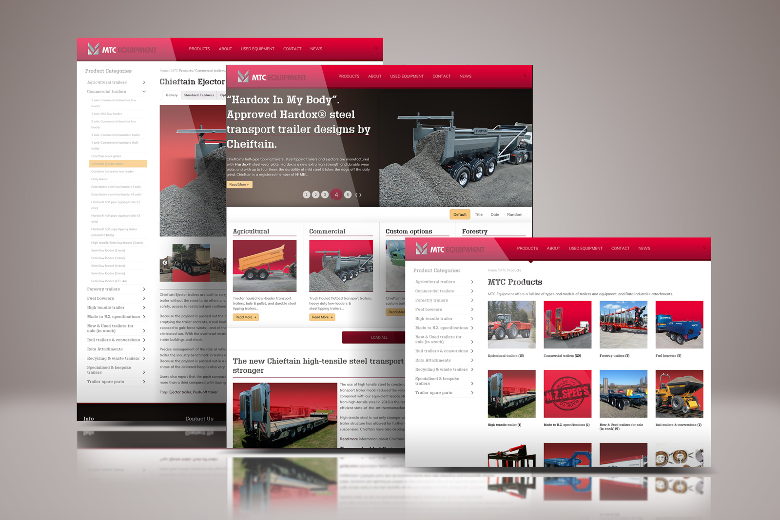
The online catalogue website is instrumental to brand launch and success going forward

Their online catalogue website is instrumental to the success of MTC Equipment selling their range of Chieftain transport trailers, other product lines, plus spare parts and after sales service.

But there is more to an impressive online catalogue than a collection of colourful pages. An effective online catalogue is a 24-hours-a-day selling machine to the domestic, Australasian and global markets. It is a website that is as effective as their leading salesperson, as knowledgeable as their top buyer and as organised as their best office administrator. The website captures online everything that is good about MTC Equipment’s business.

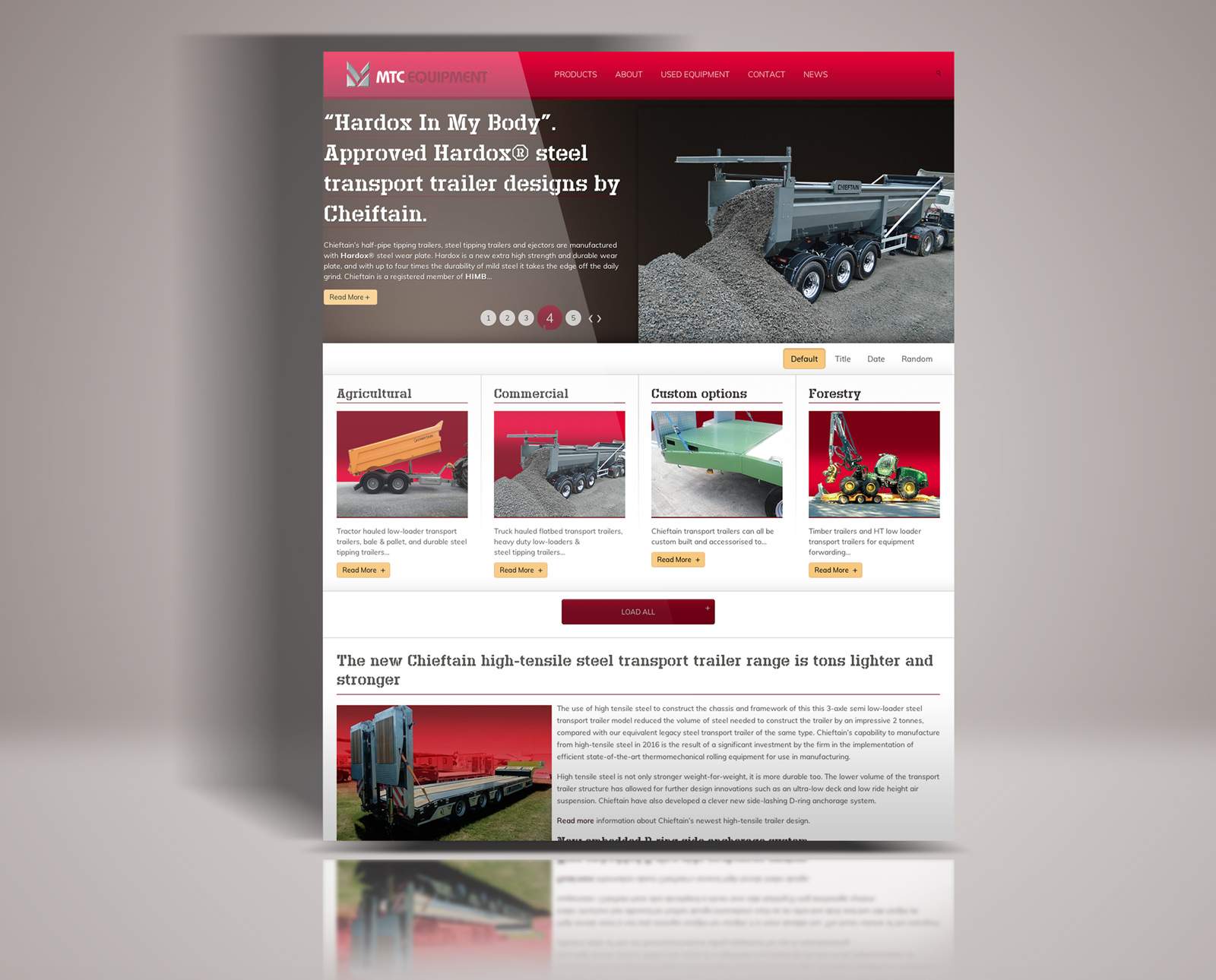
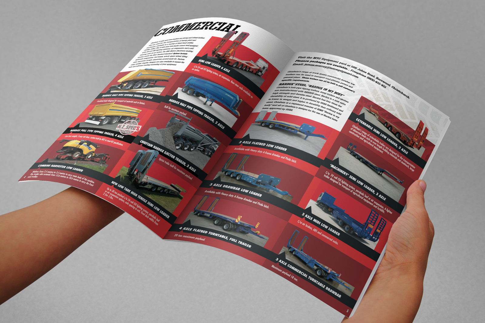
Built to order, MTC’s trailer designs offer a complex of optional extras and custom design parameters—all of which needed to be made easily accessible and easily understood.

From a web designer’s perspective, this requires an extensive graphic design and programming background. My experience and creativity in collaboration with that of the team at Dynamic Multimedia/DMM, built an effective catalogue website under my Art Direction and hands-on production effort to get to the final result.

MTC Equipment website homepage mock up

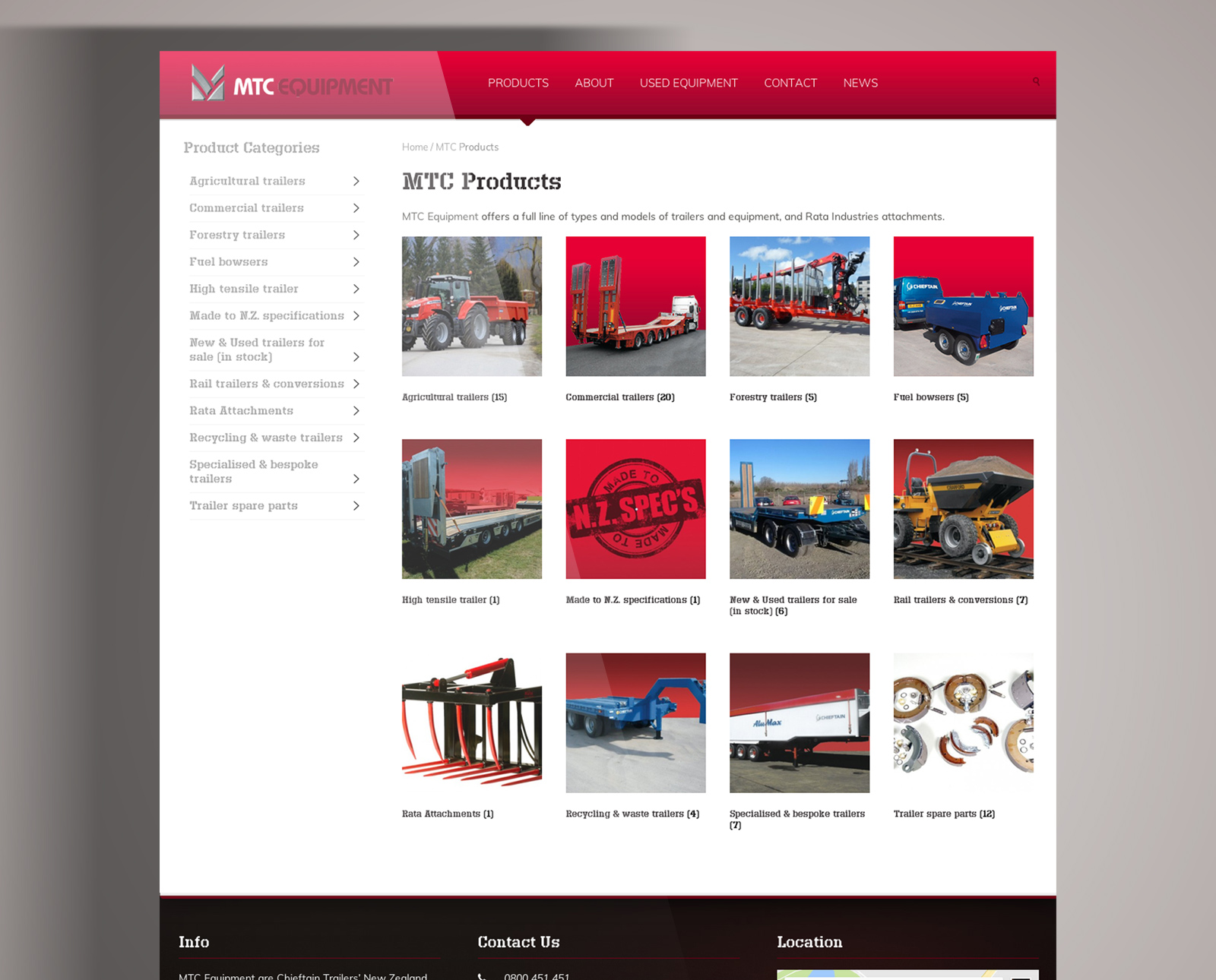
The overview of product category pages is well laid out, and user scan time is significantly reduced by offering  both visual icon and list of contents views of product categories side-by-side.

A user friendly online catalogue “Chunks” information when users are required to recall information

At the individual product “item” page level, by “chunking” complex information the catalogue item pages are simplified. So when problem solving by comparing one product with another users are best able to recall and retain information they need. This is required to attract customers and visitors.

mtc_web-product_hdr_pg-mock_1600

User scan time is significantly reduced by offering both visual and textual list of contents views of product categories side-by-side.

The ordering process is well-integrated with the product detail pages making the shopping and ordering process easier. This ease of use requires careful planning and advanced web design, but it is essential to retain site visitors and encourage them to return. If you are ready to start on a catalogue web design project contact me here.

TAKE A LOOK AT THE MTC EQUIPMENT SITE

MTC Equipment Quotation / Sales Agreement form, printed full colour both front and back.

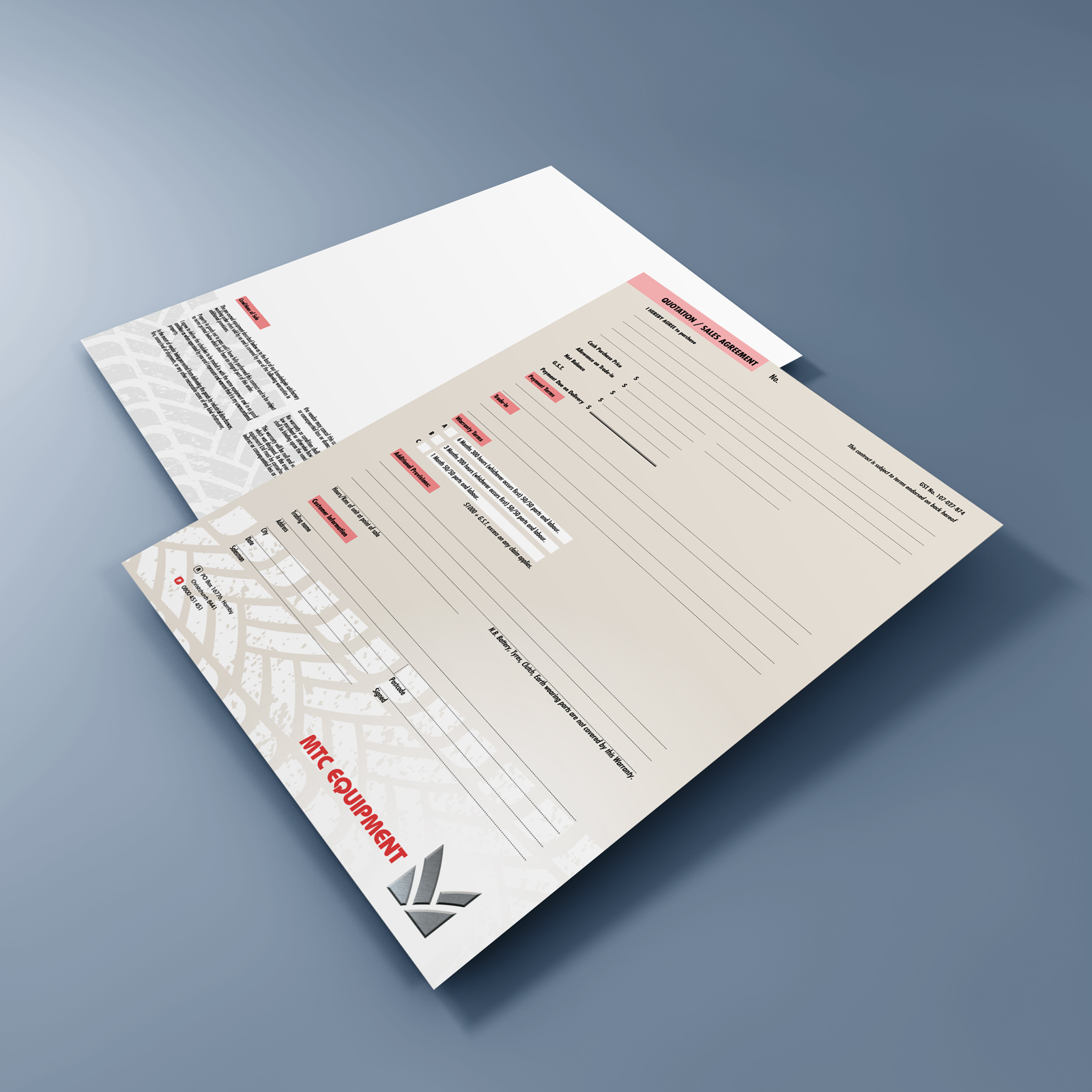
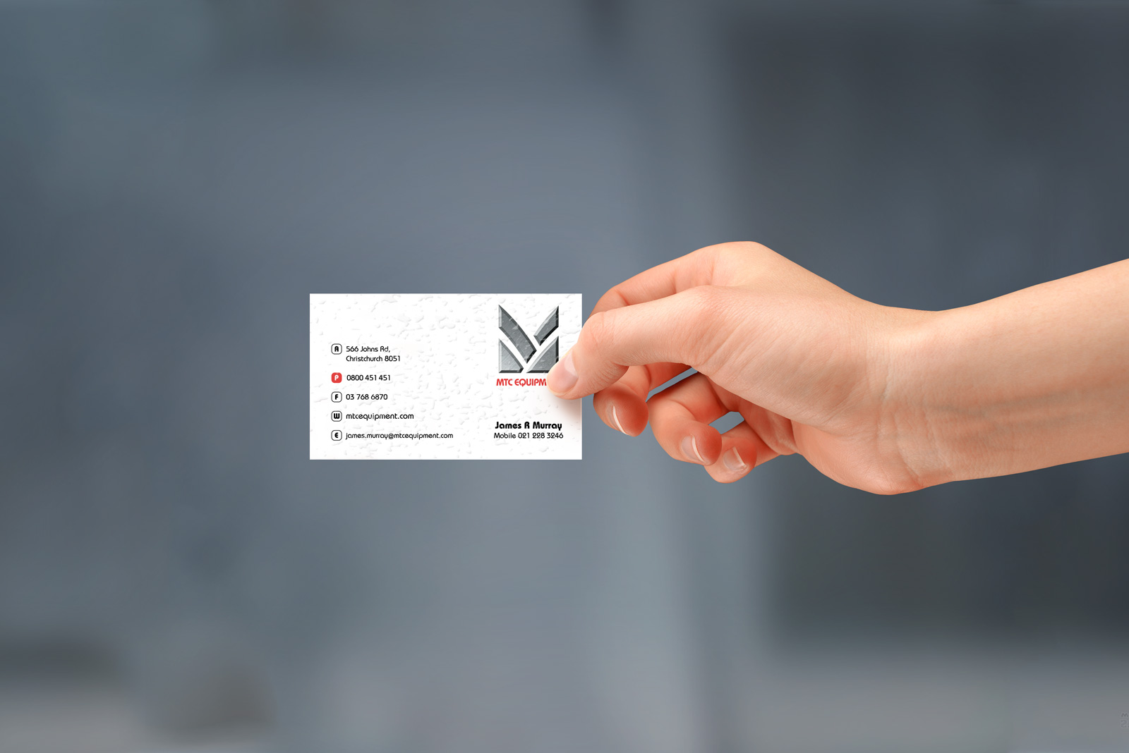
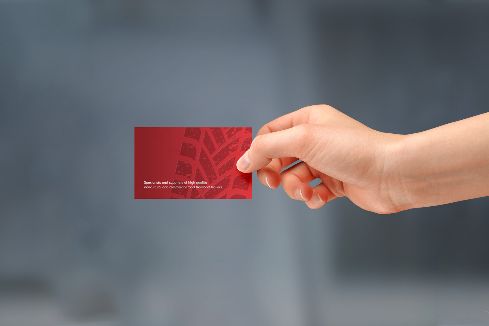
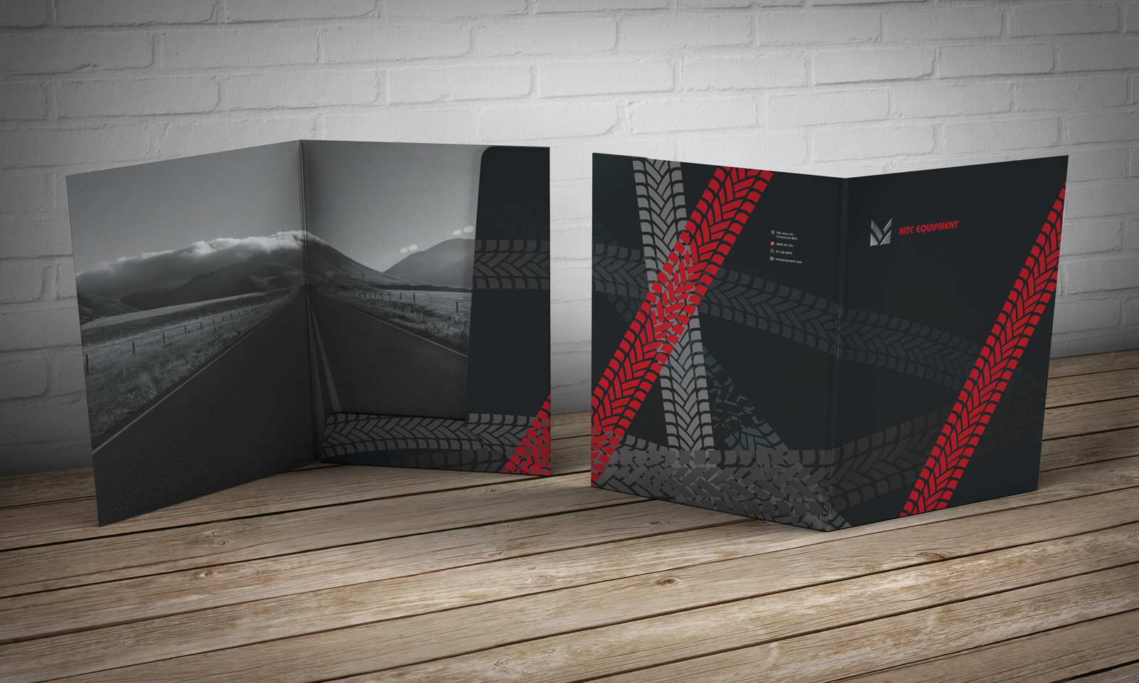
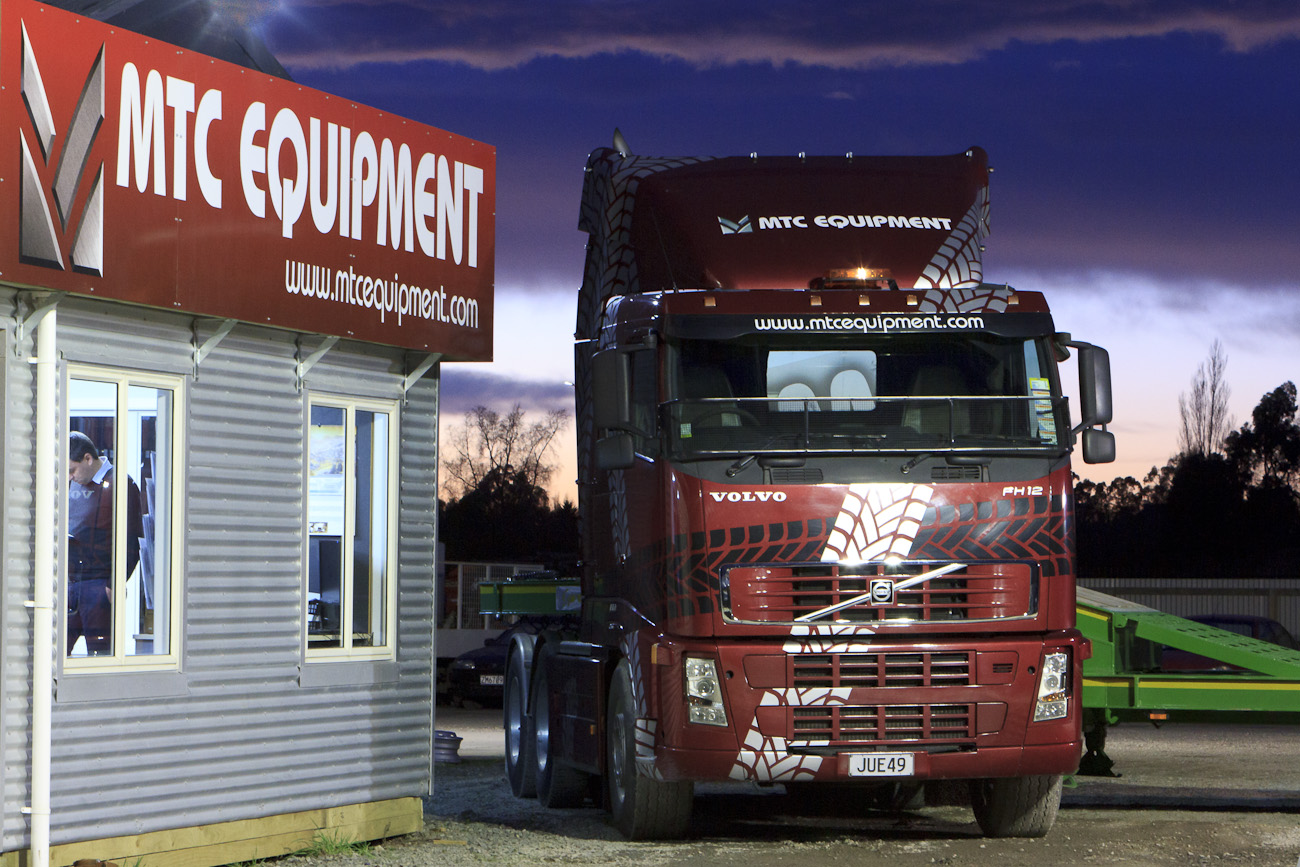
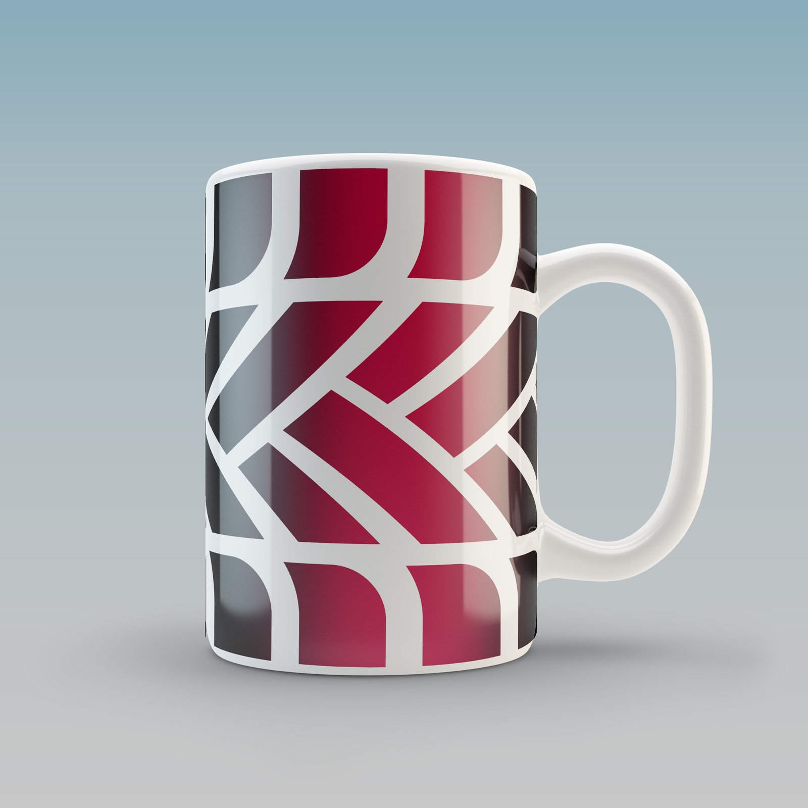
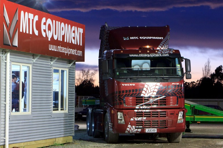
Designed on a grid, MTCs business stationery system says ‘corporate’, including this uncluttered, clean and impressive form. The system works on simple principles that are easily manipulated. The logo or “mark” is at its core, and a separate block of text and illustrated, gritty truck tyre tread developed from the logo. Combined they attractively deliver the appropriate thematic connotations of the heavy transport trailer and farm equipment “workhorse” product range.

Versatile MTC symbo

The MTC “M” Monogram was designed stand alone and for as the key repeating element of a graphical truck tyre tread pattern. This versatile illustrative brand asset stands strong when rendered with a gritty industrial look, true to the rugged, hard working character of MTC’s products and their markets.

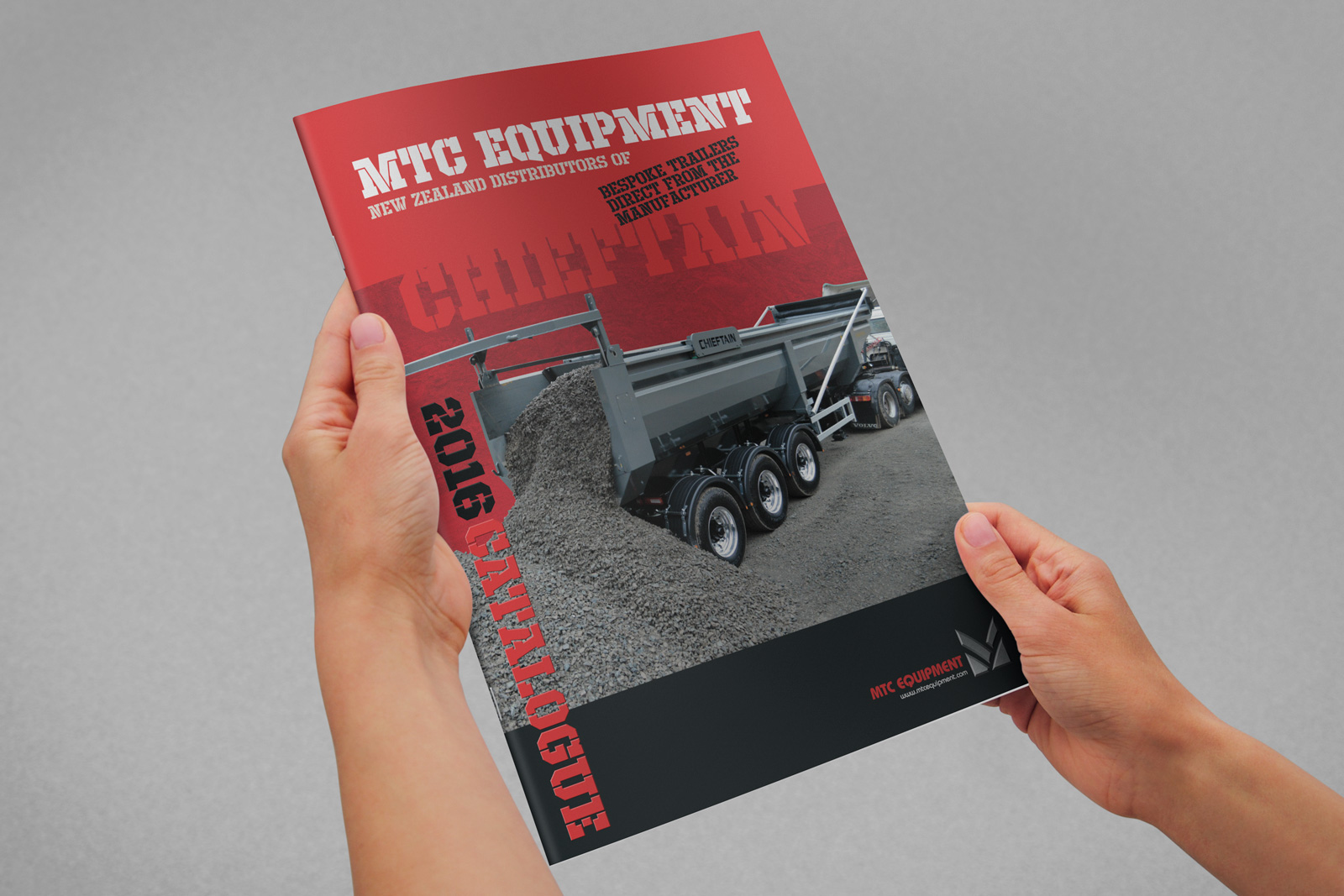
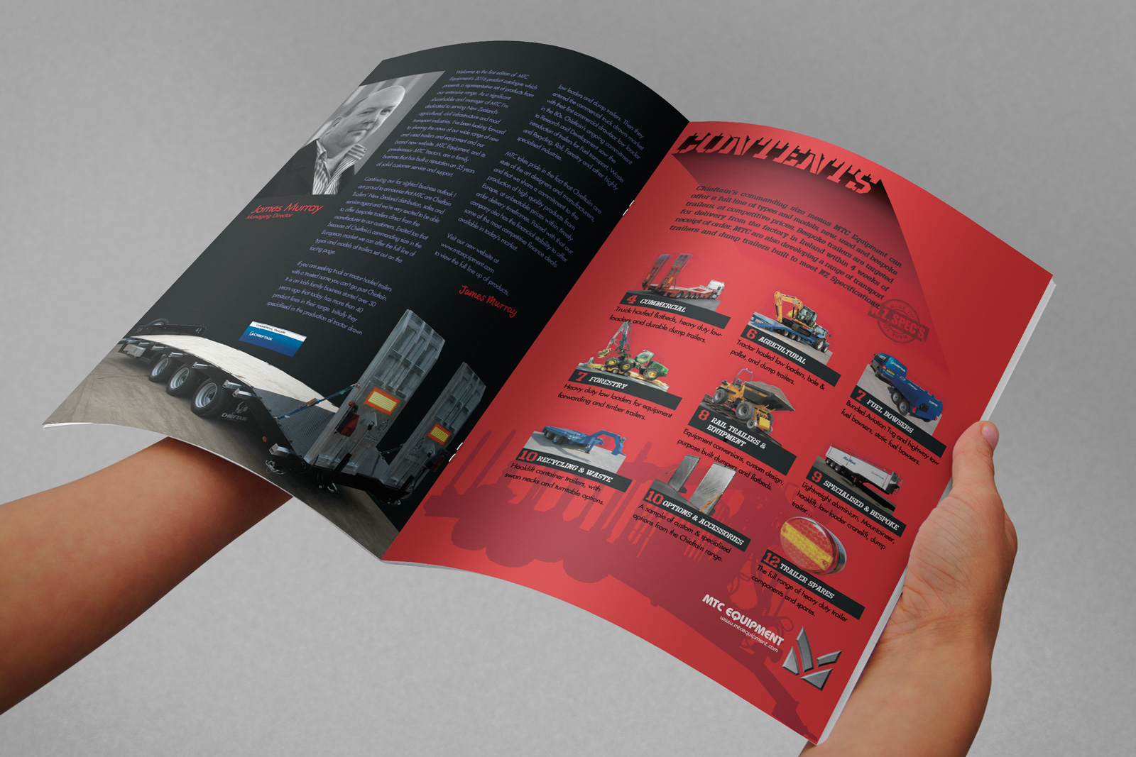
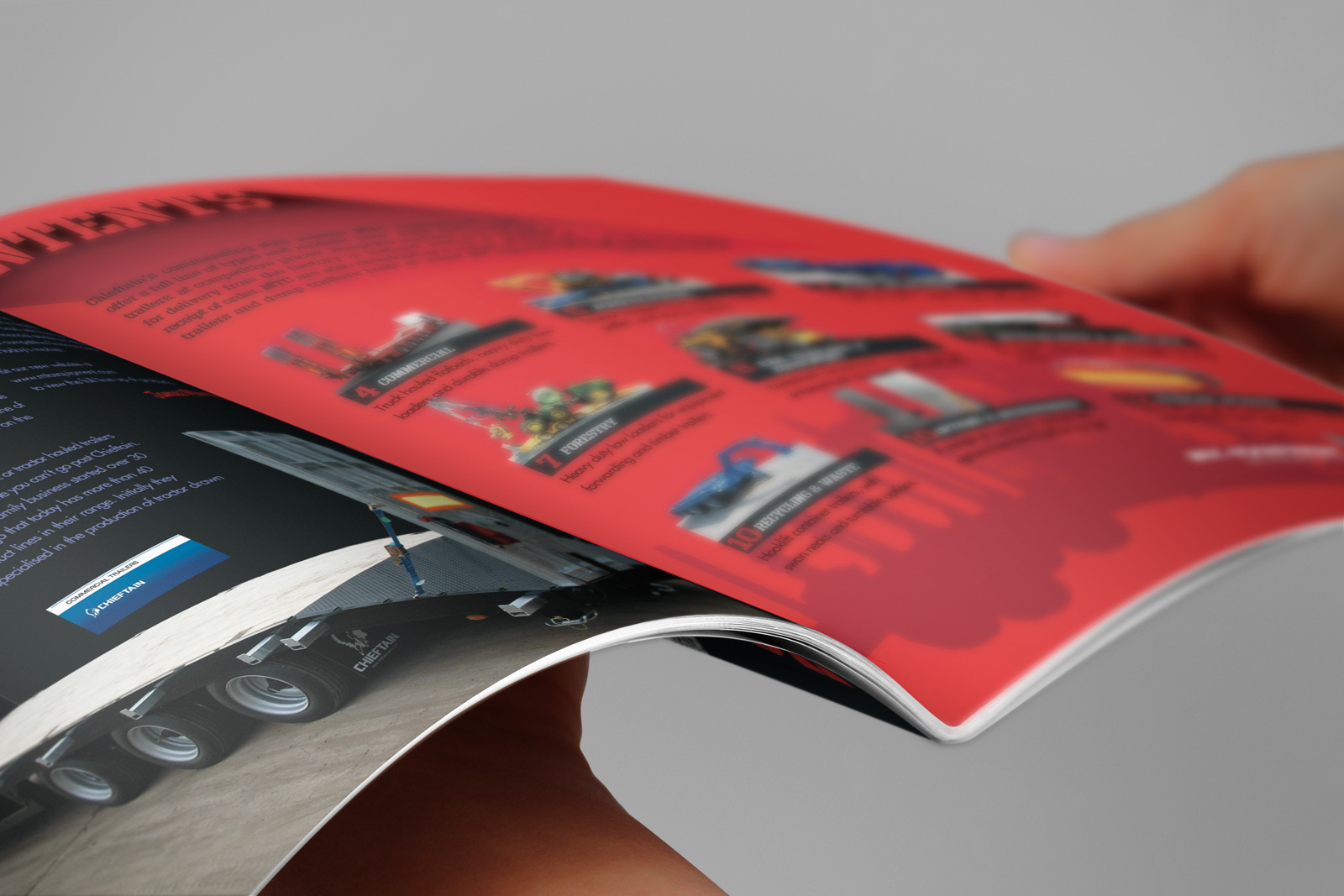
A set of stationery items and forms was followed through with a 12 page printed launch catalogue, and a print advertising campaign placed in various trade publications.Hand-held MTC Equipment business card front. Full colour front full colour back.
Handheld MTC Equipment business card back. Full colour front, full colour back.

MTC equipment 2016 A4 brochure cover, hand held mock up, photorealistic visual

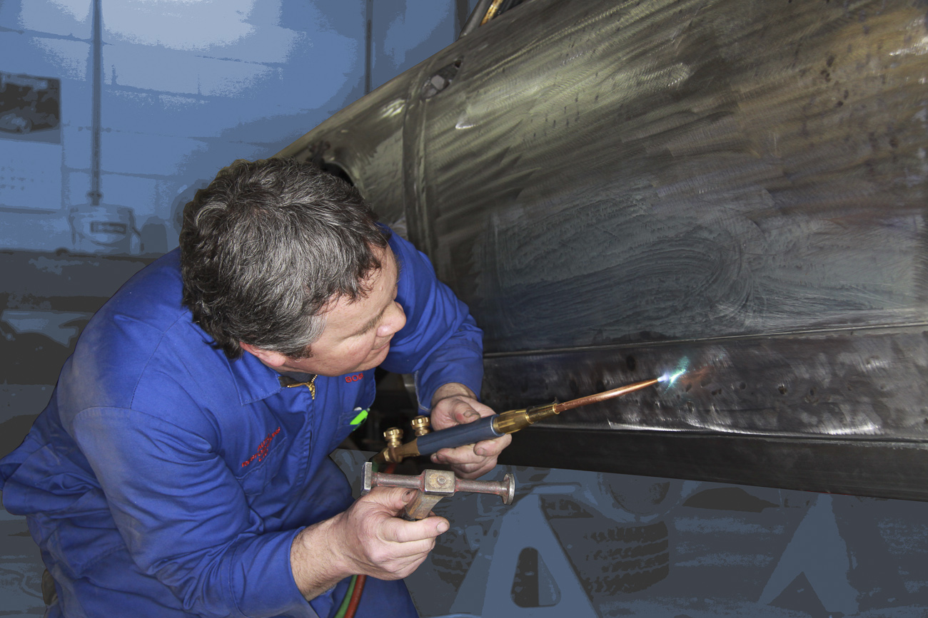
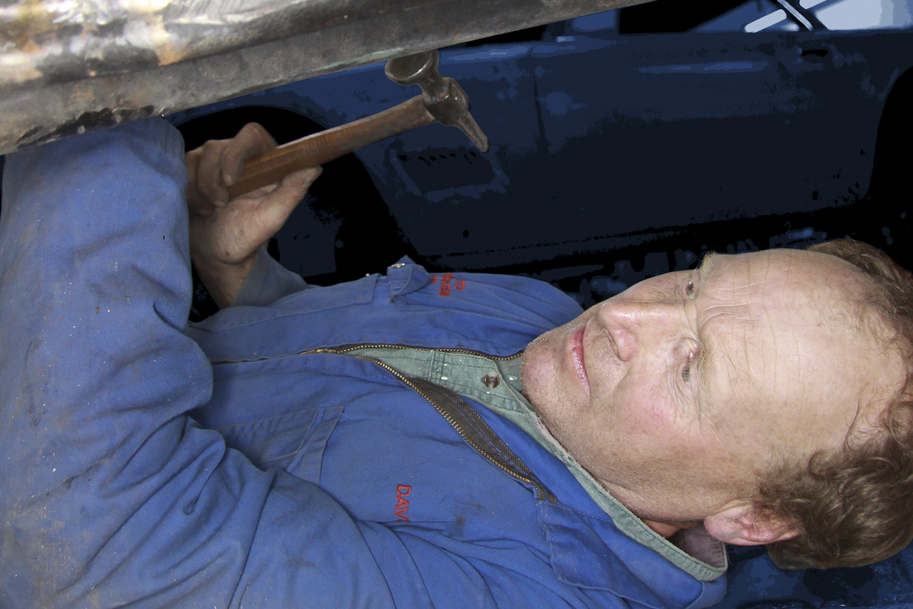
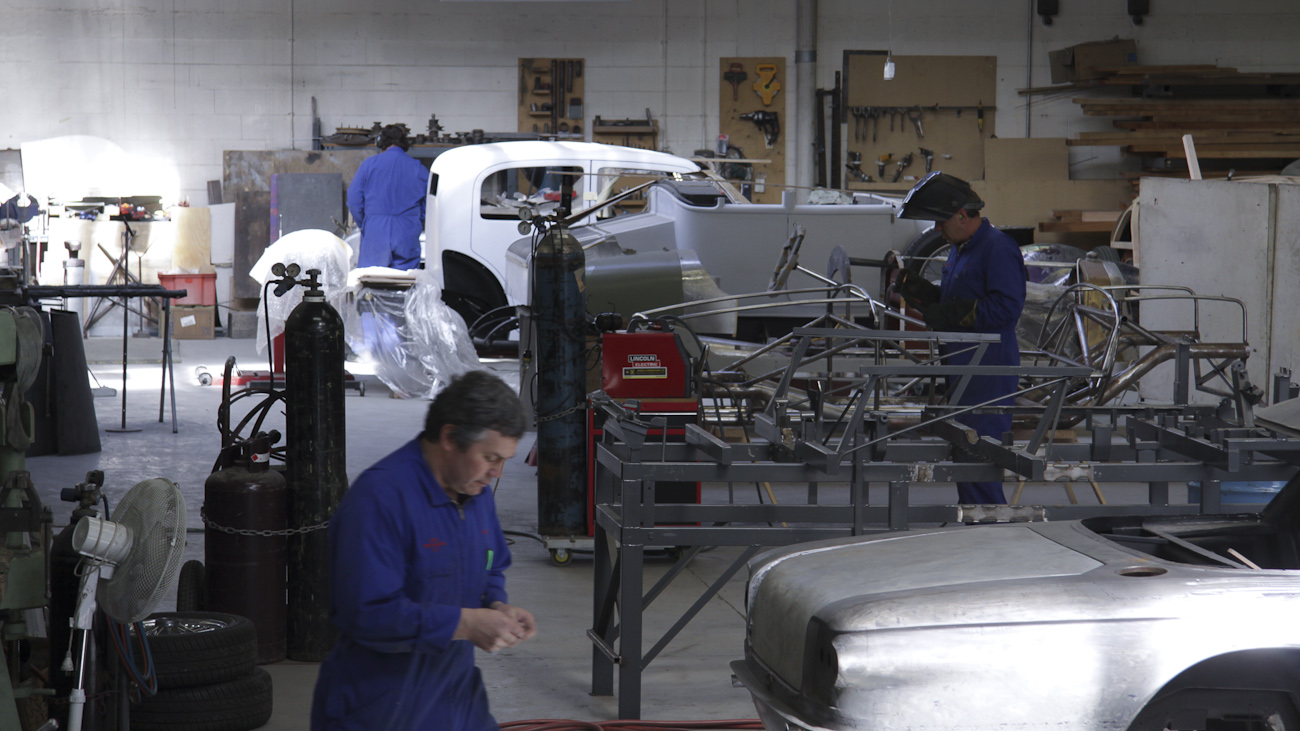
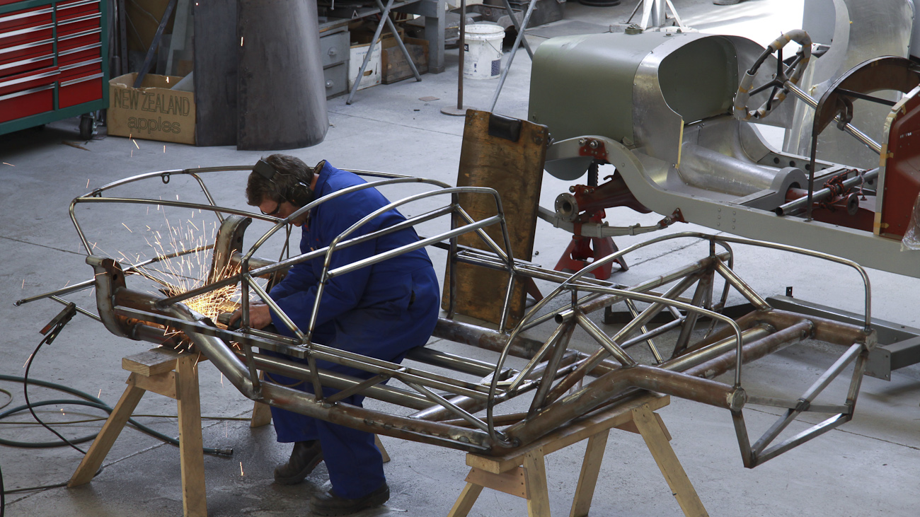
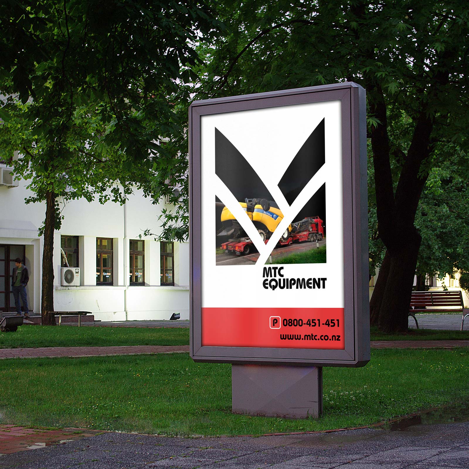
MTC Equipment is able to make a mark in the Agricultural, Industrial and Road Transport industries by creating a launch announcement and product brochure that stands out from the norm.

MTC_Brochure-A4-pg2-3-hand-held-final
MTC_Brochure-A4-pg2-3-close-up-visual-final
MTC_Brochure-A4-pg4-5-handheld-visual-final

MTC equipment 2016 A4 brochure back cover, photorealistic visualMTC equipment 2016 A4 brochure back cover, photorealistic visual

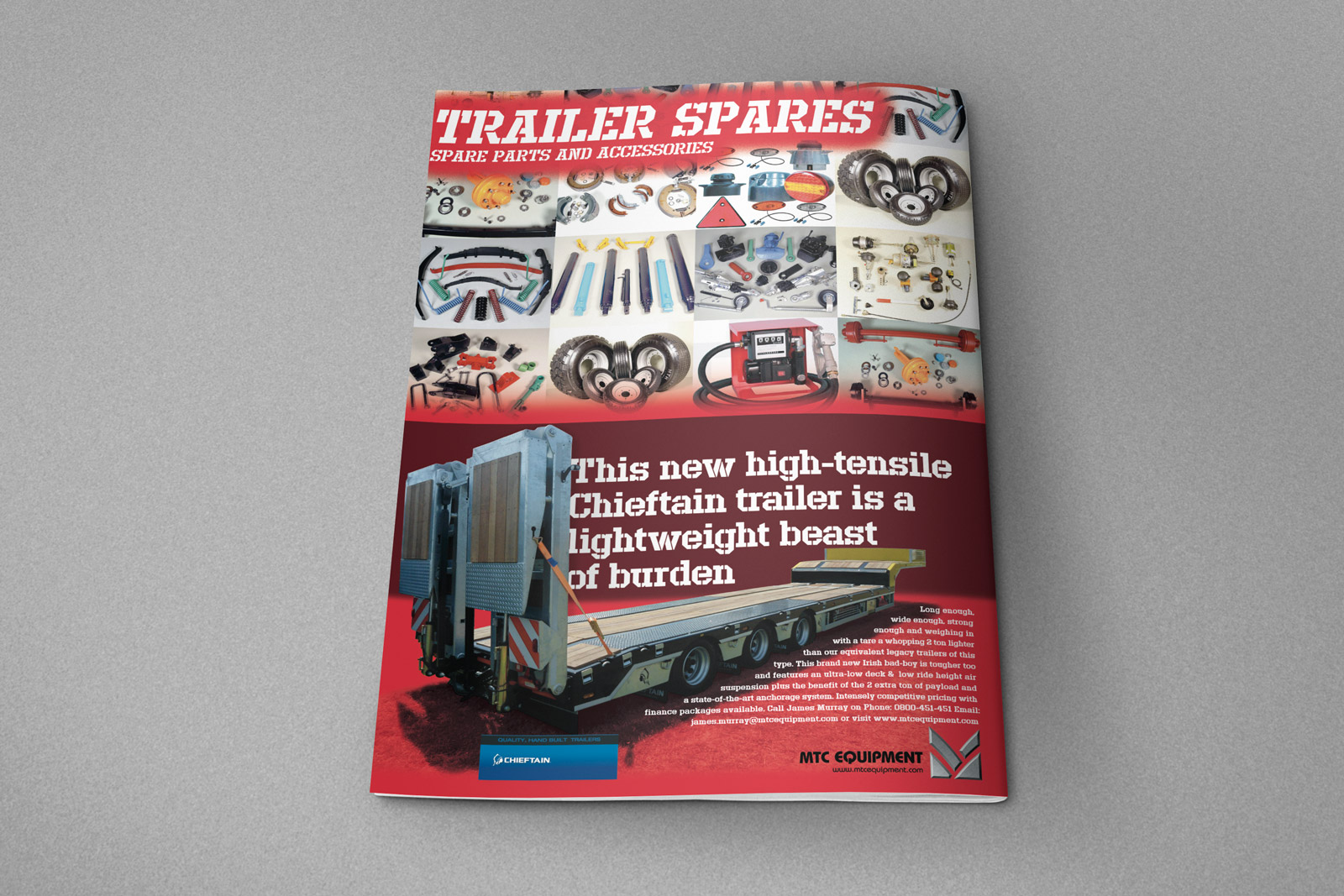
The back cover design is a break from the run of document. It features a festive display of spares and a half page horizontal advertisiment launching a new “High Tensile” semi-trailer type. The launch ad in the MTC Equipment rebrand campaign.

MTC presentation folder for holding loose sales documents and papers together to organize and protect them. Printed in full colour on both sides of heavy card stock, matt laminated and spot overglossed, folded in half with pockets. Used as a tool for business presentations to customers to aid in the sales process.

The cover graphic is a dynamic composition of the tyre tread pattern made from the MTC Monogram, the interior road photo is one that I shot near Porters Heights on the Arthurs Pass highway.

MTC exterior sign - agricultural trailer variation 2.
A white glazed ceramic mug with the MTC logo tyre tread pattern graphic wrapped around it.


Description


Project name: MTC Equipment branding
Disciplines: 
Branding / Print design / Responsive web design
Client (Industry): MTC Equipment (Automotive)
Formats: Advertising / Booklet / Brochure / Direct mail / Stationery / Website
Date: 2015


Credits


Art direction/graphic design/web design/UX design: Shaun Waugh
Copywriter: Client / Shaun Waugh
Printer: BrightPrint Limited
Web Design: MagentaDot Brands
Web development: DMM
Font credits: Defense, Futura, Futura Condensed, Impact


©magentadot brands

Nick Thomson, Eldee T.T., lightweight, Velocette special, side elevation, starboard side, petrol tank, new Eldee Velocette badge, carbon fibre petrol tank and fairing, rider, Bill Swallow, flying swallow mark, publicity photo, photographer, Shaun Waugh, MagentaDot Brands

Eldee-2 Velocette I.O.M. Classic racer launch

Before and after gallery of the equipped and race-ready Velocette special Eldee-2. These publicity photos were shot for the launch announcement and publicity purposes.

The slideshow documents the transformation from the 1950s Les Diener Eldee-2 to 2014 Nick Thomson Velocette Eldee-2 carbon fibre racing machine representing New Zealand at the Isle of Man Classic T.T., August 2014, ridded by Bill Swallow.

Eldee Velocette, front three-quarter, poster, A2, portrait, Craftsmanship

Eldee-2 Craftsmanship A2 Poster. One of a series of publicity posters designed using the publicity photos. Bike automotive engineering Nick Thomson, carbon fiber faring, seat and tank by Phil Price sculpture, “Race ready” livery photoa and publicity poster design by MagentaDot Brands.

The name ‘Eldee’ is the eponymous name that gifted Australian engineer and champion racer Les Diener (L.D.) dubbed this ‘lightweight special Velocette’ when he home-brewed this pioneering overhead-camshaft racing bike in Australia in the 50s.

July 31, 2014, Christchurch, New Zealand:
The V.R.N.Z team is proud to announce the launch of the new Nick Thomson DOHC, Dual Ignition Velocette ‘Eldee-2’, the 250cc lightweight special is equipped and ready for the Isle of Man Classic T.T., August 2014. Our rider, multiple Manx Grand Prix race winner Bill Swallow, will be competing for the new 250cc class Phil Read Trophy (the new Phil Read Trophy, will go to the first 250cc machine in the Monday’s Okells 350cc Classic TT Race). Bill Swallow is to ride the Eldee Special in the Junior Classic, 25th August.

Eldee Velocette classic racing motorcycle, Isle of Man Classic TT 2014, ClassicRacer Magazine, half page horizontal colour advertisement. Advertising design, copywriting, photography.

ClassicRacer Magazine, VRNZ half-page horizontal colour advert featuring the Eldee-2 classic racing machine in its sporting new race-ready livery. Livery, poster and logos by MagentaDot Brands.


Description


Project name: Eldee Velocette launch / publicity photos
Client (Industry): Velocette Racing New Zealand (Classic motorsport)
Disciplines: Copywriting / Digital Illustration / Photography / Promotional design and advertising / Vehicle livery / Web design
Format: Announcement / Corporate communication  / Digital Illustration / Information graphic / Social media / T-shirt / Website
Date: 2014


Credits


Design firm: MagentaDot Brands
Copywriter: Shaun Waugh
Art direction / graphic design / photography: Shaun Waugh
Font credits: Helvetica Inserat (racing numerals and decals on bike)