
The power of visual communication is the ability to…
Talk less.
Although I’ve worked on many high-profile projects, I strive to give equal attention to the more commonplace assignments and small business clients. This is the small things that need to be precise—the directional signs, capabilities brochures, websites, product packaging, corporate collateral, After almost 40 years of practice, I am still excited by that challenge and the possibilities each new project presents.
WindsorUrban | Rename & rebrand

A logo for a drainage firm client who developed into a Civil Engineering firm


IOM Classic TT campaign | The works


The attractive Terranova Tiling logo and business card. Illustrations send a powerful message. Using artwork to stir a specific feeling—in this case quality craftsmanship and attention to detail. A minimal but well crafted page layout is more professional than a flashy design poorly built.

Craftsmanship says quality. Craftsmanship is attention to detail, it is different from style, it is the fit & the finish. A modest well crafted page is more professional than a flashy design, poorly built.

Proof of concept visual of Heather’s helping hands’ screen printed in two colours on white T-shirt.

Heather’s helping hands’ business card, two-sided design.

Verso of Heather’s helping hands’ business card design.


The DLE brochure spread double as a pair of A2 promotional posters.


Runny Honey | New company name, new identity


Heather’s helping hands business card, two colour, two-sided design.
Bionona | New Positioning statement
Logo and positioning statement for manufacturer and marketer of products born of biotech research
Surface Active | The New Zealand Nature T-shirt Company.

Surface Active art-to-wear: making waves in a sea of sameness.


Two bottles of Silver Cloud at the Nelson launch event.


This one’s often overlooked by designers who make presentations on large format paper: The logo that looks great at billboard size must also work on a business card.


Arts Centre Market | Rebrand

Weststone | Rebrand

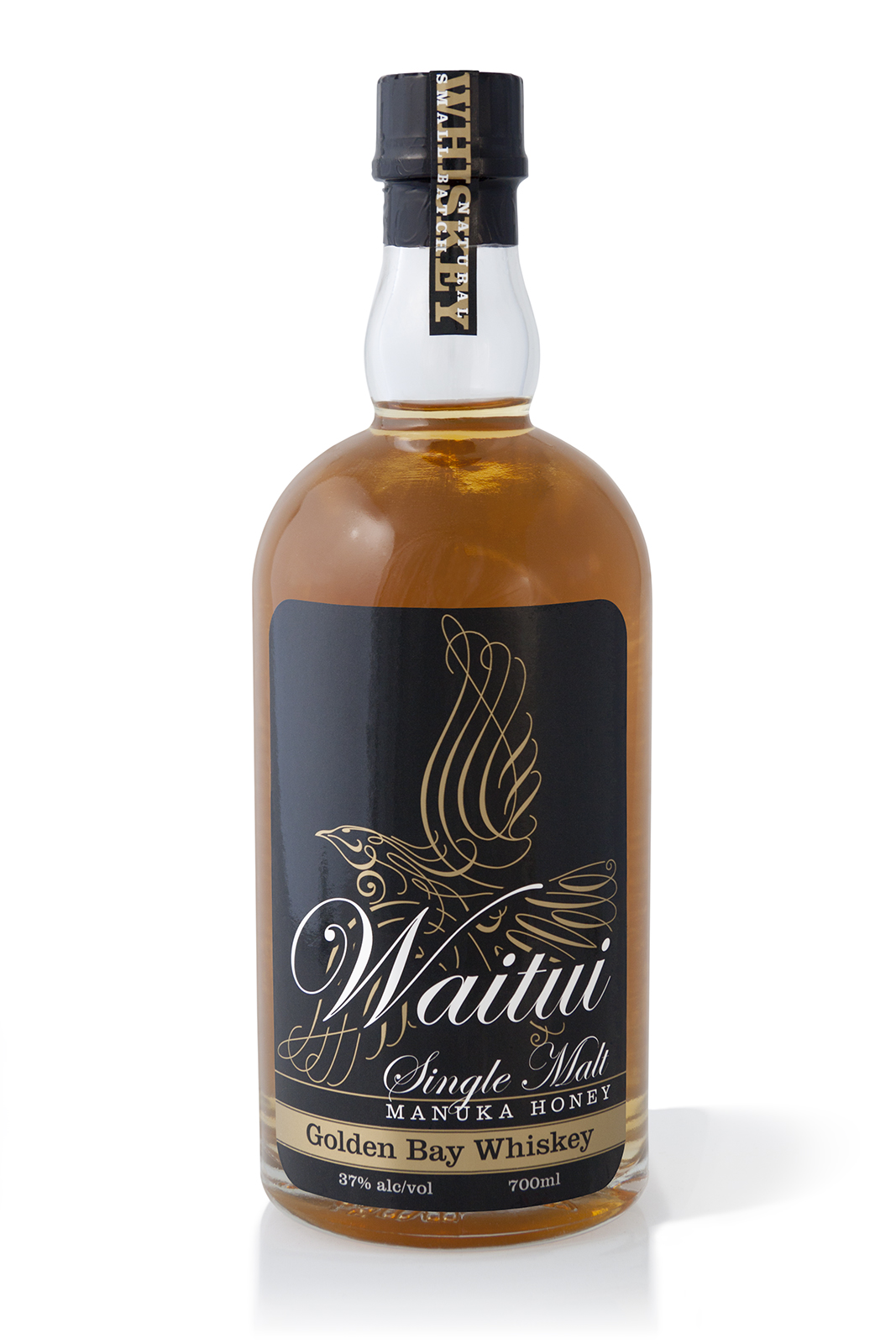
New product name, trademark and packaging for a single malt manuka honey Golden Bay Whiskey


The Auto Restorations’ logo makeoverr achieves what you want in a logo, to pull the reader in towards the centre.

Name & logo for a niche Bridal Couture firm whose owner lives in Hope


Watch This Space logo presentation document page showing an unslick iteration of the logo graffiti stencil spray bombed onto concrete.
The front cover of my Watch This Space logo presentation document depicts the logo visualised screenprinted onto the back of a woman’s red hoodie garment.
Watch This Space logo presentation document page showing awareness raising publicity poster, draft 1.
A photographer by the name of Stephan Zobeley

This noisy quarter page ad was placed in Classic Racer mag in 2014. They say red advances, blue recedes, yes sure, but blue is cool, blue is clear, blue is electric, especially a solid panel of cyan on a busy page.

The goal of this highly readable short copy quarter page ad placed in Classic Racer magazine was to telegraph its message by standing out from the crowd in other words, it aimed to achieve page dominance.


Sydney’s first and only Gayviation private air charter operator


Pomeroy’s on Kilmore custom bathroom product range packaging.
A spray tanning studio, called


Shay Hooray a.k.a The Famous Rubberband Boy heads up Pomeroy’s second first ever Laugh Inn poster

Shay Hooray a.k.a The Famous Rubberband Boy heads up Pomeroy’s second first ever Laugh Inn poster

Laugh Inn promotional posters from photos I shot at the first couple of events.


A Federated Commerce proof of concept applied to the Australian share market, the web strengthened for routing trades

Pop-up leave behind business cards are an interesting, simple and clear idea that make a great impression


A company that makes classic fruitcake in small batches
A logo for a rental property management company
A suite of RFD tag hardware and software yields efficient livestock management


Absolute Proof | New company name, new identity
A logo for a range of recycled stationery for an environmental N.G.O.


One of a series of business cards commissioned on the theme of “Catherine Harrison podiatrist”
A comic character world famous in New Zealand as the world’s loudest mime

His face and costume tells a story and by illustrating it in high contrast with the background masked out the image is transformed into one with real power. The key to audience engagement with the Mr Fungus character is to make it simple, and make it big.
A vaudevillian entertainer and a juggler with more balls than most


A small local theatre company of clowns who think globally

A photolitho service bureau and early adapter to the digital printing era

The graphic elements of Colortronic’s new logo really come into play when expressed on their business cards, stationery and forms.

The graphic elements of Colortronic’s new logo really come into play when expressed on their business cards, stationery and forms.
An immersive experience of Antarctic conditions at the Antarctica Centre
The largest hardware chain store in Iceland


A gallery shop of local artisan goods in the new Christchurch International Airport terminal building
A company that makes and retails ergonomic office furniture
A company that repairs and retails office furniture
©magentadot brands
