Three friends wearing Surface Active New Zealand nature t-shirts pose for a selfie beside New Brighton pier. Left to right the designs are Adelie penguins, paua and red-billed gull.

Surface Active—New Zealand Nature T-shirt Company stores

November 2021
Dear Surface Dweller,

We’re excited to announce our two online retail stores, the Surface Active global store and the brand new New Zealand-based store! To celebrate this significant stage in the development of our clothing brand we are rewarding our customers with a discount offer.

🛍 NZ-based store
🛍 Global store: Use code: “PERFEC” for 5% off your purchase, storewide.

Global store links: Adelie penguins, Jewelled gecko, and Kiwi iconic, light colour variant and the Treefern t-shirt, all-over printed.
NZ-based store links: Adelie penguins, Jewelled gecko, and Dolphins leaping, Kaikoura.

Actively yours,

Shaun Waugh (boss),

Chrissie Terpstra (bossier)

Read More
Birds-eye view portrait of Surface Active t-shirt’s design pARTners, Chrissie Terpstra and Shaun Waugh, wearing Harlequin and Jewelled Gecko tees, against a white background, shot in a studio in 1996.

Surface Active: The New Zealand Nature T-shirt Company

Retrospective: The New Zealand Nature T-shirt Company—Surface Active, 1986–2021

South Brighton, Christchurch, November 2021

Dear Surface Dweller, We’re excited to announce our two new online retail stores, the Surface Active <a href=”https://www.surfaceactive.nz/?pr=PERFEC”>global store and the <a href=”http://surfaceactive.digitees.co.nz/&#8221; target=”_blank” rel=”noreferrer noopener”>New Zealand-based store! We are celebrating this step forward in the development of our clothing brand with a discount offer.🛍 NZ-based store: 10% discount, storewide. 🛍 Global store: Use code: “PERFEC” for 5% off, storewide.

Surface Active well made in New Zealand t-shirt neck label.

Surface Active—The New Zealand Nature T-shirt Company, well made in New Zealand since 1986.

Back in 1986, as an illustrative graphic designer; I was a design pARTner with Chrissie Terpstra in our ‘auto printmaking’ garment screenprinting studio and clothing brand, Surface Active Artwear. We learned over the next 17 years together aboard the good ship Free Enterprise, in what began as a shared hobby screenprinting on the kitchen table, that hand-pulled screenprinting is the medium of the hard labouring graphic artist. From the drawing board, to the darkroom, to the shirtfront with squeegee in hand, to folding great drifts of cotton, employing up to four people, manning our stalls at the weekend Christchurch Arts Centre Market, The Waiheke Island market and The Great New Zealand Craftshows from Cape Reinga to Bluff… busy, busy, busy.

Overview

Of course we were big fans of the humble t-shirt. By the mid 1980s they had become hot promotional items, garments on the outskirts of fashion, and a relatively new medium for the Graphic Designer’s art. What had for a long time been considered a poor medium for Graphic Design grew to an almost essential one. All you have to do is walk down the street anywhere in the world since the early 80s to see what a ubiquitous promotional vehicle they have become. Back in the day, if you mailed out 100 potential clients a direct mail brochure perhaps 200 people will see it. But mail out, or better yet, sell 100 T-shirts, and assuming they’re at all decent looking, you launch 100 walking billboards.

‘Paua Aotearoa’, adults and kids T-shirt, four colour print on navy and black fabric.

‘Paua Aotearoa’, adults and kids T-shirt, four colour print on navy and black fabric. Placement print; four colour front, a complementary small ‘blended’ one colour print on back. Piecework; adult’s garment kowhaiwhai print on sleeves.

The trend over the past several decades has been to embrace more casual clothing, to the point of stone-washed, distressed—clothing that appears to have more life experience than the youth who wears it—though, isn’t it ironic (and oh-so bourgeois,) that all of this has in no way meant this sort of hip clothing has become less expensive or stylish. I recall my eyes watering the time I picked up a pair of name brand shotgun blasted and ripped men’s jeans in 2004, NZD$450 for the look of just having been assaulted in an alley! That’s fairly interesting. Brand awareness, including personal brand awareness has been part of this trend—to such an extent that people want, or are at least willing to flaunt, the name of the brand or designer of their shoes, jeans, and bags on the items in question. In short clothing manufacturers made their products promotional vehicles for themselves.

Surface Active T-shirts celebrate New Zealand’s unique assets

Surface Active Mark III Zephyr “Kiwi Space Shuttle” black teeshirt

Surface Active ‘Kiwi Space Shuttle’ tee, mixed media, digital illustration.

Promotional teeshirts take this walking billboard concept one step further by being clothing that promotes products, services, cultural and ideological views in such a way that the wearer is willing to be identified—whether through a sense of aesthetics, humour, social responsibility, irreverence, or loyalty to a watering hole, cultural institution, environmental organisation or charity. People are willing to wear someone else’s message because they feel it says something about themselves—which is the essence of fashion. Initially our T-shirts were retailed by us at our stall at the Christchurch Arts Centre Market, also by direct mail to the list we collected, and at Great New Zealand Craftshow events nationwide. We grew to be wholesalers to environmental organisations such as Greenpeace and the Maruia Society, for inclusion particularly in their annual pre-Xmas direct mail catalogue campaigns and sold in their retail stores. As design pARTners in the visual arts Chrissie and I applied our teeshirt design skills to everything from promoting small businesses and one-time events, to our wildlife art, Kiwiana and nuclear free collections. We wholesaled to the likes of Wild Places and The Epicentre, Christchurch’s two ecostores, and as mentioned, to Greenpeace and the Maruia Society. Our market developed to include DoC visitor centres and similar conservation themed retail outlets in National Parks and in the brand new, prestigious Te Papa store in Wellington. As our business and reputation grew we were commissioned by tourist attractions like the International Antarctic Centre, Orana Park and certain Doc conservancies to design and produce custom ranges of adult and children’s shirts.

The 2021 digital design collection in our two online retail stores, that I have been developing since 2008, is based on the archive of our ‘analogue’ and computer aided Surface Active New Zealand Nature T-shirt Company range produced 1986–2004.

In terms of our T-shirt design itself, it evolved from straightforward application of flat shape illustrations like the Dolphins Leaping design, handcut from Rubylith, to hand separated multicolour drawings, cartoon images, to symbols or logos, all screenprinted by Chrissie and I after work on the kitchen table in our flat in 1986. In the beginning sometimes these prints were devised to be handpainted to finish, or in the late 90s to approaches that treat the shirt as a canvas, involving printing the garments as piecework prior to being stitched up by local seamstresses. Whereas our early designs simply applied graphics to the front of the shirt, our designs developed into appearing on the front and back, wrap around, and encircling the hems and sleeves. Treating the T-shirts as the design of a piece of clothing in the round. We also developed from printing white and light coloured shirts to custom batch dying them in vivid dark hues and speciality, more technically challenging and laborious “dark shirt” printing. The Direct-to-garment digital printing that enables the one-off printing of the Surface Active range of designs today, that is a whole ‘nother ball of wool. In a nutshell it is a process of printing on textiles using specialised water-based inks and inkjet technology whereby the prints form a very strong bond between the garment fibres and the pigmented inks. What follows is a historical record of Surface Active’s methodology.

The mechanics of hand-screen printing fabric do not change

Final heat cure of the print on the pallet, stripping the finished Tees off and reloading the next run of 10. This process start to finish took two people labouring hard-out for 45 minutes

Final heat cure of the print on the pallet, stripping the finished Tees off and reloading the next run of 10. This process start to finish took two people labouring hard-out for 45 minutes. A lunch break from this hard labour on your feet the whole time was essential, sit-down lunches at the table which amazing Chrissie Terpstra cooked for our crew of Screen Gems every single day! Morning and afternoon coffee/tea and snacks were delivered and consumed on the fly.

When you are printing on cotton fabric with seams you cannot get the kind of fine detail you can printing on paper. The fabric absorbs the inks or dyes and the colour spreads through the fibres. With our layered or hand-separated multicolour designs the colour is laid down in areas with the hand-pulled process, with “flash-curing” of the print between colour passes, in some cases up to 10 passes to print one garment one colour at a time.

Fabric colour and the issue of “hand” or feel of the fabric printing inks

‘Jewel Gecko - New Zealand’ eight colour T-shirt print on dark green fabric. ‘Jewel Gecko – New Zealand’ eight colour T-shirt print on dark green fabric. Placement; Eight colour front print, one colour kowhaiwhai print front and back around hem.

The reason for selecting water based inks and dyes as the better printing option, other than avoiding toxic (and highly hazardous) solvents that are used for printing “Plastisol” inks, is that of the “hand” or feel of the ink on the garment. Water-based inks have a nicer feel to them but they are more difficult to work with as they easily cure, “dry in” or clog the stencil especially in peak demand hot summer weather, rendering it useless and in need of remaking. Waterbased dyes have no “hand” to them as such as the screenprint literally dyes the light coloured fabric.

Custom designed and built in-line printing workshop

We developed a custom in-line sequential printing methodology, rather than rotary print methodology in our back-shed “sheltered workshop” to successfully overcome the drying-in drawback of waterbased printing dyes and acrylic Supercover inks. It was achieved by way of additional manual labour and an innovative use of our own design of screen holding humidifier boxes for keeping the ink and screens moist between print runs.

High cover ink system

‘Harlequin Gecko - New Zealand’ eight colour T-shirt print on charcoal marle fabric. ‘Harlequin Gecko – New Zealand’ eight colour T-shirt print on charcoal marle fabric. Placement; Eight colour front print, one colour woodcut print front and back around hem.

If you want to lay down a light colour on a dark shirt you have to use acrylic Super-cover inks, in some cases laying down two light coats to best build opacity while preserving detail. Flash curing in between is the only way ensure print quality is maintained throughout the print run. If your dark shirt design has a lot of solid light ink coverage you end up making something that has the feel of a bullet-proof vest when you’re wearing it. We avoided this by planning our designs to combine both ink and dye passes, colours darker than the fabric colour are dyes, lighter ones are super-opaque acrylics, all required flash curing between. The other huge benefit with water-based inks, aside from wash-up with water, and their “thinners” being water, is that the finished garment once flashed off to the point of being touch dry is given a final cure in just 20 minutes in a domestic tumble dryer rather than a 6m long high-tech curing oven.

Surface Active wildlife collage design fabric print on bedding set. Surface Active wildlife collage design, step and repeat one colour fabric print on custom bedding set.

Optimising the illustration workflow for easy printing and graphic quality

‘Ocean - New Zealand’ one colour children’s T-shirt print on navy blue and jade green fabric. ‘Ocean – New Zealand’ one colour children’s T-shirt print on navy blue and jade green fabric. Placement; One colour front and back. ‘Puff’ printed emboss effect ink.

One of our specialities is one colour “puff printed” designs, the so called puff inks contract when cured and so draw up the fabric surface. This has a tremendous tactile and visual effect on single colour dark shirt prints such as the Tuatara and children’s Ocean and Forest floor designs. I developed a variation of drawing wildlife art based on classic zoology methods, using mixed media, charcoal pencil with pen and ink on coquille board to achieve a crisp “line and tone” effect from one colour “line” images.

Regarding the gallery and our T-shirt models

As with other portfolios on the site Archive the over 40 designs included here are collected from the period between 1988–2002 of our Surface Active printed garment editions.

‘Weta - New Zealand’ T-shirt, adults and kids, on oatmeal and grey marle fabric. ‘Weta – New Zealand’ T-shirt, adults and kids, all-over printed on oatmeal and grey marle fabric. Adult garment a six colour print. High quality custom, workmanship. Cut and sew assembly. Products made in Christchurch, New Zealand, 1999–2002.

A shout-out must go to our T-shirt models from back-in-the-day, the kids are all 20-or-30-something now at time of writing. Our compliments and lasting gratitude are also due to their T-shirt modelling parents, our friends. SurfaceActive employed most of them as our highly-trusted sales crew at our stall at the Christchurch Arts Centre Market, come rain or shine, year-round 1988–2002. Credits Design and Art Direction: Design pARTners, Chrissie Terpstra and Shaun Waugh Graphic designer, illustrator, print production/‘pre-press’: Shaun Waugh Hand-pulled screen printing: Surface Active: Chrissie Terpstra and the Surface Active “screen gems” crew

©magentadot brands
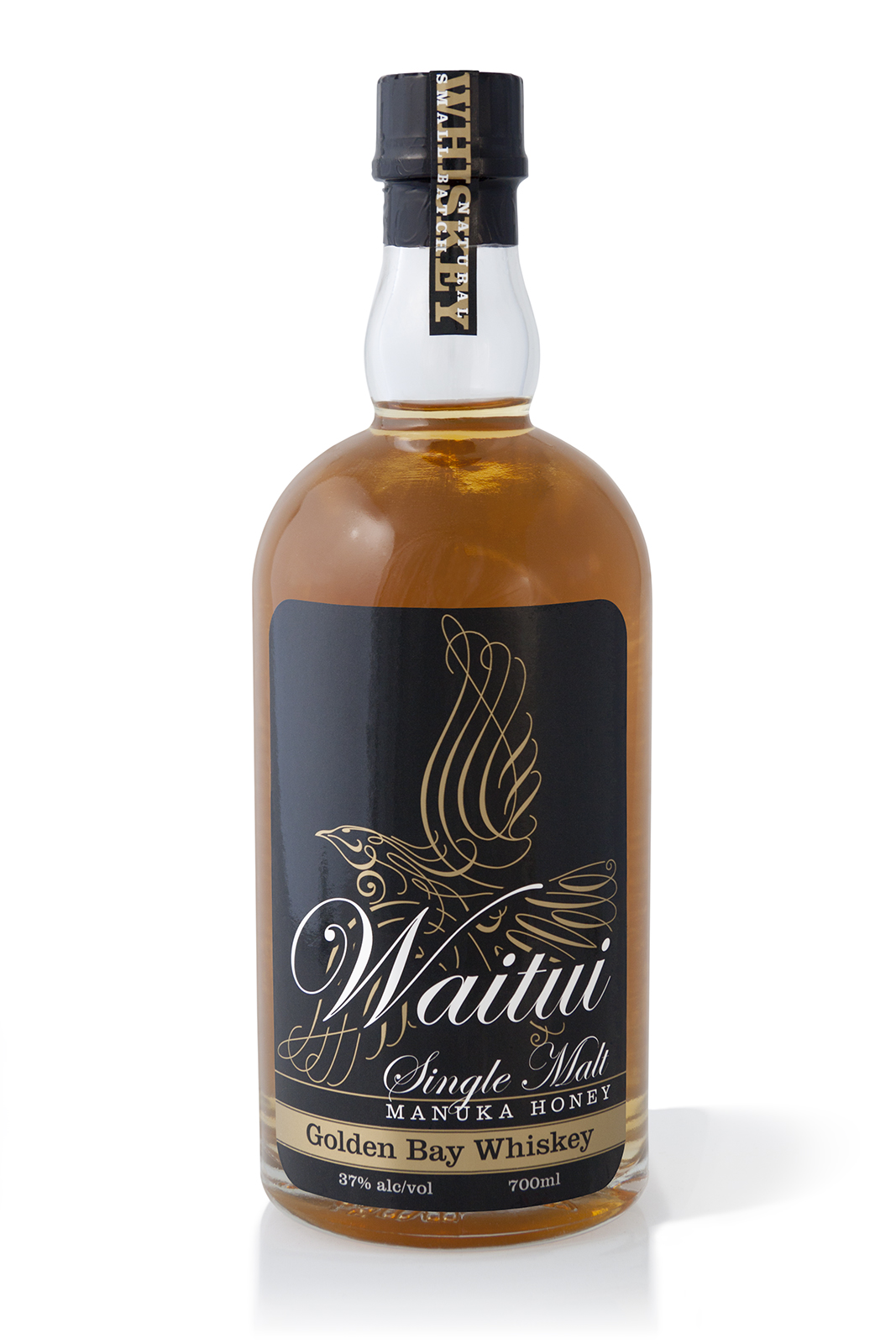
Waitui Single Malt Manuka Honey Golden Bay Whiskey full packaging label system, front, back and top. Waitui is a small batch Whiskey, barrel aged 4 years. Hand crafted in Takaka, New Zealand.

Waitui single malt: name, logo & packaging

Waitui logoWaitui, a Small Batch, Single Malt, Manuka Honey, Golden Bay Whiskey, a unique New Zealand made prestige product, one of the few true ‘Honey whiskies’ made in the world today—in Takaka, Golden Bay.

Waitui, previously named ‘Bush Whiskey’ required renaming, rebranding and packaging to a standard that properly reflects the product. The result of the rebrand and repackaging has been outstanding at achieving the client’s goals; greatly increasing sales volume, profitability, and enabling the product to be distributed to prestige Whisky specialist retailers such as Whiskey Galore in Christchurch.
Keep on reading!

Silver Cloud, 100% Blue Agave Spirit, Terry Knight

Silver Cloud 100% agave spirit launch event

Silver Cloud product launch even invitation.

Silver Cloud product launch even invitation.

A documentary photo essay that I shot of the fabulous Silver Cloud 100% Pure Agave liquor launch event at Nicola’s Cantina in Nelson New Zealand.

The feature of the launch event was the auction by Terry Knight of only the first two of the thirty bottle limited release, bottles number 30 and 29, which sold on the night for a tidy NZD$400 and $450 respectively, a fitting testament to the quality of the pure agave liquor, the packaging, the branding and the success of the well promoted and event managed launch of event.
Keep on reading!

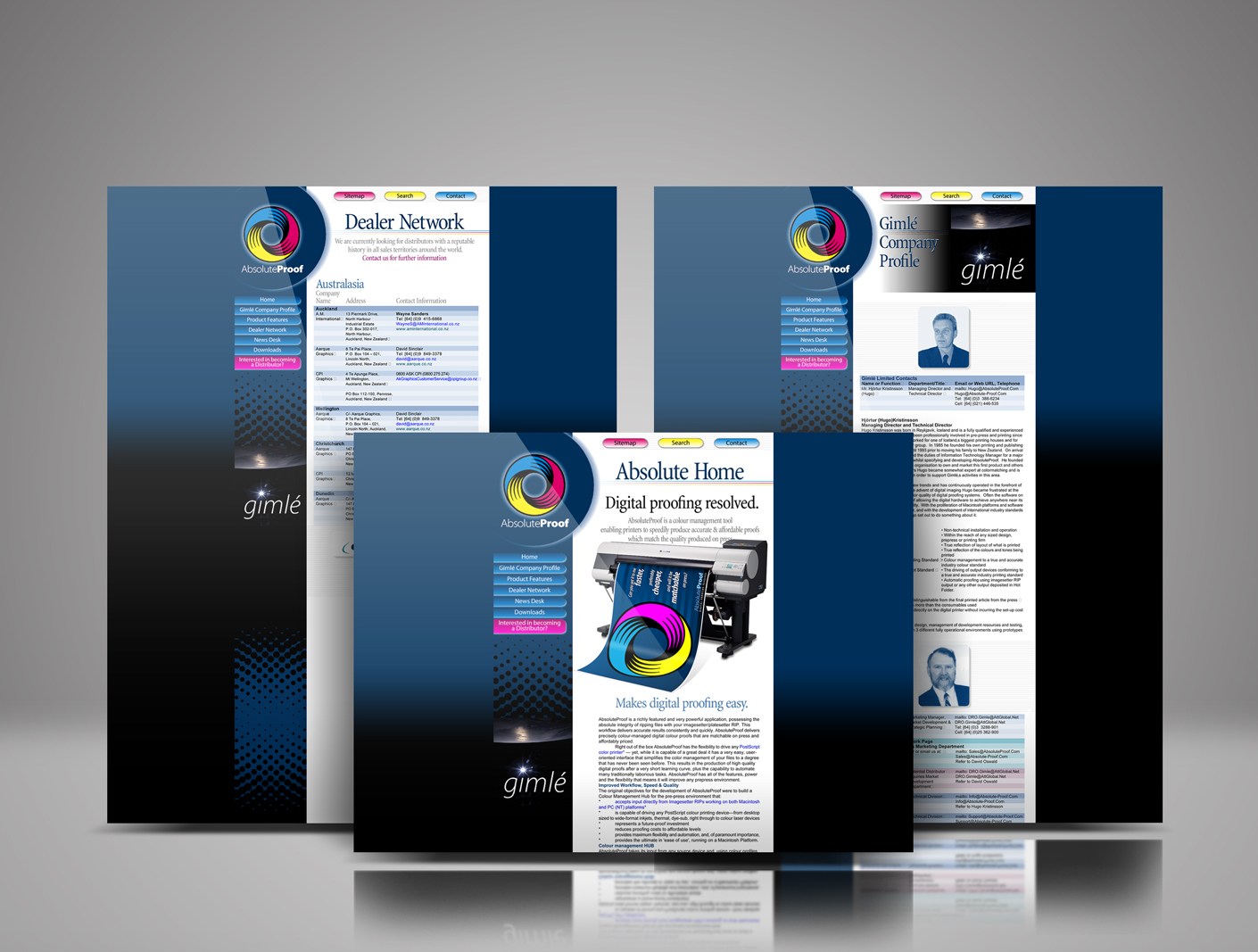
Absolute-Proof website 1998 launch design

Absolute-Proof digital proofing launch website 1998

Absolute-Proof | Digital Proofing Resolved | The 1998 product, website and brand launch

AbsoluteProof_logo_radiused_256px

Best-in-class colour-managed workflow hub / digital proofing software solution, brainchild of brilliant friend pre-press professional Hjórtur Kristínsson, named by me ‘Absolute-Proof ’, launched in 1998, this was the first iteration of the web design I designed for the product launch. The launch was aligned with Hugo showing at the Drupa print fair in Dusseldorf that year. The AbsoluteProof website was developed in collaboration with a web design firm in Reykjavik, Iceland.
Read More

A logo for a website mapping all of Christchurch’s post earthquake recovery street art

Top Marks: top 40 logos

Waitui Single Malt Manuka Honey Golden Bay Whiskey packaging label
The power of visual communication is the ability to…

Talk less.

Although I’ve worked on many high-profile projects, I strive to give equal attention to the more commonplace assignments and small business clients. This is the small things that need to be precise—the directional signs, capabilities brochures, websites, product packaging, corporate collateral, After almost 40 years of practice, I am still excited by that challenge and the possibilities each new project presents.
Keep on reading!

Windsor Urban brand use document cover

Brand use guide: WindsorUrban

Setting brand standards that people will follow

WindsorUrban symbol and type logo greyscale iconThe brand use manual or corporate identity guide ensures the new WindsorUrban logo is applied correctly in every application where WindsorUrban is identified. The purpose of the brand manual is to enable and regulate a uniformity in the firm’s visual image. WindsorUrban aims to design and manufacture the “go to” product and service offering within their market niche, the brand that their customers think of first when they want urban furniture and street lighting. The guide’s basic job is to teach everyone who uses it, what the brand is and how to effectively implement it.
Keep on reading!

WindsorUrban custom Microsoft Word quote template document.

Word template for WindsorUrban

A user-friendly and attractive quotation template

Windsor UrbanThe chief benefit of the WindsorUrban rebrand is that the company’s vision and personality across traditional and interactive media now has the same voice. The new brand accurately reflects the company’s personality and supports the sales and marketing team. A well-written and perfectly formatted Microsoft Word quote document that’s high on readability and clearly laid out information makes the job of responding quickly to client requests, and of presenting a professional image, a lot easier for the sales staff.
Keep on reading!

Pionair Unparalleled Journey’s “Affluent Travel” Agency toolkit. Ringbinder of agent information.

Pionair: Oceania “Affluent Travel” kit

Unparalleled Journey’s “Affluent Travel” toolkit… the essentials.

Pionair logo, rebrandAside from being a private air charter firm, owning aircraft and having air crew and air operations personnel on staff, Pionair was also a “best-in-class” inbound wholesale travel operator to the world’s finest destinations in the Oceania region.

The Pionair travel department had a group focussed on designing, marketing and operating escorted group air tours and a Free Inboard Travel, Unparalleled Journeys (UPJ) “affluent travel” group whose clientele was high-end travel agents in the U.S. and internationally.
Keep on reading!

Waitui bottle labelling and gift packaging

Waitui product launch proposal

Introduction

Waitui logoThe product launch of the MagentaDot Brands renamed, rebranded and repackaged “Waitui Single Malt 6 year aged” is a critical time in the early stage of introducing this New Zealand Manuka Honey Small Batch Whiskey to the domestic and international liquor markets. Kiwi Spirit distillery is a small company so to create a big launch takes careful planning and sufficient lead time to organize all the contributing components. This is a company with small budgets and limited resources so there is a need to get as much value out of the budget and resources as possible.
Keep on reading!