Waitui Single Malt Manuka Honey Golden Bay Whiskey full packaging label system, front, back and top. Waitui is a small batch Whiskey, barrel aged 4 years. Hand crafted in Takaka, New Zealand.

Waitui single malt: name, logo & packaging
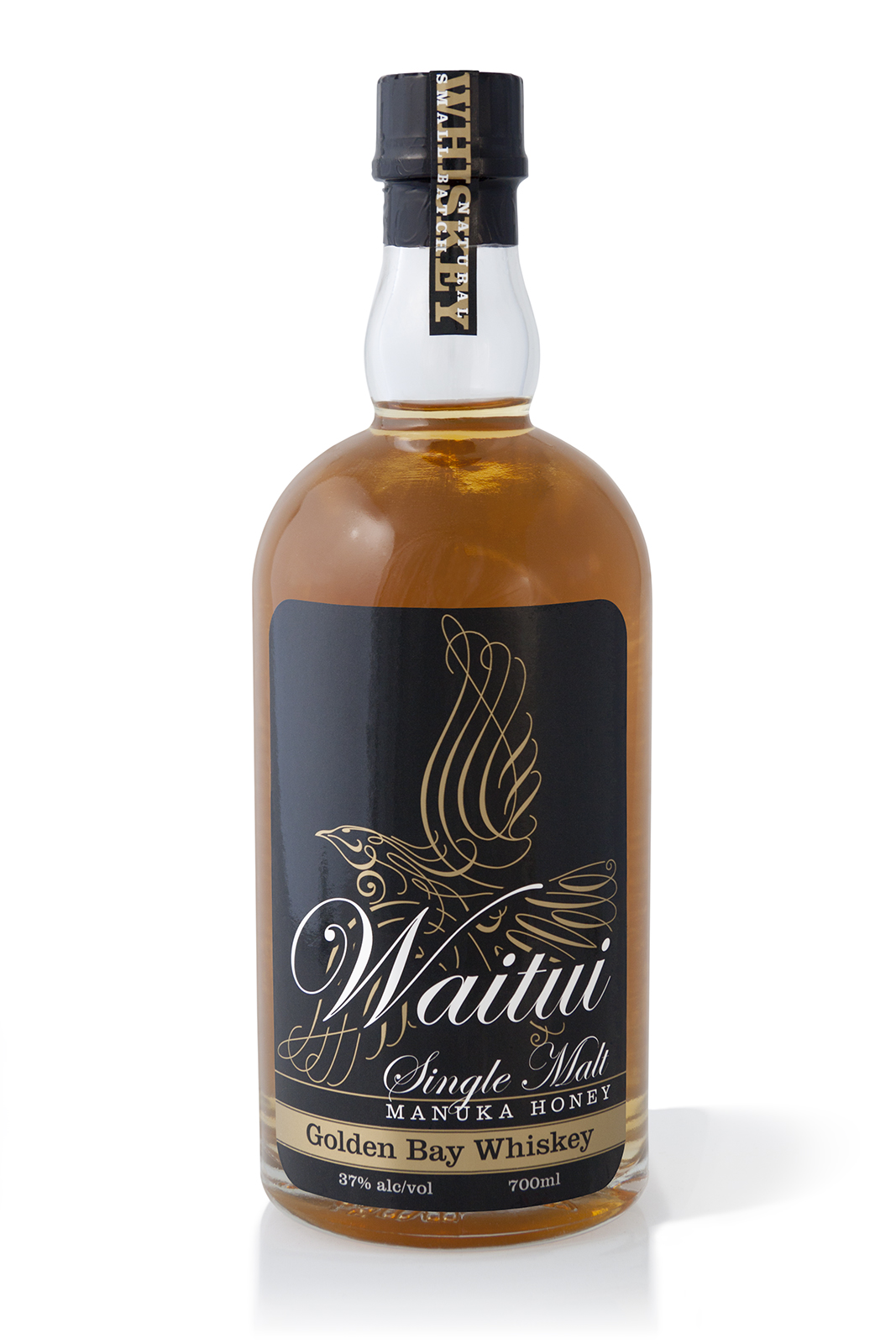
Waitui logoWaitui, a Small Batch, Single Malt, Manuka Honey, Golden Bay Whiskey, a unique New Zealand made prestige product, one of the few true ‘Honey whiskies’ made in the world today—in Takaka, Golden Bay.

Waitui, previously named ‘Bush Whiskey’ required renaming, rebranding and packaging to a standard that properly reflects the product. The result of the rebrand and repackaging has been outstanding at achieving the client’s goals; greatly increasing sales volume, profitability, and enabling the product to be distributed to prestige Whisky specialist retailers such as Whiskey Galore in Christchurch.
Keep on reading!

Silver Cloud, 100% Blue Agave Spirit, Terry Knight

Silver Cloud 100% agave spirit launch event

Silver Cloud product launch even invitation.

Silver Cloud product launch even invitation.

A documentary photo essay that I shot of the fabulous Silver Cloud 100% Pure Agave liquor launch event at Nicola’s Cantina in Nelson New Zealand.

The feature of the launch event was the auction by Terry Knight of only the first two of the thirty bottle limited release, bottles number 30 and 29, which sold on the night for a tidy NZD$400 and $450 respectively, a fitting testament to the quality of the pure agave liquor, the packaging, the branding and the success of the well promoted and event managed launch of event.
Keep on reading!

Agrimm trichoprotection, Vinevax, Pruning wound dressing, self-adhesive label, foil pouch, vacuum pack

Vinevax packaging makeover

Design is about communication, the more compelling the design, the deeper the response

Vinevax_logo_radiused_256pxMore compelling design doesn’t mean prettier, or more arty. By more compelling I mean richer, more complete, better because it is more efficient, better because it is attractive in useful ways. The design of Vinevax’s new brand collateral isn’t merely about their product looking better on the shelf, but actually functioning better as an advertisement for itself in a competitive retail environment. The design has to do with the work of increasing sales by making Vinevax’s packaging beautiful and clear.

It’s exciting. Keep on reading!

A logo for a website mapping all of Christchurch’s post earthquake recovery street art

Top Marks: top 40 logos

Waitui Single Malt Manuka Honey Golden Bay Whiskey packaging label
The power of visual communication is the ability to…

Talk less.

Although I’ve worked on many high-profile projects, I strive to give equal attention to the more commonplace assignments and small business clients. This is the small things that need to be precise—the directional signs, capabilities brochures, websites, product packaging, corporate collateral, After almost 40 years of practice, I am still excited by that challenge and the possibilities each new project presents.
Keep on reading!

Supergraphic MTC Volvo FH12 makeover

MTC’s import Volvo FH12 had a makeover and now she’s sweet, in fact she’s a cherry!

The air is thick with ideas in the MagentaDot Brands studio, design is a classic discipline of endless potential and this brief from MTC Equipment was generously thrown wide open. The new livery design brief for the Volvo was given to me in a meeting concurrent with TruLine Civil’s in-house truck painter Andrew Gill, a true master of his trade. This kicked off a fruitful, illustrious collaboration with him and Darren Leeds of Leeding signs. It included the discussion of details like the quality of new alloy boilerplate and wheel arches, the exhaust stacks makeover, and the bold selection of the AA premium cherry red metallic lustre paint to boot! Metallic paint being an exceeding rare choice for long haul trucks to be finished in.
Keep on reading!

Before & Aftereffects

A picture is worth a thousand words but a good-looking picture is worth much more

Avoid the use of poor images for your promotions. The most successful publicity photos look lifelike, convincing, and are free of distracting clutter. Professional Photoshop retouching is a great way to correct poor photos to maximise the performance of your images. Being concerned with maximising image quality whether for reasons of pride if nothing else, is beside the point, because in the end everybody wants their pictures to look good on the web and in print.
Keep on reading!

portrait with the fetching Stronger Chrischurch ballerina backdrop in Armagh Street, May 2015.

The rise & rise of Christchurch street art

Watch This Space logo design contest entry

Popular Urban Art or vandalism of private property? That thorny contention was settled unequivocally in post-quake Christchurch 2011. What now is considered pro-social and broadly popular urban art has morphed out of counter culture to become one of the totems of the fine art world. The gallery showcases my comp entry and a selection from my Stronger Christchurch, and Rise street art photo libraries.

Front cover Watch This Space logo presentation document

The front cover of my Watch This Space logo presentation document depicts the logo visualised screenprinted onto the back of a woman’s red hoodie garment.

Since the 2011 earthquakes Street Art is emerging all over the central city of Christchurch, like life it finds a way to vitalize empty sections and animate the bare walls that dominate the landscape with vibrant colour and youthful design.
Keep on reading!

Proof of concept visual of Heather’s helping hands’ screen printed in two colours on white T-shirt.

The elements of iconic design: Heather’s helping hands’ branding

The iconic logo design elements of the “right” logo for my clients

To design the right logo for a business is crucial irrespective of the firm’s size. A successful design may meet the goals set in your design brief, but a truly enviable iconic design must also be relevant, relevant, enduring, distinctive, adaptable and for successful use in responsive web design, simple and bold are key criteria too.
Keep on reading!

Southern DC3 Charitable Trust donations prospectus, Help us reach for the sky, Front cover.

Southern DC3 Trust prospectus & promotional materials

Patron Richie McCaw chats with Dave Horsburgh on the cover of The Southern DC3 Trust “Help us reach for the sky” fundraising prospectus I designed and published in 2006–7.

My role was as Creative Director of the Trust and Mac operator, providing all creative services, photography and the desktop publishing of all print collateral. This provision of goods, branding and brand management services was under the auspices of Pionair Adventures for whom I was in-house Creative Designer at the time.
Keep on reading!