
The iconic logo design elements of the “right” logo for my clients
To design the right logo for a business is crucial irrespective of the firm’s size. A successful design may meet the goals set in your design brief, but a truly enviable iconic design must also be relevant, relevant, enduring, distinctive, adaptable and for successful use in responsive web design, simple and bold are key criteria too.
So many requirements are a tall order. To create the Heather’s Helping Hands logo for my client’s new business launch I didn’t just pluck ideas from thin air. I took the tried-and-tested path of writing a creative brief and then researching, drawing thumbnail sketch ideas and adapting them to create Heather’s signature brand identity.
The basic elements of designing classic iconic logos are the ingredients in my methodology.
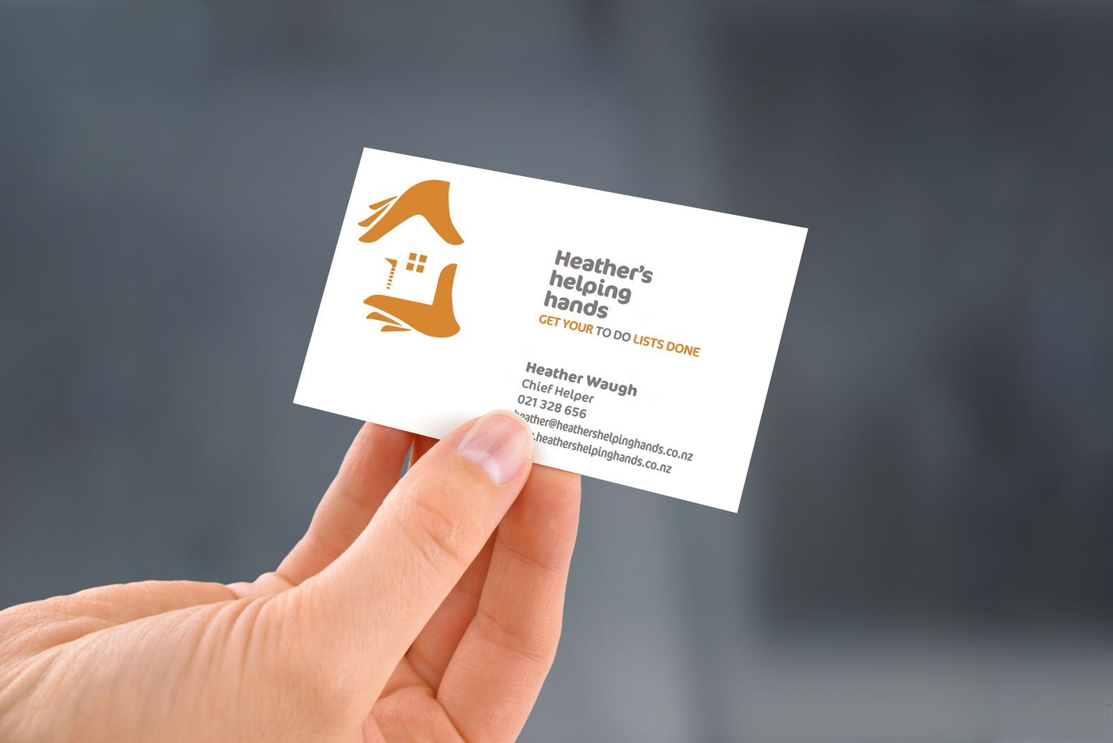
Heather’s helping hands business card, two colour, two-sided design.
Keep it simple, keep it bold
Boldness and simplicity help a design be more versatile. Adopting a minimalist approach enables your logo to be used across a broad range of media, in print and online, right down to a tiny website favicon.
Simply put, boldness and simplicity make your design easier to recognise.
Keep it relevant and easily understood
Any logo I design must be apt for the business it identifies. Designing for a landscaping and household handyperson firm like Heather’s Helping Hands? Then the set of logo ideas that would be appropriate was fairly tightly constrained. To design relevant to the industry, your client, and their audience of Kapiti Coast homeowners to which Heather’s firm is catering. Getting up to speed on all these aspects requires indepth research, and visually informed dialogue with the client. But the time invested in research and development is time well spent: Without a strong knowledge of your client’s world view, you cannot create a design that successfully differentiates your client’s business from its closest competitors.
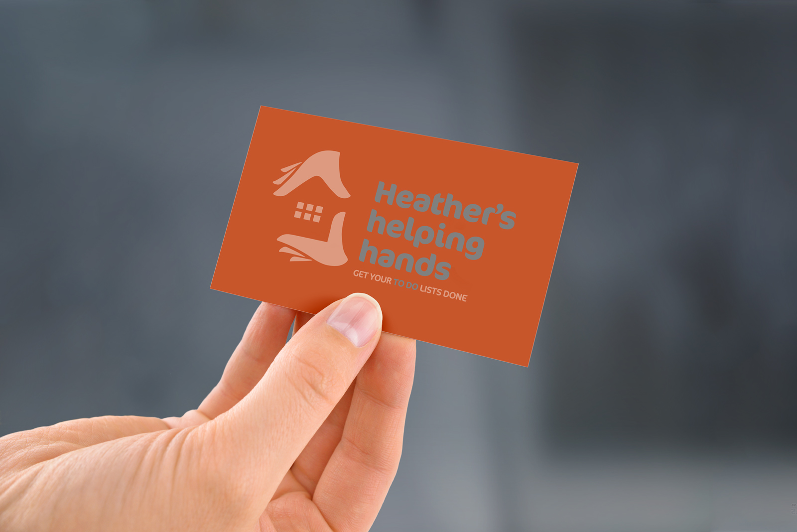
Draft concept for verso of Heather’s helping hands’ two colour business card design. A small variety of layout, colour and type variations were tested in the concept development phase for the design of the back of the card. This was the winning layout concept. This rejected earlier draft of the logo has the “H” implied in the negative space between the windows.
I worked with Heather Waugh to create her new brand identity. By sticking to the workflow above, not only did I deliver a logo that is relevant, but he also created one that her demographic of older clientele easily recognise and won’t easily forget.
With Heather’s Helping Hands, the logo idea occurred to me while I was trying to see something in the negative space in between a pair of hands. Research revealed that hands alone and together with house icons are often used to symbolise charitable organisations, the pastoral care of churches, physical and mental health and wellbeing care organisations. I had the idea that if I could use the negative space in hand and house elements that I would come up with a visual double-entendré concept that would engage the mind’s eye of the viewer. Working with the client to develop the nuances of the design arrived at the iconic open front door to symbolise the fact Heather’s capabilities encompass both indoor and outdoor helping around the home was the finishing touch that made this concept a winner.
This logo includes a simple, clean colour palette and highly legible type treatment. The fact that the design garnered the immediate ‘thumbs up’ of positive feedback from Heather’s discerning clientele is a testament to its success.
Distinction above all
A distinctive logo can be easily separated from the competition. By accurately portraying my client’s business perspective a unique and stylish mark followed for her firm. Recognition is key, so that just its shape or outline confirms it, and in Heather’s case the clever alliteration in the company name doubles-down on its distinction and immediacy. When drawing thumbnails or in early concept development I always begin working with symbols and type together in only black and white. This helps me create the most distinctive marks, since the high contrast between figure and ground emphasizes the shape or the big idea. Working with the typographic elements at this time helps bring image and type together in just the right way. Adding colour to the bones of a distinctive logo developed in black and white is really like adding toned visual muscle to the strong bones of the design and form of my logo ideas.
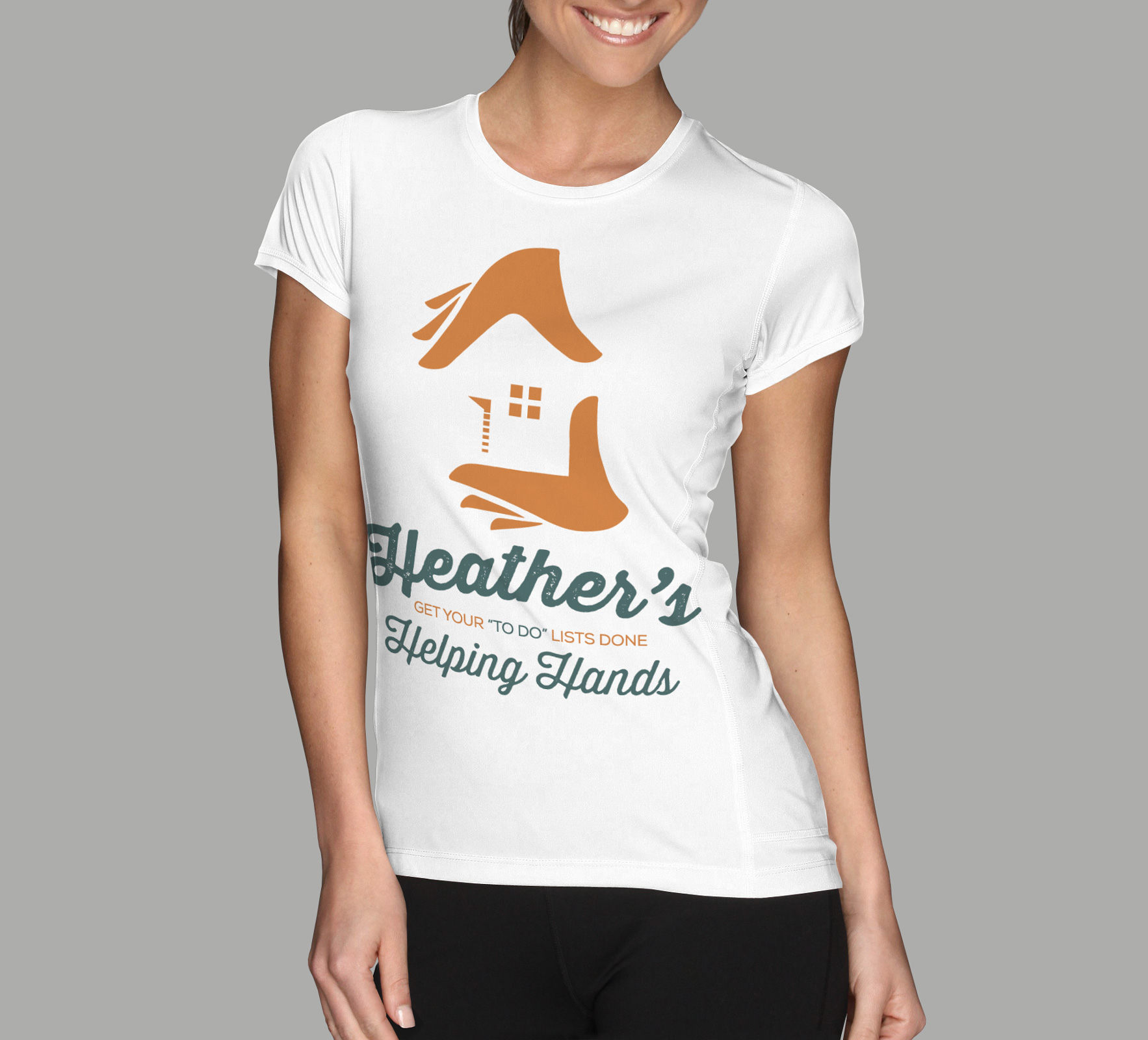
Proof of concept visual of Heather’s helping hands screen printed in two colours on white T-shirt. Heather’s identity system includes two distinct typographic solutions. A generic clean corporate look and this fun and friendly flowing script font. Given the nature of her client relationships, this sort of stylish promotional garment would be a well-received gift item. The web url is printed one colour on the back.
Remember not to forget
Beyond a positive and strong first impression an iconic logo is one that viewers will remember after just a quick glance. Think, for instance, of yourself on the street with a courier van driving by and you notice the logo on the vehicle as it whizzes past. The rule of thumb is that quite often, a logo has only one opportunity to make strong first impression, so for the logo on that van to be the right one for that business it needs to be simple and bold enough to be quickly scanned and read.
Sitting down at the drawing table to incorporate drawing thumbnails into the concept development stage is the best way But how do you focus on this one element of iconic design? It also helps to have done my research to understand what it is about competitors logos that either succeeds or fails at ingraining themselves in my visual memory. By limiting how much time I spend on each thumbnail idea I tend to develop concepts that viewers will remember with a glance? With the essential elements of design and form sketched out it is easy to develop my client’s logo ideas so the visual identity makes a strong first impression and once seen is recalled the instant they see it again.
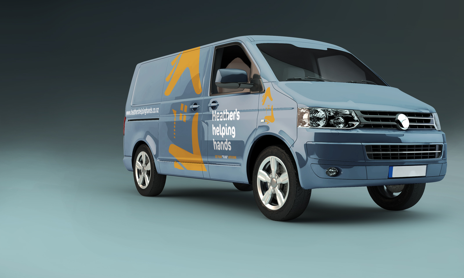
Proof of concept visual of Heather’s helping hands branding applied to her van, inexpensive placement of cut vinyl signage makes a generic van into a moving billboard.
Think visually up and down scale, think single-minded proposition
Boldness and simplicity is the key to a logo design like Heather’s Helping Hands that works well at 25mm or 25 metres in size. Bold and simple logos are durable logos, they are designs far more likely to last well.
As in media advertising outstanding logo designs have just one feature that makes them stand out. Single-minded focus, that’s it. For your visual design to be highly focussed just one feature must stand out.


©magentadot brands
