Identity: visual design speaks for itself
Simplify.
Distill the message to its essence. An image. A word. An idea.
It’s true for speaking, it’s true for writing and it’s true for graphic design.
Simplify.
Keep on reading!
![]()
Simplify.
Distill the message to its essence. An image. A word. An idea.
It’s true for speaking, it’s true for writing and it’s true for graphic design.
Simplify.
Keep on reading!

![]() Desktop publishing as in-house designer for Pionair was a path of discovery. Why is striving to make something look better worthy toil? There are benefits to clarity, ease of understanding for busy people justifies hours in production.
Desktop publishing as in-house designer for Pionair was a path of discovery. Why is striving to make something look better worthy toil? There are benefits to clarity, ease of understanding for busy people justifies hours in production.
Read More

The A5 bifold brochures and Escape from the Straitjacket of the Mind promotional poster were produced to launch John Davey’s refreshing & inspirational new approach to delivering a corporate message at conferences or training seminars—“Lip Service”.
Keep on reading!
![]() Established in 1994, The Herb Centre brings together a clinic of qualified health practitioners, who provide a range of alternative medicine modalities, a herbal dispensary and shop and The Herb Centre Café all under one roof.
Established in 1994, The Herb Centre brings together a clinic of qualified health practitioners, who provide a range of alternative medicine modalities, a herbal dispensary and shop and The Herb Centre Café all under one roof.
Keep on reading!

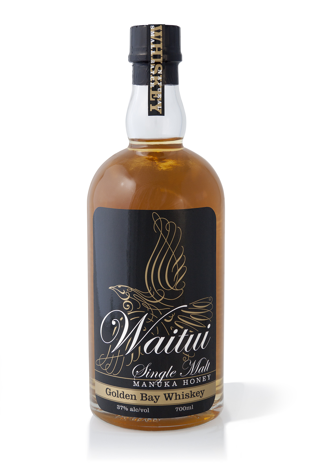
![]() Waitui, a Small Batch, Single Malt, Manuka Honey, Golden Bay Whiskey, a unique New Zealand made prestige product, one of the few true ‘Honey whiskies’ made in the world today—in Takaka, Golden Bay.
Waitui, a Small Batch, Single Malt, Manuka Honey, Golden Bay Whiskey, a unique New Zealand made prestige product, one of the few true ‘Honey whiskies’ made in the world today—in Takaka, Golden Bay.
Waitui, previously named ‘Bush Whiskey’ required renaming, rebranding and packaging to a standard that properly reflects the product. The result of the rebrand and repackaging has been outstanding at achieving the client’s goals; greatly increasing sales volume, profitability, and enabling the product to be distributed to prestige Whisky specialist retailers such as Whiskey Galore in Christchurch.
Keep on reading!


Silver Cloud product launch even invitation.
A documentary photo essay that I shot of the fabulous Silver Cloud 100% Pure Agave liquor launch event at Nicola’s Cantina in Nelson New Zealand.
The feature of the launch event was the auction by Terry Knight of only the first two of the thirty bottle limited release, bottles number 30 and 29, which sold on the night for a tidy NZD$400 and $450 respectively, a fitting testament to the quality of the pure agave liquor, the packaging, the branding and the success of the well promoted and event managed launch of event.
Keep on reading!

![]() More compelling design doesn’t mean prettier, or more arty. By more compelling I mean richer, more complete, better because it is more efficient, better because it is attractive in useful ways. The design of Vinevax’s new brand collateral isn’t merely about their product looking better on the shelf, but actually functioning better as an advertisement for itself in a competitive retail environment. The design has to do with the work of increasing sales by making Vinevax’s packaging beautiful and clear.
More compelling design doesn’t mean prettier, or more arty. By more compelling I mean richer, more complete, better because it is more efficient, better because it is attractive in useful ways. The design of Vinevax’s new brand collateral isn’t merely about their product looking better on the shelf, but actually functioning better as an advertisement for itself in a competitive retail environment. The design has to do with the work of increasing sales by making Vinevax’s packaging beautiful and clear.
It’s exciting. Keep on reading!
![]()
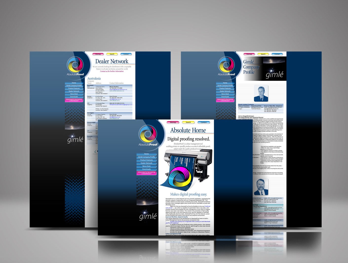
Best-in-class colour-managed workflow hub / digital proofing software solution, brainchild of brilliant friend pre-press professional Hjórtur Kristínsson, named by me ‘Absolute-Proof ’, launched in 1998, this was the first iteration of the web design I designed for the product launch. The launch was aligned with Hugo showing at the Drupa print fair in Dusseldorf that year. The AbsoluteProof website was developed in collaboration with a web design firm in Reykjavik, Iceland.
Read More
Talk less.
Although I’ve worked on many high-profile projects, I strive to give equal attention to the more commonplace assignments and small business clients. This is the small things that need to be precise—the directional signs, capabilities brochures, websites, product packaging, corporate collateral, After almost 40 years of practice, I am still excited by that challenge and the possibilities each new project presents.
Keep on reading!

Surface Active | Making waves in a sea of sameness.
Hyper-real graphics like the Jewel Gecko make a vivid impression. Why? Because people relate to them! Dramatic lifelike renderings of wildlife produce a prompt and typically positive response in a person’s mind. People relate to real things and enjoy them most. It is the route to why people relate to many of our eye-catching and impactful “SurfaceActive” wildlife-art-to-wear designs.
How did we do it? The technique of colour separating this design by hand involved breaking it down into eight separate designs, from which the screens are made. The separations are printed over each other, in layers to create the original hand screenprinted design. This crafty route is the only way to achieve the unparalleled vivid impression of the design.
Fashions come and go, then come around again, but the fundamentals stay. The inspiration for the designs came from getting to know superlative alpine/wildlife photographer Colin Monteith, and renowned wildlife photographer Rod Morris. We visited their image libraries to cherrypick the most beautiful jewels in their amazing archives that we could see had the potential to be developed into hand-separated wildlife art screen gems.
Keep on reading!

In support of the Trenchless Technologies print documents and the Case Studies section of the TruLine Civil website I was also commissioned to shoot and edit a two minute video clip of the resources and methods used for Hydo-Excavation in Christchurch city when installing the ultra-fast fibre network to businesses downtown.
Shooting: MagentaDot Brands
Director / editor: Thomas Rands
©magentadot brands

I care about how my clients’ companies present themselves to the world, and adding real value to my clients’ business. Designing business cards is challenging, but although it is a difficult task it can be solved with creativity, wit and invention. This diverse compilation includes the gamut of client categories, from heavy industrial corporates to performing artists who aim to induce a smile in the mind, this diverse compilation demonstrates how cool this simple and timeless form of communication can be.
Keep on reading!
