
![]() More compelling design doesn’t mean prettier, or more arty. By more compelling I mean richer, more complete, better because it is more efficient, better because it is attractive in useful ways. The design of Vinevax’s new brand collateral isn’t merely about their product looking better on the shelf, but actually functioning better as an advertisement for itself in a competitive retail environment. The design has to do with the work of increasing sales by making Vinevax’s packaging beautiful and clear.
More compelling design doesn’t mean prettier, or more arty. By more compelling I mean richer, more complete, better because it is more efficient, better because it is attractive in useful ways. The design of Vinevax’s new brand collateral isn’t merely about their product looking better on the shelf, but actually functioning better as an advertisement for itself in a competitive retail environment. The design has to do with the work of increasing sales by making Vinevax’s packaging beautiful and clear.
It’s exciting.
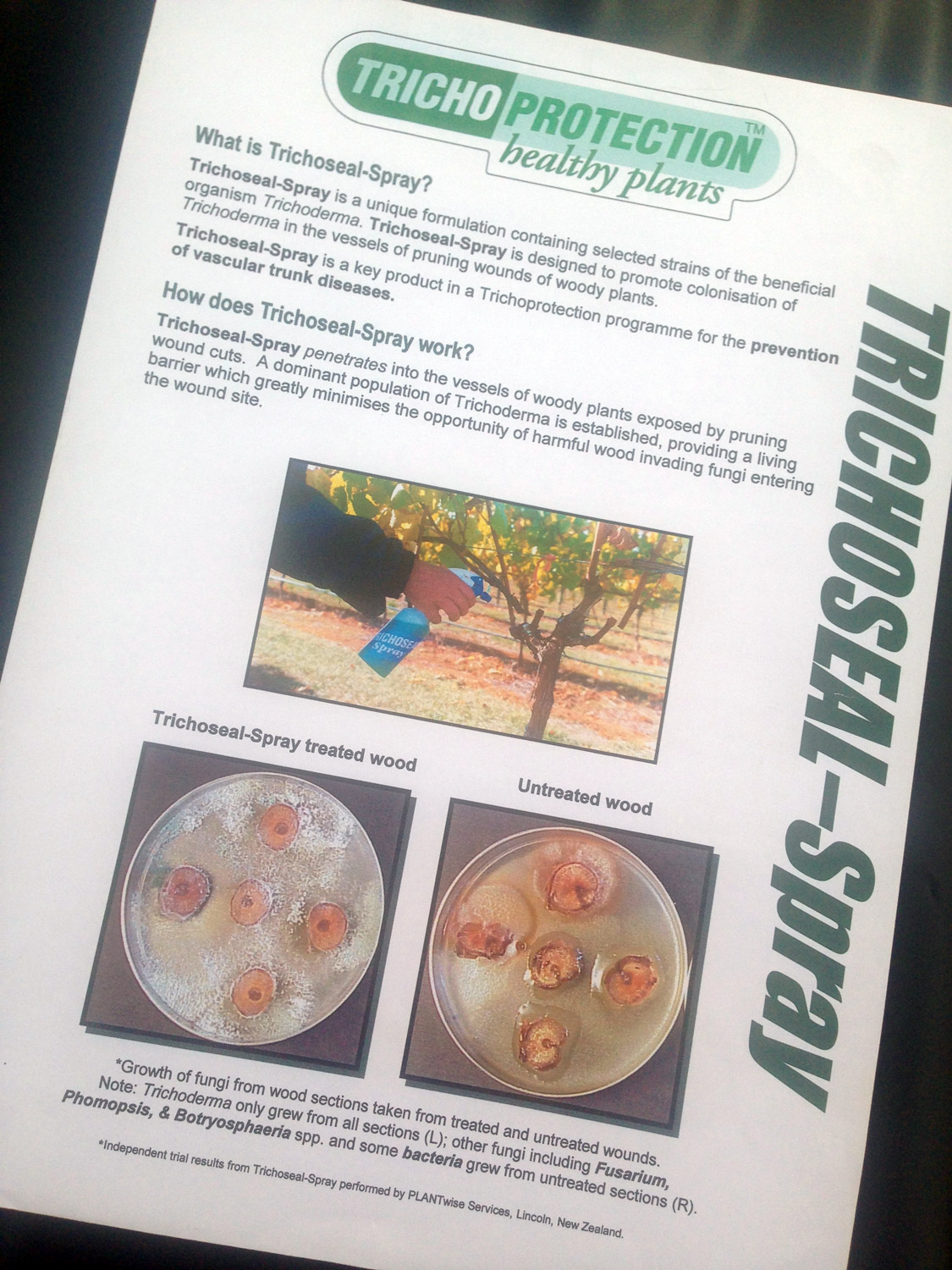
The “before” image of Trichoseal Spray product data sheet. Trichoseal is the product name which Vinevax superseded.
In 2002 the Vinevax product naming, logo design and branding project was no exception. Agrimm Technology was an established biotechnology company, formed by two scientists from Canterbury University in 1984. Agrimm’s labs and specialist production facilities based in Lincoln, near Christchurch have grown to be a world leader in the development and manufacture of effective, safe and environmentally friendly biological or ‘living barrier’ plant protection products focussing on the Trichoderma family of beneficial fungi.
Around 2002 the results from independent field testing from a PhD study being conducted at Adelaide University proved that a formulation of their ‘Trichoseal’ wettable powder product for vines was a protective and a cost effective treatment against dieback disease. At this point Agrimm engaged the services of the tattoo studio who developed the exciting new product brand and positioning statement ‘Vinevax’, ‘Living barrier wound dressing for vines’. This marketing effort superseded the legacy product that had been sold, but effectively not marketed, under their Trichoprotection® quality mark.
I designed the new logo, system of product brochures, packaging system and trade advertising. The art direction emphasis on careful editing, photo composites and custom infographics demonstrating the product’s performance contributed to a project that turned out to be a tremendous sales and marketing success. Part of the creative thinking behind the branding theme art direction was to fully engage the strengths of the product and interest of the horticultural market by maximising the integration of colour and type, image and message. This was brought together in the conceptual A5 print brochures printed on quality medium weight board. The print is quality finished with metallic foil stamping of the logo symbol and spot overglossing of images.


These days I am well aware you want your branding and marketing communications to work hard. As hard as, let’s say, this Vinevax brochure does. So to see more proof just have a look around or call Shaun on;
+64 21 067 6176.
Or email him hello@magentadotbrands.com
The brand design rationale
A blend of the outstanding clarity and distinction of the new product name, and research into the client’s market, their competitors and the biology of commensalism (by which trichoderma behaves as a living-barrier to plant pathogens), plus extensive visual research lead to several design solutions. Our recommendation to the client in the presentation, is inspired by one of the intricate yet simple mathematical designs that are found in nature. One that is related to a certain mathematical sequence know as the Fibonacci series—as seen in the opposing spiral forms of flowers, pinecones and pineapples. Inspired by these natural forms the bold, clean dynamic new brand expresses at once a radiant shield-like energy, dynamic rotation and vigorous growth out from the centre.
READ MORE ABOUT THE VINEVAX RENAME & REBRAND PROJECT
Credits
Printer: Croft Print Limited
Design firm: tattoo
Account executive: tattoo
Copywriter: tattoo, including product naming
Creative director/design/print production: Shaun Waugh, Surface Active graphic design
Font credits: Barmeno, Garamond Condensed
©magentadot brands
