Windsor Urban brand use document cover

Brand use guide: WindsorUrban

Setting brand standards that people will follow

WindsorUrban symbol and type logo greyscale iconThe brand use manual or corporate identity guide ensures the new WindsorUrban logo is applied correctly in every application where WindsorUrban is identified. The purpose of the brand manual is to enable and regulate a uniformity in the firm’s visual image. WindsorUrban aims to design and manufacture the “go to” product and service offering within their market niche, the brand that their customers think of first when they want urban furniture and street lighting. The guide’s basic job is to teach everyone who uses it, what the brand is and how to effectively implement it.
Keep on reading!

WindsorUrban custom Microsoft Word quote template document.

Word template for WindsorUrban

A user-friendly and attractive quotation template

Windsor UrbanThe chief benefit of the WindsorUrban rebrand is that the company’s vision and personality across traditional and interactive media now has the same voice. The new brand accurately reflects the company’s personality and supports the sales and marketing team. A well-written and perfectly formatted Microsoft Word quote document that’s high on readability and clearly laid out information makes the job of responding quickly to client requests, and of presenting a professional image, a lot easier for the sales staff.
Keep on reading!

Pionair Unparalleled Journey’s “Affluent Travel” Agency toolkit. Ringbinder of agent information.

Pionair: Oceania “Affluent Travel” kit

Unparalleled Journey’s “Affluent Travel” toolkit… the essentials.

Pionair logo, rebrandAside from being a private air charter firm, owning aircraft and having air crew and air operations personnel on staff, Pionair was also a “best-in-class” inbound wholesale travel operator to the world’s finest destinations in the Oceania region.

The Pionair travel department had a group focussed on designing, marketing and operating escorted group air tours and a Free Inboard Travel, Unparalleled Journeys (UPJ) “affluent travel” group whose clientele was high-end travel agents in the U.S. and internationally.
Keep on reading!

Events Management Group: logo design & identity system

EMG Events Management Group was a Christchurch firm established to support the performing arts and project manage the creation and development of large and small scale events such as outdoor theatre for the city council’s parks & recreation department, conferences, conventions and bespoke corporate events.

Senior leaders in the firm were particularly keen on ensuring the logo design and branding positioned them well in the corporate market.
Keep on reading!

Atujara logo makeover in progress.

Logo makeover: Atujara MCC

Turning a “jaggy” unusable logo into clean web & print files

Velocette Racing New Zealand organisation logo. Classic racing motorcycle enthusiasts organisation brand. ‘Coca-Cola’ style sloped and looped copperplate lettering in metallic gold on a black background, consistent with the historic livery of Velocette motorcycles. Brands for New Zealand / International organisations.You’ve got a scan of a great retro logo, everything looks perfect when you look at it at small size on the screen. But when it needs to be printed at a large size, it turns out to be unusable because the file format is incorrect. A logo makeover is the BRAND-AID® that turns unusable logos into clean web & print files by converting the jaggy, pixellated logo to a clean vector drawing format that is future proof.

Keep on reading!

Terranova tiling website Laptop mockup of a cascade of 5 pages with the Homepage at the top of the stack.

An artisan tiler’s works: Terranova’s portfolio website

Terranova Tiling is a firm of tile installation craftsmen headed by master tiler Camillo Schulz. Camillo was trained and worked in Germany for ten years before emigrating to New Zealand in 2001. Terranova traces its history back to 2003.

I designed the Terranova logo and a business card for Camillo when he launched the firm in 2003 and designed their brand new website (along with back-end assistance from NuWeb) in 2015. During the briefing of the website Camillo paid me the professional compliment that the Terranova logo design was perfect as it was, and that feedback from his customers and business associates assured him branding remained as contemporary today as when it was first designed.

Keep on reading!

Logo design workflow: Bionona

Introduction

Bionona concept development, generating ideas by rendering quick thumbnails on the drawing board.

Bionona is a global biotechnology commercial persuasion brand that aims to motivate the sale of goods in the personal healthcare, therapeutic and cosmetics consumer markets, while also inspiring confidence in their business partners in product development and their peers in scientific research and development. The launch of Bionona’s new website and brand was a combined brand launch and website design project presented to three stakeholders that comprised the client, all located remotely in different cities. This web presentation was based on the client brief and my market research online and in pharmacies and health food stores.
Keep on reading!

Cashel Street, Pop-up Mall, night photography, post earthquake, illuminated at night by WindsorUrban luminaires and lighting poles. Photo shot for WindsorUrban website redesign and rebrand project.

The creative brief: design process & the four Ws

Design from a creative brief.

Designer and client must work towards the same, agreed goal.

The creative brief is the blueprint for the project. It’s a collaboration of designer and client. It includes project overview, goals, messages, audience description, budget, schedule and so on. The act of writing all of this down means that everyone has talked through and agreed on what the design is to embody.
Keep on reading!

Tru-Line Civil, corporate stationery system, business card, letterhead, mobile web, CD ROM, envelope, website

Hard working TruLine stationery system

The Tru-Line Civil rebrand’s good-looking corporate stationery system works hard and adapts easily. The design conforms to the world’s most popular business look. It is corporate—uncluttered, clean and impressive. The Tru-Line business system, consists of A4 letterhead, envelope, business card, with compliments slip and a versatile laminated and embossed document folder that is trimmed down from the same worksheet as the folder to create a custom Word document cover with a window. The system is easily manipulated and I can adapt it for almost any use. At the core of the system is the Tru-Line Civil logo, or “mark” and a separate block of text.
Keep on reading!

the waughpath

As you would expect Shaun was born in 1961 in Te Kinga, New Zealand. He was drawn to art, design, calligraphy, printmaking, music and sports as a kid. The American Field Service programme, the underlying principles of cultural exchange and study abroad seized him as a teenager, which eventually saw him an AFS scholar graduating with honours from a high school in Dallas Texas in 1978.
Keep on reading!

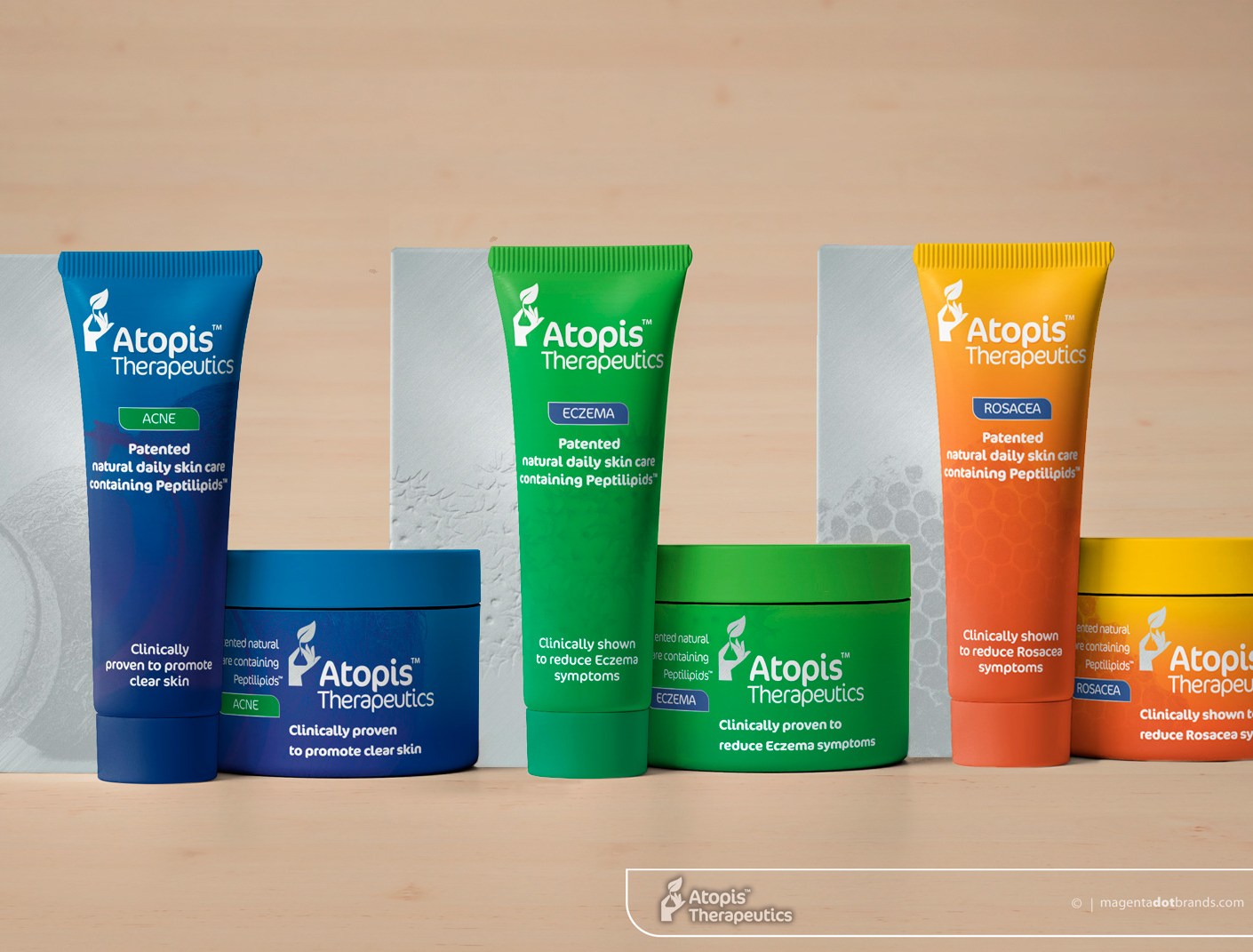
Branding & packaging for Atopis Therapeutics

Hand-held photorealistic mockup of front of Bionona business card, printed in 4 colours, litho offset.

The final Bionona logo creates a strong signature for the company. The logo design is an infographic symbol of a snip genetic code from a novel peptide developed in the lab.

When offered the chance to design branding and packaging for Bionona’s new Atopis™ Therapeutics patented daily skin care range initiative, I leapt at the chance for the reason that it was an opportunity to work directly with the scientist Iona Weir, who discovered and developed the novel compounds that are the active ingredient, and research scientists are pretty much heroes of mine. Atopis™ is a clinically proven, patented, therapeutic cream that has been specifically designed for the long-term safe management of skin conditions usually managed with steroidal creams, such as eczema, psoriasis and acne.
Keep on reading!