Introduction
Bionona concept development, generating ideas by rendering quick thumbnails on the drawing board.
Bionona is a global biotechnology commercial persuasion brand that aims to motivate the sale of goods in the personal healthcare, therapeutic and cosmetics consumer markets, while also inspiring confidence in their business partners in product development and their peers in scientific research and development. The launch of Bionona’s new website and brand was a combined brand launch and website design project presented to three stakeholders that comprised the client, all located remotely in different cities. This web presentation was based on the client brief and my market research online and in pharmacies and health food stores.
To ensure the design work is aimed in the right direction I reflected back my understanding of the client brief, and the insights gained from my research. This collegial effort affirmed that I understood the design problem in the business/market framework of the client and presented my research to the mix in a manner that built consensus between designer and client.
MagentaDot Brands’ design works: proof of concept
The process of building a great brand begins with defining the marketing communications problem. By studying the market and the competition to first define the business “problem” that design project is intended to solve.
Design inspiration is drawn from the colours, typefaces, and styles of logo that define the visual language of the Global Pharmaceutical and Biotech research market.
The Bionona logo must appeal, function and last. Gathering information on competitor logos serves as a guide for exploring design directions and to market tastes.
Design from a creative brief
Designer and client mud work towards the same, agreed goal.
The creative brief is the blueprint for the project. It is a collaboration of designer and client. It includes a project overview, goals, messages, audience description, budget schedule and so on. The act of writing all this down means that everyone has talked through and agreed on what the design is to embody.
Listen
When I discuss with remote clients via phone or Skype, my most important tools are my ears and, where appropriate a recording of briefing meetings and discussions. As we proceed together, we talk about the goals for the design, which is different from what the design should look like. I develop the creative brief. I keep it short.
Applying the Decima theme of typographic logo with customised letters and pictorial add-on to the Bionona logo instantly affirms their interdependence.
Side-by-side comparison of a Bionona brand in the manner of Decima demonstrates that “following suit” with the existing theme generates coherence.
Logo draft preview grid 1-01. Exploring colour & type. The abstract idea of therapeutic care is conveyed by the symbol’s emergent properties.
Approaches
As a framework proving draft logo ideas I identified a range of approaches specified below. The themes cover a domain of visual styles described by the following set of key “image words” that express mood, visual style and taste that can be expressed through the designer’s toolkit;
- science and clinical,
- smart and technical,
- nature, warmth, humanity and care,
- transformative and
- inspiring improvement.
These themes are expressed across the categories listed below, several visuals bridge categories and visual styles;
- [1.0] Decima theme
- [2.0] Plant / nature, (Health / healthcare / therapeutic skincare.) Healthcare and skincare encompass emotional ideas such as care and concern for the wellbeing of customers.
- [3.0] Science-based Medicine / healthcare.
- [4.0] Medical science research / healthcare.
- [5.0] Abstract concepts i.e; Transformational health ideas / Transforming ideas in health,
2.0 Draft concept preview gallery theme: plant / nature / therapeutic skincare
The concept visuals are presented in a sequence of galleries below containing logo preview grids that are a standard set of visual performance tests that verify the following pragmatic issues are resolved;
- 2, 3 and full colour renderings,
- one colour and black and white versions,
- versions on a white background and “reversed” out of black and solid colour
- readability and distinctiveness at a range of sizes
- objective review and ‘proof of concept’ comparison of colour and type
3.0–6.0 Draft concept preview gallery themes: health / healthcare / medicine / research / abstract ideas
Transforming ideas in health: The positioning statement rationale
The positive attributes of the “Transforming ideas in health” tagline. First thing is the overall effect of the double-entrendre. Transforming ideas in health can be understood to mean that any particular medicine, therapeutic process or other breakthrough that Bionona markets is in itself a “transforming idea in health”—in that sense the line means or alludes to the set of all products and Intellectual Property as well as any specific product.
The other meaning is generalised, aspirational and affirming; by transforming ideas in health Bionona as an entity is in the business of Biotech innovation through experiment and objectively tested in clinical trials—so Bionona’s purpose is to bring clinically proven transforming ideas to the domain of health care.
There is third layer of overall meaning, which represents Bionona as pioneering in the Biotechnology field, so the Myricell topical cream is transforming the ideas of how skin diseases may be treated and thereby improving the lives of skin disease sufferers day-to-day. The strapline positions Bionona correctly within the domain of clinically proven healthcare.
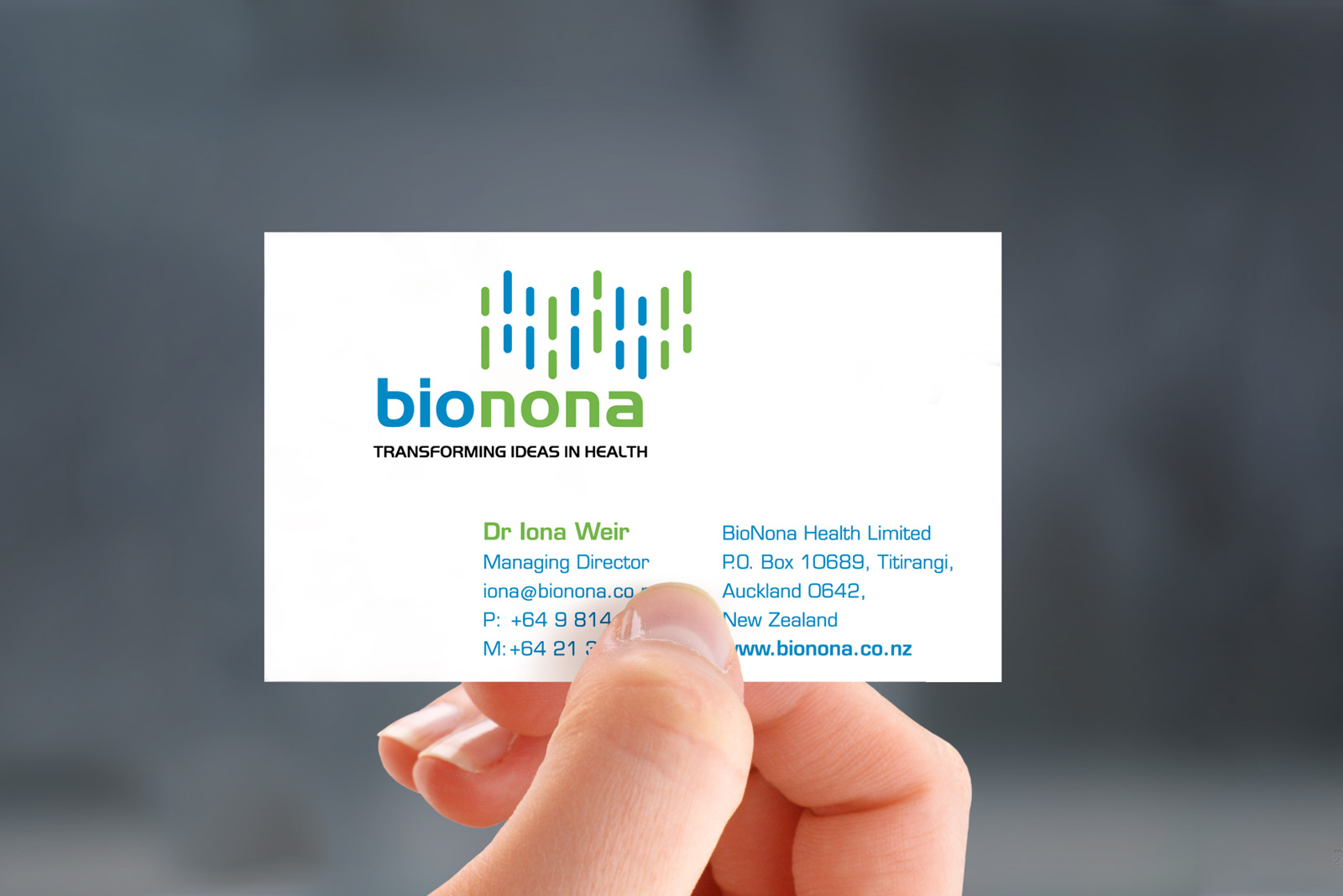
The final Bionona logo creates a strong signature for the company. The logo design is an infographic symbol of a snip genetic code from a novel peptide developed in the lab.
Final Bionona logo presentation gallery


Myricell logo and packaging presentation gallery


©magentadot brands
