
The final Bionona logo creates a strong signature for the company. The logo design is an infographic symbol of a snip genetic code from a novel peptide developed in the lab.
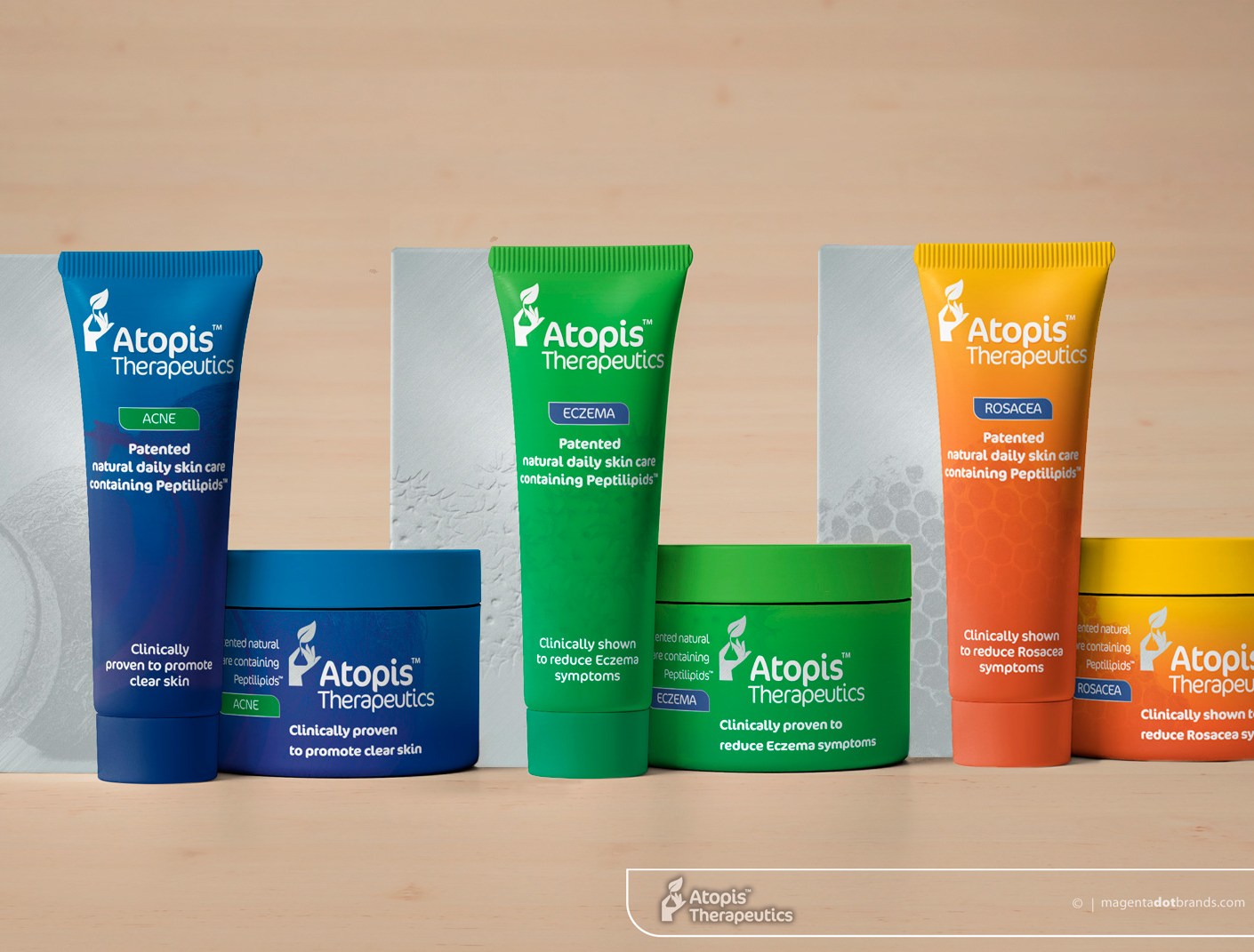
When offered the chance to design branding and packaging for Bionona’s new Atopis™ Therapeutics patented daily skin care range initiative, I leapt at the chance for the reason that it was an opportunity to work directly with the scientist Iona Weir, who discovered and developed the novel compounds that are the active ingredient, and research scientists are pretty much heroes of mine. Atopis™ is a clinically proven, patented, therapeutic cream that has been specifically designed for the long-term safe management of skin conditions usually managed with steroidal creams, such as eczema, psoriasis and acne.
The logo design brief stated that the logo should be consistent with the Decima Health brand designed for Bionona in 2012, and tie into the themes of “natural” “healthcare” “biotechnology” the packaging design had to tie into those themes and be finished with an upmarket gloss. In addition to the therapeutic range the packaging design included an Anti-Aging, beauty product. Iona extracted the novel. active ingredient compounds from sources such as kiwi fruit, coconut, honey and pollen, these ingredients provided inspiration for the packaging’s illustrative theme.


