![]() Decima is a start-up research company that makes world leading products from a new scientific platform. It is a leader in R&D creating health solutions for people of all ages. Its prime focus is to develop safe products for everyday use that strengthen our body’s immune response systems.
Decima is a start-up research company that makes world leading products from a new scientific platform. It is a leader in R&D creating health solutions for people of all ages. Its prime focus is to develop safe products for everyday use that strengthen our body’s immune response systems.
The creative brief
The clients named the company Decima, who was a goddess in Roman mythology and one of the three Parcae or fates;
- Nona—spun the tread of life
- Decima—measured the thread of life
- Morta—cuts the thread and chooses the manner of death
The portfolio shows
- the fourth and final iteration of the Decima logo design presentation document
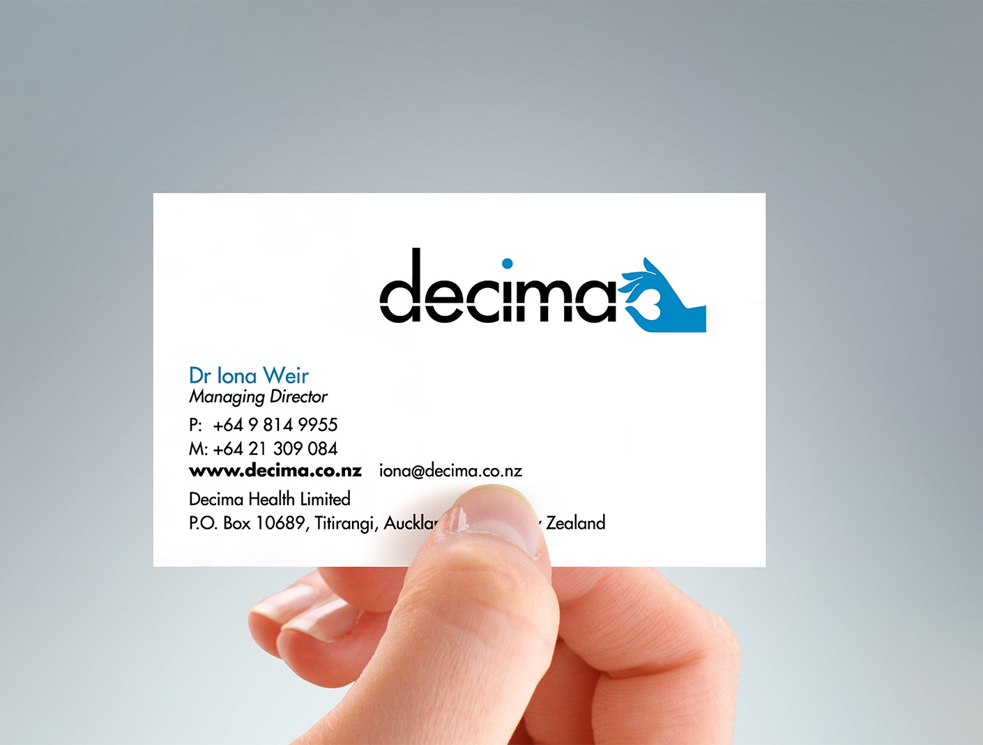
- the logo applied to their business cards which were required for an R&D and sales trip to the U.S. in 2011
- the comprehensive brand use guideline document
Client testimonial about the new Decima corporate identity
The client reported on her return from the U.S. in 2011 that the Decima branding received highly favourable comments from her contacts there.
“Wonderful Decima branding! And calm, and it’s a symbol that looks medical.”—Client praise


Credits
Printer: Click Business Cards
Font credit: Futura, Tartine Script black & regular
©magentadot brands
