Poster Mr Fungus International Comic Mime

Fungustic slaprobatics: a poster for Mr Fungus

A poster for New Zealand‘s loudest mime

After training in London at the Desmond Jones School of Mime and earning a living on the competitive streets of Covent Garden and at various international busking festivals, at age 25 Fergus returned to New Zealand to work full time as an entertainer. He needed a logo and self-promotional publicity kit to enable him to market himself and provide to talent agencies. This poster is a photo montage produced using old school paste up and photolitho methods. Inverting the chair handstand ‘fungustic slaprobatic’ trick into a free-falling Mr Fungus was to play with the audience with a sort of Irish parachute sight gag, and making a poster that could be hung “correctly” upside down and still not make sense.
Keep on reading!

Vinevax PWD brochure redesign cover

Trichoseal-spray: pruning wound dressing makeover

Vinevax_logo_radiused_256pxMore compelling design doesn’t mean prettier, or more arty. By more compelling I mean richer, more complete, better because it is more efficient, better because it is attractive in useful ways. The design of Vinevax’s new brand collateral isn’t merely about their product looking better on the shelf, but actually functioning better as an advertisement for itself in a competitive retail environment. The design has to do with the work of increasing sales by making Vinevax’s packaging beautiful and clear.

It’s exciting.
Keep on reading!

Verso of Mr Fungus business card

Mr. Fungus logo & card: make a big impression at close range

Graphics must be purposeful

Recently returned to settle back in Wellington from the U.K. in 1991, having done his time entertaining Covent Garden and international festival audiences, Fergus Aitken was a busker, a young exponent of clowning, juggling, mime and the bizarre who needed a logo and a business stationery promotional kit to advertise and promote his comic mime character Mr Fungus. More broadly he needed to promote his availability for various performing arts roles and as a mime workshop teacher in community, school and tertiary education settings. The first project, a card, would be handed over personally or included in direct mail campaigns to various audiences, where it would be viewed mainly at very close range.
Keep on reading!

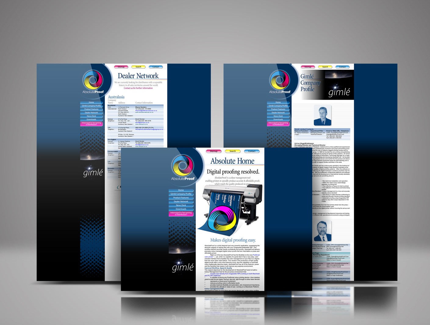
Absolute-Proof website 1998 launch design

Absolute-Proof digital proofing launch website 1998

Absolute-Proof | Digital Proofing Resolved | The 1998 product, website and brand launch

AbsoluteProof_logo_radiused_256px

Best-in-class colour-managed workflow hub / digital proofing software solution, brainchild of brilliant friend pre-press professional Hjórtur Kristínsson, named by me ‘Absolute-Proof ’, launched in 1998, this was the first iteration of the web design I designed for the product launch. The launch was aligned with Hugo showing at the Drupa print fair in Dusseldorf that year. The AbsoluteProof website was developed in collaboration with a web design firm in Reykjavik, Iceland.
Read More

A logo for a website mapping all of Christchurch’s post earthquake recovery street art

Top Marks: top 40 logos

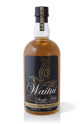
Waitui Single Malt Manuka Honey Golden Bay Whiskey packaging label
The power of visual communication is the ability to…

Talk less.

Although I’ve worked on many high-profile projects, I strive to give equal attention to the more commonplace assignments and small business clients. This is the small things that need to be precise—the directional signs, capabilities brochures, websites, product packaging, corporate collateral, After almost 40 years of practice, I am still excited by that challenge and the possibilities each new project presents.
Keep on reading!

‘Jewel Gecko - New Zealand’ eight colour T-shirt print on dark green fabric.

Jewelled Gecko: lifelike graphics make a vivid impression

Surface Active | Making waves in a sea of sameness.

Hyper-real graphics like the Jewel Gecko make a vivid impression. Why? Because people relate to them! Dramatic lifelike renderings of wildlife produce a prompt and typically positive response in a person’s mind. People relate to real things and enjoy them most. It is the route to why people relate to many of our eye-catching and impactful “SurfaceActive” wildlife-art-to-wear designs.

How did we do it? The technique of colour separating this design by hand involved breaking it down into eight separate designs, from which the screens are made. The separations are printed over each other, in layers to create the original hand screenprinted design. This crafty route is the only way to achieve the unparalleled vivid impression of the design.

It helps that beauty is permanent

Fashions come and go, then come around again, but the fundamentals stay. The inspiration for the designs came from getting to know superlative alpine/wildlife photographer Colin Monteith, and renowned wildlife photographer Rod Morris. We visited their image libraries to cherrypick the most beautiful jewels in their amazing archives that we could see had the potential to be developed into hand-separated wildlife art screen gems.
Keep on reading!

‘Tuatara - Sphenodon Punctatus’ portrait T-shirt front

Fuss, fuss, fuss: How this Tuatara drawing evolves

This terrific Tuatara illustrative design work evolves by focussing on the details, this is quite common

Surface Active made in Aotearoa, T-shirts main neck label.

Surface Active Wildlife art – making waves in a sea of sameness.

To make digital art of New Zealand’s Tuatara, that has the look and feel of a natural line drawing, the editing, fussing process can take hours and while it isn’t easy it is a great deal of fun. I take pleasure in design and I enjoy using the computer to draw with the stylus, inking over the scan just as easily as I would with traditional pen and ink. The production of design work is an incredible drill when you are doing your utmost to make it terrific. I do my utmost to make sure that every design project I work on is mega.
Keep on reading!