Verso of Mr Fungus business card

Mr. Fungus logo & card: make a big impression at close range

Graphics must be purposeful

Recently returned to settle back in Wellington from the U.K. in 1991, having done his time entertaining Covent Garden and international festival audiences, Fergus Aitken was a busker, a young exponent of clowning, juggling, mime and the bizarre who needed a logo and a business stationery promotional kit to advertise and promote his comic mime character Mr Fungus. More broadly he needed to promote his availability for various performing arts roles and as a mime workshop teacher in community, school and tertiary education settings. The first project, a card, would be handed over personally or included in direct mail campaigns to various audiences, where it would be viewed mainly at very close range.
Keep on reading!

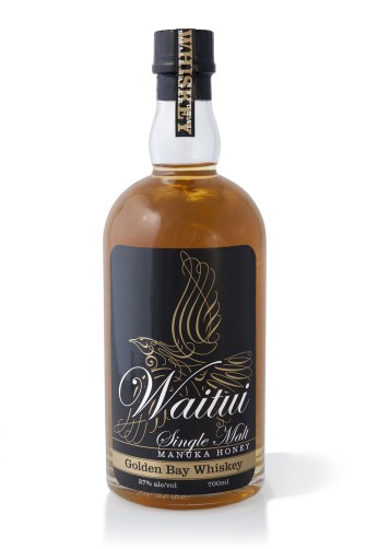
Waitui Single Malt Manuka Honey Golden Bay Whiskey full packaging label system, front, back and top. Waitui is a small batch Whiskey, barrel aged 4 years. Hand crafted in Takaka, New Zealand.

Waitui single malt: name, logo & packaging

Waitui logoWaitui, a Small Batch, Single Malt, Manuka Honey, Golden Bay Whiskey, a unique New Zealand made prestige product, one of the few true ‘Honey whiskies’ made in the world today—in Takaka, Golden Bay.

Waitui, previously named ‘Bush Whiskey’ required renaming, rebranding and packaging to a standard that properly reflects the product. The result of the rebrand and repackaging has been outstanding at achieving the client’s goals; greatly increasing sales volume, profitability, and enabling the product to be distributed to prestige Whisky specialist retailers such as Whiskey Galore in Christchurch.
Keep on reading!

A logo for a website mapping all of Christchurch’s post earthquake recovery street art

Top Marks: top 40 logos

Waitui Single Malt Manuka Honey Golden Bay Whiskey packaging label
The power of visual communication is the ability to…

Talk less.

Although I’ve worked on many high-profile projects, I strive to give equal attention to the more commonplace assignments and small business clients. This is the small things that need to be precise—the directional signs, capabilities brochures, websites, product packaging, corporate collateral, After almost 40 years of practice, I am still excited by that challenge and the possibilities each new project presents.
Keep on reading!

‘Jewel Gecko - New Zealand’ eight colour T-shirt print on dark green fabric.

Jewelled Gecko: lifelike graphics make a vivid impression

Surface Active | Making waves in a sea of sameness.

Hyper-real graphics like the Jewel Gecko make a vivid impression. Why? Because people relate to them! Dramatic lifelike renderings of wildlife produce a prompt and typically positive response in a person’s mind. People relate to real things and enjoy them most. It is the route to why people relate to many of our eye-catching and impactful “SurfaceActive” wildlife-art-to-wear designs.

How did we do it? The technique of colour separating this design by hand involved breaking it down into eight separate designs, from which the screens are made. The separations are printed over each other, in layers to create the original hand screenprinted design. This crafty route is the only way to achieve the unparalleled vivid impression of the design.

It helps that beauty is permanent

Fashions come and go, then come around again, but the fundamentals stay. The inspiration for the designs came from getting to know superlative alpine/wildlife photographer Colin Monteith, and renowned wildlife photographer Rod Morris. We visited their image libraries to cherrypick the most beautiful jewels in their amazing archives that we could see had the potential to be developed into hand-separated wildlife art screen gems.
Keep on reading!

‘Tuatara - Sphenodon Punctatus’ portrait T-shirt front

Fuss, fuss, fuss: How this Tuatara drawing evolves

This terrific Tuatara illustrative design work evolves by focussing on the details, this is quite common

Surface Active made in Aotearoa, T-shirts main neck label.

Surface Active Wildlife art – making waves in a sea of sameness.

To make digital art of New Zealand’s Tuatara, that has the look and feel of a natural line drawing, the editing, fussing process can take hours and while it isn’t easy it is a great deal of fun. I take pleasure in design and I enjoy using the computer to draw with the stylus, inking over the scan just as easily as I would with traditional pen and ink. The production of design work is an incredible drill when you are doing your utmost to make it terrific. I do my utmost to make sure that every design project I work on is mega.
Keep on reading!

Waitui Individual Gift Carton showing the duplex concept of the design

Packaging design portfolio

Whether you are launching a new product or wanting a packaging upgrade for an established brand, the goal of packaging design is to attract customers’ attention, connect with them, be memorable, and persuade them to purchase your product over your competitors. For this purpose, packaging design must do more than simply inform your customers, it must also elicit emotions. Well designed packaging is attractive, impresses with its creativity and looks beautiful both on & off the shelf.

Kraft paper shopping Bag, The Arts Centre Market, Christchurch, Logo, Brand and identity systems, Illustration, Type design

Arts Centre Market | Rebrand

Keep on reading!

portrait with the fetching Stronger Chrischurch ballerina backdrop in Armagh Street, May 2015.

The rise & rise of Christchurch street art

Watch This Space logo design contest entry

Popular Urban Art or vandalism of private property? That thorny contention was settled unequivocally in post-quake Christchurch 2011. What now is considered pro-social and broadly popular urban art has morphed out of counter culture to become one of the totems of the fine art world. The gallery showcases my comp entry and a selection from my Stronger Christchurch, and Rise street art photo libraries.

Front cover Watch This Space logo presentation document

The front cover of my Watch This Space logo presentation document depicts the logo visualised screenprinted onto the back of a woman’s red hoodie garment.

Since the 2011 earthquakes Street Art is emerging all over the central city of Christchurch, like life it finds a way to vitalize empty sections and animate the bare walls that dominate the landscape with vibrant colour and youthful design.
Keep on reading!

Sillicon Planet’s world-wide smile promo

When it comes to promoting entertainers, creating distinction is key.

Because of the tremendous competition in the market, promotions for Circus-Arts performers, children’s entertainers, need to be well thought out, be comprehensive and also entertain the reader in the same manner as performers do in order to capture the attention of any audience world wide.

Sillicon Planet’s New Zealand audience is a mash-up of schools, festival and event organisers, corporate clientele and talent agencies.
Keep on reading!

MyoPace brochure makeover

The MyoPace EMG product capabilities brochure presents the utility of a high tech piece of medical equipment beautifully and inexpensively. The brief was for a product brochure makeover. A plain sheet of paper is transformed into an engaging, easy-to-read A5 three-panel brochure with full bleed printing and two rollover folds.

By combining well thought out and carefully art directed studio photography, a large format pastel illustration and clear typography the new brochure tells a user-friendly story in words and pictures.
Read More

Hidden Gems set of 3 escorted tour direct mail brochures, 2009 direct mail campaign to Pionair’s past traveller database and affluent travel agents in the U.S. and the rest of the world, this set of brochures comprises; Hidden Gems of New Zealand, Secrets of Southern Australia and Spirit of Papua New Guinea

Pionair: “Hidden Gems” direct mail campaign

Pionair logo, rebrandDefining and evolving Pionair’s corporate identity. Pionair was one part private air charter firm, owning aircraft, employing pilots and aircrew, the other part an affluent travel firm, inbound travel wholesaler and tourism operator, my job of in-house designer, art director and founder of Pionair’s in-house “Propellor Studio” was the best of design jobs.
Keep on reading!

Cashel Street, Pop-up Mall, night photography, post earthquake, illuminated at night by WindsorUrban luminaires and lighting poles. Photo shot for WindsorUrban website redesign and rebrand project.

The creative brief: design process & the four Ws

Design from a creative brief.

Designer and client must work towards the same, agreed goal.

The creative brief is the blueprint for the project. It’s a collaboration of designer and client. It includes project overview, goals, messages, audience description, budget, schedule and so on. The act of writing all of this down means that everyone has talked through and agreed on what the design is to embody.
Keep on reading!