Young man in a red 1957 Rambler Rebel t-shirt standing beside New Brighton Pier.

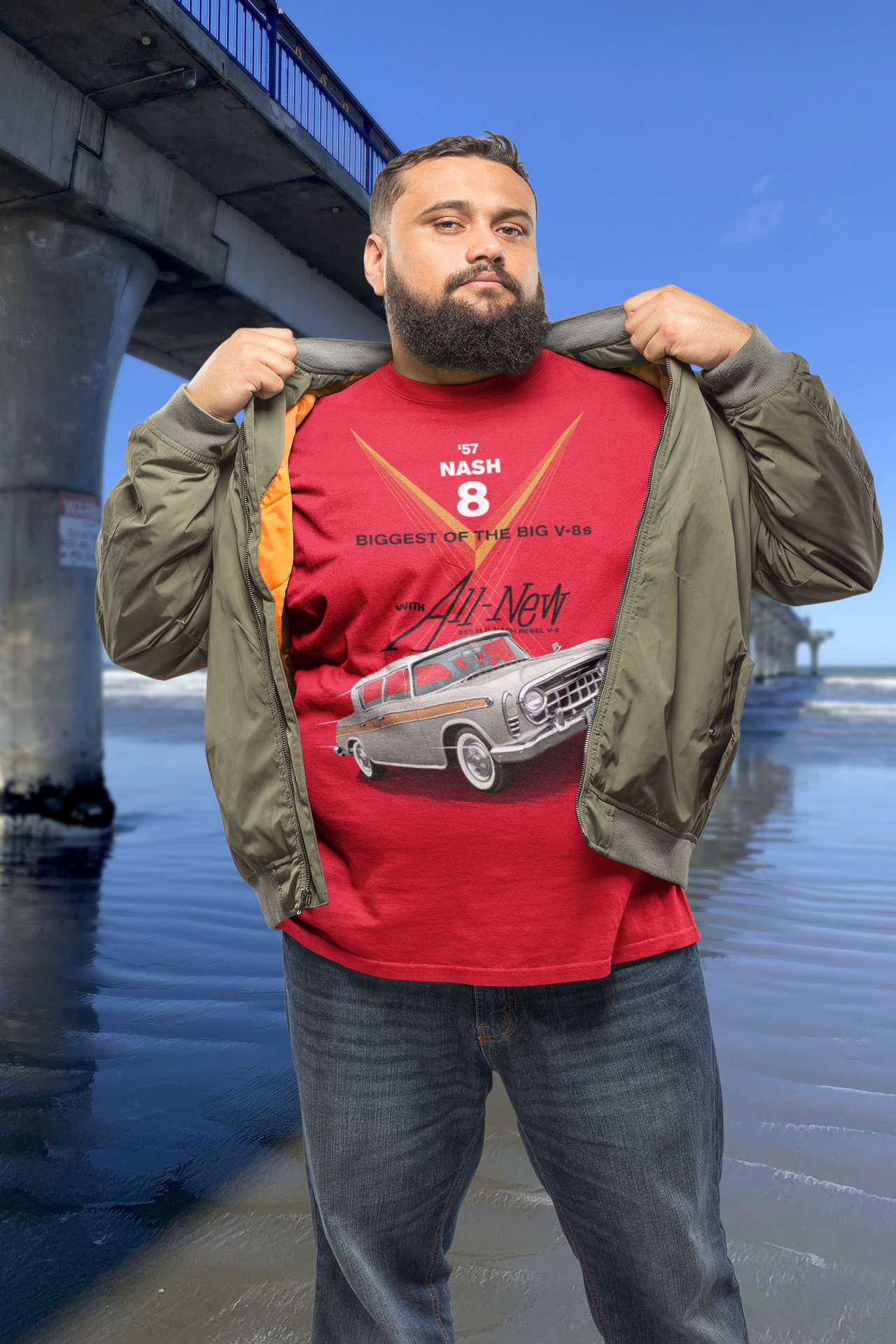
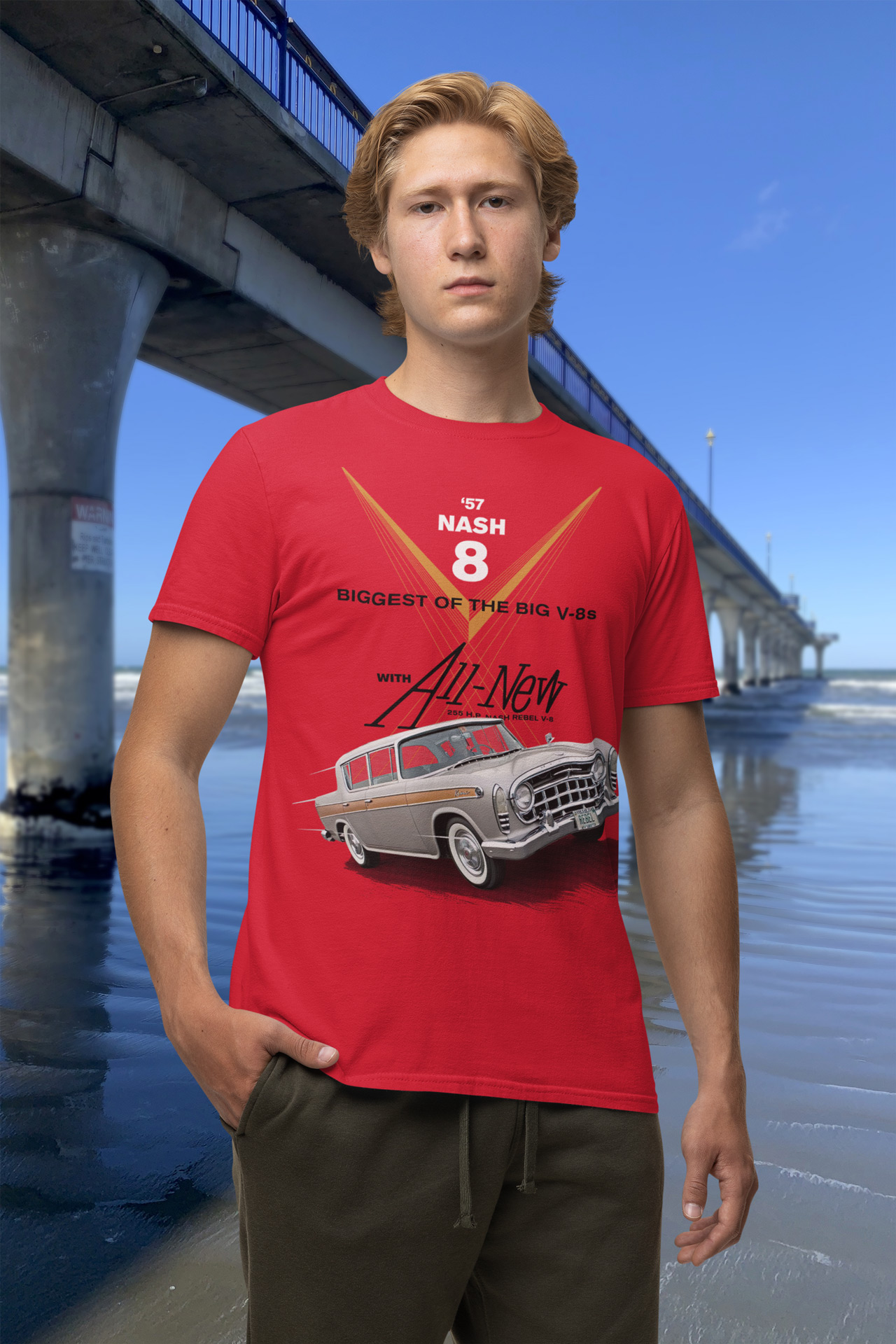
From Banner to Tee: Designing a T-Shirt Inspired by the 1957 Rambler Rebel

A Spark of Inspiration Mid-Project

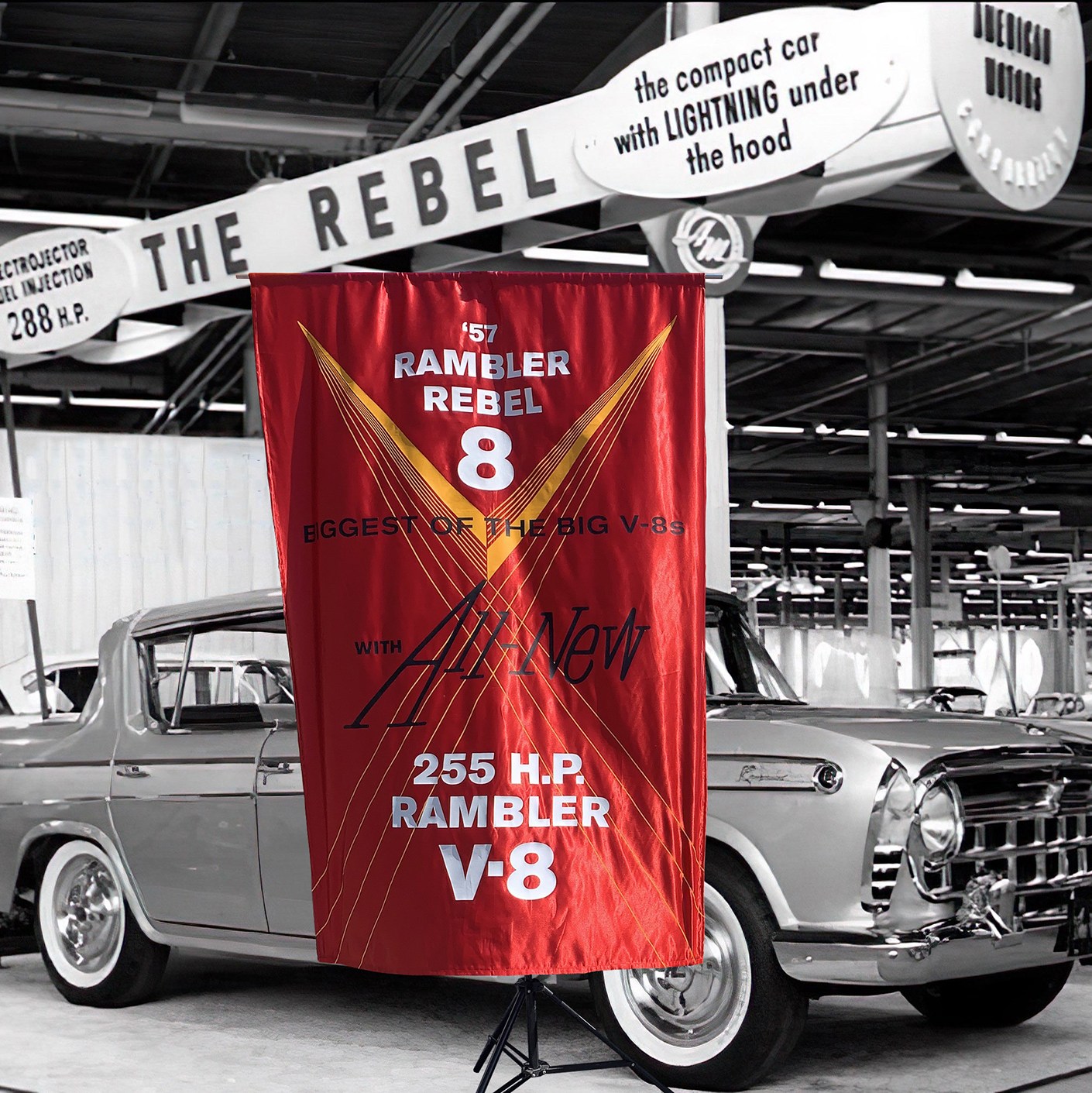
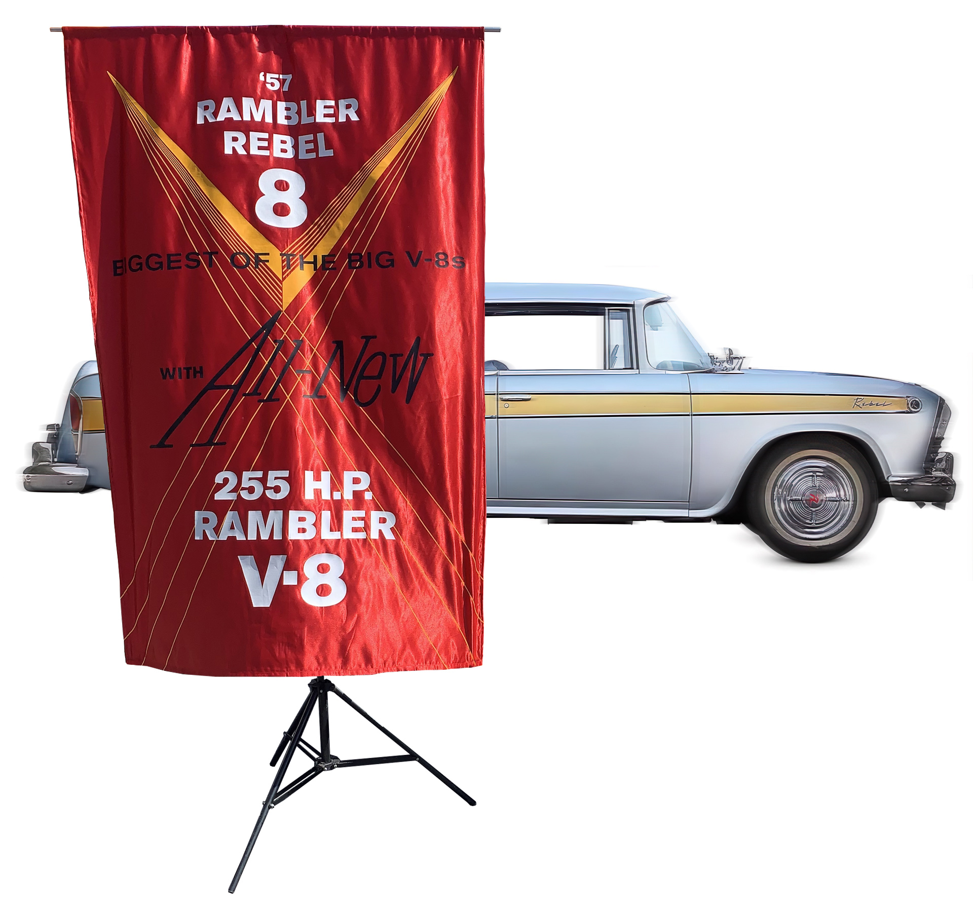
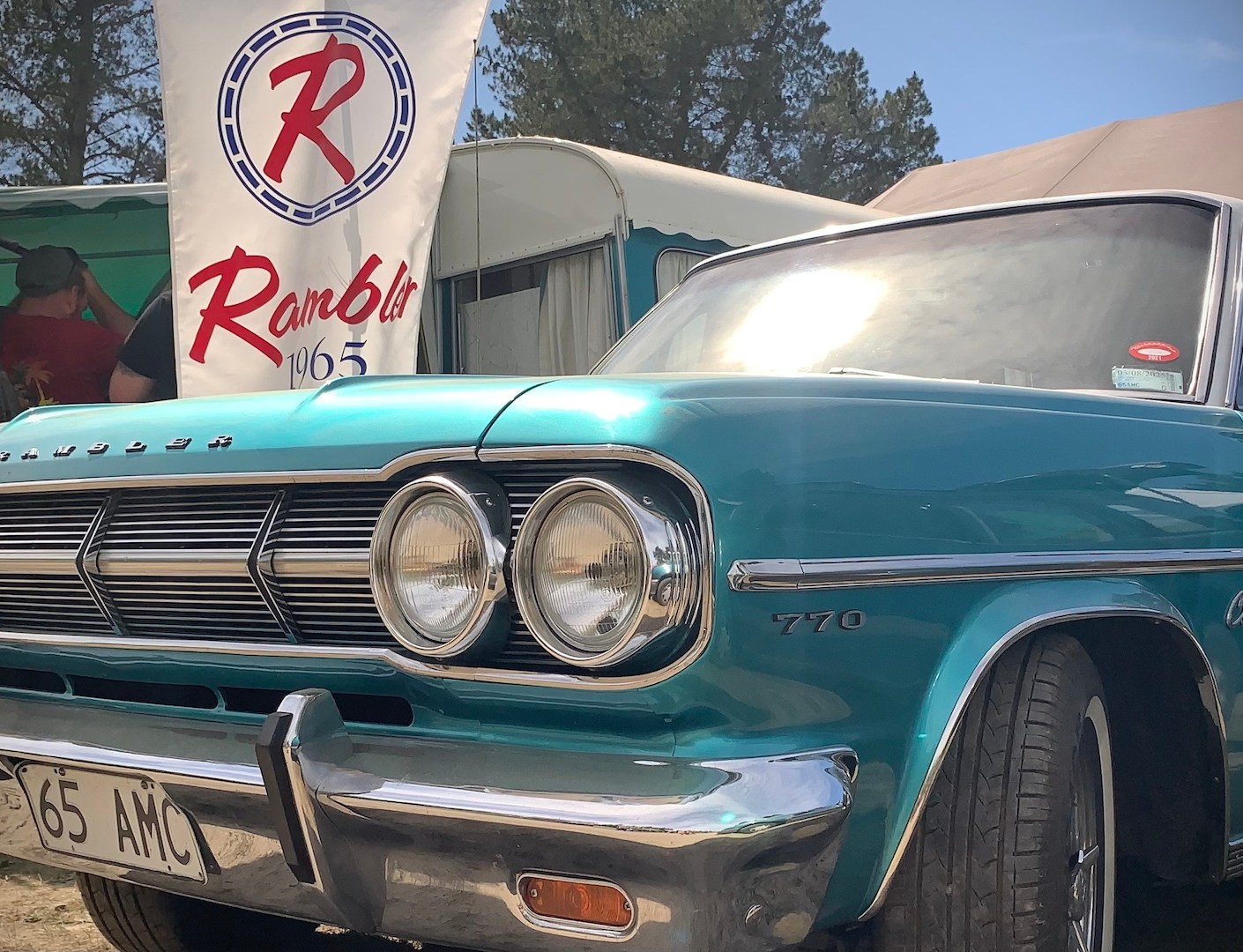
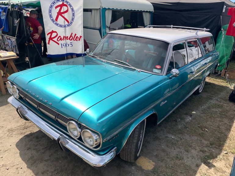
When I was deep into the process of re-creating a 1957 American Motors dealership banner for my friend’s Rambler Rebel restoration, I found myself intrigued by the car’s oddball charm. Its rarity fascinated me. My friend had showed me the 1957 Rambler Rebel in his workshop, which he’s been pouring his heart into restoring, it was in its bare metal current state. Its unibody design was clearly visible and surprising, I didn’t know that any cars were made by American Automakers in the 1950s where the body structure itself provides the main strength.

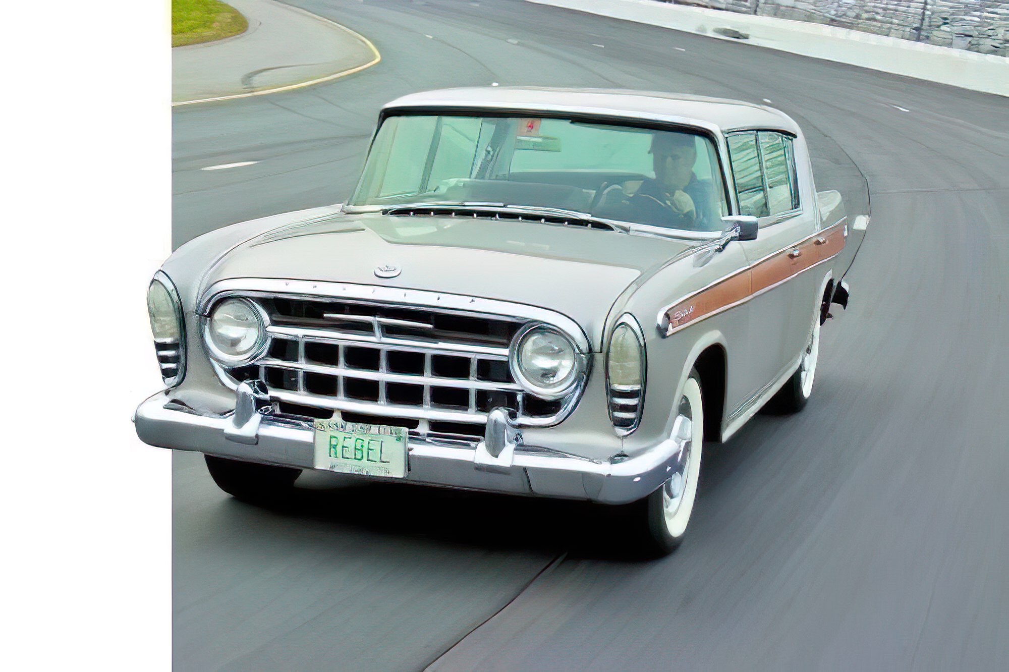
Curious to understand how this innovation came about, I dove into research. I uncovered fascinating details about the car’s legacy. Monocoque construction contributed to its lightweight agility and record-breaking 0-60 time of 7.5 seconds in 1957 at the Daytona Beach Speed Week. The research also yielded low-resolution images of the car speeding along the test track, and still images of it at Daytona Beach Speed Week.

It occurred to me that the bold graphic design of the banner, with its vintage fonts and striking colours, would look great on a t-shirt. This would be especially true if I paired it with a digital illustration of the Rebel in motion on the track.

Man wearing a red 1957 Rambler t-shirt standing beside New Brighton Pier, celebrating the Rambler Rebel’s legacy.
Rocking the rebel vibe at New Brighton Pier! This red 1957 Rambler t-shirt honours my friend’s restoration of the iconic Rambler Rebel—a bold nod to its underdog spirit!
Read More
Photocomposite of a 1957 Nash Rambler silk banner in lustrous red with a black-and-white 1957 Rambler Rebel sedan auto show image.

The 1957 Rambler Rebel: A Banner Worth Raising Again

Picture this: it’s 1957, and the American automotive landscape is a parade of chrome and tail fins—cars flexing their excess like peacocks in Detroit showrooms. Then, rolling out of the chaos, comes the 1957 Rambler Rebel. Not a conformist, not a follower, but a four-door rebel with a metallic silver streak and a secret under the hood. My friend, a car nut with grease under his nails and a gleam in his eye, is restoring one of these rare beauties right now. And me? I’m the design guy who got roped into re-creating an American Motors dealership banner from that very year—a bold, period-perfect piece to match his labour of love.

But why go to all this trouble for a car most folks don’t know they’ve forgotten?

1957 Rambler Rebel sedan on a test-driving track, showcasing its silver finish and classic design.
Revving into history! This 1957 Rambler Rebel sedan tears up the test track, proving its muscle car credentials with style and grit—America’s forgotten badass in action!

Let me tell you a story about the Rebel that explains it all.

Photocomposite of a 1957 Rambler Rebel sedan in motion as a blurred silver streak backdrop, with a crisp red silk banner in the foreground featuring heat-pressed vinyl graphics.
Speeding into the spotlight! This photocomposite pairs a motion-blurred 1957 Rambler Rebel with its stunning red silk banner, reborn to honour a rebel with a cause!
Read More
Restored 1965 Rambler Classic 770 Countryman station wagon with a red, white, and blue authentic, re-created, American Motors dealership banner, at the 2024 McLeans Island swap meet.

Making American Motors Great Again

The project: Re-Create an American Motors Classic American Car Dealership Banner from the 60s.

The Allure of a 1960s Car Dealer Banner

There’s an undeniable allure to an authentic car dealer banner from the 1960s, a cherished relic that transports us back to an era when automotive culture was as much about bold design statements as it was about engineering prowess and value for money.

A Symbol of Post-War Ingenuity

This 1960s Rambler banner, with its vibrantly patriotic red, white, and blue hues, served as proud beacons of post-war American ingenuity.

Drawing Crowds at the Swap Meet

This banner in association with the car drew enthusiasts and casual onlookers alike to the owners’ stall at the 2024 McLeans Island swap meet.

Handcrafted Authenticity

Handcrafted with care, they embodied a tactile authenticity—lustrous, pearly white polyester satin and solid cut vinyl colour printing re-creating the era’s optimism and craftsmanship.

Preserving a Legacy

Recreating such a piece, as my spouse and I did with the 1965 Rambler banner, preserves not just a design but a story, infusing it with durability for modern display while honouring its historical mid-century modern roots.

A Celebration of Nostalgia

It’s a celebration of nostalgia, a functional art piece that elevates any classic car showcase with its vivid presence and timeless appeal.

Driven by Design: Celebrating the 1965 Countryman with Mad Men-Era Panache

High front three-quarter view of a restored 1965 Rambler Classic 770 Countryman station wagon with a re-created Rambler dealer banner, shot at McLeans Island swap meet.
Behold the stunning 1965 Rambler Classic 770 Crosscountry, paired with our handcrafted 1965 Rambler dealer banner, shining at last year’s McLeans Island swap meet—a perfect blend of vintage design and modern craftsmanship.
Read More
Pomeroys Boutique Accommodation logo and hand-crafted three dimensional sign.

Excellent design conveys care


POMEROY’S ON KILMORE BOUTIQUE ACCOMMODATION, CHRISTCHURCH


Excellent design conveys care, craftsmanship, professionalism, it is beautiful to see and fun to do

THE BEST DESIGN—design that moves people’s hearts and minds—has something more. It expresses a concept, a great underlying vision that combines imagination and wisdom. Without a great concept, it is fair to say, design is only superficial decoration. A great concept is what gives purpose to the communication art of design. The design of Pomeroy’s on Kilmore Boutique Accommodation’s brand and corporate identity components, from signage to print & web, to bathroom products is all about vision—the art of imagining and thinking and seeing a world that does not yet exist, and that needs graphic design to bring that to life.

“Pomeroy’s and daughters and son” is a family business, having welcomed lots of guests through its doors over the previous eighteen months, in 2007–8 Steve and Victoria Pomeroy decided to complete their plans to fully refurbish, upgrade and rebrand the colonial villa, formerly known as Pomeroy’s B&B from 2006. Snug, comfortable Pomeroy’s on Kilmore Boutique Accommodation is centrally located next door to Christchurch’s own historic, English-style pub! Managed by Ava the atmosphere is private and personal, complete with delicious continental breakfast, what more could you ask for but their fantastic value tariff? Steve’s career in construction and Victoria’s flair for interior design came together in a great luxury b&b concept that positioned Pomeroy’s on Kilmore as a top of the line B&B.
Keep on reading!

BabyBliss nursery furniture collection A5, bifold landscape brochure

BabyBliss before & after

This slideshow requires JavaScript.

To design a brochure that sells, the key is simple: Keep all eyes on the product. Many people are not in the market for nursery furniture. The way to profits is to visualise those who are interested and present your nursery furniture to them. BabyBliss furniture is excellent; I can sell that. A consumer in the market for nursery furniture isn’t looking for a shop, they are looking for a product. My job is to make your product speak for itself. The target audience is intelligent and preoccupied. The brochure needs to be clear, to the point and concise. Don’t waste their time.
Keep on reading!

Windsor Urban brand use document cover

Brand use guide: WindsorUrban

Setting brand standards that people will follow

WindsorUrban symbol and type logo greyscale iconThe brand use manual or corporate identity guide ensures the new WindsorUrban logo is applied correctly in every application where WindsorUrban is identified. The purpose of the brand manual is to enable and regulate a uniformity in the firm’s visual image. WindsorUrban aims to design and manufacture the “go to” product and service offering within their market niche, the brand that their customers think of first when they want urban furniture and street lighting. The guide’s basic job is to teach everyone who uses it, what the brand is and how to effectively implement it.
Keep on reading!

Building exterior design + signage

Projects featured in portfolio

  • Tru Line Civil signage system 2014
  • Pomeroys Pub exterior paint scheme, 2004.
  • Winniebagoes House (Old Winniebagoes, demolished 2011) feature signage and building directory, 2003.
  • Winniebagoes restaurant, street-side front window branding on window.
  • Wigram Airforce Tower exterior paint scheme, 2006.
  • Pomeroys Boutique Accommodation one-of-a-kind 3D sign, two-sided exterior street sign, 2009.
  • Pomeroys Boutique Accommodation multi-level cast bronze building plaque, 2009.

Keep on reading!