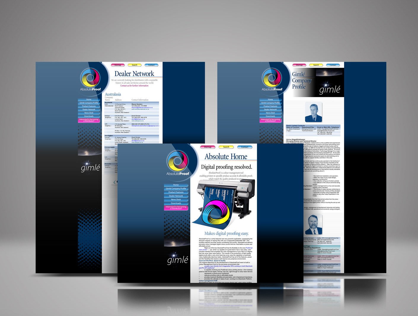
Absolute-Proof website 1998 launch design

Absolute-Proof digital proofing launch website 1998

Absolute-Proof | Digital Proofing Resolved | The 1998 product, website and brand launch

AbsoluteProof_logo_radiused_256px

Best-in-class colour-managed workflow hub / digital proofing software solution, brainchild of brilliant friend pre-press professional Hjórtur Kristínsson, named by me ‘Absolute-Proof ’, launched in 1998, this was the first iteration of the web design I designed for the product launch. The launch was aligned with Hugo showing at the Drupa print fair in Dusseldorf that year. The AbsoluteProof website was developed in collaboration with a web design firm in Reykjavik, Iceland.
Read More

WorkPace Ergonomic resting software draft packaging concept 3D digital rendering.

WorkPace packaging: great brands stand out

Whenever I am working on a packaging design project I’m focussed on one thing, how can I add value. How can I by research, writing, developing messaging and design elements add value? What strategy can I develop that will make the WorkPace breaks and exercises software brand better and stronger? What can I develop that will help create engaging packaging design concepts that appeal to office workers and their managers?
Read More

Packaging carton for MyoPace EMG Equipment for Physiotherapy

MyoPace EMG carton

This beaut MyoPace packaging design uses simple, clear visual language as well as text as the approach to expressing the core messages and to simultaneously capture and hold the consumer’s attention.

The power of packaging for your brand

As a manufacturer it is your job to package your product well, advertise it to your audience nationally and internationally, take orders, ship your product, collect revenue, handle accounting and so on.
Read More

MyoPace brochure makeover

The MyoPace EMG product capabilities brochure presents the utility of a high tech piece of medical equipment beautifully and inexpensively. The brief was for a product brochure makeover. A plain sheet of paper is transformed into an engaging, easy-to-read A5 three-panel brochure with full bleed printing and two rollover folds.

By combining well thought out and carefully art directed studio photography, a large format pastel illustration and clear typography the new brochure tells a user-friendly story in words and pictures.
Read More

Da Vinci rebrand: software brochures

Software brochures makeover for Da Vinci Communications

Desktop publishing is a path of discovery. Why is making something look better worthy toil? There are benefits to clarity, ease of understanding for busy people justifies hours in production.

Pleasing design needs no apology, even in technical publications. Artistic expression can be placed on the same level as informational expressional.
Read More