The Art of Art for Reproduction: Rediscovering the Charm of Hand-Separated Rendering for Screen Printing
In the modern world of digital design, where every line can be perfected with a click, there’s something uniquely captivating about the traditional methods of graphic design. Today, I want to take you back to the early ‘80s, to the Graphic Design School at Auckland Technical Institute, where I spent over four years mastering an art form that’s as meticulous as it is magical—hand-separating colours for screen printing. Rendering shading, texture, and detail to achieve a realistic depiction of New Zealand native animals and plants.
Keen Eyes, Steady Hands, Delayed Gratification
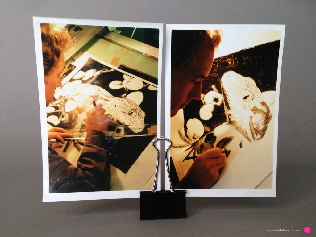
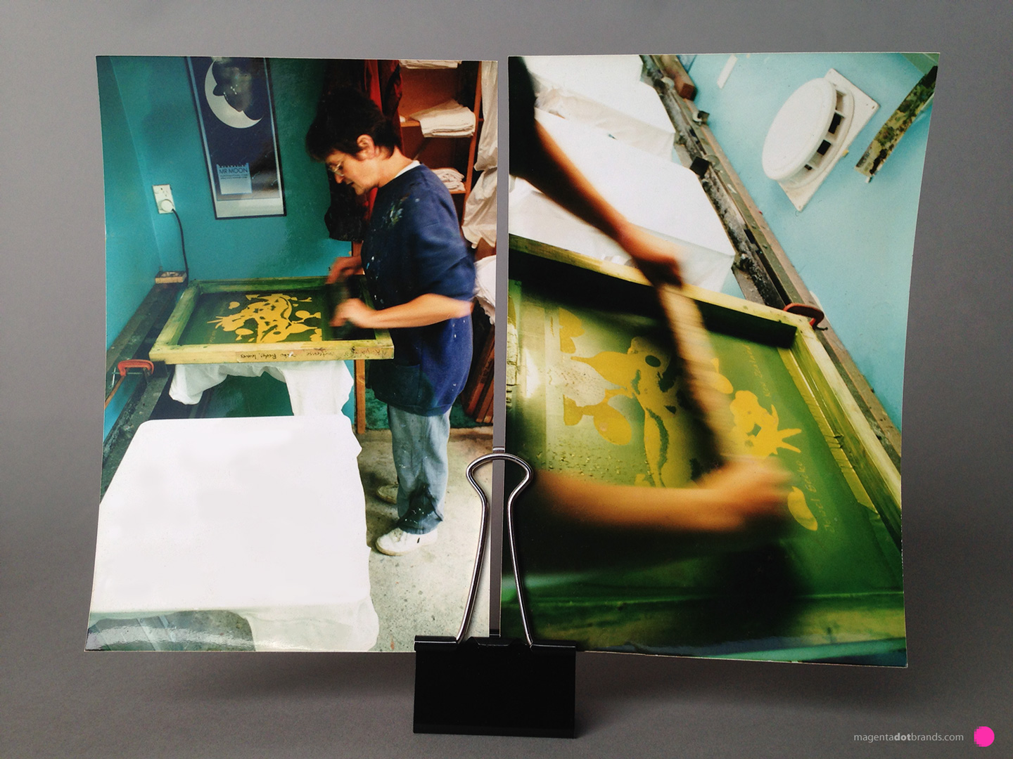
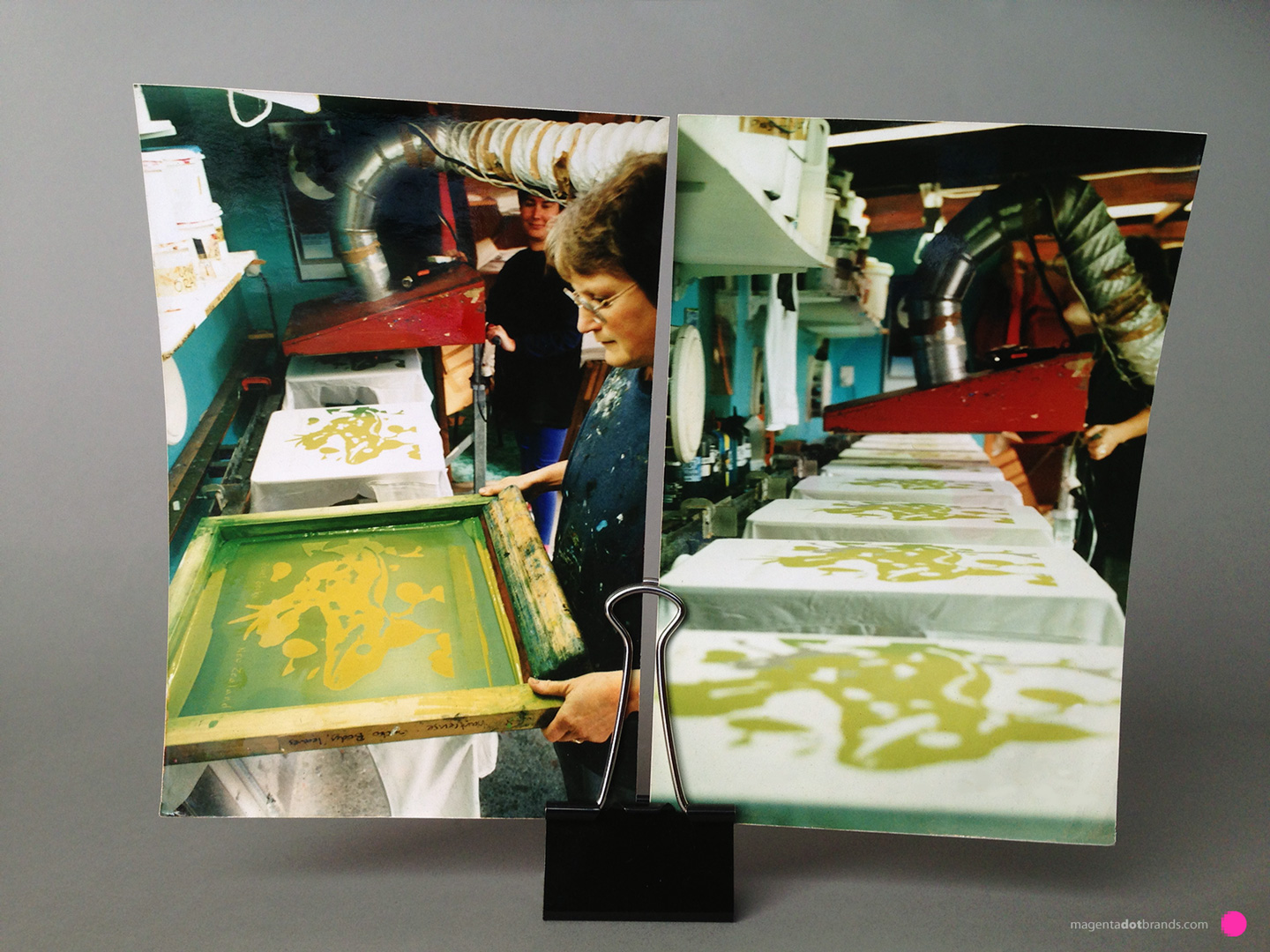
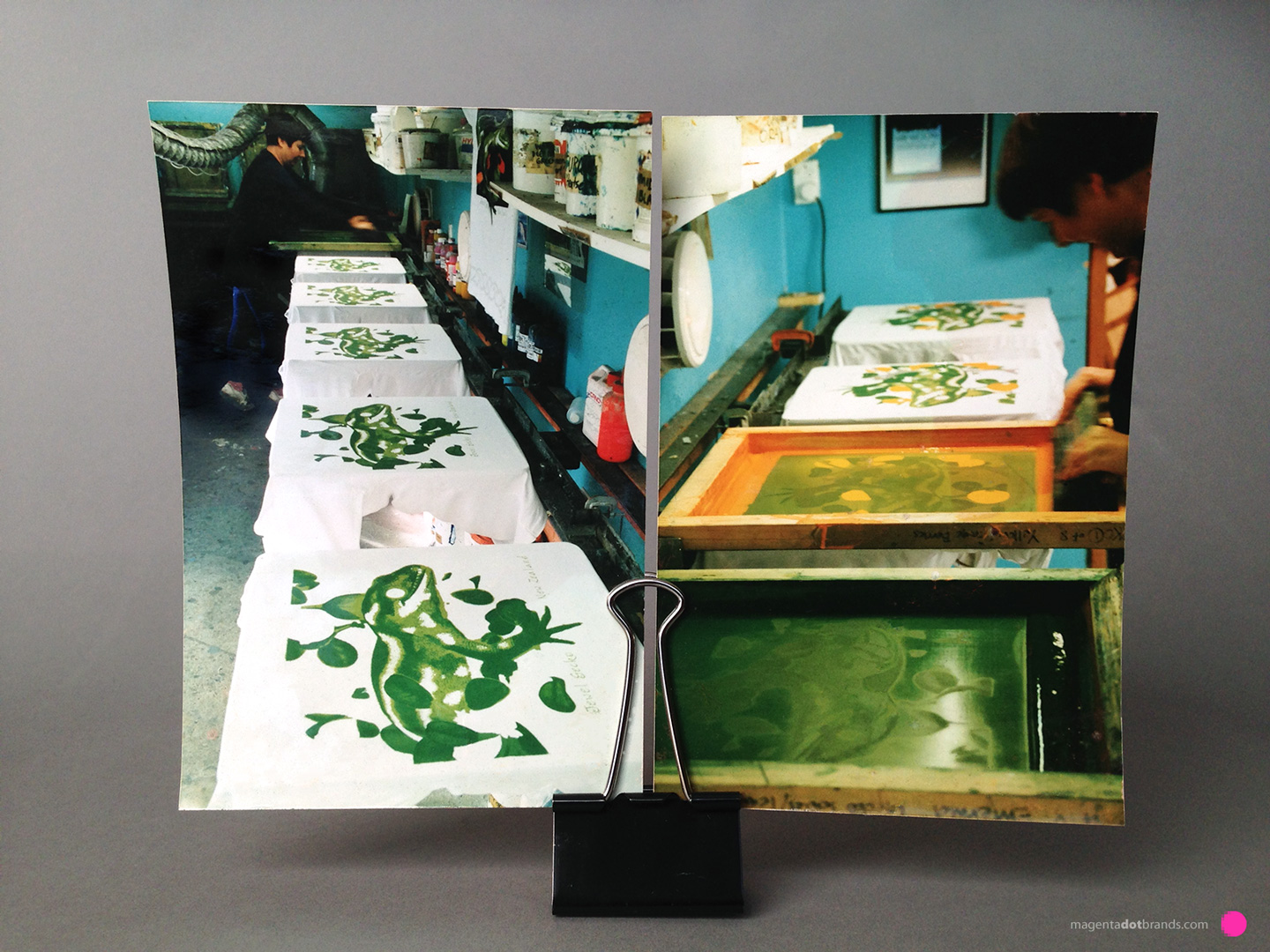
The process began with the most basic element of any print—the reference photographs. My task was to dissect this image, identifying every hue, tone, shadow, and light. This wasn’t just about seeing; it was about a feeling for the image. About understanding how each colour and how its shadows and its source of light interacted and contributed to the whole. Each colour was isolated, and gradations between one colour and another, between light and dark, shaded. This created a palette that would transform into art through the hand-pulled screen print.
Layering the Art
The technique involved using translucent mylar architectural drafting film, which allowed for the creation of each stencil layer on a lightbox. Picture this: you’re in a dimly lit room, the glow of the lightbox casting just enough light to see through the film. Here, you start to build your image one colour at a time, akin to painting with light. It’s a slow, thoughtful process of translation from one medium to another, where each stroke adds depth and dimension to what was once just a flat photo.
Registration Finesse
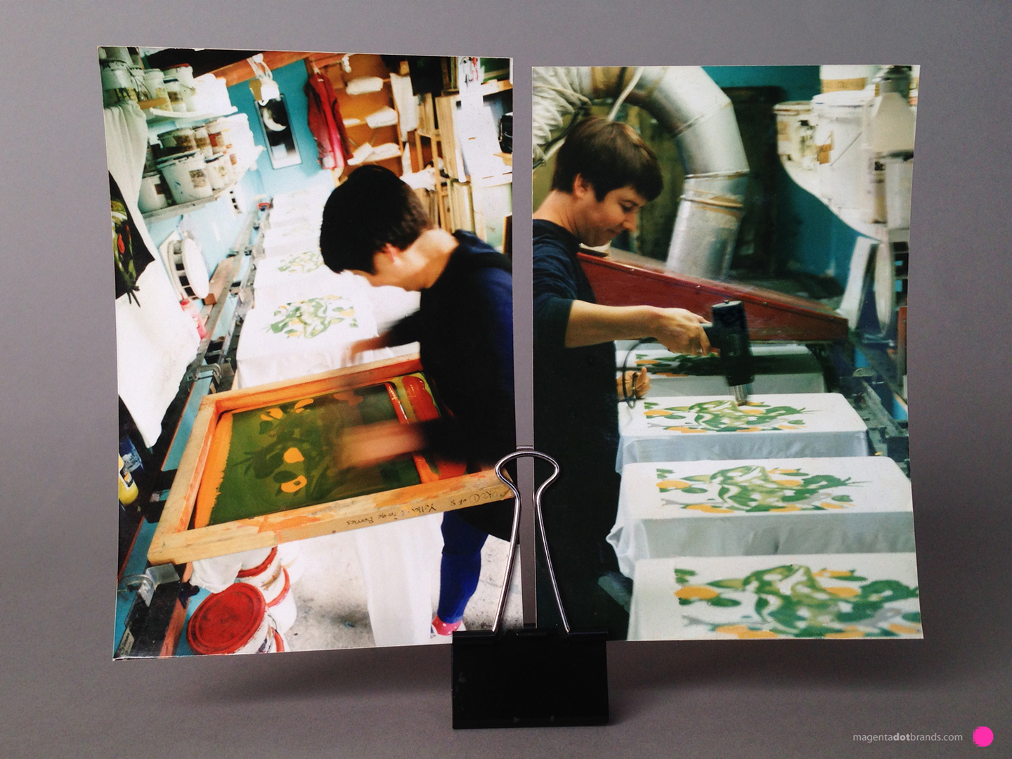
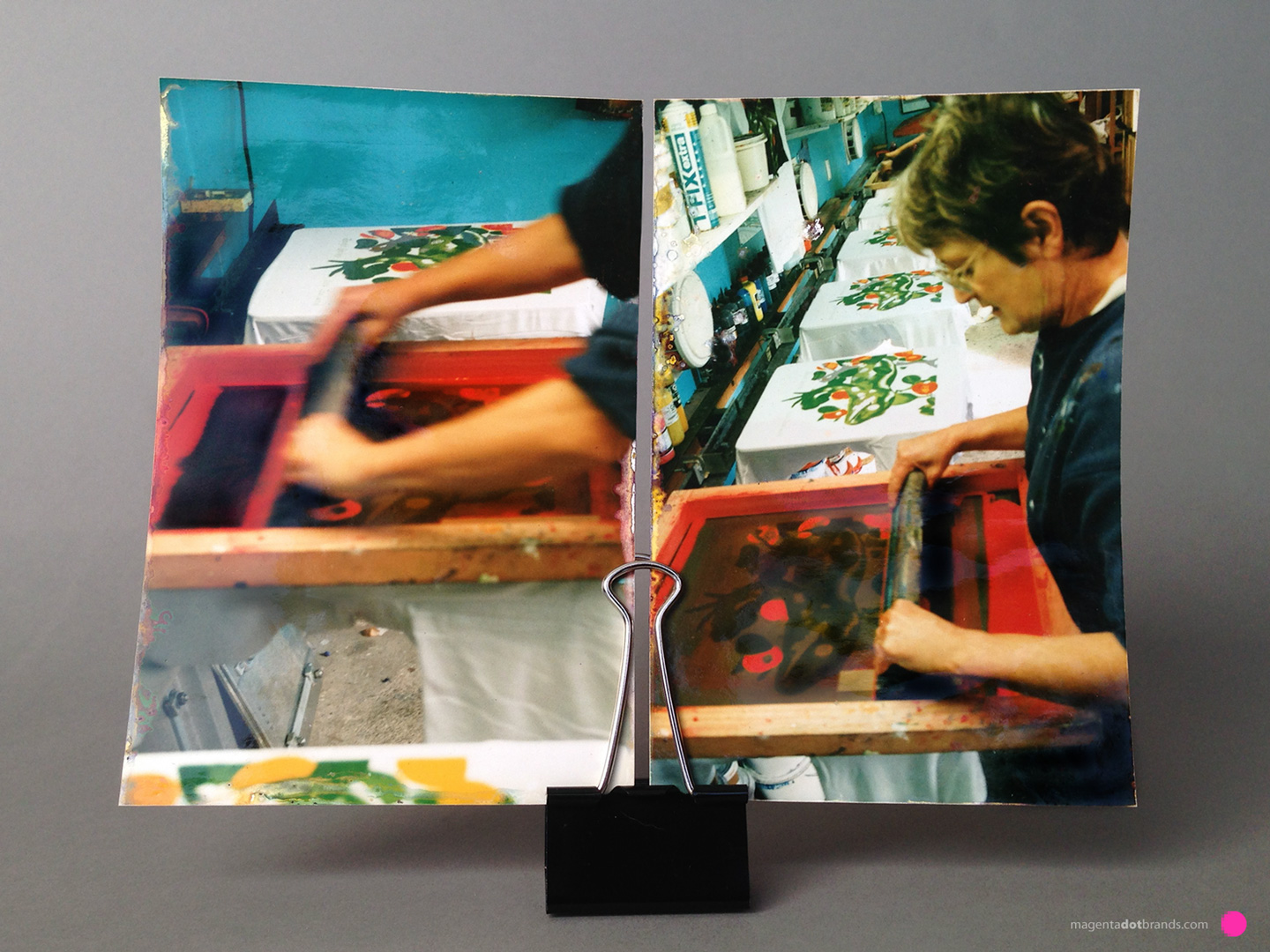
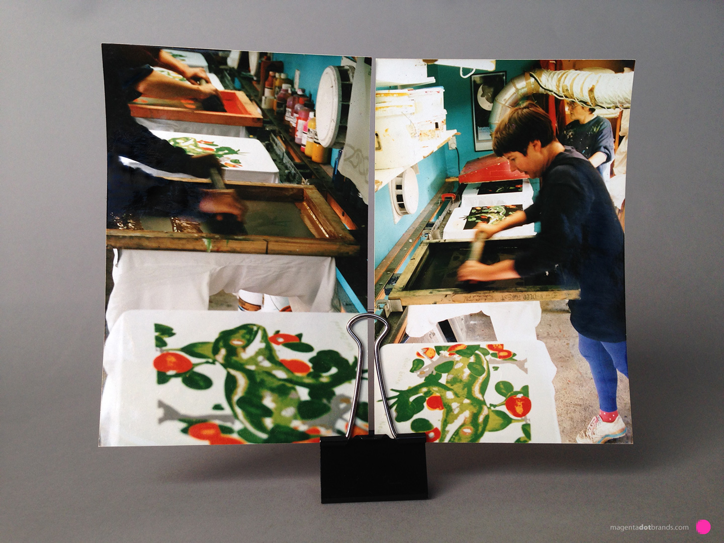
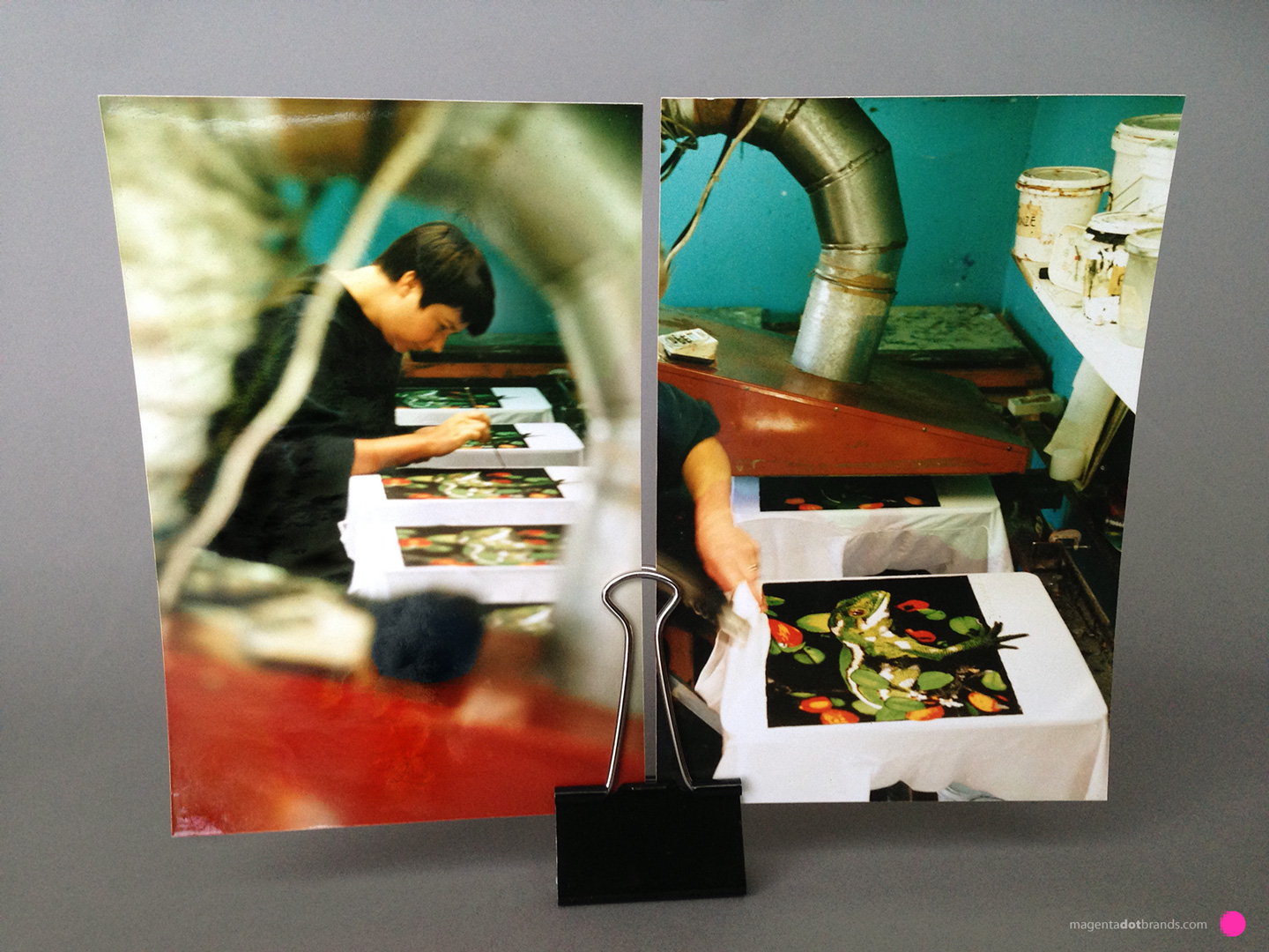
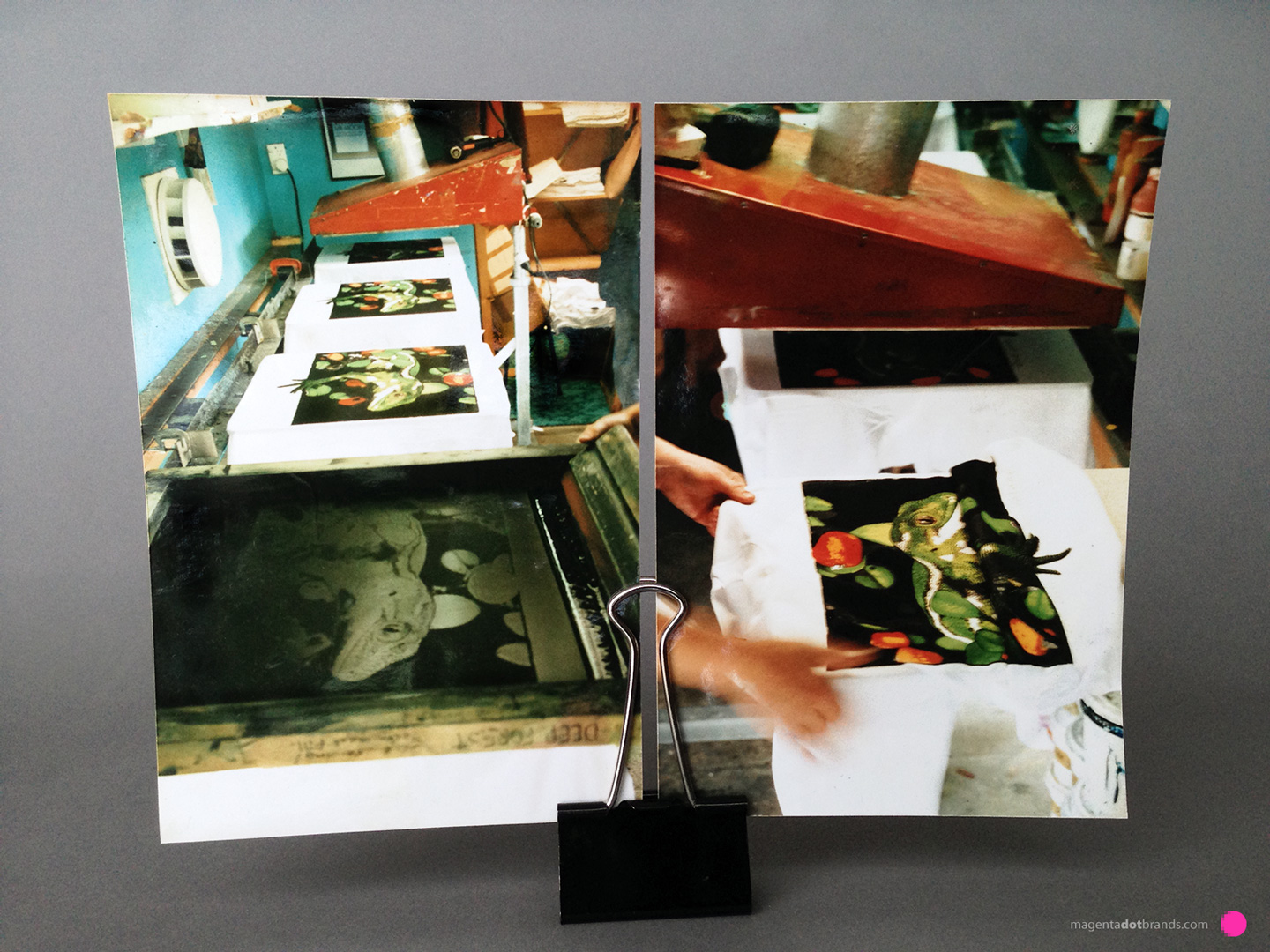
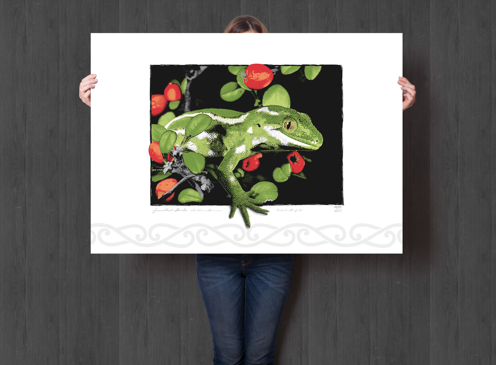
Achieving perfect alignment was crucial, akin to the precision needed in old-school cel animation. With mechanical punched registration, I ensured that each of the eight stencils I created for this specific design would align flawlessly in the darkroom, on the stencil, and ultimately when screenprinting onto the shirt. This meant tracing, drawing, and painting on each stencil, always checking back against the original stippled pen and ink drawing on translucent mylar for alignment. Every layer had to be in harmony, the fit and finish exact, or the slightest error would cause the final print to lose its coherence.
Rubylith’s Reign
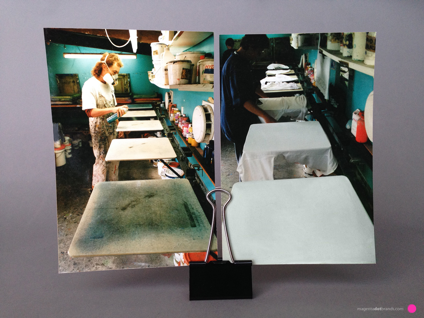
For blocking out areas where ink wasn’t needed, Rubylith was indispensable. This red, translucent film acted like a shield under the process camera’s lights, allowing for quick, clean creation of solid colour areas on stencils. In photo-stencil making terms it was like blocking light to decide where to let the printing colours shine through.
A Printer’s Palette
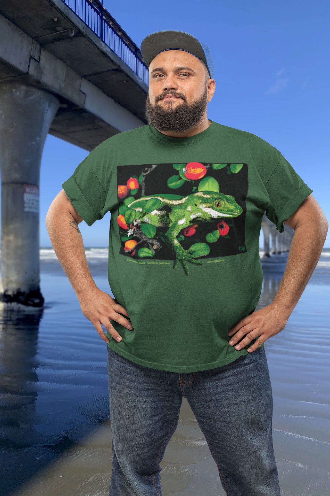
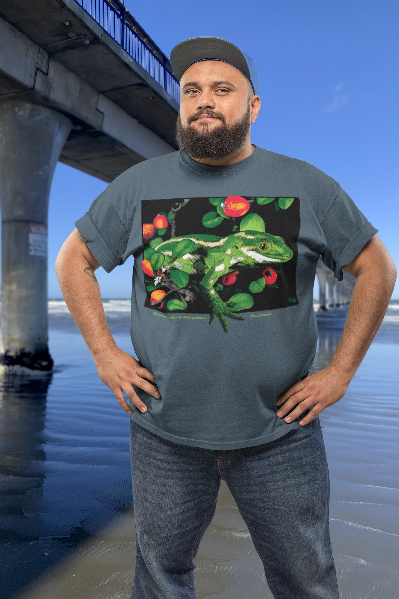
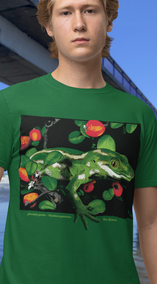
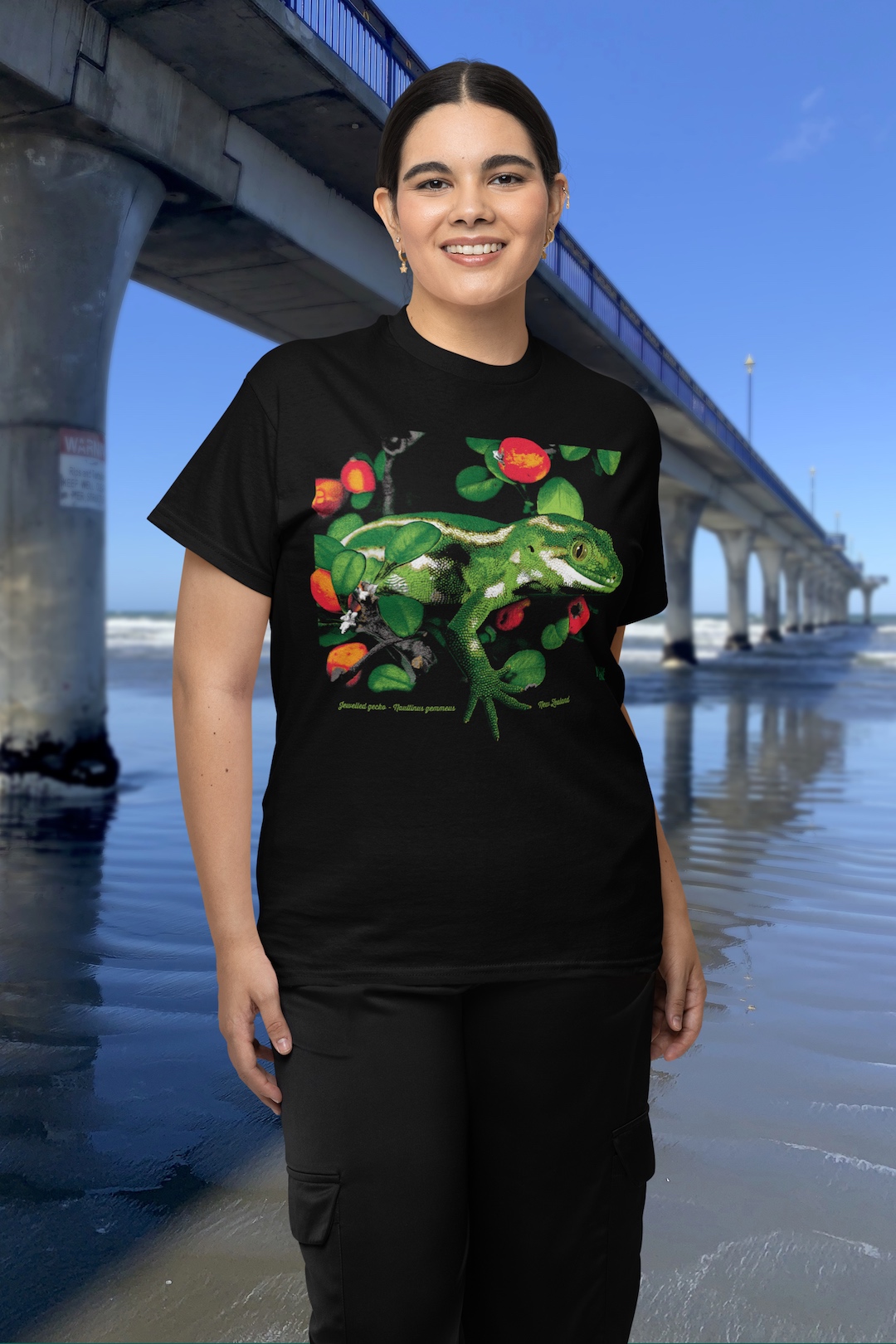
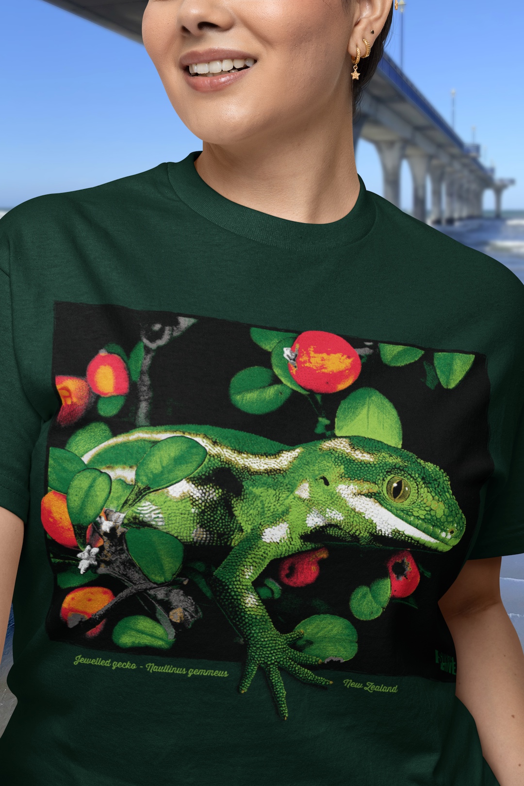
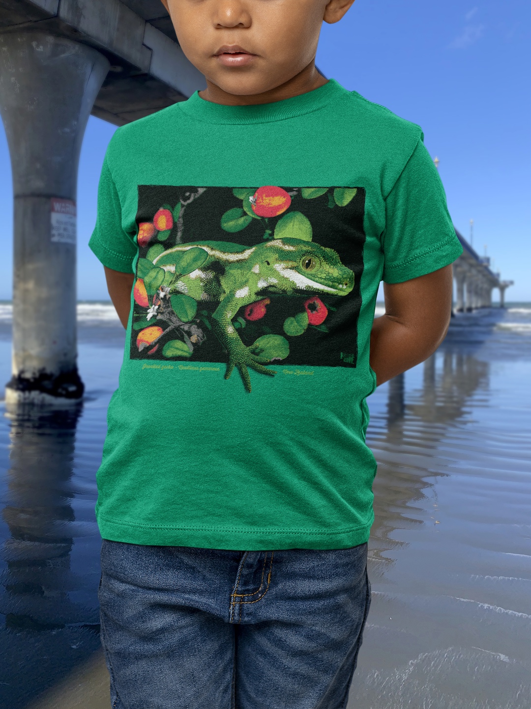
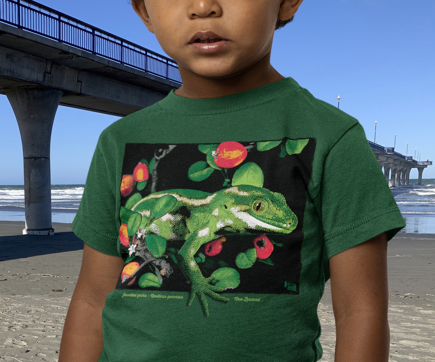
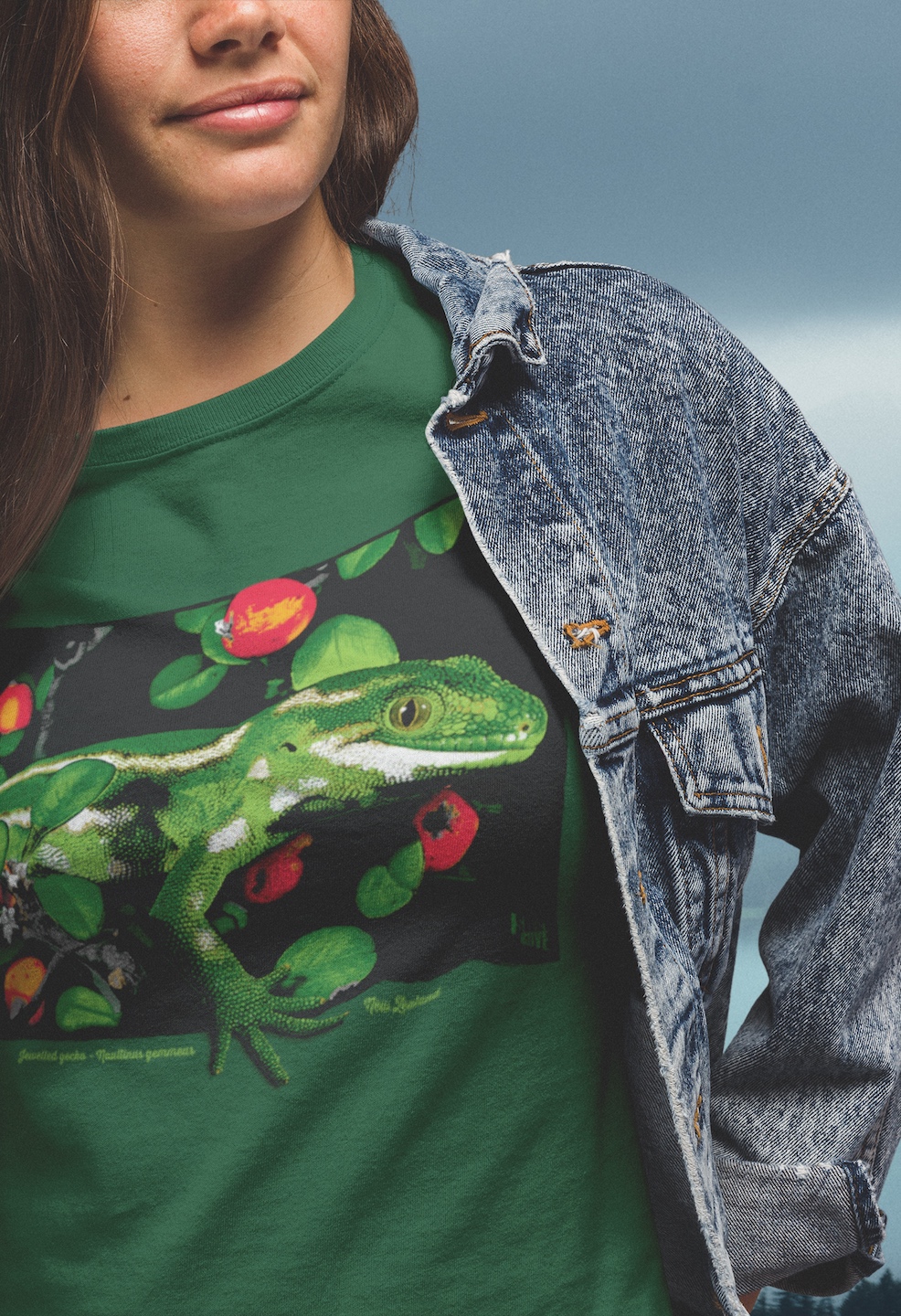
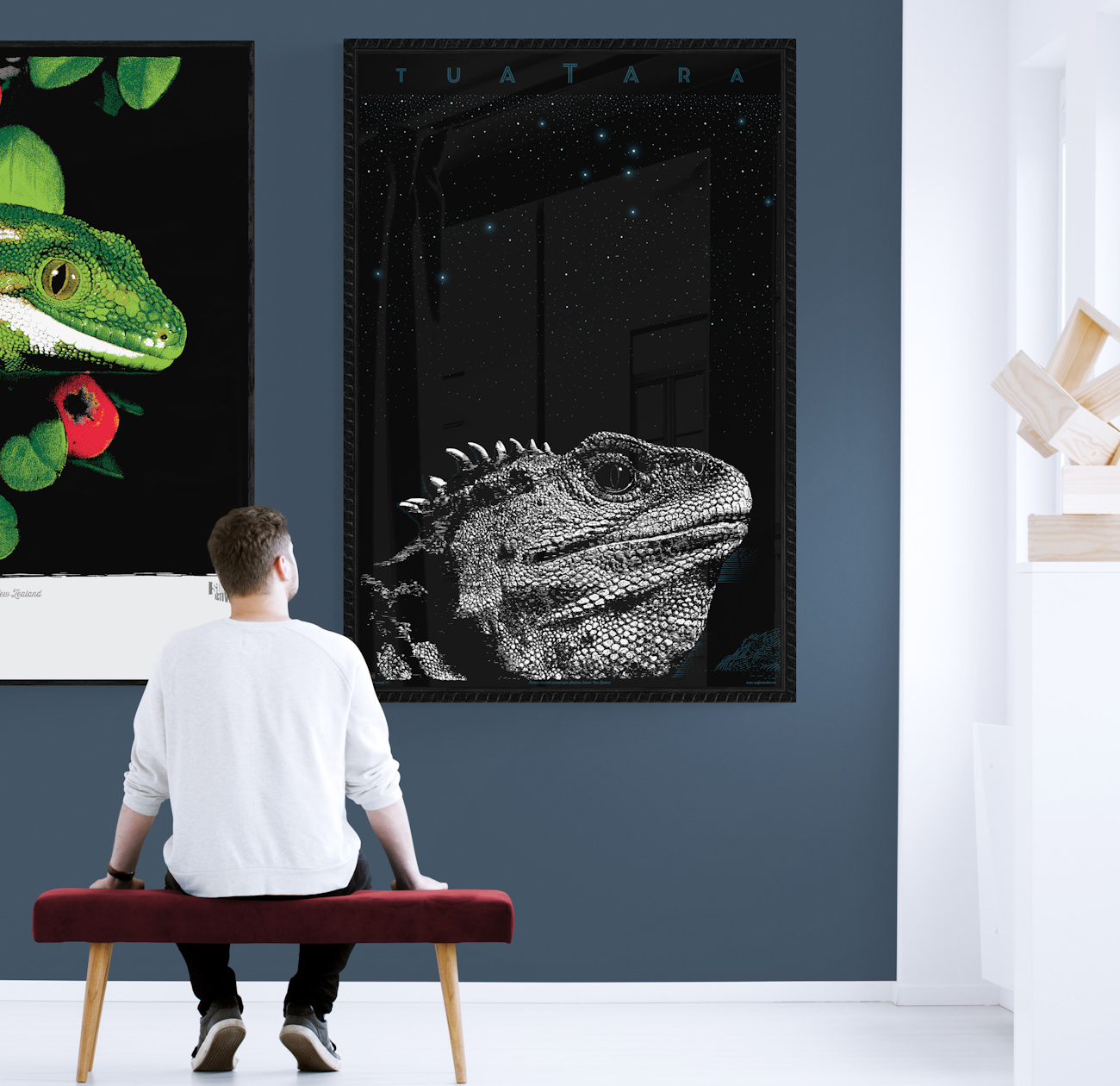
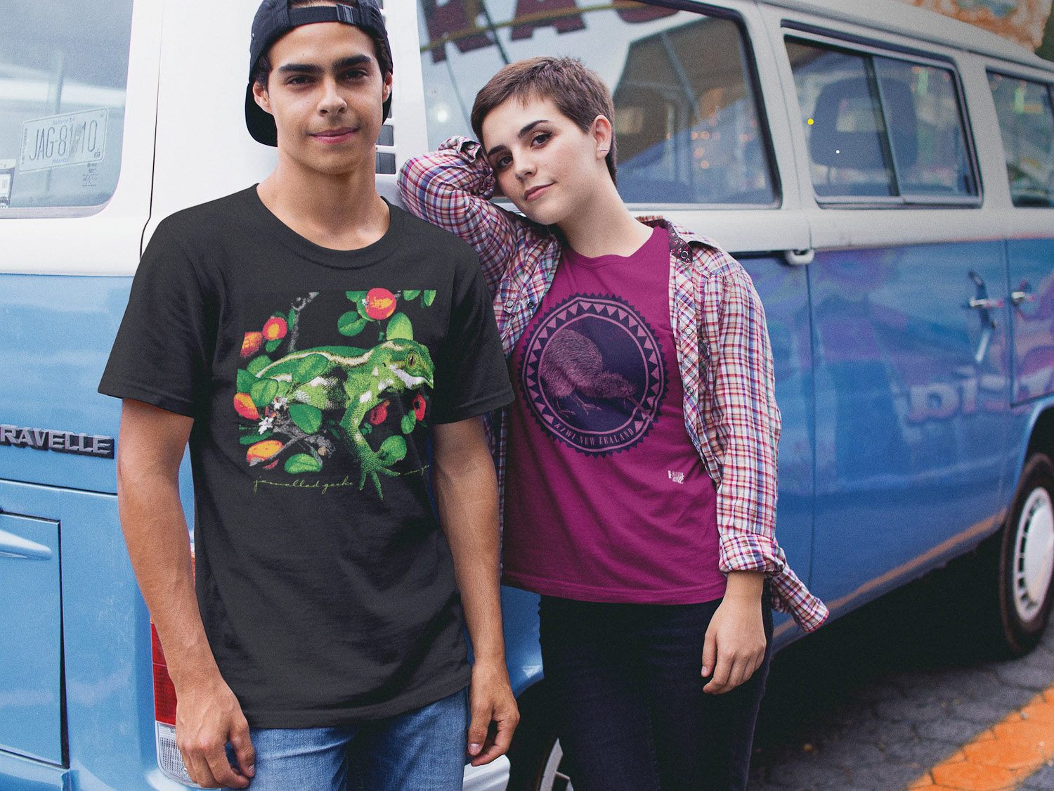
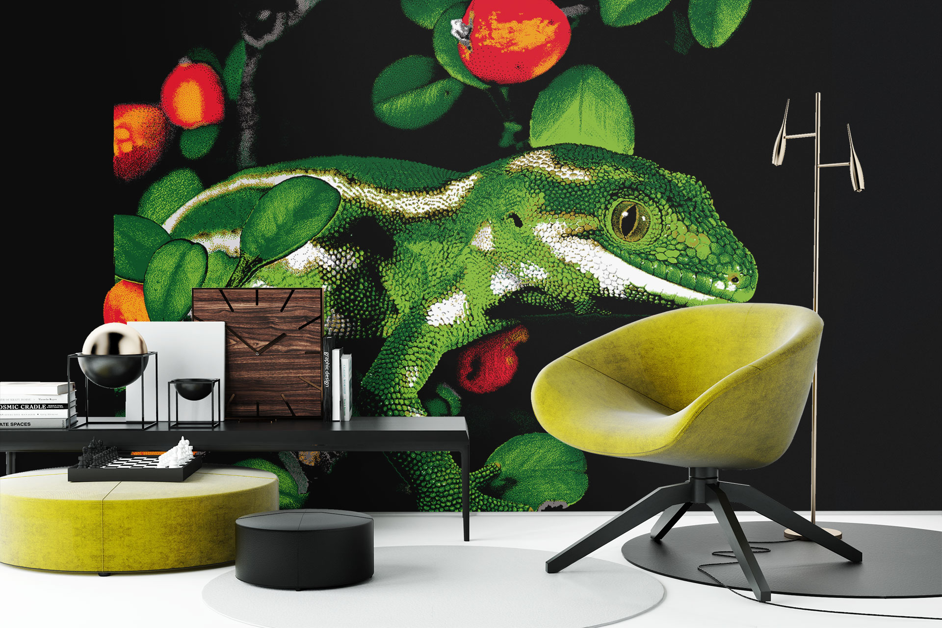
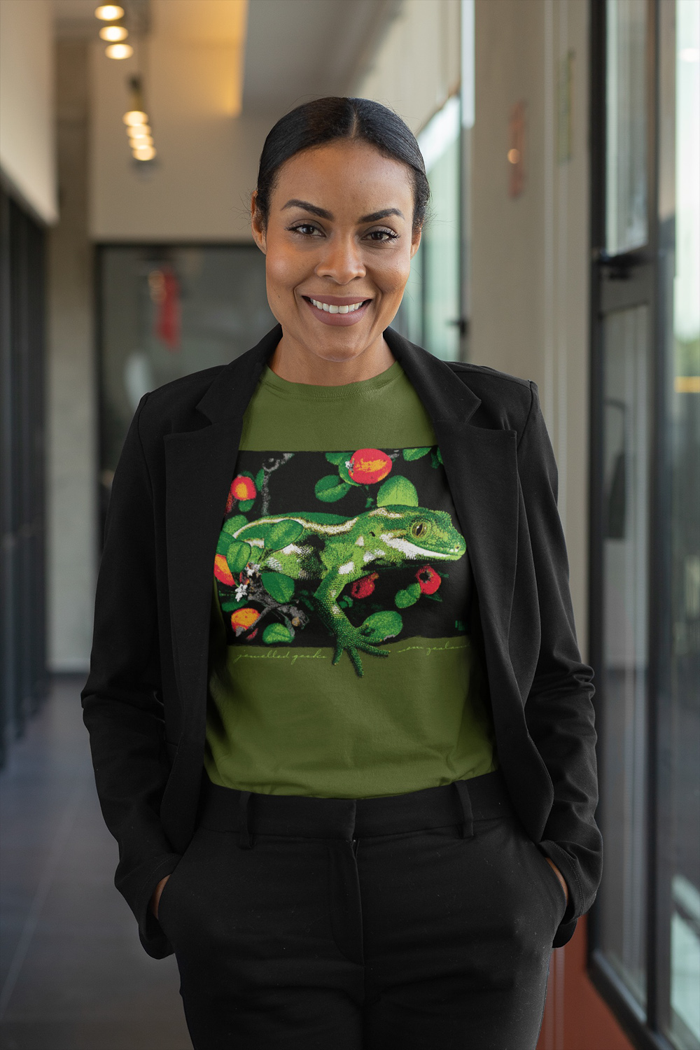
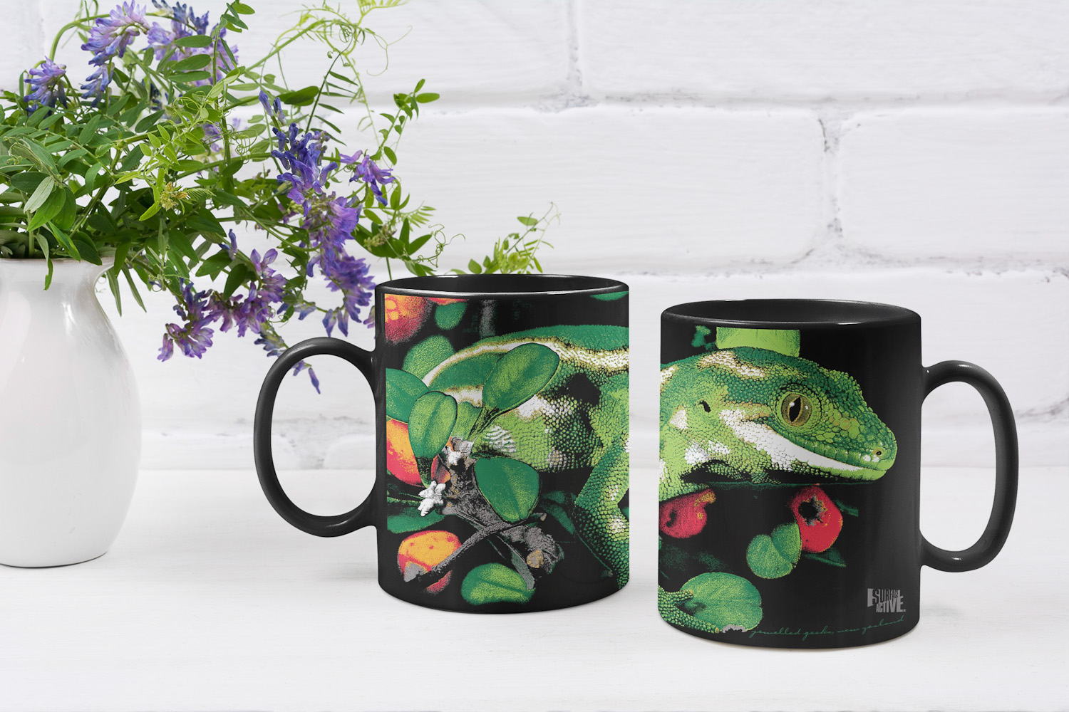
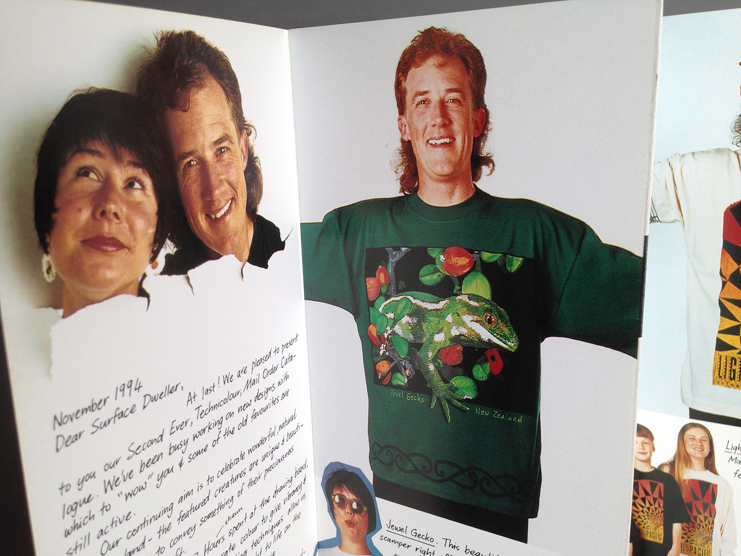
The complexity of the final print dictated the number of stencils—for this Jewelled Gecko design, nine separations were used, one screen even split between two colours for a more nuanced look. This wasn’t just about achieving colour; it was about creating a “screen gem” by respecting the source photography and its subject and adapting it into the new visual form of wildlife art on a t-shirt, while maintaining accuracy.
From Mechanical Then to Digitial In, Digital Out, Now
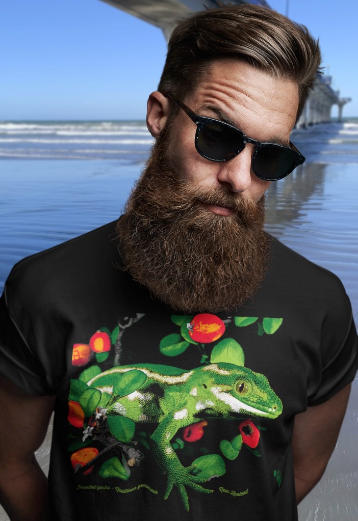
Fast forward to today, the shirt I describe is now modeled by a bearded man beside New Brighton Pier While I’ve embraced modern DTF printing technology to reproduce this design at my home studio in New Brighton, the nostalgia and skill of this old-school technique remain a significant part of my practice.
This journey from traditional to digital not only honours the craft’s heritage but also highlights how the essence of good design transcends technology. It’s a reminder that sometimes, the most beautiful art comes from the most labor-intensive methods, where patience and precision create a legacy in every print.