
The inspiration for the design came from superlative wildlife photographer Rod Morris. Chrissie and I visited Rod’s image library in Dunedin back in the 90s when we were there exhibiting with The Great New Zealand Craft Shows. We were looking for slides that he had cherry-picked. These slides had the potential to be developed into hand-separated wildlife art for screen printing.
Making It Simple: Breaking Down the Colours to Just Seven Stencils for the Original Screen Print
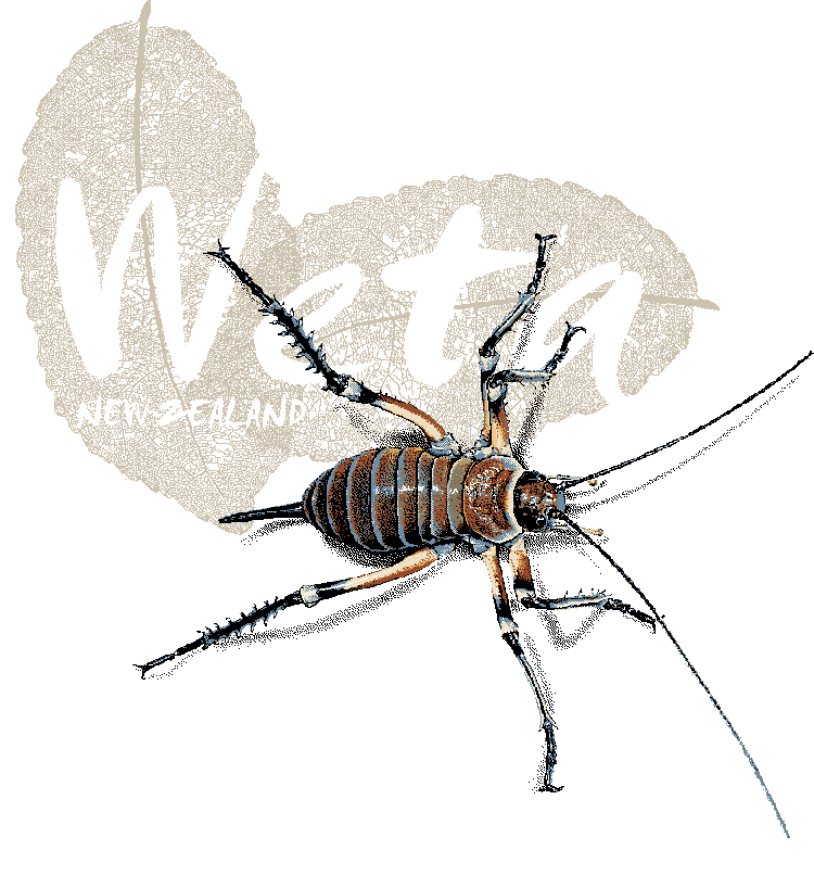
- From Millions of Colours to Seven: So, to make the colour palette for my weta photos a bit easier to handle, I fired up Photoshop, opened up the weta pics, and got to work. I carefully cut out the weta from their backgrounds and smoothed out their shadows with some airbrushing.
- Choose Final Reproduction Size For Screenprinting: When you’re picking the size for your screen print, keep in mind that the picture’s resolution shouldn’t be too high. You want the image resolution to be low enough so that each tiny pixel can actually show up when printed. The thread count or how many threads per cm (or denier) in your screen will decide how fine you can go with the pixels. Basically, each pixel should be at least as big as the gaps between the threads in that mesh.
- Convert to Indexed Colour, Posterise: This is all about picking your colours wisely to dial down the crazy range of hues in the reference image to a smaller set. The posterise filter is super handy for making guides that help you with pixel painting those bigger blocks of colour.
- Grab the Magic Wand Selection Tool: This little guy helps you pick out those colour hues and the light and shadows in your reference photo. Just cut each colour onto its own layer, and you’re all set!
- Manual Selective Colour Adjustment: So, when it comes to layering the colours for the art, I boiled it down to five colour hues, plus black and white, which really ties into each stencil I need for a single-colour layer on the final print. I found that Photoshop really helped me build the image colour by colour in a layered document. But honestly, the way the computer separated those weta images felt a bit rough around the edges.
- Colour Separation Finesse: So, I started off with the original image and used my mouse like an electric pencil to sketch out a black keyline drawing of the weta. Then, I just went for it and painted in the two weta, layer by layer, like making pixel art.
- Photolitho Platemaking Positives: So, we got our hands on the final batch of mylar film positives for making photo stencils. These were printed out using a super high-res digital platemaking photolitho image setter.
- A Screen Printer’s Palette: We mixed up the final colours by hand, using a Pantone Colour Formula Chart as a guide. The colour layers from our Photoshop document helped us figure it all out.


Why DTF Printing is a Faster Way to Get My Wildlife Art on T-Shirts Than Traditional Screen Printing
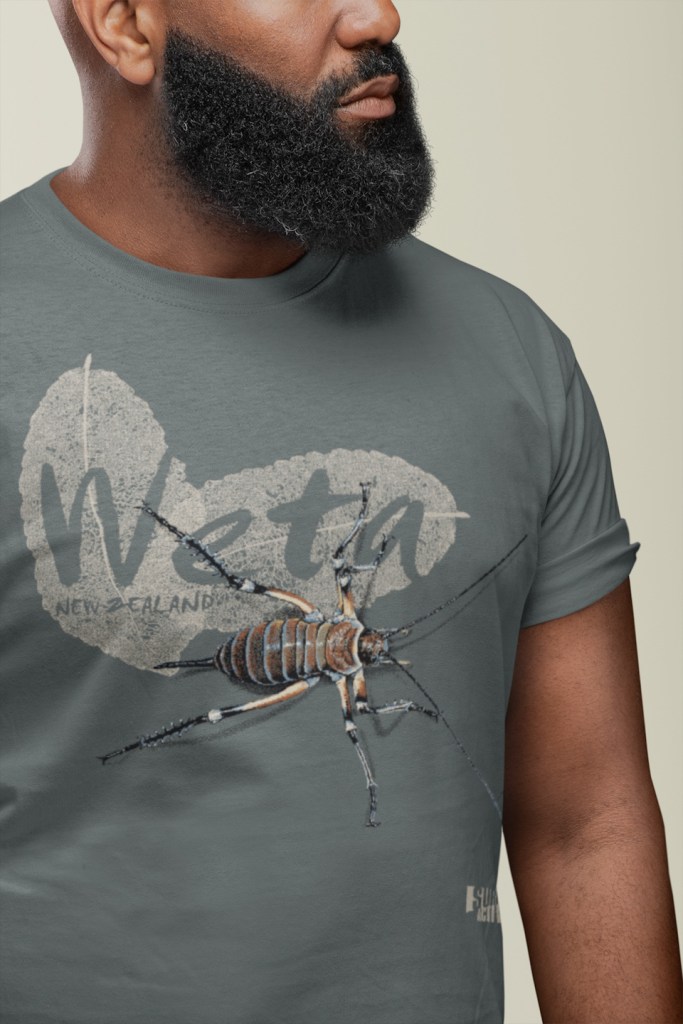
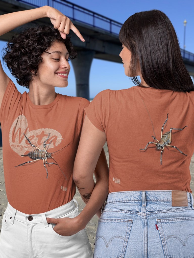
- Digital Design: I whip up a cool digital composite image on a transparent background, using—when it comes to the weta—the seven-colour separations from my screenprinted art.
- DTF Printing: So, this digital file gets printed on some cool film by my local DTF print buddy Merch Kings.
- Heat Pressing: So, I take that printed film and lay it on the blank t-shirt that the customer picked out, then I heat press it right onto the shirt. The heat gets the adhesive on the film going, making the design stick for good on the fabric.
- DTF printing totally takes away the hassle of using multiple screens and that tedious labour of multicolour hand screen printing. It makes it super easy to get my artwork onto t-shirts!
Please Release Me: DTF (Direct To Film) Printing is the Streamlined Method to Print my Wildlife Art
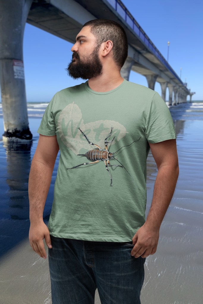
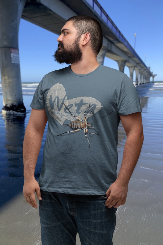
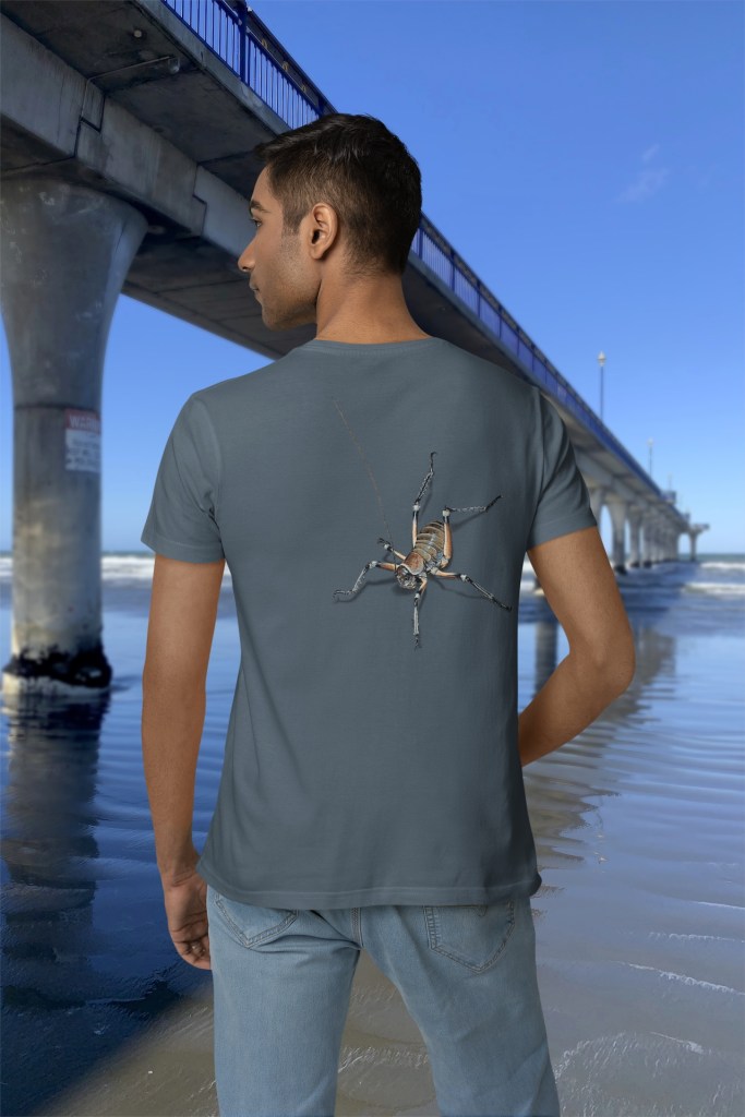
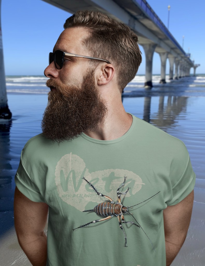
The New Zealand Nature T-Shirt Company
